Get Indexology® Blog updates via email.

In This List

Home Prices Continue to Rise

Inflation or Why Raise Interest Rates

Industrial Metals On Pace For Worst Month In 4 Years

Rieger Report: Puerto Rico munis see a bounce (last gasp?)

Don’t Blame Tight Supplies for Rising Home Prices

Home Prices Continue to Rise

Contributor Image
David Blitzer

Former Managing Director and Chairman of the Index Committee

S&P Dow Jones Indices

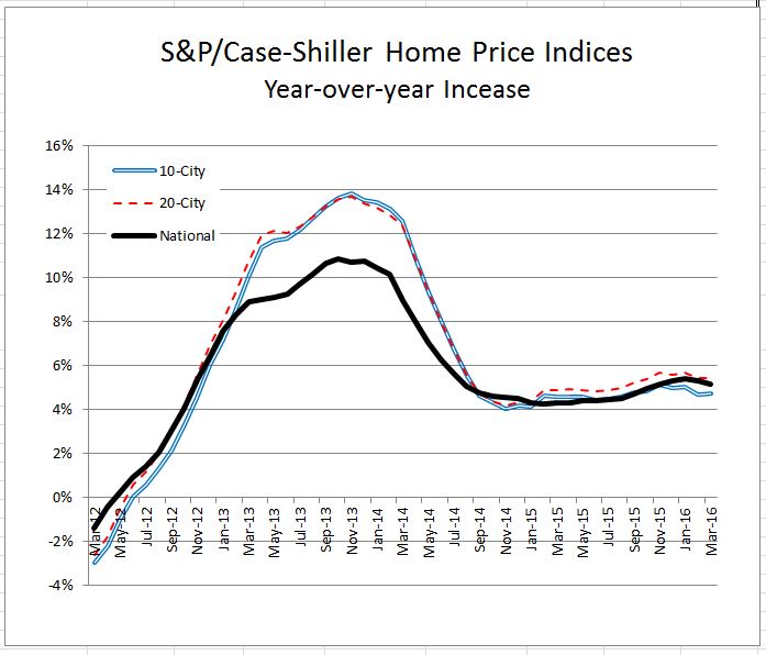
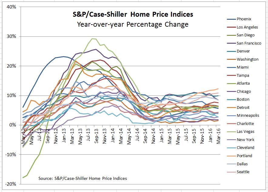
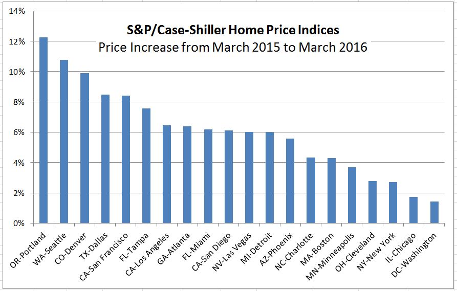
Charts from the latest S&P/Case-Shiller Home Price Indices released this morning.  Full data available here.

Nationally home prices continue at a about a 5% annual rate.  Price gains vary across the 20 cities covered with the Pacific Northwest region showing the largest gains.

The posts on this blog are opinions, not advice. Please read our Disclaimers.

Inflation or Why Raise Interest Rates

Contributor Image
David Blitzer

Former Managing Director and Chairman of the Index Committee

S&P Dow Jones Indices

The minutes of the Fed’s April 26-7 meeting convinced almost everyone that the Fed will raise interest rates at its next meeting in June, but left them wondering why.  Most of the subsequent discussion centered on the labor market and how close the economy is to full employment. There was also some whispering about inflation.

The Fed has two sometimes conflicting goals: full employment and low inflation. It defines low inflation as 2%. The definition of full employment is less specific — an unemployment rate in the neighborhood of 4.5%-5% seems right. Since 2009 the Fed has moved towards full employment by bringing the unemployment rate down from 10% to 5% currently. It has had less success with inflation unless you really want price increases of zero to 1% instead of the Fed’s 2% target.

Inflation used to be thought of as a monetary phenomenon – the growth rate of the money supply drove the rate of inflation. Despite consistent money growth, inflation remains comatose. The competing inflation theory is a combination of expectations and the Phillips curve.  Expectations is the idea that when everyone expects prices to rise, they will push for higher wages and prices; but be satisfied with  current wages and prices if they expect stability to continue. The Phillips curve was first suggested in 1958 by A. W. Phillips, a New Zealand economist, who described an inverse relation between inflation and unemployment: when unemployment drops and an economy reaches full employment, inflation tends to rise. While the details of the links among inflation, unemployment and expectations have changed, the links are still there and the Fed believes that full employment can lead to rising inflation.  The FOMC doesn’t know how far or fast unemployment can fall before inflation picks up. However, waiting to raise interest rates until inflation is climbing would mean needing to push interest rates up much farther and faster. A small step or two in interest rates this year may be prudent risk control.

Concern over inflation and the Phillips curve is not the only argument for a June-July rate hike. Over the last year the Fed has discussed normalization – moving interest rates above the zero lower bound and returning to open market operations and the Fed funds rate as the principal tools of monetary policy.  If the Fed funds rate is still 0.5% at the start of the next recession, there won’t be much room to ease and the Fed would immediately be looking at quantitative easing, negative interest rates and an expanding balance sheet. A better plan would be further economic growth and gradually moving the Fed funds rate to 2%-3% before faced with the next downturn.  That plan needs to start sometime.

One other aspect of a Fed move is more speculative.  While the Fed’s policy mandate for low inflation and full employment is domestic, the Fed’s action is felt around the globe. An increase the Fed funds target may boost the dollar against other currencies include the euro and the yen.  A stronger dollar would stimulate some foreign economies while dampening activities for US manufacturing and exporting. This should be viewed as a side effect rather than disguised stimulus to other economies.

The posts on this blog are opinions, not advice. Please read our Disclaimers.

Industrial Metals On Pace For Worst Month In 4 Years

Contributor Image
Jodie Gunzberg

Former Managing Director, Head of U.S. Equities

S&P Dow Jones Indices

While most of the markets have calmed as investors wait for Brexit and the Fed rate decision, industrial metals are crashing. The S&P GSCI Industrial Metals Total Return is down 8.7% month-to date (through May 23, 2016,) and on pace to record its worst month since May 2012, when it lost 9.7%. At this rate, the sector is having not only its worst month in four years but its 7th worst May since 1978, when the index history started.

Source: S&P Dow Jones Indices.

There has been little correlation of Chinese GDP growth to industrial metals, even copper, but two other factors may be causing the recent drop.  The first is the rising dollar.

Source: http://www.bloomberg.com/quote/DXY:CUR

Industrial metals are some of the most sensitive commodities to the US dollar.  In fact, of all 24 commodities, nickel tops the list of the single most susceptible to the rising dollar, dropping 1.9% for every 1% rise in the US dollar. Sure enough nickel is the biggest loser in the index so far in May, down 12%.  The other industrial metals are pretty sensitive too. For every 1% rise in the US dollar over the past ten years, lead, aluminum, copper and zinc lost 1.3%, 1.1%, 1.0% and 0.4%, respectively. Month-to-date in May, lead, aluminum, copper and zinc lost 8.5%, 8.0%, 9.6% and 5.1%, respectively.

The other reason for the loss in the industrial metal sector is from rising inventories. It is difficult for producers to supply exactly the amount needed.  After some mining closures and supply reductions, prices rose to cause suppliers to bring more of the metals to the market. This month inventories rose significantly for copper and lead that together comprise about half the weight in the sector.

Source: http://www.infomine.com/investment/warehouse-levels/

As for the interest rate decision, all else equal, if rates rise, the dollar may strengthen so will likely hurt the sector but suppliers may adjust again to limit the price drops. On the other hand, if the dollar strengthens, its power to lift the industrial metals is far greater. In the past 10 years, for every 1% move down in the US dollar, gains in lead, nickel, copper, zinc and aluminum have been 7.2%, 6.1%, 5.3%, 4.6% and 2.2%, respectively. That’s a pretty strong upside potential to downside risk from the US dollar.

The posts on this blog are opinions, not advice. Please read our Disclaimers.

Rieger Report: Puerto Rico munis see a bounce (last gasp?)

Contributor Image
J.R. Rieger

Former Head of Fixed Income Indices

S&P Dow Jones Indices

The rocky road that is the Puerto Rico municipal bond market continues.  Last week’s bi-partisan Puerto Rico Restructuring Bill also referred to as the ‘rescue bill’ has created a reason for the bond market to react positively.  There are ramifications to the ‘rescue bill’ however including potentially eroding bondholder (creditor) provisions for repayment.  Meanwhile, bondholders of the Puerto Rico Government Bank debt have rekindled their lawsuit seeking to retain their protections as creditors.  The net result: the S&P Municipal Bond Puerto Rico General Obligation Index is reflecting a 2.29% positive total return so far in May but not without volatility:

  • The weighted average price of bonds in the Index hit a record low of 68.38 on May 10th. (Prices of  bonds represent a percentage of par value)
  • The weighted average yield of bonds  in the Index hit a 2016 high on May 10th of 10.89% and have dropped 36 basis points since then to end at 10.53%.
  • The impact on the broader municipal bond market can be seen in the high yield segments: the S&P Municipal Bond High Yield Index has returned over 4% year-to-date and the S&P Municipal Bond High Yield Index ex-Puerto Rico has returned over 5%.
Source: S&P Dow Jones Indices, LLC. Data as of May 20th 2016. Chart is provided for illustrative purposes. It is not possible to invest directly in an index. Past performance is no guarantee of future results.

The posts on this blog are opinions, not advice. Please read our Disclaimers.

Don’t Blame Tight Supplies for Rising Home Prices

Contributor Image
David Blitzer

Former Managing Director and Chairman of the Index Committee

S&P Dow Jones Indices

The S&P/Case-Shiller National Home Price Index shows prices of existing single family homes rising 5.3% annually in the last few months, well above the rate of inflation. Recent comments cite the low inventory of homes for sale as a leading factor in higher prices. Housing markets are local and some communities may be seeing house prices driven up by a shortage of homes for sale. However, nationally low unemployment; low mortgage rates and an improving economy outweigh inventory issues.

The chart shows the S&P/Case-Shiller National Home Price Index (red, numbers of the right hand scale), sales of existing homes at annual rates (dark blue, in millions of houses per year on the left hand scale) and the inventory-sales ratio or months-supply (green, also on the left).

The current level of months-supply at 4.7 is much lower than the housing boom-bust era of 2006-2012, but it is almost the same as the 1997-2005 period, the last time we might recall a somewhat normal housing market. Looking farther back to the 1990-1996 period the months-supply was much higher. However, then the economy was coming off an earlier housing boom-bust. In 1990-1991 the Fed raised interest rates, housing slowed and inventories surged.  Given history, the months-supply isn’t the prime factor in rising home prices.

Since 2010, home prices and sales have risen together while the months-supply has stayed in a range of 4 to 4.8 months. The availability of homes for sale has kept up with rising prices and expanding sales.  If supply isn’t the cause, then factors outside of the housing market are likely drivers of rising house prices.  Mortgage rates, which have fallen from about 5% to 3.5% for 30-year fixed rate loans since 2010, are contributing to rising home prices.  Improved consumer confidence and the decline in unemployment are also positive factors behind home prices.

If the Fed pushes interest and mortgage rates up over the next year or two, and if the unemployment levels off as it approaches full employment, the rise is home prices is likely to be tempered. The months-supply figures will probably settle between 4 and 5 months.

The next S&P/Case-Shiller Home Price Index report is due on May 31st and will reveal if prices are continuing to climb at better than a 5% pace.

The posts on this blog are opinions, not advice. Please read our Disclaimers.