Get Indexology® Blog updates via email.

In This List

Valuing Low Volatility: Does Timing Matter?

“Round Up the Usual Suspects”

How Cheap Gasoline Can Lead to Costly Insurance

Understanding the Risk and Return Drivers of Smart Beta Strategies

The Rieger Report: Munis Rich or Cheap? It's all relative

Valuing Low Volatility: Does Timing Matter?

Contributor Image
Fei Mei Chan

Former Director, Core Product Management

S&P Dow Jones Indices

If early January is any indication, 2016 should be another year when low volatility strategies will be in vogue. Popularized in the turmoil following the financial crisis in 2008, low volatility strategies, as the name denotes, serve well in times of equity upheaval. And despite bearing lower risk low volatility strategies have outperformed their benchmarks over time. The S&P 500 Low Volatility Index is an example of such a strategy. In the 25-year period ended in December 2015, Low Vol delivered an average annual return of 10.91% compared to 9.82% for the S&P 500 with less volatility (standard deviations of 11.04% and 14.44%, respectively). Year to date, Low Vol is outperforming the S&P 500 by approximately three percentage points.

However, as with any investment consideration, it’s prudent to look at a few fundamentals as a gauge of whether timing is opportune. Is it possible to isolate windows for which an entry point into Low Vol will offer most bang for the buck? To address this question, we look at the current S&P DJI Style model which utilizes book/price, sales/price, and earnings/price as value components. In the graph below, the red line (left axis) charts the performance spread between the S&P 500 Low Volatility Index and the S&P 500. The blue line (right axis) charts the value score of the low volatility index over time. Value scores are constructed relative to the overall market. By design, the S&P 500 has an average value score of 0. A positive value score reflects cheapness relative to the S&P 500. Conspicuously, Low Vol’s current value score has been hovering near all-time lows. If value is relevant, now would be an inauspicious time to get into Low Vol.

it's not always about timing

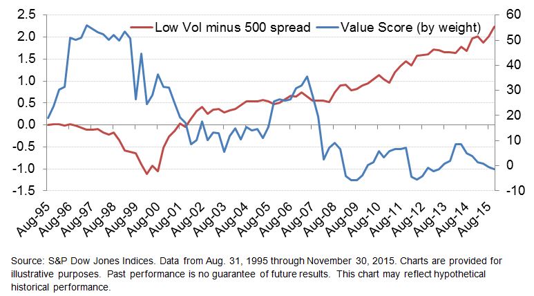
But, looking at history, Low Vol notched its highest value score (valuation was cheapest) in 1997 close to the onset of the technology bubble. Entry into Low Vol at that point would be followed by years of underperformance that would last through 2000. In contrast, one of the most expensive points of Low Vol was in the months following the financial crisis. That wasn’t too long ago but the red line in the chart above does a very good job illustrating what’s happened to Low Vol since then.  As a timing indicator, at least for Low Vol, value is not very valuable.

The posts on this blog are opinions, not advice. Please read our Disclaimers.

“Round Up the Usual Suspects”

Contributor Image
David Blitzer

Former Managing Director and Chairman of the Index Committee

S&P Dow Jones Indices

Movie fans may remember this as one of the closing lines in Casablanca. Though less artistic, market watchers have their own suspects for the stock markets turmoil of the last few weeks:

Corporate Earnings are always a good place to start and the latest projections point to 2015 EPS for the S&P 500 being down about 6% from 2014.  The price-earnings ratio is about 19.2 times, higher than average and getting close to levels where people worry. However, more suspects are probably needed to explain the turmoil than weakening earnings when the projections for 2016 and 2017 are for earnings to increase 15%-20% each year.

Oil would be a suspect except that there are far more consumers of oil than producers and the consumers are enjoying cheap energy.  The details matter: for oil consumers, expenditures on energy are a modest part of their budget. The price drop is welcome but not life-changing. For oil producers, revenue from energy is a major part of their income and the 75% drop is life changing:  layoffs, exploration cutbacks, turmoil in some petroleum exporting countries.  Fears that problems in the energy sector will spread to other parts of the economy cannot be completely eliminated.

Then there is China. China’s growth was the engine of global growth in recent years; now China’s growth slowing. Moreover, the government is trying to manage a shift from industrial development to a consumer led economy. Their efforts to let the Chinese yuan gently depreciate and to encourage the stock market have met with difficulties.  To be fair, government efforts to manage currency shifts are always fraught with difficulty. Successful government plans to influence stock markets are extremely rare. Achieving either in the midst of a major economic transition to a consumer led economy would be almost miraculous.  Japan tried as much in the 1990s – and hasn’t completely recovered yet.

Earnings are weak, the Fed says its raising interest rates and everything we knew about oil and China two or three years ago is no longer true. No wonder the market is in turmoil.

Something more positive: Debt levels in the US are modest – after the 2007-2009 recession businesses, households and the Federal government made efforts to reduce debts and deficits. This matters because high debt, along with falling stock and home prices, were the key causes of the Great Recession. The US is in better shape now than 2007.   Then there is history: the biggest stock market crash occurred on October 19, 1987 when the market fell over 20% in a day.  From the late August peak to the close on October 19th the market fell 33%. Then it closed up 2% for the full year.  If the numbers on the chart seem to be missing a digit or two, remember that was almost 30 years ago.

The posts on this blog are opinions, not advice. Please read our Disclaimers.

How Cheap Gasoline Can Lead to Costly Insurance

Contributor Image
Jason Giordano

Director, Fixed Income, Product Management

S&P Dow Jones Indices

With oil prices at 12-year lows, drivers are spending less money to fill their tanks.  However, investors looking to insure themselves against the default risk of energy bonds are being asked to pay up.  Rapidly decreasing oil prices have had a negative impact on the forecast operating cash flows of energy companies.  As uncertainty rises, the cost of credit protection (i.e., credit default swaps [CDS]) within the energy sector has skyrocketed, as evidenced by the S&P/ISDA CDS U.S. Energy Select 10 (see Exhibit 1).  The index, which seeks to track the performance of a select number of reference entities in the U.S. energy market segment, was up 20% YTD and over 110% for the one-year period as of Jan. 15, 2016.  Comparatively, CDS spreads within the energy sector are currently 280 bps wider than those of high-yield U.S. corporate entities, as measured by the S&P/ISDA CDS U.S. High-Yield Index.  This is especially noteworthy given the recent fears in the high-yield market.

Capture

High-yield bonds offer higher rates of interest, given the higher risk of default, than bonds issued by investment-grade corporations.  The S&P/ISDA CDS U.S. High-Yield Index is constructed using 80 equally weighted, five-year CDS contracts of the underlying reference entities.

While there is a strong correlation between CDS spreads and deteriorating credit, CDS spreads act more as a measure of the perceived risk of the underlying bond.  CDS spreads also depend on other factors such as market liquidity, counterparty risk, and interest rates.  It’s also worth mentioning that CDS buyers can seek insurance for credit events other than default.  For example, contracts can be written that protect investors against a credit downgrade from investment grade to below investment grade or “junk” status.

Looking further within the energy sector of the S&P 500®, performance of bonds and equity can be compared using the S&P 500 Energy Corporate Bond Index (TR) and the S&P 500 Energy (TR).  While the S&P 500 Energy Corporate Bond Index (TR) was down 10% over the one-year period, the YTD performance was fairly flat.  The S&P 500 Energy (TR), however, was down 24% and 6% across the same time horizons, respectively.

Capture

Why the difference?  Also, why are bond prices not falling as CDS spreads spike?  It’s a great example of how the equity, bond, and CDS markets react to information and price risk differently.  Between the CDS and bond markets, historically speaking, CDS spreads tend to lead, and sometimes by a significant length of time.

The posts on this blog are opinions, not advice. Please read our Disclaimers.

Understanding the Risk and Return Drivers of Smart Beta Strategies

Contributor Image
Daniel Ung

Former Director

Global Research & Design

Within the passive investment arena, smart beta strategies have witnessed a substantial growth in assets, and there is now a swathe of such strategies in the marketplace, many of which bear similar names and share similar objectives.  One may therefore expect that all these strategies are similar and that any differences would only elicit interest in academic circles, but our research suggests that the drivers of risk and return for these strategies can be poles apart, even though the strategies appear, at first glance, to be indistinguishable.

Optimized Minimum Variance or Simple Low Volatility: One and the Same Thing?
For example, the minimum variance and low volatility strategies share similar objectives in that they each target less-volatile stocks.  The main difference between the two derives from the strictness of their sector- and stock-level constraints.  Minimum variance applies strict constraints and involves optimization, whereas low volatility tends to involve selecting the least volatile stocks based on the last 12 months of standard deviation.

Exhibit 1 shows that these strategies were exposed to different fundamental factors from December 1994 to December 2014.  Less surprisingly, both strategies had lower market beta than the S&P 500®, and the simple low volatility strategy had a much lower exposure to price volatility than the minimum variance strategy.  More interestingly, both strategies had smaller market-cap stocks than the S&P 500.  They also had high exposure to high-dividend-yielding stocks.  These differences can also be seen through the different sector exposures of the two strategies.

Capture

Additional research by S&P DJI shows that exposures can be different for other strategies (such as dividend strategies, quality, size, etc.), even though they may bear similar names.

For more information on our research, please click here, where you will also find details about:

  • How each of the smart beta strategies performed in different macroeconomic and market environments, and
  • What happens when a number of factors are blended together in multi-factor portfolios.

The posts on this blog are opinions, not advice. Please read our Disclaimers.

The Rieger Report: Munis Rich or Cheap? It's all relative

Contributor Image
J.R. Rieger

Former Head of Fixed Income Indices

S&P Dow Jones Indices

Are U.S. municipal bonds rich or cheap relative to other fixed income asset classes?  It is all relative.  As of January 15th 2016, the yield to worst of investment grade bonds tracked in the S&P National AMT-Free Municipal Bond Index was a 1.8% (tax-free yield).  The Taxable Equivalent Yield (TEY) of those bonds using a 35% tax-rate assumption would be 2.77% (the required yield of a taxable bond to keep the same interest income after taxes).

Historically, the traditional measure of rich or cheap for municipal bonds has been the tax-free yield to U.S. Treasury yield ratio. Prior to quantitative easing that rations had been about 75 – 80%.  By most measures, the yields of municipal bonds remain higher than the historical trend.  For example, the investment grade non-callable municipal bonds maturing in 2024 tracked in the S&P AMT-Free Municipal Series 2024 Index ended at a yield of 1.87% verses the yield of the S&P/BGCantor Current 10 Year U.S. Treasury Bond Index yield of 2.03%…or 92% of the U.S. Treasury yield.

When comparing municipals to corporates we get a different picture:

Municipal bonds are currently rich when comparing tax-free municipal bonds to investment grade corporate bonds.  To make a fair comparison between the two asset classes indices were selected that have comparable weighted average modified durations:  S&P National AMT-Free Municipal Bond Index and the S&P 500 5-7 Year Investment Grade Corporate Bond Index.  The green line in the chart below is the Taxable Equivalent Yield of bonds in the S&P National AMT-Free Municipal Bond Index again using a 35% tax-rate assumption.  Yields of investment grade municipal bonds have now fallen to levels that in relative terms make them ‘rich’ to corporate bonds.  Higher or lower tax assumptions would change the outcome of the graph.

Chart 1: Yields of select indices

Blog chart 1 Jan 15 2016

Weighted modified durations as of January 15, 2016:

S&P National AMT-Free Municipal Bond Index: 4.72

S&P 500 5 -7 Year Investment Grade Corporate Bond Index: 5.25

No tax advice is provided  or intended in this blog. Taxable Equivalent Yields are used as a comparative measure only .

The posts on this blog are opinions, not advice. Please read our Disclaimers.