Get Indexology® Blog updates via email.

In This List

Understanding the Risk and Return Drivers of Smart Beta Strategies

The Rieger Report: Munis Rich or Cheap? It's all relative

U.S. Treasuries: A Higher Chance of Lower Yields

Recession Angst

Why Choosing Between Managers Requires a Two-Dimensional View - Part 2

Understanding the Risk and Return Drivers of Smart Beta Strategies

Contributor Image
Daniel Ung

Former Director

Global Research & Design

Within the passive investment arena, smart beta strategies have witnessed a substantial growth in assets, and there is now a swathe of such strategies in the marketplace, many of which bear similar names and share similar objectives.  One may therefore expect that all these strategies are similar and that any differences would only elicit interest in academic circles, but our research suggests that the drivers of risk and return for these strategies can be poles apart, even though the strategies appear, at first glance, to be indistinguishable.

Optimized Minimum Variance or Simple Low Volatility: One and the Same Thing?
For example, the minimum variance and low volatility strategies share similar objectives in that they each target less-volatile stocks.  The main difference between the two derives from the strictness of their sector- and stock-level constraints.  Minimum variance applies strict constraints and involves optimization, whereas low volatility tends to involve selecting the least volatile stocks based on the last 12 months of standard deviation.

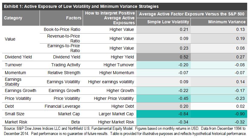
Exhibit 1 shows that these strategies were exposed to different fundamental factors from December 1994 to December 2014.  Less surprisingly, both strategies had lower market beta than the S&P 500®, and the simple low volatility strategy had a much lower exposure to price volatility than the minimum variance strategy.  More interestingly, both strategies had smaller market-cap stocks than the S&P 500.  They also had high exposure to high-dividend-yielding stocks.  These differences can also be seen through the different sector exposures of the two strategies.

Capture

Additional research by S&P DJI shows that exposures can be different for other strategies (such as dividend strategies, quality, size, etc.), even though they may bear similar names.

For more information on our research, please click here, where you will also find details about:

  • How each of the smart beta strategies performed in different macroeconomic and market environments, and
  • What happens when a number of factors are blended together in multi-factor portfolios.

The posts on this blog are opinions, not advice. Please read our Disclaimers.

The Rieger Report: Munis Rich or Cheap? It's all relative

Contributor Image
J.R. Rieger

Former Head of Fixed Income Indices

S&P Dow Jones Indices

Are U.S. municipal bonds rich or cheap relative to other fixed income asset classes?  It is all relative.  As of January 15th 2016, the yield to worst of investment grade bonds tracked in the S&P National AMT-Free Municipal Bond Index was a 1.8% (tax-free yield).  The Taxable Equivalent Yield (TEY) of those bonds using a 35% tax-rate assumption would be 2.77% (the required yield of a taxable bond to keep the same interest income after taxes).

Historically, the traditional measure of rich or cheap for municipal bonds has been the tax-free yield to U.S. Treasury yield ratio. Prior to quantitative easing that rations had been about 75 – 80%.  By most measures, the yields of municipal bonds remain higher than the historical trend.  For example, the investment grade non-callable municipal bonds maturing in 2024 tracked in the S&P AMT-Free Municipal Series 2024 Index ended at a yield of 1.87% verses the yield of the S&P/BGCantor Current 10 Year U.S. Treasury Bond Index yield of 2.03%…or 92% of the U.S. Treasury yield.

When comparing municipals to corporates we get a different picture:

Municipal bonds are currently rich when comparing tax-free municipal bonds to investment grade corporate bonds.  To make a fair comparison between the two asset classes indices were selected that have comparable weighted average modified durations:  S&P National AMT-Free Municipal Bond Index and the S&P 500 5-7 Year Investment Grade Corporate Bond Index.  The green line in the chart below is the Taxable Equivalent Yield of bonds in the S&P National AMT-Free Municipal Bond Index again using a 35% tax-rate assumption.  Yields of investment grade municipal bonds have now fallen to levels that in relative terms make them ‘rich’ to corporate bonds.  Higher or lower tax assumptions would change the outcome of the graph.

Chart 1: Yields of select indices

Blog chart 1 Jan 15 2016

Weighted modified durations as of January 15, 2016:

S&P National AMT-Free Municipal Bond Index: 4.72

S&P 500 5 -7 Year Investment Grade Corporate Bond Index: 5.25

No tax advice is provided  or intended in this blog. Taxable Equivalent Yields are used as a comparative measure only .

The posts on this blog are opinions, not advice. Please read our Disclaimers.

U.S. Treasuries: A Higher Chance of Lower Yields

Contributor Image
Kevin Horan

Former Director, Fixed Income Indices

S&P Dow Jones Indices

The yield-to-worst of the 10-Year U.S. Treasury has been dancing around 2% and dipped below 2% in intraday trading on Jan. 15, 2016.  The night before, the S&P/BGCantor Current 10 Year U.S. Treasury Bond Index closed at 2.09%.  The average yield of the 10-year for 2015 was 2.13%, while 2016 began at 2.30% for the index.  Since the beginning of the year, yields have headed lower and are now equivalent to levels seen in October 2015.

Post-Fed rate increase and halfway through the first month of 2016, Treasuries prices have increased, as some investors have moved toward safe haven assets in response to concerns over dangers in the U.S. economic recovery, which have been brought on by possible credit problems in energy and commodity companies due to the low price of oil.

Also contributing to the move would be the recent Chinese currency devaluation, a selloff in Chinese stocks, and lower Chinese demand of commodities, possibly leading to downward risk in inflation levels.

News from China added to other global issues, such as continued European economic stimulus, the threat of terrorism, and languishing global inflation, point to yields possibly remaining lower in 2016 before going higher.

Exhibit 1: S&P/BGCantor Current 10 Year U.S. Treasury Bond Index Yield-to-Worst
YTW history of the S&PBGCantor Current 10 Year U.S. Treasury Bond Index


Source: S&P Dow Jones Indices LLC.  Data as of Jan. 14, 2016.  Past performance is no guarantee of future results.  Chart is provided for illustrative purposes.

The posts on this blog are opinions, not advice. Please read our Disclaimers.

Recession Angst

Contributor Image
David Blitzer

Former Managing Director and Chairman of the Index Committee

S&P Dow Jones Indices

Stock market turmoil is generating fears and predictions of a 2016 recession.  The S&P 500 and the Dow dropped  more than 10% from recent record highs to correction levels, but none of this guarantees a recession.  In fact, the stock market is notorious for predicting recessions –and many other things – that never happened.  The chart shows the S&P 500 since 1948 with vertical areas marking recessions.  The market does drop before each recession, but it also drops several times where there is no recession.  In fact the biggest drop of all – October 19, 1987 – didn’t point to a recession.

A better place to look for recession warnings is in the broader economy – and the news there is better than in the market. A reliable short term indicator is the weekly unemployment insurance claims report – the number of people recently laid off filing their first claim. Anything under 300 thousand is considered good news, anything over 400,000 spells recession.  The numbers have been under the 300 thousand mark for a some time.

Some analysts are arguing that the Fed erred in raising the Fed funds rate last month and has set the stage for a recession. For politicians, if the market didn’t signal recession than the Fed is causing one. However, the chart shows the Fed funds rate since the mid-1950s and recessions. Interest rates do rise before recessions, but there are a lot of false signals and long lead times.

There will be another recession, and no one knows when it will begin or how nasty it will be. Despite 2016’s poor start on Wall Street, most of the economic indicators are positive.  If everyone expects a recession, stops spending, starts hoarding their money we will get a recession.

Data for the S&P 500 chart from S&P Dow Jones Indices, Recession dates from the National Bureau of Economic Research. Charts marked FRED are from the Federal Reserve Bank fo St. Louis economic data.

The posts on this blog are opinions, not advice. Please read our Disclaimers.

Why Choosing Between Managers Requires a Two-Dimensional View - Part 2

Contributor Image
Raewyn Williams

Director of Research & After-Tax Solutions

Parametric™ Australasia

Part 1 of this article looked at the ways in which superannuation funds and other institutional investors build “multi-manager” equity portfolio structures in an attempt to spread the benefits of diversification within, and not just across, asset classes.  We noted that, astonishingly, the performance track records of managers are typically compared only on a pre-tax basis, despite the fact that earnings from investments by most investors in Australia are subject to tax.

We turn now to show how this pre-tax focus can mislead superannuation funds and other investors.  In Exhibit 1, we present the 10-year excess returns (alpha) of 198 U.S. mutual fund managers over a period ending Dec. 31, 2013, from the perspective of an Australian complying superannuation fund.  We will explain the colored data points later.

Capture

Funds above 0% on the y-axis (plotted between -6% and 6%) appear to have outperformed by generating returns in excess of the 4.84% per year benchmark return we used over the 10-year period.  Those high on the y-axis indicate the most outstanding strategies based on performance track record.  The y-axis is typically the only kind of performance information considered when evaluating strategies and choosing between alternative managers.

That approach misses a significant point.  It is also important to consider the x-axis, which shows the tax cost of achieving the managers’ pre-tax excess returns.  It is concerning to think that many institutional investors and advisors take a “one-dimensional view.”  By fixating on the y-axis, which focuses only on pre-tax performance, they are not considering the important dimension of tax (the x-axis), which can give these decision makers a much more complete picture of each manager’s performance.  A few forward-thinking institutions have the ability to focus solely on pre-tax manager returns, because they employ a sophisticated overlay approach to tax management (centralized portfolio management), but most do not have that luxury.

Without a “two-dimensional” after-tax view of manager performance it is hard to see that:

  • Strategies and managers that look similar pre-tax can look different on an after-tax basis—this is illustrated by comparing the two funds highlighted in black in Exhibit 1;
  • Strategies and managers that look like they are adding value can actually erode wealth on an after-tax basis—this is illustrated by the funds highlighted in green in Exhibit 1; and
  • A strategy or manager that looks superior to another strategy pre-tax can actually be inferior when compared after tax—this is illustrated by comparing the two funds highlighted in purple in Exhibit 1. The fund that generated an annual pre-tax excess return of 3.60% (compared to its competitor that returned 3.09%) in fact returned only 2.88% after tax, which is less than the 2.98% after-tax return of its competitor.

The simplistic one-dimensional analysis of the performance histories of the complete set of funds shows that 132 of the 198 funds outperformed the broader market; that is, generated positive pre-tax alpha.  This looks like good news.  However, the two-dimensional analysis, factoring in tax, shows that only 99 (about one-half of the funds) actually added value above market.  So, in fact, the news is not quite so good, and it is certainly not good for a superannuation fund invested in one or more of the 33 managers whose performance looked healthy pre-tax but performed no better or worse than the market on an after-tax basis.

This is a cautionary message for superannuation funds and advisors engaging in the important task of choosing investment managers to achieve the right multi-manager and strategy mix: always check that performance is evaluated with the investor’s tax profile in mind and beware of traditional pre-tax analyses and their potential to mislead.

The posts on this blog are opinions, not advice. Please read our Disclaimers.