Get Indexology® Blog updates via email.

In This List

When Did Everyone Get so Sick?

Infrastructure Preferreds, +4.96% YTD

A Tale of Two Benchmarks: Factors

U.S. Treasuries' Wild Ride

Variety is the spice of life….and it’s essential for indices, too.

When Did Everyone Get so Sick?

Contributor Image
Chris Bennett

Former Director, Index Investment Strategy

S&P Dow Jones Indices

While the government squabbles over the future of healthcare, healthcare company executives can just sit back and smile.  Their investors can too.

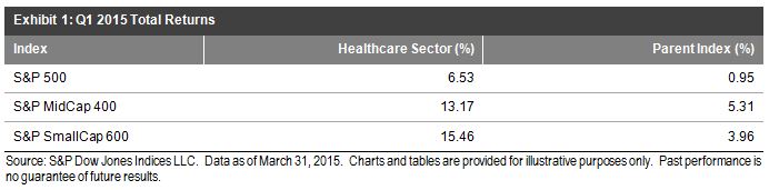
In the U.S., the healthcare sector significantly outperformed broad parent indices in the first quarter 2015, across capitalization ranges.  On a total return basis, the S&P 500® Health Care sector index gained 6.5% in the first quarter, while the S&P 500 ended the quarter up 1%.  The S&P SmallCap 600® Health Care sector index led the pack, ending the quarter up over 15%, while the S&P SmallCap 600 gained 4%.

Capture

The main benefactors in the U.S. have been mid- and small-cap pharmaceuticals.  The S&P MidCap 400 Pharmaceuticals industry index was up 44% in the first quarter, while the S&P SmallCap 600 Pharmaceuticals industry index was up 32%.  Biotechnology has cooled off slightly in 2015, following a very strong performance in 2014.

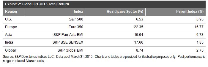
This trend is not limited to the United States, however.  Globally, the healthcare sector also outperformed broad market benchmarks.

Capture

So what’s driving this outperformance?  Well for one, there has been significant M&A activity in the space, as consolidation seems to be the name of the game.

These data also imply that the market believes the healthcare sector will continue to be prosperous.  Flows into the space indicate confidence, while recent growth in biotechnology demonstrated that some past wounds have healed.  While we wait to see if these valuations are long on substance, we must ask: Are we all really that sick?

The posts on this blog are opinions, not advice. Please read our Disclaimers.

Infrastructure Preferreds, +4.96% YTD

Contributor Image
Kevin Horan

Former Director, Fixed Income Indices

S&P Dow Jones Indices

Over a three-year period, the annualized returns of the U.S. preferred market have been more bond-like than equity-like.  The S&P U.S. Preferred Stock Index had a three-year annualized return of 7.95% as of March 27, 2015 while long U.S. Treasury bonds have returned 8.14% in the same period.  Meanwhile, the three-year annualized return of the S&P 500 has been well over 15%.  All of this is pointed out by J.R. Rieger in his recent blog post: U.S. Preferred Stock: Equity & Bond Characteristics Helping or Hurting Performance?

In order to address the growing interest in the infrastructure market, S&P Dow Jones Indices recently launched an index designed to track an additional segment of the preferred market: the S&P U.S. Preferred Infrastructure Stock Index.  The index has returned 0.03% MTD and 4.96% YTD on a total rate of return basis, as of April 2, 2015.  Returns for 2015 have all been positive at 3.37% (January), 1.11% (February), and 0.39% (March), while the dividend yield was 5.88% as of April 2, 2015.

As mentioned in J.R.’s post: “While it is easy to relate the performance of preferred stock and long-term bonds to interest rate changes, the two asset classes have shown a low correlation to each other over the last three years.  Actually, the S&P U.S. Preferred Stock Index has had a higher correlation to the S&P 500 than it did to long-term bonds.  There is a danger in just looking at the last three years, of course, as interest rates have been held low during the period.”

Below are three visuals.  The first reports on the three-year correlation across four index types, while the second shows the returns of the S&P U.S. Preferred Infrastructure Stock Index.  The graphic that concludes this piece reports on the historical total returns of U.S. preferred infrastructure stocks.
Exhibit-1: Three-Year Correlation Across Indices


Exhibit-2: S&P U.S. Preferred Infrastructure Stock Index


Exhibit-3; Historical Returns of S&P U.S. Preferred Stock IndexSource: S&P Dow Jones Indices, LLC.  Data as of April 2, 2015.  Past performance is no guarantee of future results.  Charts and tables are provided for illustrative purposes and may reflect hypothetical historical performance.  Please see the Performance Disclosures at the end of this document for more information regarding the inherent limitations associated with back-tested performance.

The posts on this blog are opinions, not advice. Please read our Disclaimers.

A Tale of Two Benchmarks: Factors

Contributor Image
Phillip Brzenk

Managing Director, Global Head of Multi-Asset Indices

S&P Dow Jones Indices

This is the third in a series of blog posts relating to the in depth analysis of performance differential between the S&P SmallCap 600 and the Russell 2000.

As we noted in the previous post, the reconstitution effect seen in the Russell 2000 doesn’t fully explain the differences in returns between the S&P SmallCap 600 and Russell 2000. Our analysis turns to factor testing, first using the Fama-French three-factor model, which includes the Market, Size and Value factors [1]. All three factors are statistically significant in explaining the index returns, though the S&P SmallCap 600 shows a statistically significant unexplained positive alpha (Intercept). The market factor is similar between the two indices, while the size and value factors differ. The size coefficient is larger in the 2000, leading to the conclusion that the Russell has more exposure to smaller capitalization companies. The 600 has a higher value factor coefficient, thus being tilted more towards value companies versus the 2000.

[1] Fama and French, 1993

A_Tale_of_Two_Benchmarks_Factors_1

With a statistically significant unexplained alpha present in the three-factor model for the 600, additional factors are added to the analysis with the introduction of two separate four-factor regressions models.

The first model incorporates the momentum factor (WML) first introduced by Mark Carhart [1], to the traditional Fama-French three-factor model. Momentum, the tendency for stocks to exhibit persistence in their relative performance, is a well-known anomaly in investing and gives sufficient reasoning to test its efficacy in explaining small-cap returns. As shown in the exhibit below, the momentum factor fails to add explanatory power to the three-factor model, with both coefficients near zero and both t-statistics insignificant.

[1] Carhart, 1997

A_Tale_of_Two_Benchmarks_Factors_2

The second model incorporates the quality factor (QMJ) first introduced in a paper by AQR, defined as companies that are profitable, growing and well managed [1]. The authors go on to mention that investing in high quality companies earns significant historical risk-adjusted returns. When the quality factor is added to the Fama-French model, interesting effects are seen in the output. In both indices, quality is positive, but the factor is larger for the S&P SmallCap 600 and statistically significant (it is not significant in the Russell 2000). In addition, the unexplained positive alpha of the S&P SmallCap 600 is no longer present- leading to believe that quality is a driving factor in the excess returns. Since profitability is a component of quality, the positive earnings screen implemented in the S&P Dow Jones Indices methodology could be seen as a contributor to the larger factor loading in the 600.

[1] Asness, Frazzini and Pedersen, 2014

A_Tale_of_Two_Benchmarks_Factors_3

The posts on this blog are opinions, not advice. Please read our Disclaimers.

U.S. Treasuries' Wild Ride

Contributor Image
Kevin Horan

Former Director, Fixed Income Indices

S&P Dow Jones Indices

The past month was a wild ride for U.S. Treasuries, and April seems to be starting out the same.  The yield of the S&P/BGCantor Current 10 Year U.S. Treasury Index closed the half-day trading session for the Good Friday holiday (April 3, 2015) at 1.86%.  The yield is at a two-month low, as rates have bounced around since the 1.81% reached on Feb. 5, 2015.  Friday’s speculation that the Fed won’t be able to raise rates anytime soon came off the back of a slowdown in job growth, as measured by the Change in Nonfarm Payroll number, which was 126,000 versus the surveyed and expected 245,000.

Prior to Friday’s trading, the yield of this index had increased by 13 bps, reaching 2%, after a 1.87% monthly low on March 24, 2015.  This low had resulted from a rally down in yield (38 bps) after the monthly peak of 2.25% on March 6, 2015.  The return of the index as of the end of March was 0.76% MTD and 3.06% YTD, while in April, the index has returned 0.66% MTD and 3.74% YTD (as of April 3, 2015).

Exhibit 1: Index Yield to Worst

YTW History of the S&P-BGCantor Current 10 Year U.S. Treasury Bond Index

Source: S&P Dow Jones Indices LLC.  Data as of April 3, 2015.  Charts and tables are provided for illustrative purposes.  Past performance is no guarantee of future results.

The posts on this blog are opinions, not advice. Please read our Disclaimers.

Variety is the spice of life….and it’s essential for indices, too.

Contributor Image
Koel Ghosh

Former Head of South Asia

S&P Dow Jones Indices

Recently, I seem to have gotten a bit addicted to online shopping, after experiencing the ease of online transactions and the constant exposure to multiple options.

Choice is important, and we are increasingly becoming spoiled by abundant choices in our everyday lives, be it with consumer goods or investments.  Online transactions are gaining popularity, not only due to their ease of execution, but also because of the convenience of being able to compare a varied number of options that meet one’s needs.  Furthermore, there is an increased awareness of new market entrants and ideas in the online space.  When there is a plethora of options from various sources, it becomes critical to be organized in order to evaluate them.  Hence, classification is essential.

This is applicable to financial market indices, as well.  There are multiple markets globally, with regional preferences and different rules and standards governing each one.  However, there are some common classifications that can be used to create comparable indices across regions. For example, every market does classify its components into large-cap, mid-cap and small-cap companies.  While the market itself could comprise various sizes based on regional capabilities, there seems to be standardization and a clear trend on how this classification is done.  The large-cap classification generally represents a significantly large percent of the total market capitalization, typically over 50%, followed by the mid-cap category, normally in the range of 10%-15%, and finally the small-cap label, which usually consists of a small percentage of total market cap.

Index classification is not only restricted to market capitalization—there are a number of other categories to choose from, as well.  Regional indices cover areas like the U.S., LATAM, APAC, EMEA, etc.  The regional offerings can be further defined into sub regions and countries.  There are sector indices offering other splits, like information technology, auto, banking and financials, manufacturing, etc., as there are many sectors that can prove useful to market participants and have a clear classification.  Additionally, there are an asset class-based index, which means there are either equity, fixed income, or commodities in the index universe.  While the aforementioned classifications are fairly generic for indices, there are also other classifications that offer access to a specific strategy or theme.  For example, S&P Dow Jones Indices has created the Shariah index series, which uses screening techniques to provide a variety of indices that are Shariah compliant, and this series is subdivided by region, as well.  In India, the S&P BSE 500 Shariah is the regional offering.  Themes such as asset allocation, dividends, etc. can also be used to classify indices.  Finally, custom indices can be created from standard classifications, offering another wide range of choices.

The classification of indices offers product providers the choice to create a range of offerings for investors.  Index providers are recognizing the need for choices and are creating innovative and varied options to suit market requirements.

The posts on this blog are opinions, not advice. Please read our Disclaimers.