Get Indexology® Blog updates via email.

In This List

House Prices and Incomes

Show Me The Muni

How Low Can the Yields Go?

Commodities "To Be Or Not To Be" GROWN

Are Investors Prepared for What may Be on the Horizon?

House Prices and Incomes

Contributor Image
David Blitzer

Former Managing Director and Chairman of the Index Committee

S&P Dow Jones Indices

Since the S&P/Case-Shiller National Home Price index bottomed in December 2011, the national index is up 24% or 7.5% annually. While the Index is about 10% below the peak level set in July 2006, the indices for Denver and Dallas set new all-time peaks last year. Boston and Charlotte NC are both closing in on new record highs. The rise in home prices comes against a background of stagnant wages gains, raising worries that some people are at risk of being priced out of the home market.

houseincome1

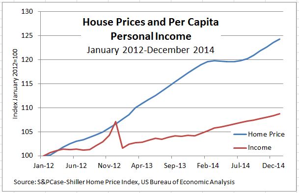
The short term picture, shown in the first chart, may be cause for concern.  The chart compares the S&P/Case-Shiller National index with per capita personal income during 2012-2014.  Home prices rose steadily except for a brief pause in early 2014. Incomes also rose, but by 9% over three years, only one-third as much.  The spike in income at the end of 2012 reflects a one-time shift in the pattern of dividend payments caused by fears that the Congress would not renew their favorable tax treatment.

houseincome2

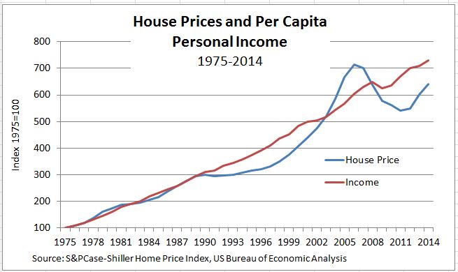
A longer view of the data tells a different story, as shown in the second chart. From 1975, when the S&P/Case-Shiller National Index starts to about 1990, home prices and per capita income tracked one-another quite closely.  In the early 1990s the combination of the 1990-91 recession followed by Fed tightening of monetary policy a few years later caused home prices to flatten out while incomes continued to rise. In the late 1990s the housing boom began to gather steam and home prices rapidly out-paced incomes (and much else). The dip in incomes and the collapse in home prices beginning in 2007 stand out, as does the recent faster growth in home prices.  With both house prices and incomes driven by the overall economy, a gradual convergence of the series is possible.  If home prices do outpace incomes, some potential home buyers will be priced out of the market and prices will slow or possible drop in response.

The posts on this blog are opinions, not advice. Please read our Disclaimers.

Show Me The Muni

Contributor Image
Tyler Cling

Senior Manager, Fixed Income Indices

S&P Dow Jones Indices

The S&P Municipal Bond Puerto Rico Index was the only state or territory index to finish the quarter in the red, down 1.25% with its yield to worst at 7.89%. Yields continue to rise as investors become more skeptical about Puerto Rico’s ability to fulfill obligations to their creditors.

The S&P Municipal Bond Puerto Rico General Obligation Index saw yields climb to 8.36% to finish the quarter. Yields on the index have not been this high since January 2014. The S&P Municipal Bond Puerto Rico General Obligation Index includes bonds from the Puerto Rico Electric Power Authority (PREPRA) that have received a 15-day extension on their debt. Investors have been concerned, as it appears the leveraged utility may have to borrow upward of USD 600 million in additional funds just to keep the lights on, with a looming USD 400 million debt payment scheduled for July 2015.

The S&P Municipal Bond Tobacco Index has outperformed all other muni sectors thus far in 2015, returning 3.66% YTD. In contrast, the S&P Municipal Bond Nursing Index was the sector loser, finishing the quarter up just 0.22% YTD. The yields are comparable; however, it is important to remember that the Tobacco Master Settlement Agreement of 1998 is a 25-year settlement. All things equal, longer duration reduces yield. Tobacco munis have a modified duration of 10.1, compared with the nursing sector’s modified duration of 3.2. Comparable yields and contrasting durations indicate that, while tobacco may be the flavor of the month, the market (and hopefully the end user) associates much more risk with tobacco than with nurses.

Capture

CORPORATE COMPARISON

When examining yields and returns on tax-free munis, it is imperative to consider the potential tax benefit. The investment-grade issues in the S&P National AMT-Free Municipal Bond Index have a tax equivalent yield of 2.89%, which is superior to the yield of 2.73% posted by the S&P U.S. Issued Investment Grade Corporate Bond Index.

Capture

Capture

The posts on this blog are opinions, not advice. Please read our Disclaimers.

How Low Can the Yields Go?

Contributor Image
Kevin Horan

Former Director, Fixed Income Indices

S&P Dow Jones Indices

Government intervention globally has driven yields lower, as the yield of the S&P Global Developed Sovereign Bond Index is down 34 bps to 0.74% from the start of 2015 (1.08%).  The U.S. Fed finished its quantitative easing program in October.  Japan has been in the process of purchasing securities, and the European Central Bank has started purchasing as well, in order to stave off deflation.

Headlines* globally tout record-setting lows:

Italy Sells Bonds at Record-Low Yields as ECB Backstops Demand
Poland to Sell First Euro Bond in Year as ECB Drives Down Yields
South Korean Bond Yields Drop to Record on Rising Rate-Cut Bets

The recent March 18, 2015, FOMC announcement pushed the interest rate increase speculation out toward later in the year, while moving the yield of the S&P/BGCantor Current 10 Year U.S. Treasury Bond Index lower by 14 basis points in one day (to 1.92% from 2.05%).  The yield level of the index is now 1.93%, and the index has returned 0.76% MTD and 3.06% YTD as of March 31, 2015.

The recent stimulus buying by the ECB has pushed the yield of the S&P Eurozone Developed Sovereign Bond Index down to 0.42%.  Presently, the index has returned 1.16% MTD and 4.02% YTD.

The S&P Japan Sovereign Bond Index’s yield is at 0.33%, as Japan’s central bank has been purchasing a broader selection of securities than just Japanese Government Bonds for a much longer time than Europe.  The index has returned 0.04% MTD and is down -0.45% YTD as of March 31, 2015.

One has to wonder, if the U.S. Fed does eventually raise short-term rates, would the yield curve remain flat, or would global demand for longer assets move the curve into an inverted state?

Exhibit-1: S&P Global Developed Sovereign Bond Index
S&P Global Developed Sovereign Bond Index


Source: S&P Dow Jones Indices LLC.  Data as of March 31, 2015.  Charts and tables are provided for illustrative purposes only.  Past performance is no guarantee of future results.

*Bloomberg Headlines

The posts on this blog are opinions, not advice. Please read our Disclaimers.

Commodities "To Be Or Not To Be" GROWN

Contributor Image
Jodie Gunzberg

Former Managing Director, Head of U.S. Equities

S&P Dow Jones Indices

There are no conclusive definitions of an asset class or definitive lists of asset classes, but asset allocation depends on how one chooses to define asset classes that collectively form the opportunity set. A company owned by Morningstar called Ibbotson Associates together with PIMCO pulled together some research on the topic that I think is interesting. They present a framework based on three super asset classes:

1. Capital assets, such as stocks, bonds and real estate, provide an ongoing source of value that can be measured using the present value of future cash flows technique.

2. Consumable or transformable assets, like commodities, only provide a single cash flow.

3. Store of value assets such as currency and fine art are not consumed and do not generate income but do have a monetary value.

The identification of the investable opportunity set significantly changes the potential risk and return possibilities. In another model, asset classes can also be thought of as risk factors or market exposures that produce a return that is not based on skill. These market exposures include sensitivities to financial markets, interest rates, credit spreads, volatility and other market-related forces.

Commodities offer an inherent or natural return that is not conditional on skill. Coupled with the fact that commodities are the basic ingredients that build society, commodities are a unique asset class and should be treated as such. Together, their sources of return have provided an important portfolio function.

The component of return called expectational variance that is caused by unexpected inflation – or supply shocks- is the main driver of the return differences between commodities and also between commodities and other asset classes.  It is typical to observe this in the low correlations between commodity sectors as shown in the table below.

Source: S&P Dow Jones Indices. S&P GSCI Sectors monthly data from 2/83 - 12/14. Charts and graphs are provided for illustrative purposes only.  Indices are unmanaged statistical composites and their returns do not include payment of any sales charges or fees an investor would pay to purchase the securities the index represents.  Such costs would lower performance.  It is not possible to invest directly in an index.  Past performance is not an indication of future results. The inception date for the S&P GSCI Sectors was May 1, 1991, at the market close.  All information presented prior to the index inception date is back-tested. Please see the Performance Disclosure at the end of this document for more information regarding the inherent limitations associated with back-tested performance.
Source: S&P Dow Jones Indices. S&P GSCI Sectors monthly data from 2/83 – 12/14. Charts and graphs are provided for illustrative purposes only. Indices are unmanaged statistical composites and their returns do not include payment of any sales charges or fees an investor would pay to purchase the securities the index represents. Such costs would lower performance. It is not possible to invest directly in an index. Past performance is not an indication of future results. The inception date for the S&P GSCI Sectors was May 1, 1991, at the market close. All information presented prior to the index inception date is back-tested. Please see the Performance Disclosure at the end of this document for more information regarding the inherent limitations associated with back-tested performance.

However, there is an important distinction between the commodities “to be grown” and commodities “in the ground”.  The commodities in the ground are energy and metals and are finite, while the agriculture and livestock are commodities “to be grown” and are able to be replenished.  As David Jacks points out, since 1950, there is a major historical performance difference of real prices for “commodities in the ground” that rose by roughly 180% versus real prices for “commodities to be grown” that fell by roughly 33%. Source: http://apebc.ca/resources/Jacks_2015.pptx

Source: http://apebc.ca/resources/Jacks_2015.pptx

This can be due to the scarcity factor of commodities “in the ground” but rather than a constant premium for scarcity, Jacks observes that typically, cycles in commodities “to be grown” are preceded by those “in the ground”. This time may be different from the transition of fixed capital accumulation to a consumption-based economy and suburbanization, but relies on the success of the CPC (Communist Party of China.) If the suburbanization is successful then we may see an increase in demand for goods “to be grown” and an inflection in long-run trend and we may also observe below-trend prices for goods “in the ground” and formation of new cycle in medium run.

Source: http://apebc.ca/resources/Jacks_2015.pptx

It is difficult to see these long-term cycles since the shorter term trends in place are noisy, particularly for the “to be grown” commodities. The prices are sensitive to immediate inventories driven by the balance of the individual supply and demand models where supply is impacted by the planting decisions, weather patterns, crop disease and technology that determine the crop yields from season to season.

For example, below is the chart of the one-year index levels of the S&P GSCI Energy & Metals versus the S&P GSCI Agriculture & Livestock:

Source: http://us.spindices.com/indices/commodities/sp-gsci-energy-metals

Yesterday, the USDA (U.S. Department of Agriculture) released Prospective Plantings report, one of its most important reports of the year. Soybeans in the index rose 57 basis points but corn and wheat fell 4.6% and 3.4%, respectively, after farmers were seen cutting their corn plantings by 500k acres less than expected even as supplies grow to highest levels in nearly 20 years. Today, corn and wheat rebounded, gaining 1.5% and 3.1%, respectively while soybeans continued to rise 1.7%. The next factors that may impact the crops are short term weather patterns and conditions that impact crop yield.

However, when thinking of long-term investing, it is important not to miss the forest for the trees and remember the asset class is providing diversification and inflation protection through time. Long-term investors like pensions may be able to use the points in the cycle rather than the short term trends to identify true opportunities that may help meet long-term liabilities.


The posts on this blog are opinions, not advice. Please read our Disclaimers.

Are Investors Prepared for What may Be on the Horizon?

Contributor Image
Kevin Horan

Former Director, Fixed Income Indices

S&P Dow Jones Indices

Demand for protection against rising costs is showing up in the S&P Global Developed Sovereign Inflation-Linked Bond Index, with the yield tumbling to -0.65%, the lowest level since April 2013.  The index has returned 1.09% MTD and 2.70% YTD, as of March 31, 2015.

Janet Yellen has been quoted saying “oil is having a transitory negative effect on inflation,” and she is taking “comfort” in the longer-term inflation expectations.  Reading between the lines, once oil normalizes, a higher inflation level (headed toward the Fed’s inflation target) is to be expected.
S&P Global Developed Sovereign Inflation-Linked Bond Index

Source: S&P Dow Jones Indices LLC.  Data as of March 31, 2015.  Charts and tables are provided for illustrative purposes only.  Past performance is no guarantee of future results.

The posts on this blog are opinions, not advice. Please read our Disclaimers.