Get Indexology® Blog updates via email.

In This List

Observations on January Release of S&P Claims Based Indices (Allowed Charge Trends): Part 1

New Words in the Sustainability Story

Asia Fixed Income: 2014 Pan Asia Report Card

The Rieger Report: Boring is good! Municipal Bonds Return 9.26% in 2014

Don't Confuse Me with the Facts

Observations on January Release of S&P Claims Based Indices (Allowed Charge Trends): Part 1

Contributor Image
John Cookson

Principal, Consulting Actuary

Milliman

The overall medical trend rates covering all services have continued to be modest in the S&P data through the 3rd quarter of 2014—increasing up to 3.5% on a 12-month moving average basis as of September[1].

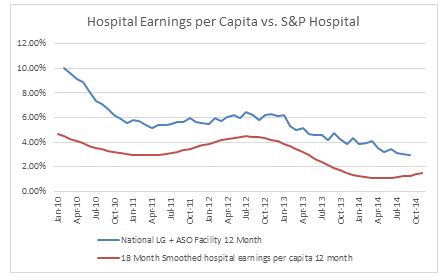
Milliman uses the S&P claims based indices to create a Health Cost Index Claims Based Forecast that uses economic factors and scenarios to project these indices out three years.  The economy has continued to pick up with a robust real GDP of 5% in the 3rd quarter after 4.6% in the 2nd quarter, but dropping off to 2.6% on the advance GDP estimate for the 4th quarter[2].  Beyond the time lag in inflation used in our forecasts, our longer inflation scenario reflects inflation moving to 2.1% by 2017, which reflects the Philadelphia Federal Reserve December 2014 Livingston Survey of forecasters.  In recent months our hospital forecasts continue to come in somewhat lower than expected.  We believe this is at least partially due to the Medicare penalties on excess hospital readmission rates, which has a spill-over effect on commercial business[3].  Not only are the readmission rates dropping, but also initial admission rates may be declining due to longer observation times (due to the 72 hour rule) in the ER—thus eliminating some admissions.  At the same time, reduced admissions appear to be pushing up practitioner trends to some degree, partially offsetting the hospital slow down.  As a result of these Medicare mandated changes in the hospital sector, hospital employment and wages have been growing slower than population growth for some time.  A comparison of hospital wages per capita (on an 18 month smoothed moving average basis) vs. S&P hospital trends is shown in Chart A below.  The dip in 2010-2011 was likely due to the effects of the recession and loss of medical coverage by individuals being laid off after the government COBRA subsidy ended.

Chart A

Capture

With respect to our future trend forecasts, we expect trends to continue to rise steadily over the next few years reflecting the strengthening economy and the impact of new drugs.  Also, once the hospital programs to reduce readmissions and the impact of longer ER observation times mature, the removal of this source of downward pressure is likely to further put upward pressure on trends.


THE REPORT IS PROVIDED “AS-IS” AND, TO THE MAXIMUM EXTENT PERMITTED BY APPLICABLE LAW, MILLIMAN DISCLAIMS ALL GUARANTEES AND WARRANTIES, WHETHER EXPRESS, IMPLIED OR STATUTORY, REGARDING THE REPORT, INCLUDING ANY WARRANTY OF FITNESS FOR A PARTICULAR PURPOSE, TITLE, MERCHANTABILITY, AND NON-INFRINGEMENT.
[1] We track the LG/ASO trends as representative of underlying trends, since Individual and Small Group are impacted more significantly by the Affordable Care Act (ACA).  Keep in mind that actual trends experienced by plans are likely to be higher than as reported in S&P data.  Trends experienced by large employers on plans that have not changed in the previous year could be higher by as much as 2% or more on bronze level plans and higher by 1% or more on gold level plans due to the effects of deductible and copay leverage.  So risk takers need to take this into account.  In addition, the S&P Indices do not reflect the impact of benefit buy-downs by employers (i.e., higher deductibles, etc.), since the indices are based on full allowed charges.  As noted above, actual trends experienced by employers and insurers in the absence of benefit buy-downs can be expected to be higher than reported S&P trends due to plan design issues such as deductibles, copays, out-of-pocket maximums, etc.   Benefit buy-downs do not represent trend changes since they are benefit reductions in exchange for premium concessions, but they can have a dampening effect on utilization due to higher member copayments, and this can have a dampening effect on measured S&P trends compared to plans with no benefit changes, further pushing up experienced trends relative to those reported in the indices.
[2] The long time lag between real personal income growth (highly correlated with real GDP) and the impact on healthcare trends defer the impact on healthcare costs for 2½ to 3½ years, and are reflected in our forecasts.  The lag on inflation is much shorter with a range of 1 to 1½ years.
[3] Readmission rates are much higher on the Medicare population than the commercial and Medicare has seen significant admission rate reductions in recent years.  Medicare 30 day readmission rates have dropped from an average of 19.0%-19.5% four to seven years ago to under 18% in early 2014.

The posts on this blog are opinions, not advice. Please read our Disclaimers.

New Words in the Sustainability Story

Contributor Image
Julia Kochetygova

Former Head of Sustainability Indices

S&P Dow Jones Indices

We all like to discuss sustainability; it is human to think about the future of the planet and mankind. But if it is always the same story (that we need to measure and account for companies’ E, S and G performance in the investment portfolios), in the absence of specific solutions, it could cause investors’ confusion and loss of momentum in the development of sustainability investment strategies.

Fortunately, it is not always the same story. Market participants are searching for longer-term and lower-cost capital solutions to allow more effective deployment of the technologies needed to slow the growth of greenhouse gas emissions. We have seen a few investor initiatives to identify metrics, tools and solutions for long-term growth, and green bond issuance has been reaching new heights. To support and facilitate this movement, investment tools and products need to be timely, easy and cheap. In light of this, various green benchmarks are becoming increasingly popular.

With green bond indices, we define a universe of securities in which environmentally friendly and technological innovations are financed with or without a special type of financial structure, taking into account that this universe can potentially evolve into a new asset class with specific risk/return characteristics.

Low-carbon stock selection gives a similar benchmark in which companies with lower carbon footprints are selected and put into a specific, but still diversified, portfolio—a carbon-efficient index.

Tweaking any geographical index toward higher sustainability, and, therefore, to companies perceived as having lower risk, is an option to achieve many goals at once. If you benchmark the performance of this specific market and build its story to capitalize on increasing investor attention, it could send the right signal to companies that do not meet these criteria and raise your own profile. Also, it does not necessarily come at the expense of increased volatility. For instance, the S&P U.S. Carbon Efficient Index has the same risk/return profile as the underlying S&P 500®, but with a 50% lower carbon footprint.

Measuring the environmental (or more broadly, the sustainability) impact of an index is a tricky issue, and S&P Dow Jones Indices’ analytical partner RobecoSAM has spent quite some time developing a new impact report, which they plan to release at the beginning of 2015.

This also goes hand in hand with the concept of materiality, which is another new focus of sustainability research and investment. This concept looks at how certain sustainability characteristics of a group of companies, such as an industry or a whole index universe, may have an impact on the companies’ business and financial performance. In 2013, RobecoSAM developed a materiality framework that identifies the most financially material ESG factors for each industry and uses this information as the basis for enhancing its ESG research framework going forward. Focusing the sustainability index on the most financially material characteristics for each company may provide a new way of benchmarking the sustainability related performance of a global market.

These new trends in sustainability metrics and benchmarks are setting a path for increased growth of sustainability driven investments.

For further information, please watch our Sustainability Videos Series:

Green Bonds: Environmentally-Friendly Investing

The Importance of Materiality for ESG Investing

Does ESG Really Matter? Understanding the Importance of Impact Reporting

Capital Needs and Index Investing

The posts on this blog are opinions, not advice. Please read our Disclaimers.

Asia Fixed Income: 2014 Pan Asia Report Card

Contributor Image
Michele Leung

Former Director, Fixed Income Indices

S&P Dow Jones Indices

As the global yields remain low, many yield-hungry investors have turned to Asia for yield pickup and portfolio diversification. Exhibit 1 lists the yield-to-worst of the ten local currency bond markets tracked by the S&P Pan Asia Bond Index.

Exhibit 1: The Yield-to-Worst of the Pan Asian Bond Indices

Source: S&P Dow Jones Indices. Data as of December 31, 2014. Charts are provided for illustrative purposes.

Reflecting the strong demand and continuous development, the size of the Asian local currency bond markets, measured by the S&P Pan Asia Bond Index, expanded by more than 9% to USD 6.94 trillion in 2014. And noticeably, the market value tracked by the S&P China Bond Index rose 16% to RMB 26 trillion, fueled by the strong issuance in the corporate market.

In terms of the index performance, despite the losses seen in December, the S&P Pan Asia Bond Index delivered a total return of 6.7% in 2014. The index’s yield-to-worst has tightened from 89bps to 4.34% in the same period.

Among the ten countries, the top three outperformers are China, India and Indonesia, which all recorded double-digit growth, please see Exhibit 2. China, in particular, continued to receive strong demand from global investors regarding the RQFII opportunities, please visit here for my last post on China – What’s More than Yields?. The total return of the S&P China Bond Index gained 10.3% YTD while its yield-to-worst tightened by 128bps to 4.29%.

Exhibit 2: Total Return Performance in 2014

Source: S&P Dow Jones Indices. Data as of December 31, 2014. Charts are provided for illustrative purposes.

*All data are as of December 31, 2014.

The posts on this blog are opinions, not advice. Please read our Disclaimers.

The Rieger Report: Boring is good! Municipal Bonds Return 9.26% in 2014

Contributor Image
J.R. Rieger

Former Head of Fixed Income Indices

S&P Dow Jones Indices

The municipal bond market steadily marched upward in 2014 and the S&P Municipal Bond Index ended up 9.26%.  The main ‘drama’ during the year came from the Detroit bankruptcy proceedings and wild swings of prices of bonds issued by Puerto Rico.

Overall, low new issue supply and relatively attractive tax-free yields certainly helped keep the supply demand equilibrium to the demand side.

Investment grade municipal bonds tracked in the S&P National AMT-Free Municipal Bond Index returned 8.92%.  In comparison, the S&P U.S. Issued Investment Grade Corporate Bond Index recorded a 7.71% return.

The S&P Municipal Bond High Yield Index returned it’s third highest return in 16 years ending up 14.6%.  Junk corporate bonds tracked in the S&P U.S. Issued High Yield Corporate Bond Index returned 2.65%.  The tailwind for high yield municipal bonds was fueled by rebounds in both the Puerto Rico bond market and the tobacco settlement bond sector.  The S&P Municipal Bond Puerto Rico General Obligation Index was up 15.27% and the S&P Municipal Bond Tobacco Index returned 16.15%.

Illinois wrestled with its pension obligations all year making headlines but it is general obligation bonds from New Jersey that underperformed the overall market.  The S&P Municipal Bond New Jersey General Obligation Index returned 3.7% significantly behind general obligations of other large issuers such as California (10.59%) , Illinois (9.63%) and New York (6%).

Not a bad year for municipal bonds.  Boring is good.

The posts on this blog are opinions, not advice. Please read our Disclaimers.

Don't Confuse Me with the Facts

Contributor Image
Craig Lazzara

Former Managing Director, Index Investment Strategy

S&P Dow Jones Indices

As surely as we saw the ball drop in Times Square, at the turn of the year we see predictions that this year, unlike last, will be the year when active equity management shows its true value.  Of course, similar predictions were made a year ago, and they didn’t work out particularly well, but that never seems to diminish the confidence of the new year’s forecasters.  A cynic might remember Upton SInclair’s observation that “It is difficult to get a man to understand something, when his salary depends on his not understanding it.”

One current argument for active management is that, with the S&P 500 and Dow Jones Industrial Average near all-time highs, the consequently heightened possibility of a bear market means that active managers are needed to mitigate risk.  This sounds like an appealing thesis; unfortunately it is untrue.  In the dozen years since our SPIVA reports began to keep score on U.S. active managers, there have been only two bear market episodes.  In the 2000-2002 deflation of the technology bubble, and again in the financial crisis of 2008, 54% of large cap funds underperformed the S&P 500.  Mid-cap and small-cap performance was even worse.  Whatever else one might say of active management, it is clearly no sure port in an investment storm.

Does that mean that successful active management is impossible?  Certainly not — but investors who are contemplating it should understand, as a matter of both theory and empirical evidence, that success is unlikely.  On the other hand, as Ellis has recently argued, true value added is more likely to reside in investment counseling than in portfolio management.  Advisers who can keep their clients from succumbing to the alternating temptations of fear and greed perform a valuable service.  Advisers who think they can identify active fund managers who will reliably outperform their index benchmarks, on the other hand, should realize that the odds are against them.


The posts on this blog are opinions, not advice. Please read our Disclaimers.