Get Indexology® Blog updates via email.

In This List

What is risk anyway?

Two Interesting Facts of the Chinese Bond Market Volatility

Yield Chasing Could Lead To Market Jitters

Despite sub-6% Unemployment, Economic Growth is Mixed and Investors are Challenged

Brent Ousts WTI From Top Spot

What is risk anyway?

Contributor Image
Corey Hoffstein

Co - Founder, Chief Investment Officer and Portfolio Manager

Newfound Research

Through some simplifying assumptions, modern portfolio theory equates risk with volatility. In many cases, it is a “good enough” approximation: higher volatility indicates a greater probability of larger realized losses. But it also indicates a greater probability of larger realized gains. Most investors, however, are risk averse, meaning they are willing to give up some of their potential return to protect against potential losses (it’s why we diversify in the first place).

In and of itself, price variability is not the manifestation of riskiness, but rather a signal of uncertainty. Volatility is an indication that the market is having difficulty reaching a consensus on a forecast of future events, their probabilities, and their impacts.

While volatility can often serve as a proxy for risk, it does not necessarily capture all risks. In buyouts, the target’s stock price will jump towards the offer price and volatility will frequently dry up. The uncertainty of the deal is not measured in the volatility of the stock price, but rather in the discount of price relative to the offer. Considerable jump risk still exists; the lack of volatility is just an indication that the market agrees on the probability of the buyout occurring. So low volatility may not imply low risk.

Higher volatility does not necessarily imply higher risk, either. Consider a highly innovative company, making progress in leaps and bounds, versus a staunch, entrenched business with incremental growth. Certainly the first will be more volatile, as the latter is more predictable. But which do we think is more resilient in the face of sweeping industry change?

The appropriateness of volatility as a proxy comes down to how we define risk. In Rethinking Risk[1], Javier Estrada states,

“[I]nvestors that focus on uncertainty are likely toview stocks as riskier than bonds, and those that focus on longterm terminal wealth are likely to view stocks as less risky than bonds even if they are concerned with tail risks.”

In stark contrast to this study, a recently released white paper from UBS[2] shows that millennials have, on average, only 28% of their portfolio allocated to stocks. This risk-averse position may be a structural shift in behavior due to long lasting impacts of prior recessions – and may represent a real risk in long-term wealth creation for this generation.

Despite all these varying manifestations of risk, portfolio construction frequently takes the purely mathematical view and considers only volatility. This can lead to portfolios over-allocating to assets whose risks do not materialize as high volatility levels or under-allocating to assets whose high volatility levels are not indicative of risk.

How to appropriately measure risk will depend on the definition of risk, which will in turn depend on the context and investor’s objective. As more “risk managed” strategies make their way to market, investors should ask, “which risk?” and quickly follow with, “and how is it measured?”

Risk is a complex topic. In an upcoming panel discussion (S&P Dow Jones Indices Financial Advisor Forum in New York City tomorrow), we’ll be looking to take a deep dive on the topic, hopefully starting with the deceptively simple “what is risk?” and moving on to more complex topics, including ways in which we can measure and manage it.

[1] http://ssrn.com/abstract=2318961 or http://dx.doi.org/10.2139/ ssrn.2318961

[2] UBS Investor Watch report 1Q 2014

The posts on this blog are opinions, not advice. Please read our Disclaimers.

Two Interesting Facts of the Chinese Bond Market Volatility

Contributor Image
Michele Leung

Former Director, Fixed Income Indices

S&P Dow Jones Indices

The S&P China Bond Index is targeted to provide global investors an independent, transparent and broad-based benchmark. A study of the index returns revealed two interesting facts on the Chinese bond market volatility.

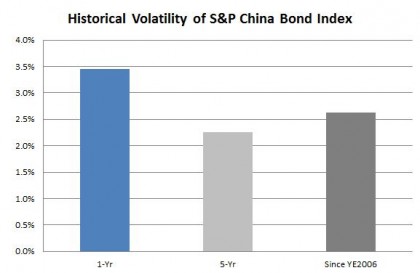
1)      While the volatilities of most Asian bonds retreated in the past year, the Chinese bonds have actually become more volatile. The historical data of the S&P China Bond Index showed that its one-year volatility stood at 3.45%, compared with its five-year volatility of 2.26%, please see Exhibit 1 below. However, China is not alone; Indonesia and Philippines also witnessed a rise in the volatility in the same period.

This heightening of volatility in Chinese bond market would be a response to the rapid growth and regulatory development, as well as the opening up of the onshore bond market. Notably, the expansion of the Renminbi Qualified Foreign Institutional Investor (RQFII) program offers global investors easier access to the Chinese onshore bond market.

Despite the recent increase, the volatility of Chinese bonds remained comfortably low and below the average volatility of Asian bonds represented by the S&P Pan Asia Bond Index.

2)      The Chinese government bonds are more volatile than the corporate bonds in the past year! While the volatility of corporate bonds is generally higher than that of government bonds over a longer time-frame, the one-year historical volatility of the S&P China Government Bond Index (3.61%) is higher than the S&P China Corporate Bond Index (3.32%).  At a closer look, the S&P China Agency Bond Index was the most volatile sector-level index. In fact, the S&P China Agency Bond Index outperformed all government sector-level indices and rose 6.87% YTD, while its yield-to-worst also tightened by 100bps to 4.69%.

*Source: S&P Dow Jones Indices. All data are as of August 29, 2014.

For more details, please read “A Deep Dive Into Chinese Fixed Income”.

Exhibit 1: Historical Volatility of the S&P China Bond Index

Source: S&P Dow Jones Indices.  Data as of August 29, 2014.  Charts are provided for illustrative purposes.  This chart may reflect hypothetical historical performance.  Past performance is no guarantee of future results.
Source: S&P Dow Jones Indices. Data as of August 29, 2014. Charts are provided for illustrative purposes. This chart may reflect hypothetical historical performance. Past performance is no guarantee of future results.

The posts on this blog are opinions, not advice. Please read our Disclaimers.

Yield Chasing Could Lead To Market Jitters

Contributor Image
Kevin Horan

Former Director, Fixed Income Indices

S&P Dow Jones Indices

Up until September 18, yields on the S&P/BGCantor Current 10 Year U.S. Treasury Bond Index crept high enough to ensure a loss of -1.21% for September.  Since then, rates have come down 18 basis points to Friday’s close of the index at 2.44%.  Currently the 10-year is trading another 2 basis points tighter at a 2.42%.

Month-to-date the S&P U.S. Issued High Yield Corporate Bond Index is returning 0.51% and on the year it has returned 4.06% year-to-date.  A more positive start to the month than the -2.05% the index returned for September.  Like July’s decline, a heightened concern for a rise and rates and a quick withdrawal of funds from the sector led to dramatic loss for the month.  The question for October will be if interest rate remain low, will the high yield sector bounce back from here like it did in August?
2014 Monthly S&P U.S. Issued High Yield Corporate Bond Index Returns


An interesting chart that might represent how U.S. rates could remain low on the back of the European economy for a while shows the yield difference between the S&P Eurozone Sovereign Bond 7-10 Years Index and the S&P/BGCantor 7-10 Year US Treasury Bond Index.
7-10 Year US versus Eurozone Yield Comparison


Source: S&P Dow Jones Indices, October 3, 2014

The posts on this blog are opinions, not advice. Please read our Disclaimers.

Despite sub-6% Unemployment, Economic Growth is Mixed and Investors are Challenged

Contributor Image
David Blitzer

Former Managing Director and Chairman of the Index Committee

S&P Dow Jones Indices

This morning’s report on September Employment beat expectations and took the unemployment rate to 5.9%, the lowest in six years.  Payrolls gained 248,000 jobs and the labor force rose by 317,000 people.  The stock market responded with a better than 10 point jump in the S&P 500 at the open as the Dow added about 175 points in the first 45 minutes of trading.

As nice as the news is, the longer run prospects for the economy are mixed. Sustaining the 4%-plus GDP growth seen in the second quarter will be difficult.  One way to project GDP growth is to look at the growth in the labor force and productivity.  This analysis won’t catch quarter to quarter shifts or reflect each adjustment by the Fed; it will show the intermediate term prospects for the economy based on the supply side and potential GDP.  In simple terms, GDP’s potential depends on how many people are working and how much they produce.  If the number of workers grows by half a percent annually and productivity (output per person) at one percent per year, GDP potential growth is the sum: one-and-one-half percent.  While the economy can grow faster when it is recovering from a slump, as it did in the second quarter, it can’t sustain a pace above the potential growth over the long run.

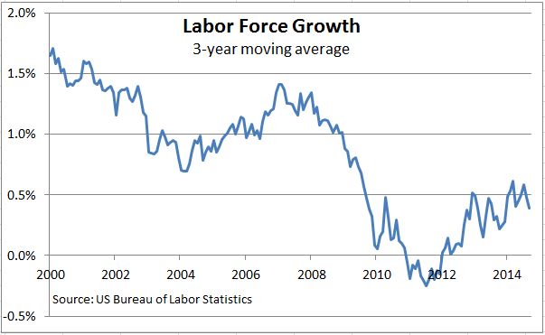
Currently the labor and productivity numbers aren’t encouraging.  Labor force growth in the three years ended in September was 0.4% annually.   The first chart shows the figures (three year moving averages) since 2000.  With population growth at 0.9% and the population aging, labor force growth isn’t likely to get much above 0.5% — and that’s assuming that the unemployment rate stays under 6% and some discouraged workers return to the job market.

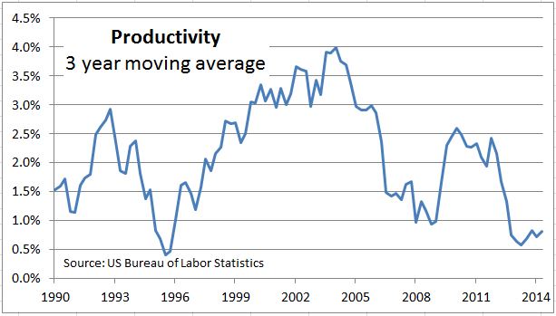
Productivity growth isn’t encouraging either. In the three years through the 2014 second quarter it grew 0.8%. The second chart shows this series since 1990. Productivity was strong during the tech boom in the 1990s, fell from its 2004 peak at 4% and enjoyed a short rebound in 2010-2011.  An optimistic guess from the future is 1.5% or possibly 2%. Combine that with labor force growth and the US economy long run growth might be a bit better than 2%.

Two percent growth with interruptions for geopolitical crises, Fed tightening and other surprises is a challenge for investors.  In a low to moderate growth environment, inflation, interest rates, dividend yields and other returns will remain low. Equity markets and corporate profits may benefit from smaller cost increases, but a strong rebound wages and incomes will be difficult.  The boost in asset prices engineered by the Fed with low interest and discount rates is largely behind us. One challenge to investors will be to keep the expenses and costs of investments as low as possible so they take home as much of smaller returns they earn as they can. No wonder we are seeing reports about the strong growth of index-based investment approaches.

The posts on this blog are opinions, not advice. Please read our Disclaimers.

Brent Ousts WTI From Top Spot

Contributor Image
Jodie Gunzberg

Former Managing Director, Head of U.S. Equities

S&P Dow Jones Indices

The S&P GSCI 2015 Rebalance Preview marks a historic shift in the benchmark renowned for its world production weight.  According to this announcement of pro-forma weights, Brent crude oil is targeted take over WTI‘s status as the leading oil benchmark and the most heavily weighted commodity in the S&P GSCIThis is the first time since 1997 that a commodity other than WTI crude oil is set to be the most heavily weighted. (Natural gas was greater at times from 1994-7.)

Source: S&P Dow Jones Indices. Weights as of 12/31, except 9/30 for 2014 and target weights are shown for 2015.

In 1987, WTI was added to the S&P GSCI with a target weight of roughly 35% that declined to 32.6% by the end of that year.  Brent was added in 1999 with a weight of about 7.5%, and by that year’s end it grew to 10.9% while WTI’s weight fell to 26.3%. Since then, WTI’s weight had grown to 40.6% by June 2008 but dropped to 25.5% as of 9/30/2014, replaced quickly by Brent which continued has continued to rise to its current level of 22.9%. Its pro-forma 2015 target weight of 24.7% is almost double its 2008 weight and more than 3x its weight from initiation.

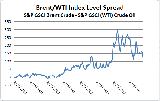
The dynamics of the crude market have changed, especially since 2010, as unconventional crude and liquids have seen an explosive growth in production from shale oil fields in Texas, North Dakota and also from increased Canadian imports. This increased supply of crude oil resulted in bottlenecks and oversupply at the Cushing pipeline nexus, which put pricing pressure on WTI. Now, pipeline capacity has been increased and transportation improved to reduce the Brent premium.  The chart below shows the premium collapse in index terms that in dollar terms translates from a high of about $20 to near parity today.

Source: S&P Dow Jones Indices. Monthly Index Levels Jan 1999 -  Sep 2014
Source: S&P Dow Jones Indices. Monthly Index Levels Jan 1999 – Sep 2014

While in the Americas, WTI crude remains the benchmark for pricing, a number of U.S. based hedgers use Brent due to its global fundamental relevance, and also since it is internationally arbitraged to U.S. refined oil product exports and oil imports. Since U.S. refined product exports and oil imports are not constrained by pipeline infrastructure, or restrictions on exporting U.S. crude, Brent futures are used as effective hedging tools. Below is a map that shows the widespread influence of Brent oil in benchmark pricing.

Source: https://www.theice.com/publicdocs/ICE_Crude_Refined_Oil_Products.pdf

Might this mean a greater opportunity for producers to hedge? Recently, the Brent curve has collapsed from bearish secular trends for the Atlantic Basin and Asia imports from West Africa. However, this puts pressure on Middle East suppliers to cut back. So there are both bull and bear pressures on Brent, making it likely range-bound – but conceivably at a lower range. More disruptions are possible and only a major one, probably from the Middle East might offset more production, especially from Saudi Arabia. Though influences from new refinery capacity in the Middle East may substitute crude supplies with products. On the upside in the short term, production growth in Lybia and Iraq is unlikely to grow fast enough to surpass disruptions from Nigeria and Venezeula.


The posts on this blog are opinions, not advice. Please read our Disclaimers.