Get Indexology® Blog updates via email.

In This List

What Ails Housing Starts

Keep Calm and Understand Scotland's Oil Impact

Asia Fixed Income: How Big is the Pan Asia Bond Market?

Picking Factors Beats Picking Winners

Benchmarking target date funds (TDFs) with market-driven indices ≠ performance chasing.

What Ails Housing Starts

Contributor Image
David Blitzer

Former Managing Director and Chairman of the Index Committee

S&P Dow Jones Indices

August housing starts, reported today, were disappointing at 956,000 units, a drop of 14.4% from July and 8% from August last year. Only twice this year have monthly reports of housing starts topped a million units at annual rates – from 1991 to the financial crisis in 2008, starts were never below one million.  To a large extent building houses hasn’t recovered from the financial crisis. If one uses the average number of houses started from 1995 through 2004 as a pre-boom-bust normal measure, housing starts in August were 59% of the normal level.

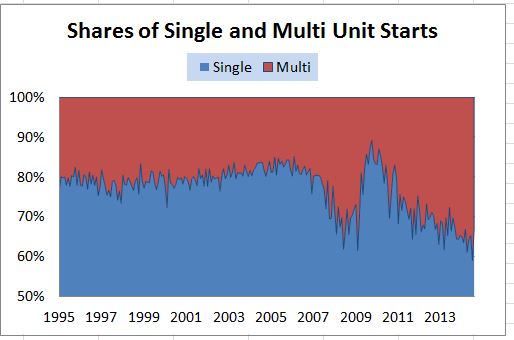
The details suggest there is much more to the story. Single family homes started in August were 50% of the normal rate while multi-family homes (apartments) were at 94% of the normal pace. The chart shows that there was a change in the shares of single family homes and apartments.  The single family share (in blue) dropped beginning in 2007, rebounded briefly in 2009 when the government provided tax benefits to first time home buyers and then fell from 2010 on.


Source:Bureau of the Census

What happened to keep people in apartments?  Renters who decided not to become home buyers are a part of the story.  The New York Fed (click here) provides an analysis of why people are renting rather switching to being home-owners.  First time home buyers account for 30% to 50% of home sales. The principal answers, in the chart from the New York Fed, are not enough money, too much debt or credit isn’t good enough.  The damage of the financial crisis is still with us.  Mortgage rates and home prices are barely mentioned.  Moreover, both renters and home owners expect moderate increases the home prices, enough to stay a bit ahead of inflation. About 60% believe owning a home is a good or very good investment; another 29% are neutral on investment value; with little difference between renters and home owners.  The idea that the financial crisis relief should have focused more people in debt may make sense.

The posts on this blog are opinions, not advice. Please read our Disclaimers.

Keep Calm and Understand Scotland's Oil Impact

Contributor Image
Jodie Gunzberg

Former Managing Director, Head of U.S. Equities

S&P Dow Jones Indices

Will Scotland vote to become independent? That’s a big question, especially for the future of commodity indices.  This is since one of the largest commodities in the indices is Brent crude oil – the oil produced in the North Sea off of Scotland’s coast.  If Scotland separates from the United Kingdom, there may be consequences for the oil that is the arguable benchmark of the world.  According the Intercontinental Exchange (ICE), since March 2012, ICE Brent has been the world’s largest crude oil futures contract with annual volume reaching a record 159 million contracts in 2013, doubling market share since 2008.

Source: Intercontinental Exchange

From this, commodity indices have increased their allocation to Brent. Over the past 5 years Brent has replaced WTI at a relatively high pace. Notice in 2009, Brent was less than half WTI and today the allocations are near equivalent, especially in the S&P GSCI. Also notice the big increase in Brent in 2014 in the DJCI.

Source: S&P Dow Jones Indices. Weights as of 12/31, except 9/17 for 2014.

Although the U.K. only produces about 4.2% of Non-OPEC OECD or 89 kb/d of the world oil supply as seen below, the great majority of offshore production is in Scottish waters.

Source: Oil Market Report. Sep 2014

If Scotland votes yes to independence, their local oil market may have a much bigger global impact. Despite it’s size, it is the oil used to set benchmark prices in London each day. Just 2.4 mb/d of the oil from the U.K. and Norway, set pricing for about 60 million barrels of oil or 60% of global supply that is priced based on Brent crude oil. It is the dominant benchmark rate against which daily oil trades are priced worldwide. The new uncertainty may place great pressure on the oil price which may be magnified by the weakened local currency since it is denominated in dollars.

Brent’s turmoil could reverse the trend of increasing weight in the indices, giving the opportunity for WTI to grow again, especially if the U.S. starts exporting oil. However, the change could be gradual since the indices use five year averages in liquidity and world production.

The posts on this blog are opinions, not advice. Please read our Disclaimers.

Asia Fixed Income: How Big is the Pan Asia Bond Market?

Contributor Image
Michele Leung

Former Director, Fixed Income Indices

S&P Dow Jones Indices

The S&P Pan Asia Bond Index tracks the performance of the local currency bonds in the 10 Pan Asian countries. The market value tracked by the S&P Pan Asia Bond Index has expanded three fold to USD 6.7 trillion since the index’s first value on Dec. 29, 2006. This rapid expansion warrant some attention as it is compared with the total size of the global debt securities, which is estimated to be over $90 trillion, according to the Bank of International Settlements.^

If we look at the market composition of the S&P Pan Asia Bond Index, which is market value- weighted, it is not surprising to see the S&P China Bond Index has a dominant share of 59% with its market value currently stood at CNY 24 trillion. The S&P South Korea Bond Index and the S&P India Bond Index came second and third, respectively. Please see Exhibit 1.

Exhibit 1: Country Breakdown of the S&P Pan Asia Bond Index 

Source: S&P Dow Jones Indices. Data as of August 29, 2014. Past performance is no guarantee of future results. See the Performance Disclosure at the end of this document for additional information.
Source: S&P Dow Jones Indices. Data as of August 29, 2014. Past performance is no guarantee of future results.

In the Pan Asian bond market, while the size of government bonds has doubled to USD 4.8 trillion, the size of corporate bonds jumped 9 times to USD 1.9 trillion in the same period! In fact, the market share of the corporate bond market rose from merely 9% to 28% of the index, which represents a significant reversion from traditionally underdeveloped corporate market, see Exhibit 2.

Exhibit 2: Sector Breakdown of the S&P Pan Asia Bond Index 

Source: S&P Dow Jones Indices. Data as of August 29, 2014. Past performance is no guarantee of future results. See the Performance Disclosure at the end of this document for additional information.
Source: S&P Dow Jones Indices. Data as of August 29, 2014. Past performance is no guarantee of future results.

This growth dynamic is supported by a stronger investor demand, both locally and externally. Many Pan Asian local currency bond markets are now made easier for foreign investors to access, particular through the use of exchange traded products. The regulatory framework also becomes more welcoming, for example, the expansion of Renminbi Qualified Foreign Institutional Investor (“RQFII”) quota in China. Underpinned by the robust economic growth, the Pan Asia bond market has historically been attracting steady inflows.

^Source: http://www.bis.org/statistics/secstats.htm. Data as of December, 2013.

The posts on this blog are opinions, not advice. Please read our Disclaimers.

Picking Factors Beats Picking Winners

Contributor Image
Jodie Gunzberg

Former Managing Director, Head of U.S. Equities

S&P Dow Jones Indices

If you were to ask a few commodity experts what is going on with precious metals (like an attendee did at our 8th annual commodities conference), the answer is long-winded since the story is different for each commodity.  A few years back, the answer was far more simple where it depended on the RORO environment that overpowered supply and demand models of individual commodities and spiked correlations. The quantitative easing caused all the commodities to move together, and the excess inventories with destroyed demand caused them to fall (except gold – the safe haven that acts like currency.)

Fast forward to today and that has all changed. As inventories have depleted, supply shocks have become prevalent so correlations dropped. Sounds like an active manager’s dream, right? Maybe not. While this environment hovers near equilibrium causing swings across the zero line, there are abundant opportunities, winners and losers.  So what’s the problem? Picking the winners.  At our conference, we asked about the best calls for the year and got a mixed bag of answers. For single commodity plays, we heard long sugar, copper, nickel and short natural gas. For spreads, we took a poll of the registrants to uncover their beliefs about the best trade that resulted in about 40% corn-wheat, followed by about 33% WTI-Brent and 27% copper-aluminum. There are no clear answers and at this time when commodities seem to be mean reverting, the risk of being wrong and getting whipsawed is high.  That is why diversification is important.

The points of majority agreement at the conference according to the polls, were that 53% felt investors will move money from active to passive, and 77% felt over the next three years that money will flow into commodities. Why? Diversification.  Current correlations and roll yields indicate commodities are still an effective asset class in a portfolio, but not just via plain beta.

The return opportunity likely sits with assuming identified risks; therefore, risk premium strategies applied in a systematic way to capture variable contract expirations, less typical roll windows and different weighting schemes may be how to get the value from beta.  In other words, using a diversified set of factors may be the way to capture commodity risk premiums.

The newly launched Dow Jones – RAFI Commodity Index (DJ-RAFI CI) is designed to be a fundamental factor-weighted, broad-market commodity index with a modified roll. Notice although the DJ-RAFI CI has high correlations (3 yr) with the DJCI and S&P GSCI of 0.97 and 0.90, the current returns are better. This is the reflection of the power of factor investing in this environment. 

Source: S&P Dow Jones Indices. Data from Jan 2, 2014 to Sep 11, 2014. Past performance is not an indication of future results.


The posts on this blog are opinions, not advice. Please read our Disclaimers.

Benchmarking target date funds (TDFs) with market-driven indices ≠ performance chasing.

Contributor Image
Philip Murphy

Former Managing Director, Global Head of Index Governance

S&P Dow Jones Indices

At their core, TDFs are professionally managed asset allocation policies. Questions therefore naturally arise around how (or even whether) they should be benchmarked with market indices. The investor(s) on whose behalf a particular policy is undertaken may have highly subjective criteria for success that have very little to do with outperforming market benchmarks. For example, if I have a specific goal toward which I earmark some assets, in any given year I probably care more about making progress toward my goal than I do about outperforming the stock market.

However, we should not be led astray by false choices. We do not have to choose between market-based or goals-based benchmarks – we need to intelligently use both. If my large-cap fund manager consistently underperforms the S&P 500, there may be a very good reason for it. Maybe she is taking a lot less risk. Or maybe not. In either case, I ought to know about it, and having the S&P 500 as a proxy helps me to understand the opportunity, and risks, available in large-cap stocks. The market benchmark helps me make an informed decision about who should manage my hard-earned capital, as well as the overall portion of my resources that I should devote to the large-cap category.

Many stakeholders get hung up on how to benchmark TDFs because they include multiple asset classes and provide more holistic investment programs than single-asset class funds. Investors should be aware that benchmarking with market-based proxies enables better informed choices. For example, some TDF managers generally underperform market-based benchmarks because their policy is to invest more in fixed income than competitors. There is nothing wrong with that and many investors seek such exposure. To understand why managers perform in certain ways, referencing market-based benchmarks of the TDF universe provides valuable information. Benchmarking custom TD strategies is no different. Whether a plan selects a custom solution to create a more diverse asset allocation, have more control over underlying managers, or build a glide path that addresses unique plan demographics, the only way to fully gauge the impact of the decision to go custom is to compare results, and asset allocation, with a market-based proxy. In some instances, it may be eye opening for retirement plan sponsors to see that their custom glide path is not very different from the market consensus. In others, comparing the custom glide path with the market consensus may validate the decision to go custom. Either way, it’s better to be mindful of overall opportunities and risks within the TDF category, and to be conscious about deviating from the consensus where appropriate, via reference to a market benchmark.

If you are interested in a comparison of TDF performance with a market-based consensus glide path, as represented by the S&P Target Date Index family, please see our latest Target Date Scorecard.

The posts on this blog are opinions, not advice. Please read our Disclaimers.