Get Indexology® Blog updates via email.

In This List

Rieger Report: A Tale of Two Bond Markets

Green Bond Market: September 2017

Most S&P and Dow Jones Islamic Indices Outperform Conventional Benchmarks in 2017

Avoid Unintended Stock Market Bets by Understanding Benchmarks

Don't Shoot the Messenger

Rieger Report: A Tale of Two Bond Markets

Contributor Image
J.R. Rieger

Former Head of Fixed Income Indices

S&P Dow Jones Indices

The U.S. corporate and municipal bond markets seem to be neck and neck in total return performance for the first three quarters of 2017.  However, there are distinct characteristics of both of these markets that have played a key role and could cause the performance to vary significantly going forward.

The intent of this blog post is to bring top of mind some of the potential drivers of performance in each market.

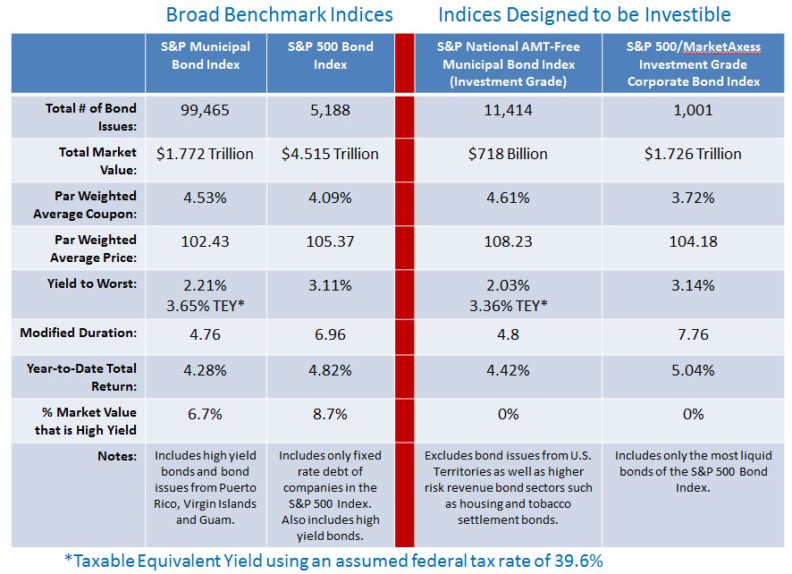
Coupon cash flow: Investment grade, tax-exempt municipal bonds tracked in the S&P National AMT-Free Municipal Bond Index have an average coupon of 4.61% vs. the average coupon of 3.72% of the bonds in the S&P 500/MarketAxess Investment Grade Corporate Bond IndexIn a low yield and low expected return environment municipal bonds offer higher interest rate cash flow that is tax-exempt.  Advantage: Municipal bonds 

Yield: Investment grade tax-exempt municipal bonds on average are yielding 2.03% vs. higher yielding taxable investment grade corporate bonds.  However, looking at it from the perspective of Taxable Equivalent Yield (TEY) municipal bonds are currently at higher yields than their corporate bond equivalents.  Please refer to table below.  Advantage: Municipal bonds

Duration: Investment grade corporate bonds of the issuers of the S&P 500 Index are tracked in the S&P 500/MarketAxess Investment Grade Corporate Bond Index.  Their average duration is over 7.75 vs. an average of 4.8 for investment grade municipal bonds tracked in the S&P National AMT-Free Municipal Bond Index. In general, in a rising rate environment the lower duration favors municipal bonds.  Advantage: Municipal Bonds

Market size: U.S. corporate bonds that are index eligible tend to be very large issues.  The market size of the corporate bond market tracked in the S&P 500 Bond Index (broad index) is over $4.5trillion.  The broad S&P Municipal Bond Index tracks over $1.77trillion of the $3.8trillion municipal bond market. The larger corporate bond market tends to be more liquidAdvantage : corporate bonds

Diversity & number of bond issues: The nearly 100,000 bond issues tracked in the S&P Municipal Bond Index illustrates that the municipal market has many smaller and less frequent issuers than the corporate bond market.  This can result in secondary market liquidity being significantly less for municipal bonds than bonds in the corporate bond market. Municipal  bond buyers typically demand a higher yield for this illiquidity – “Liquidity Premium”. Advantage : corporate bonds

New issue supply:  Supply of new issue corporate bonds is on a high pace as compared to last year and demand remains strong with many new issues being over-subscribed (more buyers seeking bonds than bonds being sold.)  While demand for municipal bonds continues to be extremely strong, new issue supply remains lower than previous years.  However, there are some larger municipal bonds on the calendar for sale. Supply is something to keep an eye on for both markets.

Headline risk:  Municipal bonds are heavily a retail product and as a result retail sentiment can play a big role in market performance. Real fiscal challenges in both large and small municipalities add to the risk already impacting the market from issuers in Puerto Rico, Illinois and Connecticut. The corporate bond market is currently enjoying a period of lower historical default rates while the municipal bond market is wrestling with the largest default in it’s history – Puerto Rico.  Advantage : corporate bonds

Tax code changes:  Early days, but the impact of potential tax code changes on both of these markets could be a major factor in performance.

These are some of the factors I keep top of mind to understand the drivers of performance of the corporate and municipal bond markets. As for the future;  Bob Dylan once wrote “don’t speak too soon as the wheel’s still in spin” and these are certainly times that are changing.

Table 1: Select bond market indices and their characteristics:

Source: S&P Dow Jones Indices, LLC. Data as of September 29, 2017. Table is provided for illustrative purposes. It is not possible to invest directly in an index. Past performance is no guarantee of future results.

The posts on this blog are opinions, not advice. Please read our Disclaimers.

Green Bond Market: September 2017

Contributor Image
Dennis Badlyans

Former Associate Director, Global Research & Design

S&P Dow Jones Indices

In the first three quarters of 2017, green bond issuance reached USD 83 billion, nearing the issuance reported by the Climate Bond Initiative for full-year 2016 (see Exhibit 1).  France accounted for 18% (USD 14.8 billion) of the issuance, driven primarily by the USD 7.6 billion sovereign bond issued by the country in January. Commercial banks issued 44% of the USD 12.4 billion of capital raised in China to fund green projects.  U.S. municipals continue to account for about half of the U.S. issuance YTD, however asset-backed securities continue to increase market share.  Fannie Mae, a newcomer in 2017, issued its fourth green ABS in August, bringing its YTD total to USD 1.8 billion of USD 11.4 billion issued in the U.S. market through the end of Q3 17 (see Exhibit 2).

Over 80% of the green bonds issued in 2017 have qualified for the S&P Green Bond Index, which is designed to track the global green market.  Nearly 80% of those bonds have qualified for the S&P Green Bond Select Index, which further limits exposure subject to stringent financial and extra-financial eligibility criteria (see Exhibit 3).  As of Sept. 29, 2017, the global green market has USD 232.2 billion of outstanding debt, USD 209.7 billion of which is included in the S&P Green Bond Index and USD 165.7 billion in the S&P Green Bond Select Index.

The continuing trend of broader representation by issuers, asset types, and currencies makes the S&P Green Bond Index a suitable substitute for global aggregate exposure.  In terms of performance, monthly returns are highly correlated with the S&P Global Developed Aggregate ex-Collateralized Bond Index (USD) (see Exhibit 4).

The posts on this blog are opinions, not advice. Please read our Disclaimers.

Most S&P and Dow Jones Islamic Indices Outperform Conventional Benchmarks in 2017

Contributor Image
Michael Orzano

Head of Global Exchanges Product Management

S&P Dow Jones Indices

Most S&P and Dow Jones Shariah-compliant benchmarks outperformed their conventional counterparts year-to-date through September 27, 2017 as Information Technology and Health Care – which tend to be overweight in Islamic Indices – have been sector leaders, and Financials – which are underrepresented in Islamic indices – have experienced some weakness.  One notable exception has been in the Middle-East where equity markets have very little exposure to Information Technology and Health Care, so Shariah-compliant indices have not benefited from the strength in these sectors.

Global Equities Power Higher in Q3 Led by Emerging Markets

Global equity markets powered higher in the third quarter adding to strong first half gains.  As of September 27, 2017, the Dow Jones Islamic Market World and S&P Global BMI Shariah Indices each gained more than 17%, respectively, for the year, outperforming the conventional S&P Global BMI by nearly 300 basis points.  Outside of the Middle-east, where the S&P Pan Arab Composite Shariah has underperformed the conventional S&P Pan Arab Composite, all other major regional Shariah-compliant indices remain well ahead of their conventional counterparts through late September.

The S&P 500 notched several new all-time highs in Q3.  However, non-U.S. equity markets have posted the strongest year-to-date returns.  Emerging markets sustained momentum in Q3 as improved economic sentiment and weakness in the dollar boosted interest in the asset class.  The Dow Jones Islamic Market Emerging Markets Index has jumped over 30% for the year through September 27.

MENA Equity Markets Continue to Lag

Despite a rebound in oil prices during Q3, MENA equities continue to lag broader global equity markets as sustained geopolitical concerns have weighed on sentiment and the regional equity market has seen little benefit from the soft dollar and boom in technology stocks that has powered emerging markets more broadly.  The S&P Pan Arab Composite Shariah declined 1.3% in the 3rd quarter through September 27, bringing the year-to-date return slightly into negative territory.  The S&P Qatar BMI has experienced the steepest losses, falling 17.7% year-to-date, while Kuwait has been one of the few bright spots as the S&P Kuwait BMI has gained more than 20% on the year.

The posts on this blog are opinions, not advice. Please read our Disclaimers.

Avoid Unintended Stock Market Bets by Understanding Benchmarks

Contributor Image
Philip Murphy

Former Managing Director, Global Head of Index Governance

S&P Dow Jones Indices

In a recent Financial Planning article,[1] Craig Israelsen advocated using stock market size segments to construct portfolios rather than a total market approach.  His conclusion may be perfectly valid for market participants willing and able to bear greater small-stock exposure, but his analysis fails to adequately take account of this source of risk.  He compared returns of several index funds and reviewed results of combining them in a couple of different ways.  The sample period was from 1999 through 2016, and the funds used in his analysis were:

  • Vanguard Total Stock Market Index Investor (VTSMX);
  • Vanguard 500 Index Investor (VFINX);
  • Vanguard Mid-Cap Index Investor (VIMSX); and
  • Vanguard Small-Cap Index Investor (NAESX).

The results over this 18-year period are summarized in Exhibits 1 and 2.

One of the article’s conclusions is that the Vanguard Total Stock Market Index Investor fund failed to meaningfully capture mid- and small-cap returns within its portfolio, because it is dominated by large-cap stocks and experienced historical returns pretty close to those of the large-cap Vanguard 500 Index Investor fund.  One can debate what is or is not a meaningful difference in performance, but the Vanguard Total Stock Market Index Investor fund returned 63 bps more per year on average than the large-cap fund. That does not seem insignificant and is slightly greater than the performance pick-up of 62 bps per year that Israelsen found over the Vanguard Total Stock Market Index Investor by approximating its market cap weights with individual size segments, which is the 70/20/10 strategy.  This performance enhancement, however, has some dubious underpinnings.

For all of the analysis, including the 70/20/10 strategy, the underlying benchmarks are not all published by the same provider.  This has downstream impacts on performance that are not examined in the article. The underlying benchmarks tracked by each index fund are not obvious from the fund names, with the possible exception of the Vanguard 500 Index Investor, which tracks the S&P 500®.  This is the only index fund in the list that tracks an S&P DJI index; the others track indices published by the University of Chicago’s Center for Research and Security Prices (CRSP).  Combining index funds referencing benchmarks from different index providers often leads to unintended consequences.  According to Morningstar, as of June 2017, 240 stocks were held in both the Vanguard 500 Index Investor and the Vanguard Mid-Cap Index Investor.  These positions accounted for about 14.2% of the former fund and 78.3% of the mid-cap fund.  The overlap is a result of differences in index methodology between S&P DJI and CRSP.  Market participants implementing Craig Israelsen’s portfolio recommendations could potentially make unintended bets if they do not realize incompatibilities between underlying benchmarks. With respect to the 33/33/33 strategy, it bears emphasis that the overlap of stocks in the underlying benchmarks skew what looks like equal weighting on the surface.

In addition to benchmark incompatibility, the mid-cap, small-cap, and total market index funds did not track the same benchmark for the entire sample period.  Prior to April 1, 2011, they tracked different indices. Exhibit 3 shows each fund’s inception date, current benchmark, and when they switched to their current benchmark.

Since all of these index funds seek to replicate the returns of their respective benchmarks (before expenses), changing benchmarks midstream affects the meaningfulness of the analysis.  We don’t know how the index composition of previous benchmarks compares or aligns with composition of current benchmarks.  Therefore, we should not assume any kind of relational consistency between observed historical index fund performance and unknown future performance.  As a workaround, it may be more useful to do similar analysis using back-tested index returns, if they are available going as far back as 1999, rather than the Vanguard index fund returns.

There is certainly nothing wrong with using size segments to overweight or underweight parts of the stock market, but one does not get a free lunch by doing so.  In order to accurately implement a view regarding size or factor tilts, it is beneficial to understand the underlying benchmark methodology and use index funds tracking benchmarks from a single index provider.  When there seems to be value added without explanation, look deeper for its reasons.  Outsize gains from unexplained sources could imply flawed analysis.

[1] https://www.financial-planning.com/news/three-against-one-a-battle-of-index-funds

The posts on this blog are opinions, not advice. Please read our Disclaimers.

Don't Shoot the Messenger

Contributor Image
Anu Ganti

U.S. Head of Index Investment Strategy

S&P Dow Jones Indices

Here are some recent headlines about the consequences of passive investing:

Japan Central Bank’s ETF Shopping Spree Is Becoming a Worry

Passive Market Share to Overtake Active in the US No Later than 2024

Passive investing boom is creating a ‘frightening’ risk for markets

ETFs are taking over the world, and there’s nothing anyone can do to stop them

Let’s Prevent ETFs from Eating the Economy

What all these headlines have in common is that they are inherently misleading.  For instance, the first statement reflects a common misconception that the Bank of Japan (BoJ) owns more than two-thirds of the Japanese stock market.  In fact, the BoJ owns 70% of listed ETFs, and only 2.5% of the capitalization of the market—not exactly an eye-catching headline.  Understanding the importance of passive investing requires us to get both the numerator (passive AUM) and denominator (total market capitalization) correct, and much press commentary is mistaken about one or both.

Calculated properly, how large is passive investing?  S&P DJI’s annual asset survey shows that 15% of the S&P 500®’s capitalization is held in S&P 500 index-based funds.  Expanding these numbers to cover mid- and small-caps as well as other index providers, we estimate that 20% of total U.S. market capitalization is held by passive trackers.  This estimate excludes the factor indices that underlie “smart beta” ETFs.  Factor strategies are not price takers—they trade on fundamental metrics like value or momentum, in much the same way (although at different frequencies) as active managers.

So what does 20% passive market share imply for market efficiency?  Not much.  It is trading, not asset ownership per se, that sets prices, and passive funds’ share of trading is much less than their share of AUM.  Under reasonable assumptions, if index funds’ share of AUM is 20%, their share of total trading would be approximately 5%.  Even if index assets rose to 50% of AUM, which is a commonly expressed fear from the active side, the passive share of trading would still be less than 20%.  Passive price takers are a long way from controlling the market and causing inefficiencies.

Fifty years ago, 100% of market capitalization was actively managed; the shift to 20% passive, with more possibly to come, surely is one of the most important developments in modern financial history.  But it’s important not to confuse means and ends.  The shift to passive management has been, and continues to be, driven by the persistent underperformance of active managersPassive growth is the consequence, not the cause, of active underperformance.  To argue otherwise is to misunderstand the most important thing about it.

The posts on this blog are opinions, not advice. Please read our Disclaimers.