Get Indexology® Blog updates via email.

In This List

The S&P GIVI Japan Posts Impressive Five-Year Live Track Record

Security Selection & Sector Allocation Effects of Equal Weighting the S&P 500®

The Wrong Diagnosis

The Lifetime Income Disclosure Act of 2017

Commodity Trends Boost Leveraged and Inverse Indices

The S&P GIVI Japan Posts Impressive Five-Year Live Track Record

Contributor Image
Tianyin Cheng

Former Senior Director, ESG Indices

S&P Dow Jones Indices

The S&P GIVI (Global Intrinsic Value Index) Japan posted an impressive five-year live track record.  It is one of the few multi-factor indices in the market, and it was launched five years ago.  Since its launch in March 2012, the S&P GIVI Japan has outperformed its benchmark, the S&P Japan BMI, by 1.17% per year, with a tracking error of 2.42%.  There has been a larger contribution from the low beta component (0.84%) than from the intrinsic value component (0.39%).  The sequential combination of low beta and intrinsic value appears to have added value.  In terms of risk-adjusted performance, the S&P GIVI Japan had a risk-adjusted return of 0.95, versus 0.82 for its benchmark, due to the reduction in volatility.  The annualized alpha for the S&P GIVI Japan was 1.96%, with a beta of 0.93 against its benchmark.

Having gone through a major sell-off in the last quarter of 2016, Japanese equities, as measured by the S&P Japan BMI, increased 0.47% in the first quarter of 2017.  This was backed by better-than-expected manufacturing and service PMIs; however, a strong Japanese yen remained a major challenge, along with sluggish GDP growth and stagnant inflation.  A combination of ongoing economic improvements and higher expectations for profit growth led to a rebound for cyclically sensitive sectors in Japan, such as energy and materials.

The S&P GIVI Japan underperformed its benchmark index by 20 bps in the third quarter of 2016.[1]  In the first quarter of 2017, the intrinsic value leg and the low beta leg of the S&P GIVI Japan underperformed the benchmark.  The three-year correlation between the excess return of the two legs continued to drop, reaching a low of -0.79.


The posts on this blog are opinions, not advice. Please read our Disclaimers.

Security Selection & Sector Allocation Effects of Equal Weighting the S&P 500®

Contributor Image
Philip Murphy

Former Managing Director, Global Head of Index Governance

S&P Dow Jones Indices

Constituents of the S&P 500 Equal Weight (EW) and S&P 500 are identical, but the EW version is rebalanced quarterly so that every company has equal representation after the rebalance.  That often results in significantly different performance between the two indices, because equal weighting gives more representation to smaller stocks and alters the distribution of sector exposure.

Sector representation is different between the indices because the weight of a sector in the EW index is strictly a function of the number of stocks in the sector, whereas cap-weighted sectors depend on company size and company count.  The largest sector in the EW index is consumer discretionary, because it has the most companies (85 as of March 31, 2017); however the largest deviation from cap-weighted sectors is in information technology because that sector comprises several mega-cap companies such as Apple, Alphabet (parent of Google), Microsoft, and Facebook.  Exhibit 1 shows relative sector weights of the EW index versus its cap-weighted benchmark.

In the 14 years since its launch on Jan. 8, 2003 (counting 2003 as a full year), the S&P 500 EW outperformed the cap-weighted S&P 500 10 times, underperforming in 2007, 2008, 2011, and 2015.  The magnitude of outperformance was greatest in 2009 as the market bottomed and then began its recovery from the global financial crisis.

Decomposing performance of the S&P 500 EW relative to the S&P 500, using 2 Factor Brinson Attribution (showing sector allocation and security selection effects) illustrates the historical impact of EW variation relative to the cap-weighted benchmark.  Since the set of index constituents are identical, the security selection factor measures only the effect of weight differences between the indices.

In spite of significantly different sector allocations between equal- and cap-weighted indices, most of the value added or detracted by equal weighting comes from variations of individual component weights.  In other words, the effect of EW security selection has historically dominated that of EW sector allocation.  The value of security selection relative to sector allocation is important because it demonstrates that the S&P 500 EW aligns with a desire to gain access to smaller S&P 500 stocks without necessarily resulting in detraction from sector redistribution.  Market participants looking for a simple variation of cap-weighting with a reasonable chance of adding value over time may want to consider investment strategies tracking S&P 500 EW.

[1] GICS stands for Global Industry Classification Standard.  Information about GICS is available at http://spindices.com/resource-center/index-policies/.

The posts on this blog are opinions, not advice. Please read our Disclaimers.

The Wrong Diagnosis

Contributor Image
Craig Lazzara

Former Managing Director, Index Investment Strategy

S&P Dow Jones Indices

This morning’s Wall Street Journal described how “a $1.4 billion ETF gold rush” supposedly has disturbed the pricing of mining stocks around the world.  $1.4 billion turns out to be the incremental cash flow into a single exchange-traded fund designed to track an index of the gold mining industry, including some relatively small-capitalization companies.  These flows, it is argued, are another illustration of how passive management is disrupting market efficiency and creating a bubble, the economic effects of which some commentators consider to be even worse than Marxism.

I have no opinion on whether there is a bubble in gold shares at the moment; having one would require a knowledge of these stocks’ fundamental valuations relative to their market prices.   But the bubble, if there is one, has nothing to do with passive management and is only tangentially related to the ETF in question.  The bubble, if there is one, is being inflated by investors who’ve decided that they want to increase their exposure to gold.

If you doubt this, consider what would happen if no ETFs invested in gold stocks, but actively-managed mutual funds did.  Then presumably the $1.4 billion that flowed into the gold ETF would have gone into an actively-managed fund.  An active portfolio would almost certainly be less diversified than the ETF, which means that the same asset flows would have been directed to a smaller number of stocks where they would presumably have been even more disruptive.

When the technology bubble inflated in the late 1990s, the ETF industry was a negligible fraction of its current size.  Bubbles inflate with greed and deflate with fear; whether the mechanism by which fear and greed are expressed is active or passive is a secondary issue.  Focusing on an ETF rather than on the motives of its purchasers is the wrong diagnosis.

The posts on this blog are opinions, not advice. Please read our Disclaimers.

The Lifetime Income Disclosure Act of 2017

Contributor Image
Peter Tsui

Former Director, Global Research & Design

S&P Dow Jones Indices

Earlier this month, both the Senate and the House introduced bipartisan legislation to amend the Employee Retirement Income Security Act that would mandate annual income disclosures on 401(k) and other defined contribution account documents.  The language in the legislation is identical to a bill introduced in 2009, early in the Obama administration.  This new effort reflects the ongoing concern that Americans are lagging significantly behind in their retirement savings.  At a minimum, the logic behind the proposed legislation is that estimates of plan participants’ future retirement income may motivate them to pay closer attention to savings rates and may encourage more aggressive deferrals to make up for savings shortfalls as evidenced by the income estimates.

However, despite the good intention, there are significant hurdles in coming up with an easy-to-understand and implementable methodology.  For the lifetime retirement income estimate to be useful, it has to be realistic, and that means quite a few assumptions have to be made, including the savings rate, investment returns, and stability in job tenure.  Besides, it is one thing to estimate the retirement income for a 65-year-old with close-to-retirement account balances, but it is something else to estimate the same thing for a 35-year-old, 30 years away from retirement.

For participants who are close to retirement, a standard, simple income calculation based on a participant’s current account balance using today’s rates in the immediate annuity market would be an easy and acceptable way to provide the income estimate.  For a younger participant with a much lower balance, using the same approach, without taking into account the anticipated future savings, would clearly result in a much lower income estimate and may or may not be helpful to the younger participant.  Thus, we may want to allow plan sponsors to provide different types of income estimates based on the participants’ proximity to retirement.

The posts on this blog are opinions, not advice. Please read our Disclaimers.

Commodity Trends Boost Leveraged and Inverse Indices

Contributor Image
Jodie Gunzberg

Former Managing Director, Head of U.S. Equities

S&P Dow Jones Indices

In the context of declining commodity prices following the global financial crisis, inverse indices became popular for market participants looking to profit from negative returns. As the oil war unfolded and drove commodity prices further down, market participants took a renewed interest in using inverse indices to bet against the market. When commodities rebounded last year, market participants remained opportunistic, demanding leveraged indices for the potential to earn extra in the comeback by doubling down. However, there have been some questions and observations about the performance of inverse and leveraged indices as their popularity has increased.

Why is the performance of the inverse indices not exactly opposite from the standard, long-only versions?  The inverse performance is exactly opposite the standard, long-only indices, but only for the stated period. For example, most of the inverse indices have a daily rebalance, which means the daily return of the inverse excess return index will be opposite from the standard excess return. However, when these returns are compounded, a performance difference arises that is beneficial in trending markets. Exhibit 1 shows a simple example of the performance impact of two daily consecutive positive moves and two daily consecutive negative moves. Note that there is an arbitrage opportunity for market participants if they pursue both strategies during trending times; when there are two consecutive negative moves, the inverse index gains more than the standard index loses, and if there are two consecutive positive moves, the standard index gains more than the inverse index loses. The magnitude of the consecutive losses and gains does not matter for this relationship to hold.
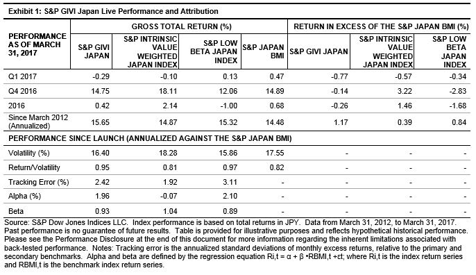
What happens to the cumulative returns when the daily returns move in opposite directions?  In this case, the magnitude of the returns matters, but not the order. If a market participant were to pursue both strategies, it would likely be a losing proposition in a choppy market. The only way to profit is by picking whether the larger absolute return will be positive or negative and using the standard long index for the larger absolute positive return and the inverse index, which is like a short position, for the larger absolute negative return. If the magnitudes of the opposite consecutive returns are the same, the directional order makes no difference, as shown in the first column of Exhibit 2, and there is a certain loss for both the standard and inverse indices. However, there is a chance to win if opting for only one strategy with a correct bet on the bigger absolute return, regardless of order.What conclusions can be drawn for 2x leveraged indices when daily returns are compounded?  Similar results are observed when comparing the standard indices to the 2x leveraged indices, which double the daily return. The compounded returns when there are two days of consecutive losses or gains show that the 2x leveraged version has a better payoff profile, since it loses less than double the standard index return but gains more than double. If a market participant is sure about commodity trends over time, then the 2x leveraged index may be a winning bet, even if the direction is uncertain.

However, if the daily returns move in opposite directions, then the magnitude matters. For returns of the same magnitude moving in opposite directions, the 2x leveraged version magnifies the loss by more than a factor of two, as shown in Exhibit 3. Also, the gain in the 2x leveraged index is less than double when the magnitude of the positive return is larger than the magnitude of the negative return, while the loss is more than double when the magnitude of the negative return is bigger than the magnitude of the positive return. Again, unless a market participant picks the direction of the big move, the standard index may be the better choice in a choppy market.Are there some commodities that trend more than others, and might be advantageous in a 2x leveraged or inverse version?  The most popular commodities used in 2x leveraged and inverse indices for products are Brent crude, copper, corn, WTI crude oil, gold, natural gas, silver, and soybeans.

From Jan. 2, 2007, to March 24, 2017, each of these commodities trended nearly 50% of the time. Corn trended the most, exactly 50% of the time, while copper and silver trended the least, around 46% of the time. During trending days, silver and gold posted the highest percentage of consecutive positive returns, 55% and 53%, respectively, while natural gas posted the highest percentage of consecutive negative returns, spending 54% of its trending time with consecutive losses.

Most of the commodities had larger positive returns than negative returns on opposite consecutive days, with gold and soybeans each recording 54% of consecutive opposite direction days with a larger gain than loss. Corn, the most-trending commodity, showed 52% of its non-trending days with a bigger gain than loss. Copper, one of the least-trending commodities, had 51% of non-trending consecutive days with bigger losses than gains, as did natural gas.

Given that corn trended the most and had relatively large gains to losses on opposite days during the period studied, it may be the best overall commodity choice for 2x leveraged and inverse indices. Natural gas may be a strong choice for an inverse index, based on its high consecutive negative returns and high losses in opposite consecutive daily returns. Copper also had more losses on opposite days, which may be beneficial in its inverse version. Lastly, gold and silver may be good choices for the 2x leveraged indices, based on their high positive consecutive return rates, even though silver was more choppy than trending.

The posts on this blog are opinions, not advice. Please read our Disclaimers.