Get Indexology® Blog updates via email.

In This List

A Closer Look at Payout Ratios and Earnings

Worse Than Marxism?

A simple model of aggregate dividend growth

Japanese Market Participants Accessing U.S. Treasuries (Part 2)

Japanese Market Participants Accessing U.S. Treasuries (Part 1)

A Closer Look at Payout Ratios and Earnings

Contributor Image
Erik Norland

Executive Director and Senior Economist

CME Group

Beyond the growth in nominal GDP, the other two macro-factors that may influence the returns of the S&P 500® Dividends Index: payout ratios and corporate earnings.

When corporations make profits, they have a choice: They can either reward shareholders or they can retain and reinvest the earnings.  While some companies, notably fast-growing technology firms, opt to retain all of their earnings, most choose to pay out a portion in dividends.  These dividend payout ratios fluctuate over time, though not necessarily with a strong correlation to the economic cycle.  Payout ratios rose during the 1980s boom but declined during the period of strong growth during the 1990s.  They also fell substantially during the 2008 recession, but rose during the most recent expansion. Dividend payout ratios can also fluctuate in response to changes in tax policy. Over the past few decades, payout ratios have averaged to around 40-50%.

Corporate Earnings
Corporate earnings rarely exceed 10% of GDP. They reached this level briefly in 2006 and hovered around 10% from 2011 to 2014.  They have since dropped to around 8.5% because the labor market has tightened, wages have begun to rise while productivity growth has remained slow.  All of these factors are putting downward pressure on corporate profits.  The impact of declining corporate profits on dividends has been offset by two other factors:

  1. Continued growth in nominal GDP, which has been growing at around 3.5% year on year.
  2. A rising dividend payout ratio, which now exceeds 50% of earnings.

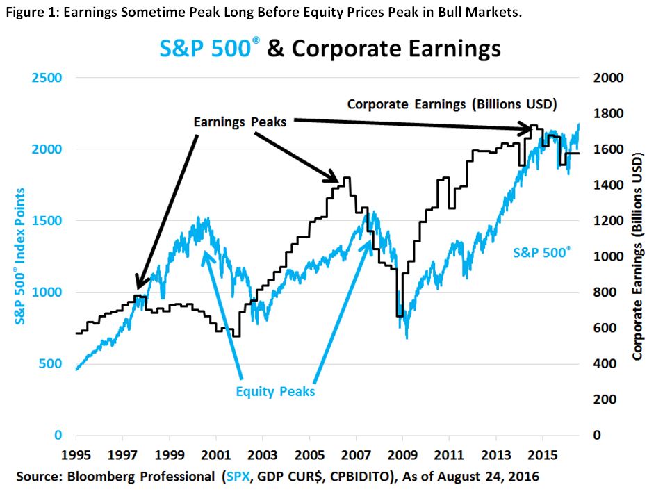
Notably, when corporate earnings peak as a percentage of GDP and begin to decline, equity prices can continue to rise. During the 1990s, earnings peaked as a percentage of GDP in 1997 while stocks continued to rise until 2000.  During the subsequent decade, earnings peaked relative to GDP in 2006 but stocks didn’t reach their highest levels until late 2007.  Likewise, this time around, earnings as a percentage of GDP may have plateaued in 2011-14 and then began falling, but the S&P 500® continued upward and broke to a new record high (Figure 1).  As such, a peak in earnings doesn’t necessarily imply an imminent peak in equity prices.  That said, post-peak earnings declines often correlate with periods of rising equity volatility (Figure 2).

Capture

Capture

The posts on this blog are opinions, not advice. Please read our Disclaimers.

Worse Than Marxism?

Contributor Image
Craig Lazzara

Former Managing Director, Index Investment Strategy

S&P Dow Jones Indices

The investment community was bombarded last week with a paper arguing that passive investing is “worse than Marxism.”  That any putatively-serious observer can compare an investment strategy, even one he doesn’t like, with a political ideology responsible for the deaths of millions boggles the imagination, but maybe I’m just too sensitive.  The paper’s argument seems to be that the macroeconomic function of financial markets is to direct capital to its most efficient use, and that only active management contributes to this effort.  In reply we offer several observations:

First, we can’t resist observing that not all active trading contributes to efficient capital allocation.  We have only to remember names like Pets.com or Drkoop.com to recognize that active managers are fallible human beings; they sometimes get it wrong, and when they do capital can be badly misallocated.  One of the ways the economy might adjust to such misallocations is to reduce the assets entrusted to those who made them.

Second, when passive alternatives are offered in a market that was formerly dominated entirely by active managers, where do the passive assets come from?  If you believe that some active managers are more skillful than others, and that their skill is manifested in outperformance, then presumably it must be the least skillful active managers who lose the most assets.  In that case, the existence of a passive alternative raises the quality of the surviving active managers, and thus contributes to market efficiency.  (Note, though, that increasing the ability of the average manager doesn’t translate to outperformance for the average manager’s clients – a conundrum first noticed by Charles Ellis more than 40 years ago.)

Third, active traders trade with other active traders.  If an active manager spots what he believes to be an opportunity and wants to allocate capital to a particular stock, he’ll have to buy it from another active manager (or from a dealer who will lay off the position to another active manager).  An index fund would have no reason to be the source of liquidity for such an information-driven trade.  Whether index funds represent 5% of assets or 50%, all information-driven trades are between two active managers.

Finally, active management’s share of trading is far higher than its share of assets; it is trading that sets prices and drives market efficiency.  Under reasonable assumptions, if half of the market’s assets are indexed and half managed actively, the active managers will still do 91% of the trading.  Indeed, if three-quarters of assets are managed passively, active managers will do more than three-quarters of all trading.

We don’t need to learn The Internationale just yet.

The posts on this blog are opinions, not advice. Please read our Disclaimers.

A simple model of aggregate dividend growth

Contributor Image
Erik Norland

Executive Director and Senior Economist

CME Group

Dividends are getting more and more into the spotlight as overall corporate earnings growth continues to face many challenges in a low inflation and relatively slowly growing world.  And, a U.S. Treasury 10-year note yield of sub-2% certainly adds interest to the dividends that can be earned from S&P 500® companies.  And, dividends may also provide a modest potential hedge against changes in nominal GDP growth, should the economy decelerate unexpectedly.

The principal drivers of dividends are corporate profit growth and payout ratios.  From an economic perspective, the amount of dividends market participants should expect for the whole economy may be defined by the following formula:

Aggregate Dividends = (Nominal GDP) x (Corporate Earnings as % of GDP) x (Average Dividend Payout Ratio)

That is, aggregate dividends can be determined arithmetically by nominal GDP, corporate earnings as a percent of nominal GDP, and the average dividend payout ratio.

Moreover, dividends are a key component of one of the most venerable means of valuing equity markets  — the dividend discount model, which holds that equity valuations are (or should be) equal to the discounted value of future dividends.

Currently markets are pricing slow growth for dividends.  The December 2020 futures price for S&P 500® dividends points to 50.1 index points versus 45.6 for December 2016.  This implies a modest 2.2% annualized growth rate over the last four years of this decade.  Nominal GDP might expand a little faster than that, perhaps at around 3.5% or 4% per year, assuming 1.5% to 2.0% real growth and a similar level of inflation.  In turn, this implies that corporate earnings, from which dividends are paid out, will likely grow more slowly than nominal GDP.

Market participants have been revising their views on dividends and are becoming much more optimistic.  Since February, pricing for 2020 dividends has risen from 44.35 index points to 50.1 — a 12% increase.  This increase comes on the back of a 20% rise in the S&P 500® index as equity investors become more optimistic about prospects for firms in general (Figure 1).

Capture

We are living in a slow growth world, however, and the rather modest expectations for dividend growth reflect that.

All examples in this report are hypothetical interpretations of situations and are used for explanation purposes only. The views in this report reflect solely those of the author and not necessarily those of CME Group or its affiliated institutions. This report and the information herein should not be considered investment advice or the results of actual market experience.
S&P Dow Jones Indices is an independent third party provider of investable indices.  We do not sponsor, endorse, sell or promote any investment fund or other vehicle that is offered by third parties. The views and opinions of any third party contributor are his/her own and may not necessarily represent the views or opinions of S&P Dow Jones Indices or any of its affiliates.

The posts on this blog are opinions, not advice. Please read our Disclaimers.

Japanese Market Participants Accessing U.S. Treasuries (Part 2)

Contributor Image
Michele Leung

Former Director, Fixed Income Indices

S&P Dow Jones Indices

Japanese market participants looking to access U.S. Treasury bonds or any other international bond market may need to be aware of fixed income risk and currency volatility.  Depending on their investment view, Japanese market participants may choose to hedge currency risk or remain unhedged. Either way, market participants may be exposed to additional returns or a reduction in returns that can result from the hedging or the performance of the foreign currency.

To illustrate this, let’s look at the S&P U.S. Treasury Bond 7-10 Year Index (TTM JPY) and the S&P U.S. Treasury Bond 7-10 Year Index (TTM JPY Hedged). The S&P U.S. Treasury Bond 7-10 Year Index (TTM JPY) measures the performance of U.S. Treasury bonds maturing in 7 to 10 years and is calculated in Japanese yen, while the S&P U.S. Treasury Bond 7-10 Year Index (TTM JPY Hedged) measures the performance of U.S. Treasury bonds hedged in Japanese yen.

As observed in Exhibit 1, the historical total return of the S&P U.S. Treasury Bond 7-10 Year Index (TTM JPY Hedged) closely tracked the S&P U.S. Treasury Bond 7-10 Year Index, which is calculated in USD. The total return of the hedged index is composed of the local total return and the hedging return, which is derived from the forward return and depends on the interest rate differential between the countries. Since the S&P U.S. Treasury Bond 7-10 Year Index (TTM JPY) has exposure to currency fluctuation, it resulted in higher volatility, and it outperformed or underperformed the hedged index depending on the time horizon.

Exhibit 1: Comparison of S&P U.S. Treasury Bond 7-10 Year Indices’ Returns20180824a

The reduced volatility of the S&P U.S. Treasury Bond 7-10 Year Index (TTM JPY Hedged) is further demonstrated in Exhibit 2; the volatility of the hedged index was approximately half that of the unhedged version over the one-, three-, and five-year periods.  In other words, historical data suggests that the S&P U.S. Treasury Bond 7-10 Year Index (TTM JPY Hedged) has a better risk-adjusted return profile.20180824b

Conclusion

The S&P U.S. Treasury Bond 7-10 Year Index (TTM JPY Hedged) and the S&P U.S. Treasury Bond 7-10 Year Index (TTM JPY) seek to track intermediate-term U.S. Treasury bonds while giving market participants the option to have currency exposure or manage their currency risk.  Japanese market participants seeking the benefits of diversification can access U.S. Treasury bonds.  The portfolio volatility could be further reduced by currency hedging, which historically has resulted in a better risk-adjusted return profile.

The posts on this blog are opinions, not advice. Please read our Disclaimers.

Japanese Market Participants Accessing U.S. Treasuries (Part 1)

Contributor Image
Michele Leung

Former Director, Fixed Income Indices

S&P Dow Jones Indices

Since the negative interest rate policy was announced by the Bank of Japan, the yield of the S&P Japan Sovereign Bond Index has tightened 33 bps to -0.07%, as of Aug. 23, 2016.  As the quantitative and qualitative easing program continues, some Japanese market participants seek investments that diversify their portfolios.  U.S. treasury bonds have become appealing, as they offer better yields and high creditworthiness.

Fixed income investments can play an important role in a well-diversified portfolio, as they tend to reduce the overall portfolio volatility and generate income.  Historically, U.S. bonds and U.S. equities have performed differently; they have negative correlations over the five-year period ending Aug. 23, 2016.[1]

The benefit of diversification still holds when looking into Japanese yen assets.  In the correlation analysis in Exhibits 1 and 2, the Japanese equities market is represented by the S&P Japan 500 (TR), the U.S. equities market is represented by the S&P 500 JPY Hedged (TR), and the Japanese sovereign bond market is represented by the S&P Japan Sovereign Bond Index.  These assets are separately compared against the S&P U.S. Treasury Bond 7-10 Year Index (TTM JPY), which is calculated in Japanese yen, and the S&P U.S. Treasury Bond 7-10 Year Index (TTM JPY Hedged), which tracks the same bonds with returns represented in Japanese yen but is hedged in an effort to eliminate currency exposure through a one-month forward currency contract.

Regardless of market participants’ option to hedge the currency or not, historical data shows that U.S. Treasury bonds have had low to negative correlations with other major asset classes offered in Japan. Hence, there is a potential diversification benefit.

Exhibit 1: Correlation With the S&P U.S. Treasury Bond 7-10 Year Index (TTM JPY)

20160823a

Exhibit 2: Correlation With the S&P U.S. Treasury Bond 7-10 Year Index (TTM JPY Hedged)

20180823b

[1]   Based on return performance of the S&P 500® (TR) and the S&P U.S. Treasury Bond 7-10 Year Index; data as of Aug. 23, 2016.


The posts on this blog are opinions, not advice. Please read our Disclaimers.