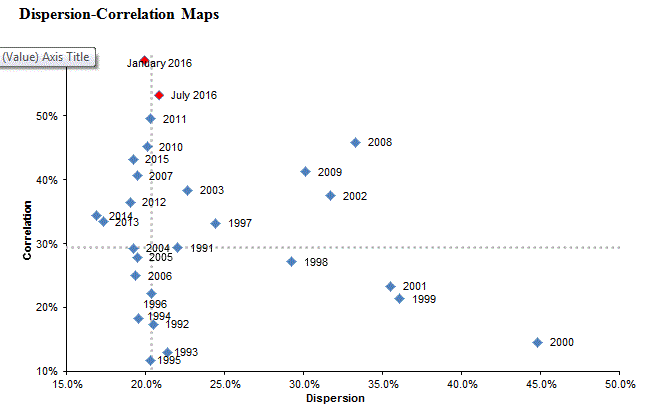
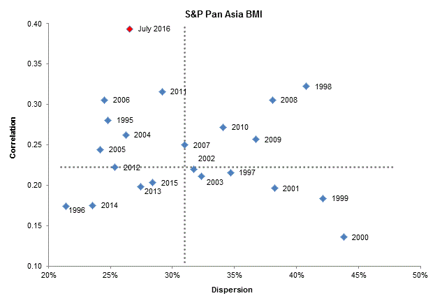
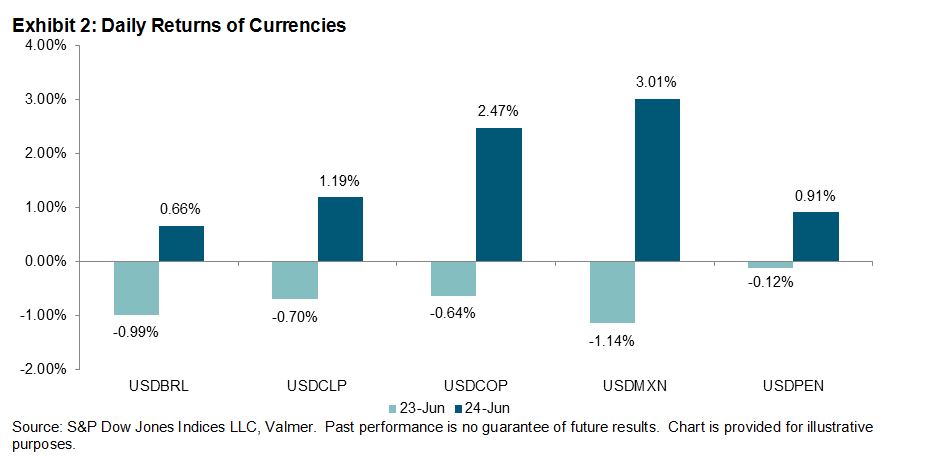
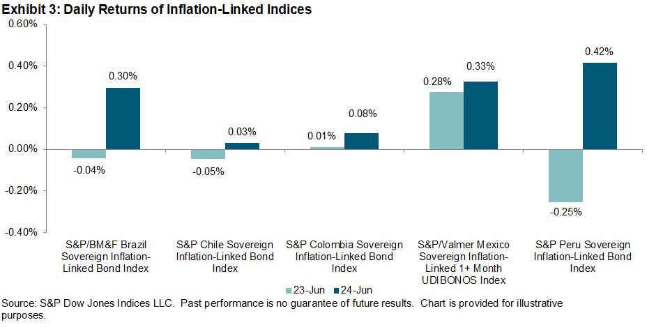
As an exercise in understanding market volatility, we recently introduced the dispersion-correlation map to see how volatility manifests in dispersion and correlation. We saw very high levels of correlation at the beginning of January for both the S&P 500 and S&P Europe 350; the S&P Pan Asia BMI also sat at above average correlation then. We’ve often said that high correlations indicate fragile markets, as indicated by the sharp declines that took place in the following month for all three indices.
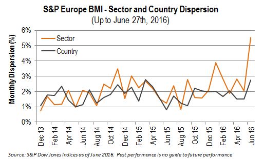
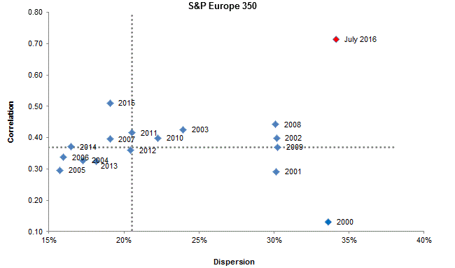
Following the results of the June 23rd Brexit referendum, volatility spiked around the globe. In the U.S., correlation is almost as high as it was at the beginning of the year, and dispersion is slightly higher. Similar readings can be seen in Pan Asia where correlation is high but dispersion is below average. The situation in Europe is different. As of the end of June, dispersion for the S&P Europe 350 was well above average, as was index correlation.
Paradoxically, wider dispersion in the S&P Europe 350 also means that there are more places to hide. Current European dispersion levels reflect considerable room to add (or subtract!) value by stock or sector selection.
Heightened correlations make for fragile markets. Investors in the U.S., Europe, and Asia should prepare for the possibility of a rough ride.
Source: S&P Dow Jones Indices LLC. Data from Dec. 31, 1990, through June 30, 2016. Past performance is no guarantee of future results. It is not possible to invest directly in an index, and index returns do not reflect expenses an investor would pay. Chart is provided for illustrative purposes.
The posts on this blog are opinions, not advice. Please read our Disclaimers.


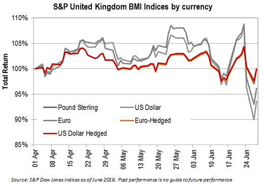
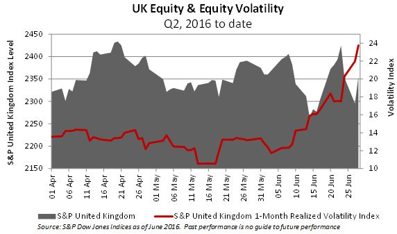 Given the general sentiment, it is notable that the UK’s equity market is not far at all from where it was only three months ago, at least, in pound sterling terms. One reason that the market has held up so well is due to the fall in the value of the British pound: for the large multinationals that make up a significant proportion of the local exchange, a cheaper pound inflates the relative value of their considerable foreign revenues. The chart above shows a very different picture for investors calculating their returns in a different home currency.