Get Indexology® Blog updates via email.

In This List

Best March For Commodities In 10 Years

Indexing the Brexit

The Teleology of Smart Beta

Can House Prices Keep Rising?

Has the Affordable Care Act Achieved its Goal of Significantly Increasing Enrollment While Making Healthcare Coverage More Affordable? Part 1

Best March For Commodities In 10 Years

Contributor Image
Jodie Gunzberg

Former Managing Director, Head of U.S. Equities

S&P Dow Jones Indices

In the first half of March, the S&P GSCI Total Return had added 9.6% and staged its biggest comeback ever, gaining 18.8% from its bottom on Jan. 20, 2016. Unfortunately, the index gave up 4.3% since March 17, 2016, losing about half its March gain. Despite the loss, the index posted its first positive monthly gain of 4.9% (data ending Mar. 30, 2016) since Oct. 2015. March’s commodity return is historically big and is the biggest March since March 2006, when the index gained 5.1%.

Source: S&P Dow Jones Indices.

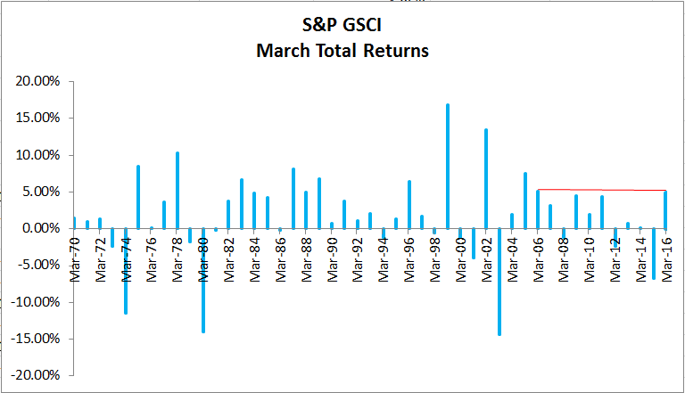
All 14 commodities in the Agriculture (8) and Energy (6) sectors in the S&P GSCI TR gained in March. This has not happened since July 2012. In fact, all commodities inside the agriculture sector have never been positive together in any historical March.

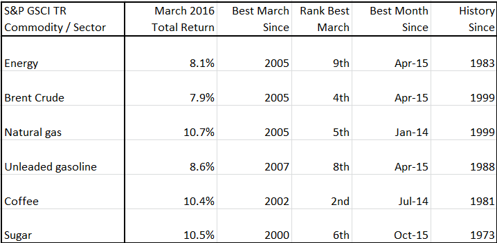
March 2016 has also been a historically big month for the energy sector and some of the constituents inside it, in addition to coffee and sugar. For example, coffee gained 10.4% in March, it was the best March since March 2002 and the second best March since 1981, and the best month since July 2014.

Source: S&P Dow Jones Indices.


The posts on this blog are opinions, not advice. Please read our Disclaimers.

Indexing the Brexit

Contributor Image
Kevin Horan

Former Director, Fixed Income Indices

S&P Dow Jones Indices

The central bank of England has said that the European Union referendum in June 2016 is the most significant near-term domestic risk to the country’s financial stability.  Because of its separate currency, Britain is one of the countries that could disassociate itself most easily from the EU.  It is a long time until June, and the question lingers: is this another Scotland situation with a heavy amount of press, but in which case, like Scotland, the U.K. will stay just where it is?

The “Brexit,” as it is being called, could have varying consequences, depending on the terms of a departure agreement.  Such terms would be negotiated after the vote.  To try and predict the outcome is sheer madness, as they say.  The decision will rely upon prevailing economics, future outlook, crowd sentimentality, and many other factors.

What can be observed from S&P Dow Jones Indices is the following.

Exhibit 1: Option-Adjusted Spread History–U.K. Investment-Grade Corporate Bond Indices

Source: S&P Dow Jones Indices LLC. Data as of March 28, 2016. Past performance is no guarantee of future results. Chart is provided for illustrative purposes.
Source: S&P Dow Jones Indices LLC. Data as of March 28, 2016. Past performance is no guarantee of future results. Table is provided for illustrative purposes.

The posts on this blog are opinions, not advice. Please read our Disclaimers.

The Teleology of Smart Beta

Contributor Image
Craig Lazzara

Former Managing Director, Index Investment Strategy

S&P Dow Jones Indices

As assets tracking factor indices grow, so does the attention paid to evaluating and promoting these so-called “smart beta” funds.  Even the nomenclature attracts attention.  Professor William Sharpe, famous among other things for introducing the concept of beta to academic finance, has said that the term “smart beta” makes him “definitionally sick,” and lesser lights than he have also voiced reservations about the terminology.  Recently one of the financial community’s best journalists opined that smart beta may be less smart than many of its practitioners allow.

How should an investor evaluate a “smart beta” strategy?  One fair way is to evaluate it against the claims its advocates make, which requires that those claims be made explicit.  A factor index provides exposure to stocks with certain common characteristics.  Are those characteristics desirable in themselves, or desirable only because they are a means to a different end?  What, in other words, is the telos of a smart beta index?  This question puts a certain burden on both manager and investor, as clarity, already a moral virtue, becomes a practical necessity.

For example: suppose an investor is sold a value-driven “smart beta” ETF.  Its managers say (truthfully) that it will hold only stocks with above-average yields and below-average PE ratios.  The investor buys the fund and, several years later, finds that his “smart” ETF has underperformed the dumb old cap-weighted index from which its constituents were drawn.  But the ETF’s stocks were cheap when they were bought and they remain cheap.  Ought the investor to be aggrieved?  And if so, with whom — with himself, or with his ETF manager?

Of course, in our simple example, the investor may not have been fully clear, not even with himself, about his underlying assumptions.  He may have told himself that he bought the ETF in question because he wanted to own undervalued stocks, and this may even be true, as far as it goes.  But it may not go far enough.  Perhaps the fuller truth is that he wanted to own undervalued stocks as a means of outperforming a cap-weighted benchmark.  And smart beta’s failure to outperform, in this case, is as irksome as would be the underperformance of an active manager (although perhaps less painful in view of smart beta’s presumably-lower fees).

The investor, in other words, needs to understand his own motivation.  Does he want factor exposure in itself, or because it is a means to a different end?  An investor who undertakes factor exposure as a means of outperforming should be aware that, just as no active manager outperforms all the time, neither does any factor index.  The investor should strive to understand the conditions that will make for a factor’s success.  Equally, he should strive to understand his own goals and motivations.

The posts on this blog are opinions, not advice. Please read our Disclaimers.

Can House Prices Keep Rising?

Contributor Image
David Blitzer

Former Managing Director and Chairman of the Index Committee

S&P Dow Jones Indices

Prices of existing homes rose 5.3% in the year ended December 2015, more than twice the rate of inflation.   However, the pace of price increases varies across the country with the strongest gains in the west and the weakest in the northeast, as shown by the chart.  Sales of both new and existing homes also vary across the country with more strength in the west.

The next S&P/Case-Shiller Home Price report will be releases at 9 AM Tuesday morning. It will show whether the west’s dominance continues and whether prices will keep climbing despite questions about the availability of financing.

The posts on this blog are opinions, not advice. Please read our Disclaimers.

Has the Affordable Care Act Achieved its Goal of Significantly Increasing Enrollment While Making Healthcare Coverage More Affordable? Part 1

Contributor Image
Glenn Doody

Vice President, Product Management, Technology Innovation and Specialty Products

S&P Dow Jones Indices

The Affordable Care Act (ACA), signed on March 23, 2010, by President Barack Obama, has often been described as legislation to 1) make healthcare and health insurance more affordable, and 2) make health insurance more broadly available to Americans.  Key parts of the ACA have been discussed relentlessly in the market, in particular the requirements that people with preexisting conditions can’t be charged more or denied treatment, and the requirement that all Americans must have healthcare or face a tax penalty.  While the new rules imposed on the healthcare industry have served to increase accessibility, what has the impact been with respect to affordability?  In this two-part series, we will look at the impact of this legislation, first from the perspective of accessibility and whether enrollment has actually increased since the ACA was introduced, and then at affordability, or costs, and how overall costs in the individual market have been increasing.  We will use the S&P Healthcare Claims Indices to evaluate the success of each provision further.

Capture

Accessibility: Do More Americans Have Healthcare Coverage Today Than When the ACA Was Introduced in 2010?

According to the S&P National Healthcare Individual Claims Index, there appears to be strong evidence that there has been an increase in private enrollment since the introduction of the ACA.  The majority of this increase occurred concurrent with the introduction of the Health Insurance Marketplace in January 2014.  Because the initial open enrollment in the Health Insurance Marketplace was plagued with administrative problems, growth in enrollment was delayed.  In fact, in early 2014, the government announced that open enrollment would be extended to March 31, 2014.  As can be seen in Exhibit 1, individuals started to take advantage of this new coverage, and between October 2013 and September 2015, total enrollment increased by over 25% on an adjusted basis,[1] as measured by the S&P Healthcare Claims Indices for the individual market.  Given that the S&P Healthcare Claims Indices represent approximately 40% of the total commercial healthcare market in the U.S., we believe that it is reasonable to conclude that the ACA has induced more individuals to buy individual health coverage.  Also notable in Exhibit 1 is an increase in the cost trend from 5% annual to over 30% in 2014 on a 12-month basis, indicating that these additional enrollees had a significant impact on costs.

In part 2 next week, we will look deeper into the impact on costs that the additional enrollment had.

[1]   The enrollment numbers have been adjusted to remove the drop in enrollment due to the removal of a plan from the S&P Healthcare Indices in October 2014.

The posts on this blog are opinions, not advice. Please read our Disclaimers.