

Volatility can feel like an earthquake.
As many investors can painfully testify, the chart below is typical of volatility. A period of relative calm is disturbed first by a few small tremors, then by a precipitous rise. At this point, risk breaks all connections with its normal level and climbs rapidly to a crystalized zenith of distress and chaos … before declining, at first rapidly then slowly; rollercoasting through a cascade of aftershocks as the grind back down to normality occurs.
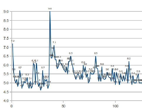
Note: Chart courtesy of Groundswell Earthquake Outreach
Volatility can feel like an earthquake, and it’s far from simply a romantic metaphor. As the reader may have already guessed, the chart above is not from any financial market. In fact it shows the measured magnitude of foreshocks, aftershocks and the actual ‘Great East Japan Earthquake’ at Tohoku on March 11th, 2011. The reading of 7.1 immediately subsequent to the main spike is better known, resulting ultimately in the failure of the nuclear plant at Fukushima.
The statistical properties of earthquakes are the subject of much serious academic research, the fruits of which allow for empirical predictions of the number, magnitude and frequency of aftershocks. In 2010 a group of physicists tested these sharpened tools on market volatility, with a remarkable degree of success. Put simply, the statistical rules that explain earthquakes also fit and predict the patterns of stock market volatility.
Such analytic dissections are certainly interesting to options and volatility traders. And these relationships provide the rest of us with a deeply meaningful analogy for the judicious management of risk. If you live near a fault line, take very close heed of tremors; immediately after an earthquake, prepare for the aftershocks accordingly.
The posts on this blog are opinions, not advice. Please read our Disclaimers.


