Get Indexology® Blog updates via email.

In This List

Comparing Small-Cap Indices in Developed and Emerging Markets

How Are Insurers Staying Ahead of the Curve?

The Rebalance of Power: Tesla, Walmart, & Disney Join the S&P 500 ESG Index, Facebook, Wells Fargo, & Costco Dropped

Introducing the S&P Cryptocurrency Indices

Commodities Burst Higher in April

Comparing Small-Cap Indices in Developed and Emerging Markets

Contributor Image
Rachel Du

Senior Analyst, Global Research & Design

S&P Dow Jones Indices

Not all small-cap indices are identical. Indices within the same market cap range can have varied performance in different markets. We studied the S&P Developed SmallCap and S&P Emerging SmallCap for their performance, volatility, and sector allocation in different market segments.

The S&P Global SmallCap is a widely used benchmark representing the global small-cap market. Made up of the S&P Developed SmallCap and S&P Emerging SmallCap, it covers 9,236 stocks from 25 developed and 25 emerging countries/regions as of April 30, 2021. Both subindices are float-market-capitalization weighted and reconstituted annually in September, the same as their benchmark.

Using monthly return data in U.S. dollars, the S&P Developed SmallCap outperformed the S&P Emerging SmallCap in 165 out of 316 months from Dec. 30, 1994, to April 30, 2021, displaying a 52.2% outperformance hit rate. On the other hand, the S&P Emerging SmallCap exceeded the S&P Developed SmallCap performance in 151 out of 316 months during the same period.

Exhibit 1 shows the return/risk comparison between the S&P Developed SmallCap and S&P Emerging SmallCap. The S&P Developed SmallCap did better in most of the periods, while the S&P Emerging SmallCap outperformed over the 20-year period. The S&P Emerging SmallCap had higher volatility during all the periods studied.

Exhibit 2 shows the 12-month rolling volatility since Dec. 31, 1994, where volatility is calculated as the annualized standard deviation of the monthly total return in U.S. dollars. While the S&P Emerging SmallCap has been more volatile than the S&P Developed SmallCap for most of the time observed, the S&P Developed SmallCap appeared to be riskier than the S&P Emerging SmallCap from December 2018 to April 2021, except from July 2020 to October 2020.

Historically, the S&P Emerging SmallCap has been more closely correlated to the emerging market, as measured by the S&P Emerging BMI, compared with the correlation between the S&P Developed SmallCap and the S&P Developed BMI (see Exhibit 3). This means that in emerging markets, the small-cap stocks have been more closely related to the broader market than small-cap stocks in developed markets over the studied period.

The sector exposure displayed in Exhibit 4 shows that as of April 30, 2021, both the S&P Developed SmallCap and S&P Emerging SmallCap have more weight allocated to Industrials, Information Technology, and Consumer Discretionary than other sectors. The S&P Emerging SmallCap is more overweighted in Materials, Utilities, and Consumer Staples than the S&P Developed SmallCap, while the S&P Developed SmallCap is more overweight in Health Care, Financials, and Industrials than the S&P Emerging SmallCap.

From year-end 1994 to the end of April 2021, the S&P Developed SmallCap delivered better returns overall, while the S&P Emerging SmallCap generally exhibited higher volatility. The difference in sector exposure may reflect the economic development and opportunity in different markets. While investing in small caps may offer potential long-term outperformance, it is important to consider the characteristics exhibited in different markets.

The posts on this blog are opinions, not advice. Please read our Disclaimers.

How Are Insurers Staying Ahead of the Curve?

Contributor Image
Raghu Ramachandran

Head of Insurance Asset Channel

S&P Dow Jones Indices

Environmental, social, and governance (ESG) has been a nearly ubiquitous topic of conversation among investors in recent years, bringing to light important questions: How do you measure it? How do you report it? Why should you use it? However, to date, few U.S. insurance companies have incorporated ESG into their policy guidelines, and the practicalities of implementing ESG are rarely addressed.

At our Annual Insurance Investment Summit – How Are Insurers Staying Ahead of the Curve?, NEPC’s Andrew Coupe and Liberty Mutual’s Patrizio Urciuoli explore the practical considerations of incorporating ESG into an insurance portfolio, alongside a host of other industry experts who tackle other topics relevant to insurance company investments. Since the Global Financial Crisis, insurance companies have had two major trades—trading illiquidity for yield and going down the credit curve. Two sessions at our summit focus on these critical issues and the challenges they pose for insurance companies. First, we explore whether illiquidity still has a place in an insurance investment portfolio with experts from BlackRock, F&G, S&P Global Market Intelligence, and S&P Global Ratings. Second, panelists from QBE Insurance, Voya Investment Management, Callan, and S&P DJI discuss the credit impact of COVID-19 on insurance portfolios.

We also look back at 2020 and the lessons we learned in the context of trading and liquidity. Even though the concept of ETFs originated out of the 1987 stock market crash, no one was sure how fixed income ETFs would behave during a stressed period—especially when the underlying securities weren’t trading. The chaos of spring 2020 was the perfect crucible to test fixed income ETFs, and panelists from Citadel, State Street, One America, and S&P DJI discuss how ETFs behaved during this liquidity crunch and what those lessons could mean for insurance companies moving forward.

Looking prospectively, we also examine areas of consideration or opportunity for insurance investors. Will inflation play a role in investments in the near future? How might liquid alternative indices help insurers diversify? What’s driving the high yield muni tailwind?

Access our Annual Insurance Investment Summit on-demand to explore these questions and more.

The posts on this blog are opinions, not advice. Please read our Disclaimers.

The Rebalance of Power: Tesla, Walmart, & Disney Join the S&P 500 ESG Index, Facebook, Wells Fargo, & Costco Dropped

Contributor Image
Mona Naqvi

Global Head of ESG Capital Markets Strategy

S&P Global Sustainable1

ESG momentum shows no signs of stopping, with sustainable fund assets nearing USD 2 trillion, following record inflows in Q1.1 Pressure on firms to perform in sustainability rankings has never been higher, as Wall Street’s hottest topic gets hotter still. But what firms benefit from all this heat? From the assets flowing into S&P 500® ESG Index related products,2 it seems the balance of power may be shifting. At least for the foreseeable future, Sustainability is King (or Queen). So, by almost royal decree, here are the results of the 2021 S&P 500 ESG Index annual rebalance.

What’s changed? First, the methodology itself—with the introduction of a new thermal coal screen last September following public consultation. Even though the index still aims to offer similar overall industry group weights to the S&P 500, with sustainability enhancements—rather than reduce carbon exposure, per se—it experienced a welcome decrease of 12% in carbon intensity since the last annual rebalance.3

ADDITIONAL INDEX-LEVEL METRICS

A broader sustainability lens reveals that the index achieved an S&P DJI ESG Score improvement of 8% (at the index level), representing 23% of the overall ESG-improvement potential, given the sustainability characteristics of the starting universe.4 Within the underlying E, S, and G dimensions, the sustainable counterpart to the S&P 500 realizes numerous tangible enhancements, all while providing similarly broad U.S. equity exposure. Due to the depth and breadth of topics covered in the S&P Global Corporate Sustainability Assessment that underpins the S&P DJI ESG Scores, there are too many to demonstrate here, though a sample is provided in Exhibit 1. Such improvements are even more pronounced within industry groups, given the industry-specific nature of S&P DJI ESG Scores.5

CONSTITUENT SELECTION

What of the constituents? As of the 2021 rebalance, 315 constituents made it into the S&P 500 ESG Index, as 190 constituents were not included (79 were ineligible and 111 were eligible but not selected). As per the S&P 500 ESG Index methodology, companies might not qualify because they are: (a) ineligible according to certain ESG exclusionary criteria; or (b) simply not selected, even if they are eligible, because of poorer relative S&P DJI ESG Score performance than their index industry group peers. Exhibit 2 highlights how the S&P 500 translated into the composition of S&P 500 ESG Index in 2021.

As for major changes, Exhibit 3 highlights the biggest new additions and drops in terms of market capitalization. Other household names that made it into the sustainable index include Ford Motor Crop, News Corp, Marriott, and Etsy. Meanwhile, Lumen Technologies, L Brands, UDR, and Sealed Air Corp were among those that were removed despite being eligible, due to relatively poor S&P DJI ESG Score performance than their peers. Other names, such as Atmos Energy, Allegion, and Fortune Brands Home & Security were dropped because they fell to within the bottom 25% of S&P DJI ESG Score rankings among their global GICS industry group peers, rendering them ineligible. In addition, Johnson & Johnson, 3M, and Dupont remained on the exclusion list, as they have not yet completed the penalty period for their involvement in material public controversies.7

Interestingly, though the rebalance generates ample turnover, 74 constituents of the S&P 500 have consistently not met the rules-based selection criteria of the ESG index since it launched in January 2019 (see Exhibit 4). Conversely, 207 companies have managed to maintain their position in the sustainable index since its launch (see Exhibit 5).

RESULTS & PERFORMANCE

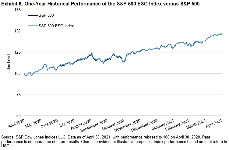
Despite containing just 75% of the S&P 500 market capitalization, the aforementioned sustainability improvements were achieved with only 1.11% of tracking error and excess returns of 0.67% over the past five years—in part, helping to dispel the myth of an inherent sustainability versus performance tradeoff. However, since the five-year return includes back-tested history that was built before the index was launched, it is worth paying special attention to the live performance record over the past one year, when it exhibited excess returns of 0.42% and 1.83% of tracking error (see Exhibit 6).

But can this outperformance be explained away by other factors?

PERFORMANCE ATTRIBUTION: A STORY OF SELECTION

Performance attribution primarily reveals a story of selection. It was generally because of the stocks selected according to their sustainability credentials, rather than differences in sector exposure, that appear to have driven this excess return. Indeed, this should come as no surprise, as the methodology lends itself by design to a broadly sector-neutral outcome. Thus, the outperformance was not all necessarily due to significant overexposure to Tech and underexposure to Energy, as many might assume.

FACTOR EXPOSURE: SPOT THE DIFFERENCE

A closer look at the underlying factor exposure also reveals that the factor tilts are in fact quite similar to the S&P 500, save for a minor discrepancy in its exposure to larger firms.9 These similarities are consistent with the ESG index’s objective to provide a similar level of risk and return. As such, the absence of any sizeable unintended factor exposure cannot entirely explain this difference either—suggesting other “forces” are still potentially at work.

CONCLUSION

Though the aim of the S&P 500 ESG Index is not to outperform but provide exposure and performance broadly in line with the benchmark, these results show that a rules-based selection process, driven by ESG principles, has yielded greater exposure to high-performing companies. And so, without other explanatory challengers to usurp the performance throne, long may the reign of our sustainability monarch continue.

APPENDIX A

APPENDIX B

1 Source: https://www.morningstar.com/lp/global-esg-flows

2 As of March 30, 2021, there is USD 4 billion of AUM in ETFs tied to the S&P 500 ESG Index, with more than half a billion USD of net new inflows in Q1 2021 alone.

3 Calculated as the percentage difference between the weighted average carbon intensity (WACI) of the S&P 500 ESG Index as of the rebalance dates in 2020 and 2021, measured in metric tons of CO2e per USD 1 million of revenues using S&P Global Trucost data.

4 The realized ESG potential depicts how much of the S&P DJI ESG Score improvement was achieved by the ESG index, relative to the maximum possible improvement that could in theory have been attained by investing solely in the single highest-ranked company by S&P DJI ESG Score. While diversification requirements would render this approach undesirable in practice, it is nevertheless an interesting metric to contextualize the S&P DJI ESG Score improvement relative to the starting characteristics of the benchmark universe. For example, in markets where companies are generally sustainable to begin with, it is harder to obtain a substantial S&P DJI ESG Score increase without incurring a sizeable loss of diversification or higher levels of tracking error.

5 Due to the industry-specific nature of the S&P DJI ESG Scores, driven by a materiality-weighted scoring framework, the aggregate S&P DJI ESG Score improvement metrics vary considerably by sector. For example, the S&P DJI ESG Score improvement for the Materials sector and Real Estate sectors both came to approximately 11%; whereas the improvement among the IT and Health Care sectors both came to approximately 6%, relative to the S&P 500. However, it is among the underlying ESG indicators where we find the greatest discrepancies in performance between industry groups, though the methodology accounts for too many data points (600-1,000 data points per company) to feasibly showcase here.

6 As the methodology prevents companies removed for this reason (at the discretion of the Index Committee) from reentering the index for one full calendar year.

7 See Appendices A and B for a detailed explanation of these changes.

8 S&P DJI ESG Scores are normalized by industry group and thus designed to be read as percentiles. For example, a company score of 70 means that this company has a higher score than 70% of its peers within its industry group. This allows for a comparison of relative rankings of companies across different industry groups, despite the industry-specific nature of S&P DJI ESG Scores.

9 This is unsurprising due to the generally positive correlation between sustainability performance and firm size, as visibility, access to resources, and operating scale are typically associated with large firms.

The posts on this blog are opinions, not advice. Please read our Disclaimers.

Introducing the S&P Cryptocurrency Indices

Contributor Image
Sharon Liebowitz

Former Head of Innovation

S&P Dow Jones Indices

For us at S&P DJI, this is an exciting time because this new asset class is bringing unprecedented change to our financial ecosystem and the mindsets of market participants.

The cryptocurrency space is unlike traditional financial markets, and certainly unlike the ones we have benchmarked at S&P DJI over the last 100 years. Living mainly within the realm of technology, cryptocurrencies like Bitcoin are beyond the realm of traditional currencies, securities, commodities, and physical assets. They are new, evolving, and not controlled by governments, although their use is regulated in various jurisdictions. Instead, they’re decentralized, meaning that no one entity can fully control or halt the use of these currencies.

Structurally, these cryptocurrencies are creating their own new, evolving, decentralized markets. Enormous value is now being transacted in dozens of exchanges where there are no traditional market makers.

But along with opportunities, this asset class comes with a host of new challenges. As an emerging space, one of the biggest issues is a lack of transparency.

Our cryptocurrency indices seek to address some of the challenges the industry is currently facing, including the issue of transparency. S&P DJI’s independent, reliable, and accessible indices have a long track record of bringing transparency to a wide range of markets across asset classes and geographies, and we believe they can do the same for this emerging, complex asset class.

To that end, we are launching our index series around the two largest and most prominent cryptocurrencies—Bitcoin and Ethereum. The initial launch will include the following indices:

These indices will measure the performance of Bitcoin, Ethereum, and a market cap weighting of Bitcoin and Ethereum, respectively.

Later this year, the S&P Digital Market Index Series will look to include additional coins and broader-based indices such as large-cap and broad market benchmarks.

Stay tuned as we expand this series of indices, and learn more in our paper “Bringing Transparency to an Emerging Asset Class.”


1 Market capitalization corresponds to coin supply multiplied by coin price for cryptocurrencies.

The posts on this blog are opinions, not advice. Please read our Disclaimers.

Commodities Burst Higher in April

Contributor Image
Jim Wiederhold

Former Director, Commodities and Real Assets

S&P Dow Jones Indices

Several commodities made new all-time highs, as the global economy reflated, consumer confidence hit pre-pandemic highs, and housing prices in the U.S. jumped the most in 15 years. The S&P GSCI continued to perform well, rising 8.2% for the month to start the second quarter, following a strong 13.5% in the first quarter. Most commodities sectors rose by several percentage points, while the S&P GSCI Livestock fell 2.3%. The S&P GSCI Iron Ore rose 18.7% this month, more than tripling its performance from a year ago. The S&P GSCI Biofuel rose 19.8%, as the underlying corn, wheat, soybean oil, and sugar displayed impressive double-digit percentage gains. The U.S. Personal Consumption Expenditures (PCE) Price Index rose 2.3%, confirming inflationary pressures are here, albeit from the low April 2020 base.

In its latest meeting, OPEC+ agreed to stick to the plan of easing oil output cuts from May to July due to the upbeat demand picture. The different crude oil grades and heating oil performed well, but the S&P GSCI Natural Gas came to life this month, up 9.41%, due to demand. According to the International Energy Agency (IEA), the greenhouse gas emissions from natural gas are 45%-55% lower than those of coal to generate electricity. Natural gas is considered one of the lower-cost, lower-carbon-emitting vessels to help ferry the world to a net-zero future.

Copper climbed to its highest point in almost a decade in April, as the global economy continued to recover from the COVID-19 pandemic, pushing the broad S&P GSCI Industrial Metals 9.7% higher over the month. Industrial metals have benefitted from the world’s largest economies announcing programs to build back greener from the COVID-19 shock; at the same time, companies and investors remain reluctant to expand supply, despite the surge in prices. A recovery of global steel demand over the past 12 months has driven the market for its main ingredient, iron ore, climbing, and helped the S&P GSCI Iron Ore reach another all-time high in the last week of the April. The resilience of iron ore prices has also been compounded by tight supply over the past three months, as Brazil and Australia experienced seasonal production reductions.

All precious metals rose in April, as the U.S. dollar took a break. The S&P GSCI Palladium hit a new all-time high, rising 12.7% for the month. Like natural gas, palladium’s use in catalytic converters was the focus this month, with world leaders preoccupied about lowering greenhouse gas emissions.

The bulls came out to play in the agricultural commodities complex; the S&P GSCI Agriculture finished the month up 15.7%. The complex was turbo-charged by the S&P GSCI Kansas Wheat, up 20.1%, benefiting from less-than-ideal weather conditions for the winter wheat crop. Corn and soybeans also enjoyed strong performances over the month, with surprisingly moderate planting intentions in the U.S. driving prices higher.

In contrast, the S&P GSCI Livestock was the only S&P GSCI sector down for the month, pulled lower by feeder and live cattle. The U.S. cattle market was hit with lingering processing capacity issues on top of a steep increase in feed costs.

The posts on this blog are opinions, not advice. Please read our Disclaimers.