Get Indexology® Blog updates via email.

In This List

Uncertainty’s Curse on Confidence

Accessing Energy and Energy Infrastructure through Master Limited Partnerships (MLPs)

Iron Ore Is on a Hot Roll

Why Facebook Was Dropped from the S&P 500® ESG Index

Four Decades of the Low Volatility Factor

Uncertainty’s Curse on Confidence

Contributor Image
Stuart Magrath

Former Senior Director, Channel Management, Australia and New Zealand

S&P Dow Jones Indices

With the dust still settling after the unexpected result of Australia’s recent federal election on May 18, 2019, which resulted in a third 3-year term for the incumbent Liberal-National Party coalition, the Australian government has quickly turned its attention to a slowing in the Australian economy.

While the uncertainty over franking credit refunds and negative gearing on investment properties is over, and despite a recent fillip in residential auction clearance rates, Australia’s unbroken record of 27 recession-free years may still be in danger of being derailed by offshore events. In addition to a keen focus on economic matters, expectations are that the government will quickly turn its focus to legislating the majority of the recommendations from the Royal Commission into Misconduct in the Banking, Superannuation, and Financial Services Industry once the Governor-General opens the 46th Parliament in early July 2019.

For this reason, financial advisers in Australia will likely continue to grapple with major disruption in their industry in 2019 and for the next few years to come. Adding to the Royal Commission outfall, the Financial Adviser Standards and Ethics Authority (FASEA) requirements are now in place for advisers, with the education standards having to be met prior to Jan. 1, 2024.

Despite all these headwinds, many opportunities remain for advisers to transform their practices, and index-based investment solutions could be a vital part of that transformation. We recently published our semiannual Australian Persistence Year-End 2018 Scorecard, and once again, we saw that relatively few active funds were able to stay on top over time. With the results of the SPIVA® Australia Year-End 2018 Scorecard, we can continue to say with confidence that most active managers underperform most of the time.

The latest Australian Persistence Scorecard measured the performance persistence of active funds that outperformed their peers and benchmarks over consecutive three- and five-year periods, and analyzed their transition to other quartiles over subsequent periods. Overall results suggested that only a minority of high-performing funds persisted in outperforming their respective benchmarks, or consistently stayed in their respective top quartiles, over consecutive three- and five-year periods. Among top-quartile funds across all asset classes, 9.7% and 2.2% consistently maintained top-quartile rankings over the consecutive three- and five-year periods, respectively. Top-quartile funds in the Australian Bonds fund category had the lowest turnover over both periods.

With this data, financial advisers could recommend index-linked investment solutions to their clients, explaining that it is difficult to select an active fund that will outperform its relevant benchmark, and that it would be even more difficult to select an active fund that will do so consistently.

The posts on this blog are opinions, not advice. Please read our Disclaimers.

Accessing Energy and Energy Infrastructure through Master Limited Partnerships (MLPs)

Contributor Image
Qing Li

Director, Global Research & Design

S&P Dow Jones Indices

In 2018, the U.S. set world production records for both natural gas and oil.[1] The growth in production is expected to continue and the U.S. is set to become a net energy exporter[2] by 2020, ending a 75-year period of dependence on imports.

The increase in energy production not only shifts the dynamics of the global oil market, but also increases the demand for strong energy infrastructure to support the processing, transporting, and storage of oil and gas. An average of USD 14.7 billion in capital expenditures for a pipeline of oil, gas, and natural gas liquids would be needed from now through 2035 to support this demand.[3]

In addition to providing exposure to energy and energy infrastructure, MLPs provide a tax advantage[4] and stable income. The latter is due to MLPs distributing the majority of their earnings in cash. Using the S&P MLP Index to represent the asset class, our analysis shows that MLPs offer potential diversification benefits. Based on monthly return data from August 2001 to April 2019, MLPs showed low or negative correlations with traditional asset classes such as stocks and bonds (see Exhibit 1).[5]

Historically, MLPs demonstrated solid performance in various market environments. The S&P MLP Index outperformed the overall stock market in 10 out of 18 years (see Exhibit 2) and outperformed the bond market in all market environments with an average excess return of 0.5%. This is higher than the excess returns from Utilities (0.29%), Energy (0.36%), and the broad equity market (0.31%; see Exhibit 3). Owing to a positive outlook on the Energy sector and its infrastructure, the S&P MLP Index gained 17.57% YTD in 2019 (as of April 2019).

Using 18 years of index history, we can see that MLPs had attractive yield, with an average annual dividend yield of 6.6%, compared with 1.9% from equities, and 2.2% and 3.4% from the Energy and Utilities sectors, respectively (see Exhibit 4). Although the recent tax reform[6] may make MLPs less attractive than they used to be, the taxable income from MLPs continues be subject to single-level taxation.

In general, MLPs can not only provide exposure to the Energy sector, they also stand to gain from the increase in demand for energy infrastructure and higher yield.

[1]   U.S. Energy Information Administration (EIA), March 14, 2019 and April 15, 2019.

[2]   Annual Energy Outlook 2019, EIA, Jan. 24, 2019.

[3]   North American Midstream Infrastructure through 2035, the INGAA Foundation, Inc., June 18, 2018.

[4]   Being set up as a pass-through entity, an MLP allows all the gains and losses to flow through to the individual partners (unitholder) directly and the business entity does not need to pay income tax.

[5]   We use the S&P MLP Index, S&P 500, and Bloomberg Barclays U.S. Aggregate Bond Index to represent MLPs, stocks, and bonds, respectively.

[6]   The Tax Cuts and Jobs Act of 2017 cut corporate tax from 35% to 21%.

The posts on this blog are opinions, not advice. Please read our Disclaimers.

Iron Ore Is on a Hot Roll

Contributor Image
Jim Wiederhold

Former Director, Commodities and Real Assets

S&P Dow Jones Indices

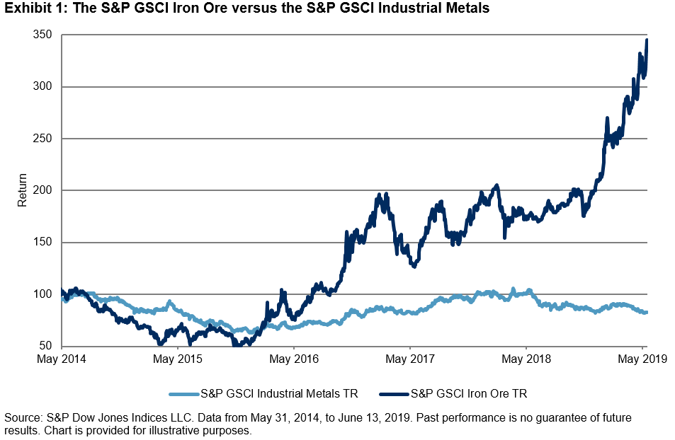
The S&P GSCI Iron Ore has been on a tear this year, up 72.47% YTD as of June 13, 2019, breaking through the previous high from May 22, 2019. It had by far the best YTD performance out of any of the commodities indices in the S&P GSCI Series. This bullish performance during the first half of 2019 is a good example of how using commodities in a tactical way can boost returns for investors. The S&P GSCI Iron Ore was able to distance itself from other metals. For example, the S&P GSCI Industrial Metals was flat over the same period.

Prior to the recent rally, the S&P GSCI Iron Ore was relatively range bound for two years due to competing macro themes. There are several factors to point to when explaining the recent YTD performance. First, the challenging risk-off environment in Q4 2018 left most assets finishing the year in the red. This allowed for neutral-to-bearish investor positioning entering 2019, especially for those commodities with a high beta to global markets and specifically to Chinese economic activity.

Second, to ease the burden of U.S. tariffs and to support the slowing economy, Beijing announced a variety of stimulus measures focused on boosting its industrial complex. China currently purchases approximately two-thirds of seaborne iron ore. As has been seen in the last few years with each China hard landing or global growth scare, the People’s Bank of China has not hesitated to turn on its most-adored stimulus levers. Those levers have historically been ways to increase funding for construction and infrastructure projects. While the planned move away from manufacturing to a more consumer-based economy continues to creep along in China, it will likely take a long time to implement this plan, and the Chinese administration appreciates that the current most effective way to support economic growth remains via these industrial support levers. The S&P GSCI Iron Ore is highly correlated to Chinese economic indicators such as real estate investment, industrial production, and steel production. Several of these indicators spiked in Q1 2019 just as iron ore prices started to rise (see Exhibit 2). It is worth noting that the most recent industrial production number dropped to a five-year low of 5%.

Third and most important, supply has been drastically curtailed in recent months. Inventories held globally have been reduced and are on pace to fall to five-year lows within the next few months. The Vale dam collapse in Brazil in late January 2019 and a cyclone in Australia in March 2019 reduced supply from the world’s two largest iron ore exporters. Shipments from Australia have largely returned to normal, but it is likely that Brazilian iron ore exports will be constrained for an extended period of time. Imported iron ore stock at Chinese ports fell to a 2.5 year low of 121.6mm metric tons in mid-June 2019 according to Steelhome.

The iron ore market has a number of characteristics that make it distinctive as an investable asset, but these characteristics are relatively common among commodities; iron ore supply is concentrated in a handful of geographic regions and controlled by a small number of players, and demand is dictated by one major end-user (China). Both supply and demand are subject to shocks caused by geopolitical events, unforeseen natural disasters, and policy decisions, as well as the actions of individual asset owners. However, with unique characteristics can come unique tactical investment opportunities for investors.

The posts on this blog are opinions, not advice. Please read our Disclaimers.

Why Facebook Was Dropped from the S&P 500® ESG Index

Contributor Image
Reid Steadman

Former Managing Director, Global Head of ESG & Innovation

S&P Dow Jones Indices

When the S&P 500 ESG (Environmental, Social, and Governance) Index underwent its annual rebalance after markets closed on April 30, 2019, several notable companies were removed, including Wells Fargo, Oracle, and IBM. However, the largest component to be dropped was Facebook.

A day before its exclusion, Facebook held a weight of 2.5% in the S&P 500 ESG Index. At that time, Facebook was the fourth-largest company in the S&P 500, the parent index for the S&P 500 ESG Index, with a weight of 1.9%.

Why was Facebook removed? To better understand, a primer on the S&P ESG Index Series methodology[1] is helpful.

Some ESG indices, like the Dow Jones Sustainability Indices,[2] are narrow in their construction, selecting only a few leading companies in sustainability, industry by industry. Other ESG indices, such as the S&P 500 ESG Index, keep broad exposure but exclude companies lagging in ESG performance or that are involved in certain business activities, such as the production of tobacco or controversial weapons.

To keep alignment with the S&P 500 and to exclude companies underperforming in ESG, companies are ranked within their S&P 500 GICS® industry groups by their S&P DJI ESG Scores. They are then selected, highest to lowest, with the aim of getting as close as possible to a market capitalization threshold of 75% within each industry group.

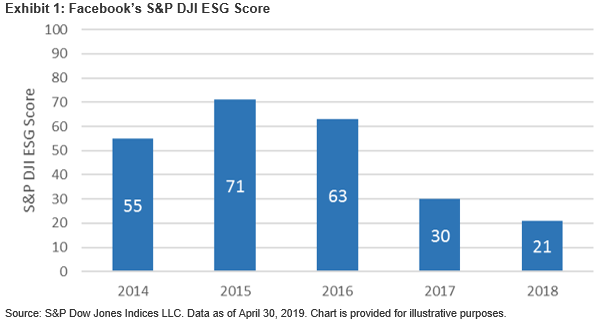
In the case of Facebook, its overall S&P DJI ESG Score was 21, out of a range of 0 to 100, with 100 being best. This low score resulted in Facebook not being selected as part of the approximately 75% of the Media & Entertainment industry group’s market capitalization included in the S&P 500 ESG Index.

Drilling down further, though its environmental score was strong at 82, this sub-score only carried a 21% weight in determining its aggregate ESG score, as environmental issues tend to be less material for tech companies. More impactful were its social and governance sub-scores, which registered at 22 and 6, respectively. These scores carried weights of 27% and 52%, respectively.

The specific issues resulting in these scores had to do with various privacy concerns, including a lack of transparency as to why Facebook collects and shares certain user information. According to SAM, a unit of RobecoSAM, S&P Dow Jones Indices’ collaborator on the S&P 500 ESG Index, its “Media and Stakeholder (MSA) analysis found that Facebook had experienced many privacy issues over the past 24 months, including allowing more than 150 companies access to more users’ personal data than it had disclosed, misuse of personal information (e.g., Cambridge Analytica) and hacking of almost 50 million accounts. These events have created uncertainty about Facebook’s diligence regarding privacy protection, and the effectiveness of the company risk management processes and how the company enforces them. These issues caused the company to lag behind its peers in terms of ESG performance.”

The good news for Facebook and other members of the S&P 500 is that the composition of the S&P 500 ESG Index is reasonably fluid, rebalancing annually. However, the S&P DJI ESG Scores are relative measures.[3] As Facebook’s peers raise the bar in their ESG performance, Facebook will need to do even more to rejoin the ranks of the S&P 500 ESG Index.

[1]   Please see the S&P ESG Index Series Methodology.

[2]   Please see the Dow Jones Sustainability Indices.

[3] Please see FAQ: S&P DJI ESG Scores.


The posts on this blog are opinions, not advice. Please read our Disclaimers.

Four Decades of the Low Volatility Factor

Contributor Image
Hamish Preston

Head of U.S. Equities

S&P Dow Jones Indices

Many financial theories are based on the idea that riskier investments should offer higher returns.  However, there is a bank of evidence – accumulated since the 1970s – showing that less volatile stocks posted higher risk-adjusted returns across a number of time horizons, regions, and market segments, historically.

S&P Dow Jones Indices produces a range of low volatility indices, which serve as benchmarks for low volatility investment strategies, globally.  And as we have shown again and again, low volatility indices have offered upside participation and downside protection, historically.  We recently extended the returns history for the S&P 500 Low Volatility Index back to February 1972, giving us nearly five decades of insight into the factor’s performance and characteristics.  Here are a couple of takeaways from the newly available, back-tested history extension.

Low volatility outperformed in both absolute terms and on a risk-adjusted basis.

Exhibit 1 shows that S&P 500 Low Volatility Index outperformed the U.S. equity benchmark between February 1972 and November 1990, both in absolute terms and on a risk-adjusted basis.  Its higher annualized returns and lower volatility than the S&P 500 resulted in a risk/reward ratio of 0.98, which was similar to the ratio observed during the latter period.  Hence, the S&P 500 Low Volatility’s returns were similarly compensated for the risks being taken in the 1970s and 1980s compared to the period since December 1990.

Upside participation and downside protection were preserved.

Exhibit 2 provides a breakdown of the S&P 500 and the S&P 500 Low Volatility indices’ returns over three horizons: from February 1972 to May 2019, between February 1972 and November 1990, and between December 1990 and May 2019.  Up and down months are based on S&P 500’s monthly total returns.

While both indices posted similar average monthly total returns during the two distinct periods – before Dec. 1990 and since Dec. 1990 – the hit rates show that the low volatility index was slightly better (worse) at beating the S&P 500 during up (down) months before December 1990.  Although this contributed to the low volatility index capturing a greater proportion of S&P 500 returns in the earlier period – it typically captured around 90% of the equity benchmark’s monthly gains and 65% of the S&P 500’s monthly declines – the S&P 500 Low Volatility index still offered upside participation and downside protection.

As a result, the key characteristics of low volatility indices remained intact over the four decades of (back-tested) index history: the S&P 500 Low Volatility Index displayed its usual asymmetric risk/return characteristics of upside participation and downside protection.  Given these characteristics helped the low volatility index to outperform the broad-based market benchmark, the history extension provides further evidence of the potential advantage of focusing on the least volatile constituents in a given market.


The posts on this blog are opinions, not advice. Please read our Disclaimers.