Get Indexology® Blog updates via email.

In This List

Commodities Performance Highlights – April 2019

Increasing Share of BBB-Rated Bonds and Changing Credit Fundamentals in the Investment-Grade Corporate Bond Market

Performance Trickery, part 2

How Is Your Undefined Benefit Plan Going?

Year-End 2018 Canada SPIVA®: Challenging Three Active versus Passive Misconceptions

Commodities Performance Highlights – April 2019

Contributor Image
Fiona Boal

Managing Director, Global Head of Equities

S&P Dow Jones Indices

The commodities bull market party continued in April. The S&P GSCI was up 2.8% for the month and up 18.2% YTD. The Dow Jones Commodity Index (DJCI) was flat in April and up 7.6% YTD, reflecting its lower energy weighting. Petroleum prices, once again, were the standout drivers in the broad commodity index in April, as they have been all year. Agriculture and industrial metal prices dragged on overall performance for the month.

Oil prices continued to surge in April following the decision by the U.S administration to ban all Iranian oil purchases after May 1, 2019, ending sanction exemptions that had been in place for eight nations since last November. The S&P GSCI Petroleum ended the month up 7.0% and up 35.9% YTD. The intensity of supply disruptions in the global oil market, ranging from voluntary output cuts by OPEC and its allies to U.S. sanctions on Iran and Venezuela, have to date overwhelmed any concerns regarding sluggish global economic growth and the expectation of further increases in U.S. oil production. Undoubtedly, investor confidence and risk appetite also contributed to Brent crude oil pushing above USD 75 per barrel during the month for the first time since the end of October last year.

The S&P GSCI Industrial Metals gave back a significant proportion of its first quarter gains during April, leaving it up 4.8% YTD. Aluminum remained the laggard among industrial metals, with underperformance driven by expectations that additional aluminum smelting supply will come on stream over the remainder of the year. The S&P GSCI Aluminum fell 6.5% in April. Nickel prices also declined for the month, with the S&P GSCI Nickel down 6% but still up 14.2% YTD. Despite all the electric vehicle excitement in the nickel market, physical demand remains dominated by the Chinese stainless steel sector. Chinese stainless steel production was strong in the first quarter of the year but is forecast to tail off into the second half of 2019, as thin profit margins prompt producers to scale back.

The yellow metal has now given back almost all of its 2019 gains; the S&P GSCI Gold ended April up only 0.1% YTD. A supportive backdrop for risky assets has certainly curtailed investor interest in so-called safe haven assets. The level of attraction of gold for investors over the remainder of 2019 will likely depend heavily on the arc of U.S. interest rate policy and the strength of the U.S. dollar.

Malaise in the agricultural markets persisted in April. The S&P GSCI Kansas Wheat was the worst-performing constituent in the S&P GSCI YTD, down 21.1%. Higher planted area and favorable growing conditions across the major winter wheat production regions in Russia, Europe, and the U.S. suggests that supply will continue to weigh on the market. In the soybean market, there is growing concern that measureable progress on the U.S.-China trade war front has waned and the outbreak of African swine flu (ASF) in China will greatly reduce demand for U.S. soybeans, albeit temporarily. The S&P GSCI Soybeans was down 4.6% in April and 6.6% YTD.

Across the livestock complex, it was a relatively quiet month, with the S&P GSCI Livestock ending the month down 2.6% while holding onto a small yearly gain (1.2%). In contrast to the impressive recovery in hog prices in March, April proved more sedate, with the S&P GSCI Lean Hogs down 0.2% for the month. Hog market participants are torn between the demand opportunities for U.S. pork presented by the outbreak of ASF in China and the ongoing market access restrictions for U.S. pork in key export markets, as well as the risk of ASF spreading beyond China.

The posts on this blog are opinions, not advice. Please read our Disclaimers.

Increasing Share of BBB-Rated Bonds and Changing Credit Fundamentals in the Investment-Grade Corporate Bond Market

Contributor Image
Hong Xie

Former Senior Director, Global Research & Design

S&P Dow Jones Indices

Since the 2008/2009 financial crisis, BBB-rated bonds have seen significant growth in the U.S. Today, they constitute more than half of the U.S. investment-grade bond market. The increasing share of BBB-rated bonds has dragged the S&P U.S. Investment Grade Corporate Bond Index average credit rating lower, and is accompanied with higher leverage of BBB-rated bond issuers.

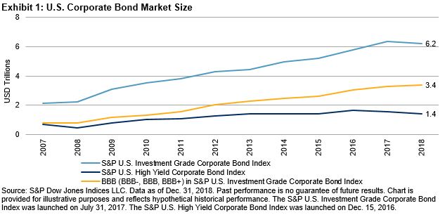
The U.S. corporate bond market has grown significantly since 1980. Issuance paused briefly in 2008 and the growth continued shortly after the global financial crisis. From 2007 to 2018, U.S. investment-grade and high-yield corporate bond markets[1] grew by 194% and 98%, respectively.

During the same time period, growth of BBB-rated bonds (which have the lowest credit rating among investment-grade bonds), outpaced both investment-grade bonds as a whole and high-yield bonds. BBB-rated bonds increased by 330%, or from USD 0.8 trillion to USD 3.4 trillion at year-end 2018 (see Exhibit 1). As of Dec. 31, 2018, BBB-rated bonds made up 55% of the S&P U.S. Investment Grade Corporate Bond Index, compared with 37% in 2007 (see Exhibit 2).

The investment-grade index’s larger share of BBB-rated bonds pulled down its average rating about one notch, as shown in Exhibit 3, from its pre-crisis rating of above A- to currently between A- and BBB+.[2] Most of the rating deterioration happened between August 2011 and June 2012, possibly reflecting the knock-on effects of the of U.S. credit rating downgrade of August 2011, particularly on insurance borrowers. The downward trend of the investment-grade index average rating has continued since late 2012, though at a milder rate.

The credit fundamentals of investment-grade bonds have evolved since 2007. Leverage for BBB-rated bonds as a whole has risen, as measured by net debt/EBITDA and debt/enterprise value (EV). We calculated net debt/EBITDA and debt/ EV for U.S.-domiciled nonfinancial corporate issuers (ultimate parent) of bonds of sizes greater than USD 750 million and maturity of less than 10 years. Our analysis included public companies only.[3]

Since 2007, the net debt/EBITDA ratio for U.S. issuers of investment-grade bonds went up from 1.49x to 2.16x at the end of 2018, while net debt/EBITDA for issuers of BBB-rated bonds rose faster, to an elevated 3.08x. Exhibit 5 illustrates the same up-trend in debt/EV for both investment-grade bond issuers as a whole and for BBB-rated bond issuers in particular.

[1]   The S&P U.S. Investment Grade Corporate Bond Index and S&P U.S. High Yield Corporate Bond Index are used for this blog to approximate the U.S. investment-grade and high-yield corporate bond markets, respectively.

[2]   An equal-paced mapping is applied to convert letter-graded ratings to numerical scales and aggregate ratings on index levels.

[3]   For this analysis, we excluded bonds issued by the GE family because the combination of its volatile credit rating and high leverage ratio makes the index average leverage difficult to read.

The posts on this blog are opinions, not advice. Please read our Disclaimers.

Performance Trickery, part 2

Contributor Image
Craig Lazzara

Former Managing Director, Index Investment Strategy

S&P Dow Jones Indices

Here is a 22-year history of a (hypothetical) actively-managed portfolio and its benchmark:

Results have been decisively mediocre. The portfolio outperformed in only five years out of 22, for a hit rate of 22.7%. Its cumulative return (68.2%) lagged that of the benchmark (74.0%), and its volatility was higher (4.79% vs. 4.25%). The manager’s marketing department will need to work overtime to hold onto this account.

And then a brainstorm occurs (as they occasionally do, in marketing departments). What happens if we look, not at annual performance, but at performance over rolling three-year windows?

The returns haven’t changed, but now, mirabile dictu, the portfolio outperforms in 15 of the 20 possible three-year intervals – 75 percent! The manager’s marketing staff trumpets his consistent outperformance for the last 20 years. And of course, the use of a three-year window adds credibility to the story, since “everyone knows” that you shouldn’t evaluate a manager over a period as short as a single year.

What has happened?

The manager’s five years of good performance were spread out over the 22 years of his history. Though few in number, there were enough good years that most of the three-year intervals contain at least one winner. The rolling average approach lets the good years do triple duty, and can convince the unwary observer that good performance is more frequent than it really is.

The lesson for students of investment performance is clear: Use all the data you have, but be wary of unnecessary aggregation. Aggregated performance data can conceal as much as they reveal.

The posts on this blog are opinions, not advice. Please read our Disclaimers.

How Is Your Undefined Benefit Plan Going?

Contributor Image
Philip Murphy

Former Managing Director, Global Head of Index Governance

S&P Dow Jones Indices

I have probably been receiving them for years, but lately I have noticed opposing position papers in my inbox. Some claim Americans need a revival of defined benefit (DB) plans because of a looming retirement crisis, while others contend that defined contribution (DC) plans are doing great and there is no cause for alarm. DC plans do not define benefits in retirement, and DC accounts are personal. Therefore measuring average performance or aggregated account values, to assess the effectiveness of the DC system has limited utility for an individual. Harry Truman said, “It’s a recession when your neighbor loses his job; it’s a depression when you lose your own.” Similarly, everyone may be doing great in their DC plan, but if you have not saved enough and formulated a prudent withdrawal plan, retirement may feel like a depression. On the other hand, if you are a diligent saver and earn good returns, your retirement lifestyle may be better than it could have been with a DB plan.

In other words, the distribution of outcomes across DC plan participants tends to be more dispersed (has fatter tails) than the distribution of outcomes across DB plan participants—because DB plans define their outcome formulaically. To use a financial analogy, you might say DC plans are more stock-like while DB plans are more bond-like. The key for individuals is recognizing that many DC plans offer enough flexibility to create a more DB-like experience.

The S&P STRIDE Indices measure the performance of such a strategy, although there are many ways to accomplish similar aims depending on the available investments within given DC plans. The vital step to creating a more DB-like experience from available investments within a DC plan is lowering the risk to the future income expected to be drawn from the DC account.

Innovative plan sponsors are aware of the hurdles that participants face, which include not only saving and investing prudently, but also managing an effective withdrawal strategy in retirement. The title of Thomas Heath’s Washington Post column, published April 20, 2019, succinctly expresses the decumulation challenge. “Saving for retirement is hard. Knowing how to spend it down is harder.” Mr. Heath noted some of the challenges of retirement funding by quoting my colleague Howard Silverblatt and contemplating his own situation as he looks ahead to retirement. The DC system is essentially a collection of privately run investment menus from which individuals must handcraft their own retirement funding experience. Each sponsor should recognize the enormity of such a challenge and make income risk management solutions available to their participants. Each individual participant must develop their own situational awareness to inform their decisions about long-term accumulation, income risk management, and ultimately prudent decumulation. Relative to bond-like DB plans, there will be winners and losers. That is the nature of the DC system.

The posts on this blog are opinions, not advice. Please read our Disclaimers.

Year-End 2018 Canada SPIVA®: Challenging Three Active versus Passive Misconceptions

Contributor Image
Hamish Preston

Head of U.S. Equities

S&P Dow Jones Indices

Our Year-End 2018 Canada SPIVA scorecard was released today.  In addition to showing that the majority of Canadian active equity managers failed to outperform their benchmarks, the scorecard’s results provide the opportunity to dispel some common misconceptions.  Here is a brief summary.

1) Higher volatility does not necessarily result in outperformance by active managers

A common view among market participants is that more volatile markets favor active management over passive solutions.  However, in a year when Canadian equities were caught up in global equity gyrations, 75% of Canadian active equity managers underperformed in 2018, as the majority of funds lagged in all categories.

Such underperformance by active managers in more volatile environments is consistent with other international regions, and perhaps speaks to a bias many active managers have for higher-beta stocks.  Indeed, these stocks are expected to be more heavily impacted by market corrections.

2) Smaller-cap stocks may not be better suited to active management

Another popular perception is that small- and mid-cap stocks are inefficient asset classes that are more suited to active management.  However, 80% of all small- and mid-cap managers failed to beat the S&P/TSX Completion (-12.85%) in 2018, suggesting they struggled to navigate the market turbulence as the equity benchmark recorded its worst calendar-year performance in a decade.

In fact, only once in the last eight calendar-year periods did the majority of small- and mid-cap managers beat the S&P/TSX Completion.  Hence, using an index-based approach to access smaller Canadian companies would have been beneficial, historically.

3) Get what you pay for? Not necessarily!

In many walks of life we are told that the cost of something is proportional to its quality.  But while some investors may believe higher-fee funds are illustrative of higher quality managers – as measured by their ability to outperform benchmarks – the data does not reflect this.

Exhibit 3 shows the relative performance of surviving active mutual funds in 2018.  Funds in each category are first grouped according to their expense ratio from the end of December 2017: “Q1” contains the 25% of funds in each category with the lowest expense ratio, while “Q4” contains the 25% of funds in each category with the highest expense ratio.  The average relative return in 2018 is then taken for each group; a negative number indicates the benchmark outperformed.

Quite clearly, higher expense ratios were typically associated with a greater degree of underperformance compared to their benchmarks.  Hence, market participants may find it useful to consider the impact of fees in determining relative performance.


The posts on this blog are opinions, not advice. Please read our Disclaimers.