Get Indexology® Blog updates via email.

In This List

The Passive Canon

It May Not Be Time To Fear Stocks Yet, But Perhaps Real Estate

Explaining Equal-Weight Indices

Performance of Indian Capital Markets in 2017

S&P 500 Companies Issued USD 775 Billion of Bonds in 2017

The Passive Canon

Contributor Image
Jamie Farmer

Former Chief Commercial Officer

S&P Dow Jones Indices

A “canon” refers to the core texts that constitute the doctrine of a specific discipline.  Different faiths hold certain letters and books as canon.  The same can be said of a body of works that shaped and directed a culture.  The original Ghostbusters is, obviously, a canonic comic film and anyone who suggests otherwise should be met with scorn and opprobrium.

While presenting recently to some indexing neophytes, I referenced a few of the important academic works that are foundational in the development of passive investing.  Serendipitously, I discovered during my prep that the English word “canon” comes from the Greek “κανών”, which can be translated as “rule” or “measuring stick”.  And benchmarks and indices are, of course, the measuring sticks for investment performance.   How cool is that?

Here, therefore, are the works from my list.  Seven texts from The Passive Canon

“Portfolio Selection” by Harry Markowitz in The Journal of Finance (1952) – in this ground-breaking work, Markowitz introduces Modern Portfolio Theory (MPT).  He demonstrated that the risk/return profile of a portfolio is determined by combining the expected risk and return of its component securities and their relative correlations.  In doing so, he underscored the benefits of diversification – i.e. that a broad portfolio of holdings can offer greater risk-adjusted returns.

“The Performance of Mutual Funds in the period 1945-1964″ by Michael Jensen in The Journal of Finance (1965) – Jensen offered one of first studies that indicated active fund managers tend to underperform their benchmarks.  This is a forebear of S&P DJI’s SPIVA research, which for 15 years has been the de facto scorecard for the passive vs. active debate.

“Random Walks in Stock Market Prices” by Eugene F. Fama in Financial Analysts Journal (1965) – herein, Fama coined the term “efficient market”.  He conducted extensive research on stock price patterns and their unpredictability, positing that prices quickly incorporate available information.  The underlying notion of this “Efficient Markets Hypothesis” is that it is very difficult, if not impossible, to consistently identify individual securities that are mispriced relative to their intrinsic value.

“A Random Walk Down Wall Street” by Burton G. Malkiel (1973) – Malkiel drew attention to concept of an index fund when he complained that “Fund spokesmen are quick to point out you can’t buy the market averages.  It’s time the public could.”  Three years later, the first mass-marketed index fund was introduced.

“Challenge to judgment” by Paul Samuelson in The Journal of Portfolio Management (1974) – any article that John Bogle credits as his inspiration for the first index mutual fund must be canonical.   Samuelson contended there was insufficient evidence that money managers were skilled enough to produce consistent, market-beating returns.  He mused, “At the least, some large foundation should set up an in-house portfolio that tracks the S&P 500 Index — if only for the purpose of setting up a naive model against which their in-house gunslingers can measure their prowess.”  Shortly thereafter, Mr. Bogle picked up that gauntlet.

“The Loser’s Game” by Charles Ellis in Financial Analysts Journal (1975) – from the paper: “…most institutional investment managers continue to believe, or at least say they believe, that they can and soon will again “outperform the market.” They won’t and they can’t.”  Written 40 years ago, Ellis’s proclamation could have easily come from today’s news.  He points to a few reasons for this, chief among them that the markets are increasingly professional – active managers are trading against one another and both sides of that trade can’t be right.

“The Arithmetic of Active Management” by William Sharpe in Financial Analysts Journal (1991) – Sharpe lays out a clean, elegant construct that explains much of the underperformance of active:  1) Since passive investors own a pro-rata share of the market, active and passive investors in aggregate own the same portfolio; 2) Active management is inherently more expensive than passive management; 3) Therefore, “properly measured, the average actively-managed dollar must underperform the average passively-managed dollar, net of costs.”

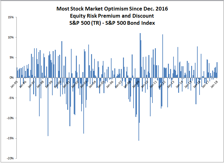
Record-breaking passive asset flows are a very “now” phenomenon, but they’re properly evidence of an incremental advance rather than a seismic shift.  This sampling of works – four of which come from Nobel Prize winners (Markowitz, Fama, Sharpe and Samuelson) – are the incremental contributions that have made it possible.

The posts on this blog are opinions, not advice. Please read our Disclaimers.

It May Not Be Time To Fear Stocks Yet, But Perhaps Real Estate

Contributor Image
Jodie Gunzberg

Former Managing Director, Head of U.S. Equities

S&P Dow Jones Indices

Euphoria seems to be taking over the stock market with frequent stories of new highs – but what is more important is how strong the stock market performance is relative to the bonds.  Month-to-date through Jan. 18, 2018, the S&P 500 is outperforming the S&P 500 Bond Index by 3.8%, the most since Dec. 2016, when the monthly outperformance was 4.5%.  The comparison between the stocks and bonds of the S&P 500 shows market sentiment by calculating the the equity risk premium or discount.

If there is equity outperformance, it is called an equity risk premium, and it indicates that market participants may be more inclined to participate in the upside of stocks rather than to be protected by the limited downside risk of the bonds. Conversely, if the bonds outperform the stocks, it is called an equity risk discount, and it reflects bearish feelings, so market participants may be more likely to capitalize from the bonds.

Not only is the sentiment highly positive now by magnitude, but this is the 5th consecutive month with a positive equity risk premium. It is the first time since the 5 months ending in July 2013 that the S&P 500 outperformed the S&P 500 Bond Index for this long.

Source: S&P Dow Jones Indices

As of now, this market seems fearless and there may be no need to worry yet.  Through history, equity market discounts are observed before big stock market declines.  In 1998, the S&P 500 Bonds outperformed the stocks in May before the S&P 500 top in June.  Similarly in 2000, there was an equity risk discount in July before the August top.  Again in July 2007 before the Oct top that year, and also this pattern was observed in March and April 2011, June and July of 2015 as well as in Sep. and Nov. that year.  If this pattern repeats, an equity risk discount should be observed before a major stock market decline.

Source: S&P Dow Jones Indices

The same concept applied above can be applied for a gauge on sector sentiment by applying the formula to the equivalent S&P 500 sectors and S&P 500 Bond Index sectors.  On average, the market sentiment is slightly positive in every sector, but there is a slightly bigger monthly equity risk discount (measure of pessimism) than equity risk premium (measure of optimism) as measured by the magnitude of equity risk premiums and discounts monthly starting in Jan. 1995.  Materials is the only sector that shows slightly bigger premiums.

Source: S&P Dow Jones Indices. Real estate data is as of Nov. 2001.

Currently, there are 8 of 11 sectors with positive sentiment with pessimism in real estate, telecom and utilities.  While utilities is the most bearish with an equity risk discount of 5.8%, it is less negative than the 6.2% discount last month, but is the biggest consecutive monthly discount since Feb. 2009.  On the other hand, the equity risk discount on real estate has increase from 0.4% last month to 5.5% and is the biggest monthly discount since Aug. 2013.  The concern in this sector is justified by the fear of rising rates, especially in the 10-year that impacts mortgages.

Source: S&P Dow Jones Indices

The posts on this blog are opinions, not advice. Please read our Disclaimers.

Explaining Equal-Weight Indices

Contributor Image
Hamish Preston

Head of U.S. Equities

S&P Dow Jones Indices

Our recent paper explores the characteristics and applications of equal-weight indices from various standpoints. Since a number of equal-weight indices have outperformed their corresponding cap-weighted parents over the past 15 years, one of the most interesting perspectives asks if factors can help to explain the excess returns of equal weight.  Which factors are most relevant? And just how important are they in explaining the returns to equal-weight indices?

Exhibit 1: Annual Outperformance of Equal-Weight Indices

Source: Outperformance in Equal-Weight Indices. Past performance is no guarantee of future results. Chart is provided for illustrative purposes.

Small Size matters, and so does (anti-) Momentum

The most obvious candidate for explaining the performance of equal weight is size. In comparison to cap-weighted indices, equal-weight indices are much less concentrated in the largest constituents and have much greater exposure to smaller stocks. Exhibit 2 shows that whereas the largest 10% of stocks (by market cap) accounted for nearly 50% of the total weight in the S&P 500®, the same stocks accounted for only 10% of the weight in the S&P 500 Equal Weight Index. Conversely, the smallest 40% of stocks accounted for just one tenth of the total weight in the S&P 500, compared to 40% in its equal-weight counterpart.

Exhibit 2: Comparing Constituent Sizes and Cumulative Weights.

Source: Outperformance in Equal-Weight Indices. Past performance is no guarantee of future results. Chart is provided for illustrative purposes.

Another clear choice is momentum. An equal-weight index rebalances by selling relative winners and purchasing relative losers. This is opposite to what a momentum strategy does, and so it is unsurprising that equal-weight indices have generally performed relatively better when their corresponding momentum index has fared relatively poorly, and vice-versa.

Regression Analysis

In order to see how much of the variation in equal-weight indices’ excess returns is accounted for by these two factors, it is possible to run a simple linear regression. Focusing on the S&P 500 Equal Weight Index, we calculated 12-month excess returns each month between September 1995 and December 2017. Doing the same for the S&P 400 MidCap® and the S&P 500 Momentum Index gives the excess returns of our proxies for the size and momentum factors, respectively.

Exhibit 3 summarizes a regression of excess returns to the equal-weight index on the excess returns to the factor proxies. We can clearly see that the signs of the size and momentum coefficients match what we would expect; there is a positive size loading and a negative momentum loading.

Exhibit 3: Regression statistics

Source: S&P Dow Jones Indices. Data from Sep. 1995 to Dec. 2017. Past performance is no guarantee of future results. Table is provided for illustrative purposes.

Using these regression coefficients to derive a predicted 12-month excess returns in the equal-weight index, Exhibit 4 shows that the size and anti-momentum effects captured the majority of the observed variation in S&P 500 Equal Weight performance; there is an R-squared of 0.88.

Exhibit 4: Comparing relative performances of the S&P 500 Equal Weight Index

Source: S&P Dow Jones Indices. Data from Sep. 1995 to Dec. 2017. Past performance is no guarantee of future results. Table is provided for illustrative purposes.

Of course, this factor analysis is not the only way to explain the characteristics and applications of equal-weight indices – as our paper shows, sector and constituent level approaches are also useful. However, market participants would be well-served to account for size and momentum when assessing the performance of equal-weight indices. Such analysis helps to explain why the S&P 500 Equal Weight Index underperformed the S&P 500 in 2017, when momentum was the best-performing S&P 500 factor strategy, and smaller size exposure proved a hindrance.


The posts on this blog are opinions, not advice. Please read our Disclaimers.

Performance of Indian Capital Markets in 2017

Contributor Image
Ved Malla

Associate Director, Client Coverage

S&P Dow Jones Indices

Capital markets in India had a bull run in 2017 and gave exponential returns across size, segments, and sectors. In this blog, we will analyze how capital markets in India have performed in 2017.

Exhibit 1 and 2 showcase returns for India’s four leading size indices in 2017. 

Exhibit 1: One-Year Absolute Returns of Size Indices
INDEX INDEX VALUE ON DEC. 31, 2016 INDEX VALUE ON DEC. 31, 2017 ONE-YEAR ABSOLUTE RETURN (%)
S&P BSE SENSEX 37,472 48,550 29.56
S&P BSE Large Cap 3,707 4,877 31.55
S&P BSE Mid Cap 13,938 20,893 49.90
S&P BSE Small Cap 13,936 22,408 60.80

Source: S&P Dow Jones Indices LLC. Data from Dec. 31, 2016, to Dec. 31, 2017. Past performance is no guarantee of future results. Table is provided for illustrative purposes.

Exhibit 2: Index Total Returns

Source: S&P Dow Jones Indices LLC. Data from Dec. 31, 2016, to Dec. 31, 2017. Index performance based on total return in INR. Past performance is no guarantee of future results. Chart is provided for illustrative purposes.

From Exhibits 1 and 2, we can see that all four indices performed well, and returns have been promising for large-, mid-, and small-cap segments. The returns of the small- and mid-cap segments have been better than the large-cap segment. The S&P BSE SmallCap and S&P BSE MidCap posted one-year absolute returns of 60.80% and 49.90%, respectively, while the S&P BSE LargeCap and S&P BSE SENSEX returned 31.55% and 29.56%, respectively.

Exhibits 3 and 4 showcase returns for the 11 leading sector indices for India in 2017. 

Exhibit 3: One-Year Absolute Returns in Sector Indices
INDEX INDEX VALUE ON DEC. 31, 2016 INDEX VALUE ON DEC. 31, 2017 ONE-YEAR ABSOLUTE RETURN (%)
S&P BSE Realty 1,357 2,813 107.24
S&P BSE Basic Materials 2,722 4,298 57.90
S&P BSE Consumer Discretionary 3,286 5,116 55.66
S&P BSE Telecom 1,175 1,775 51.10
S&P BSE Finance 4,781 6,892 44.15
S&P BSE Energy 3,671 5,272 43.62
S&P BSE Industrials 3,174 4,419 39.24
S&P BSE Fast Moving Consumer Goods 9,967 13,283 33.26
S&P BSE Utilities 2,111 2,796 32.48
S&P BSE Information Technology 12,233 13,859 13.29
S&P BSE Healthcare 16,131 16,309 1.10

Source: S&P Dow Jones Indices LLC. Data from Dec. 31, 2016, to Dec. 31, 2017. Past performance is no guarantee of future results. Table is provided for illustrative purposes.

Exhibit 4: Index Total Returns 

Source: S&P Dow Jones Indices LLC. Data from Dec. 31, 2016, to Dec. 31, 2017. Index performance based on total return in INR.  Past performance is no guarantee of future results. Chart is provided for illustrative purposes.

From Exhibits 3 and 4, we can see that most of the sector indices have posted promising returns. The S&P BSE Realty had the best return in 2017, with 107.24%, followed by the S&P BSE Basic Materials, S&P BSE Consumer Discretionary, and S&P BSE Telecom, which had one-year absolute returns of 57.90%, 55.66%, and 51.10%, respectively. The S&P BSE Information Technology and S&P BSE Healthcare were the worst-performing indices in 2017, with absolute returns of 13.29% and 1.10%, respectively.

To summarize, we can say that the bulls had their way in 2017, and indices across various size, segments, and sectors have given exponential returns.

The posts on this blog are opinions, not advice. Please read our Disclaimers.

S&P 500 Companies Issued USD 775 Billion of Bonds in 2017

Contributor Image
Jason Giordano

Director, Fixed Income, Product Management

S&P Dow Jones Indices

2017 was the sixth consecutive year of record U.S. corporate bond issuances, as companies continued to take advantage of the accommodative environment created by low interest rates and strong investor demand. As measured by the S&P 500® Bond Index, 325 companies came to market for a total of over USD 775 billion in 2017.

Approximately 65% of issuances were refinancings, with corporations looking to lock in lower interest rates and extend maturities. Of the nearly USD 800 billion of bonds to enter the index in 2017, 20% of issues were 30-year term deals, lifting the weighted average maturity of the index close to its 2015 peak (see Exhibit 1). The remaining USD 270 billion of net new issuance propelled the market value of the S&P 500 Bond Index to over USD 4.5 trillion by the end of 2017—an increase of 2.0 trillion since 2011 (see Exhibit 1).

As expected, financial corporations were the top issuers in 2017; companies in the information technology and consumer discretionary sectors filled out the top three. Combined, companies from these three sectors accounted for more than 50% of all debt issuances to enter the index in the year. Issuers from all 11 GICS® sectors were represented (see Exhibit 2).

The 10 largest non-financial issuers accounted for over USD 180 billion of activity in 2017. Activity related to mergers and acquisitions was a predominant driver of bond issuance, as 6 of the top 10 issuers were involved in some form of M&A in 2017. Share buybacks and dividends were also a popular use of proceeds. Both Apple and Microsoft issued bonds to help fund their expanded share repurchase programs (see Exhibit 3).

For more information on the S&P 500 Bond Index, please visit https://spindices.com/indices/fixed-income/sp-500-bond-index.

The posts on this blog are opinions, not advice. Please read our Disclaimers.