Get Indexology® Blog updates via email.

In This List

Asian Fixed Income: China Was the Worst-Performing Country in the Pan Asian Bond Market

Carbon Footprint Reporting in Mexico

The Trump Rally – A Macroeconomic Perspective

Does Value Enhance Quality Investing in China's A-Share Market?

A Study of the Classics – Part 2

Asian Fixed Income: China Was the Worst-Performing Country in the Pan Asian Bond Market

Contributor Image
Michele Leung

Former Director, Fixed Income Indices

S&P Dow Jones Indices

China’s lackluster performance has made it the worst-performing country in the Pan Asian bond market this year.  While China has been among the top three outperforming regions in the past few years, it has significantly lagged its peers in 2017.  Indonesia, as represented by the S&P Indonesia Bond Index, rose 12.6% YTD as of Nov. 10, 2017, while India (represented by the S&P BSE India Bond Index) gained 4.8% in the same period (see Exhibit 1).

The widening access that Bond Connect announced in July brought positive momentum to the market and helped recover the losses from May.  However, onshore bonds are still in the negative territory compared with this time in 2016.

In fact, sell-offs in China onshore bonds continued to make to the headlines as the deleveraging campaign and liquidity concern lingered.  As represented by the S&P China Bond Index, the one-year total return was down 1.75% (see Exhibit 2).

The S&P China Government Bond Index dropped 2.35% during the same period, underperforming the S&P China Corporate Bond Index.  According to the S&P China Bond Index, government bonds represented 68% of the overall market.  There are reports that market participants are switching to short-term bank debts, as they tend to offer better yields and liquidity.

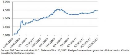
Despite its performance, China bond yield is attractive, considering its relatively short duration.  As of Nov. 10, 2017, the yield-to-worst of the S&P China Bond Index was 4.5%, which widened 150 bps over the 12-month period, with a modified duration of 3.86.

Exhibit 1: Total Return of the S&P Pan Asia Bond Indices in 2017

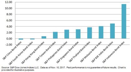
Exhibit 2: Total Return of the S&P China Bond Index

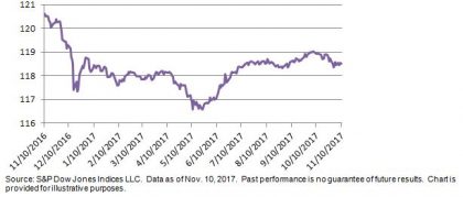
Exhibit 3: Yield-to-Worst of the S&P China Bond Index

The posts on this blog are opinions, not advice. Please read our Disclaimers.

Carbon Footprint Reporting in Mexico

Contributor Image
Maria Sanchez

Director, Sustainability Indices Product Management, Latin America

S&P Dow Jones Indices

At the most recent National AFORES convention, held jointly with FIAP International in Mexico City at the end of October 2017, Latin American institutional investors continued to show increasing interest in ESG-related topics and this was evident in the conference agenda.  In particular, the participants spoke about the following topics.

  • Impact reporting: The ability to measure and quantify the sustainability of their current investment portfolios.
  • Relevant benchmarking: Incorporating relevant benchmark indices for comparison.
  • ESG implementation: Ensuring ESG implementation into the multi-step investment process and quantifying the benefits of doing so.

As highlighted in a recent research paper, Stepping Up to Carbon Transparency, S&P Dow Jones Indices has been at the forefront of sustainability-related educational efforts.  We have recently started to report sustainability metrics as part of an index’s characteristics to support and promote ESG transparency.

In this blog, we use the “carbon footprint”[1] measurement provided by Trucost to understand how much carbon reporting has evolved in Mexico, using the country’s headline equity index, the S&P/BMV IPC, as an example.  Trucost measures the carbon footprint as the aggregation of operational and first-tier supply chain carbon footprints of index constituents per USD 1 million invested.

In 2007, there were only six IPC companies with information on their carbon footprint, of which 100% was estimated by Trucost using sector-related information.  Reflecting the growing market’s needs and interest, the carbon footprint reporting of this local index has increased from 17% in 2007 to nearly 100% in September 2017.  It is important to note that the coverage has not only increased, but the method of obtaining the carbon data has also evolved (see Exhibit 1).

At the start of 2007, 100% of the carbon data was estimated, whereas after 10 years, by September 2017, 14.7% of the companies were fully disclosing their carbon information.  More specifically, 38.24% was estimated from companies’ partial environmental and financial disclosures, 8.82% of the companies in the index were estimated using previous disclosures, and 38.24% was estimated using the sector breakdown.  This is a clear indication that Mexican companies are recognizing the importance of environmental data disclosure in financial reporting.

Currently, carbon data is available for 34 of the 35 companies in the S&P/BMV IPC.  When the data is broken down by sectors, we can see that some sectors, due to the nature of their businesses, have substantial carbon footprints compared to others.  As a comparison, we stack up the relative carbon intensity of the sectors in Mexico to those of the U.S., as measured by the S&P 500® (see Exhibit 2).

The top three carbon-intensive sectors in Mexico, on average, are utilities, materials, and industrials.  Utilities comes in first place with 2,394 tons of CO2e emissions per USD 1million invested, even though the sector only represents less than 2% of the S&P/BMV IPC.  Materials comes in second, with roughly 1,329 of CO2 emissions per USD 1 million invested on average, while accounting for roughly 17.52% of its benchmark as of Sept. 29, 2017.  Industrials has about 613 tons of CO2 emissions per USD 1 million invested, on average, with the sector representing about 11.359% of its benchmark.

In a follow-up blog, we will provide a time-series analysis of the carbon footprint of companies that are part of the S&P/BMV IPC to highlight how the Mexican market has evolved.

[1]   Operational and first-tier supply chain greenhouse gas emissions.  For more information, please visit: www.spdji.com/esg-metrics.

The posts on this blog are opinions, not advice. Please read our Disclaimers.

The Trump Rally – A Macroeconomic Perspective

Contributor Image
Phillip Brzenk

Managing Director, Global Head of Multi-Asset Indices

S&P Dow Jones Indices

As noted in a previous blog, The Trump Rally – One Year Later, the Domestic Revenue Portfolio underperformed the foreign revenue portfolio during the one-year period since the 2016 U.S election.  We showed that currency movements may have negatively impacted the performance of the Domestic Revenue Portfolio.

To better understand the currency risk of the portfolios beyond tracking relative performance and currency movements, we use the Northfield U.S. Macroeconomic Equity Risk Model to breakdown total portfolio risk.  This model gives us the ability to understand the macroeconomic risk exposures, including changes in the value of the U.S. dollar, of a portfolio.  Exhibit 1 breaks down the total risk (in variance terms) of the two portfolios between stock specific risk and systematic/factor risk.

The Foreign Revenue Portfolio had significantly higher stock specific risk than the Domestic Revenue Portfolio, which means the percentage of total risk that can be explained by U.S. macroeconomic factors present in the model is lower.

The highlighted factor in Exhibit 1, Exchange Rate USD, indicates how much of the total risk is caused by changes in USD value relative to other major trade currencies.  We can see that the currency risk of the Foreign Revenue Portfolio (7.58%) was much higher than the Domestic Revenue Portfolio (1.26%), which indicates that changes in USD will have a higher impact on the foreign portfolio than the domestic portfolio.  In other words, the Foreign Revenue Portfolio is more sensitive to weakening and strengthening of the U.S. dollar than the Domestic Portfolio.

As such, we look at the factor exposures and how those exposures in turn have affected the portfolios.  These figures show how the individual factors have performed over the 12-month period, as well as if the active factor exposures of the portfolios have contributed positively, or negatively, to total return.

For the 12-month period, the average monthly return for the Exchange Rate USD factor was -0.44%, meaning that holding the U.S. dollar versus holding other major trade currencies would negatively contribute to total return.  Relative to the S&P 500, the Foreign Revenue Portfolio is observed to have negative active exposure to the currency factor, while the Domestic Portfolio has positive active exposure.  The active exposures of the portfolios show that relative to the S&P 500, 1) the foreign portfolio is negatively related to changes in the USD value, and 2) the domestic portfolio is positively related to the USD value.  These results confirm the potential relationship we saw in the previous blog post.  The compounded factor impact shows the result of the active portfolio exposures to total return.

In a forthcoming blog, we will look beyond macroeconomic risk to sector-level performance attribution analysis of the portfolios.


[1]   The model provides a monthly-based analysis; therefore the start date is Oct. 31, 2016, as opposed to Nov. 8, 2016.

[2]   The model provides a monthly-based analysis; therefore the start date is Oct. 31, 2016, as opposed to Nov. 8, 2016.

The posts on this blog are opinions, not advice. Please read our Disclaimers.

Does Value Enhance Quality Investing in China's A-Share Market?

Contributor Image
Liyu Zeng

Director, Global Research & Design

S&P Dow Jones Indices

As discussed in my previous blog, quality investing has gained attraction in China, as high-quality stocks recorded remarkable performance in the first nine months of 2017.  As a result, the risk of paying too much for high-quality stocks has become a concern.  To address the issue, on Sept. 29, 2017 we launched the S&P China A-Share Quality Value Index, which is designed to measure the performance of the top 100 high-quality stocks with reasonable valuation, (see Exhibit 1).[1]

Historically, the S&P China A-Share Quality Value Index has outperformed the S&P China A BMI (the benchmark) on an absolute and risk-adjusted basis.  It is important to note that, after adding the value screen, the S&P China A-Share Quality Value Index recorded higher absolute and risk-adjusted returns with slightly higher return volatility and bigger drawdown than the hypothetical S&P China A-Share Quality 200 Portfolio without an additional value screen.[2]  This demonstrated the benefit of using the value screen to exclude those high-quality stocks with expensive prices (see Exhibit 2).

From June 30, 2006, to Sept. 29, 2017, the S&P China A-Share Quality Value Index outperformed the benchmark and the S&P China A-Share Quality 200 Portfolio in 9 and 8 out of 12 periods, respectively.

Exhibit 3 shows the performance of quality portfolios in up and down markets.  Compared to the quality portfolio without value screen, the S&P China A-Share Quality Value Index had more balanced performance with more than 50% of win ratios and positive excess returns in both up and down markets, without much sacrifice in downside protection.

Exhibit 4 shows the performance of the S&P China A-Share Quality Value Index versus the hypothetical quality portfolio and value portfolio[3] across different China A-share equity market cycle phases, defined with respect to the S&P China A BMI’s (BMI’s) performance trends (three bearish and four bullish cycle phases).  The S&P China A-Share Quality Value Index outperformed the benchmark in six out of seven market cycle phases, while the value portfolio and quality portfolios only outperformed the benchmark in five and four out of the seven phases, respectively.  With the aid of the value screen, the S&P China A-Share Quality Value Index exhibited more consistent outperformance than purely value or quality screened/weighted portfolio.

As we expected, the S&P China A-Share Quality Value Index exhibited cheaper valuation with some sacrifices in quality features (see Exhibit 5).  It is interesting to note that it had higher dividend yield than the quality portfolio without additional value screen, due to the lower valuation of stocks.

Historically, most of the constituents of the S&P China A-Share Quality Value Index were from the industrials and consumer discretionary sectors.  Compared to the broad China A-share market, most of the time, it was overweight in consumer discretionary and underweight in real estate and financials.

[1]   For detailed index methodology, please see https://spindices.com/indices/strategy/sp-china-a-share-quality-value-index-cny.

[2]   The S&P China A-Share Quality 200 Portfolio is a hypothetical portfolio that consists of 200 high-quality stocks before the value screening, with eligible criteria, weighting method, and rebalancing schedule following the S&P China A-Share Quality Value Index methodology.

[3]  The S&P China A-Share Enhanced Value Portfolio was constructed based on the same parent indices with the same size and liquidity criteria.  The top 100 stocks with the highest value scores in the eligible universe are selected, subject to 20% rebalance buffer by number of stocks.  The value score is measured as the average z score of earnings-to-price, sales-to-price, and book value-to-price ratios.  Constituents are weighted by score-tilted market cap, subject to security and sector constraints such that the weight of each security is between 0.05% and the lower of 5% and 20 times its float-adjusted market-cap weight in the eligible universe, and the maximum weight of any given GICS sector is 40%.  The portfolio is rebalanced semiannually on the third Friday in June and December.

The posts on this blog are opinions, not advice. Please read our Disclaimers.

A Study of the Classics – Part 2

Contributor Image
Jamie Farmer

Former Chief Commercial Officer

S&P Dow Jones Indices

This scene came to mind after I recently posited a few indexing milestones.

My intent was to opine on watershed moments in design, those individual indices that marked advancement, a change in approach, or increased utility.  Almost immediately, I received “Yeah, but what about…?” communiques.

So forthwith I complete my all-too-brief, original list with the expectation of eventually correcting a few glaring omissions.

Dow Jones Sustainability Index (1999): Today, we take for granted that ESG—environment, social, and governance factors—are important considerations for corporations and market participants alike.  In 1999, however, the concept was nascent at best.  The Dow Jones Sustainability Indices were the first benchmarks to focus exclusively on companies that adhered to “best-in-class” sustainable practices.  Since that time, the S&P ESG suite has developed into a fast-growing and comprehensive framework that includes such dynamics as carbon emissions, environmental impact, corporate citizenship, and human capital development, among others.  As ESG matures as an investing discipline, it has become clear that individual perceptions can vary on highly granular dimensions, so such a framework is necessary in order to construct indices to meet bespoke needs.

TIE – Dow Jones U.S. Select Dividend Index (2003) and S&P 500® Dividend Aristocrats® (2005): Since 1926, dividends have contributed approximately one-third of the total return of the S&P 500.  Few, then, would suggest that investing with an eye toward optimizing that income was uncharted territory.  In 2003, however, President George W. Bush signed tax law changes that offered more favorable treatment of dividends and the stage was set for the introduction of the Dow Jones U.S. Select Dividend Index.  With components weighted according to indicated dividend yield, “Select Div” pioneered the category of dividend indexing and is often considered among the first wave of smart beta indices.  Two years later, the S&P 500 Dividend Aristocrats offered a different take on dividend exposure by encapsulating shares with consistent records of increasing payouts.  These two index series remain early testimony to the idea that there are always catalysts for new index development.

S&P 500 Low Volatility Index (2011): Finally, if one accepts that weighting components according to dividend yield can be considered the earliest appearance of smart beta, then the S&P 500 Low Volatility Index truly established the concept in the indexing firmament.  This index was the first genuinely successful entry into the factor-based space, which seeks to amplify or attenuate the drivers of investment performance (cap size, value versus growth, momentum, etc.).  At its heart is the somewhat counterintuitive, though heavily documented, notion that lower volatility stocks can offer superior risk-adjusted returns over time.  By indexing what was once solely the province of quantitative active managers, these strategies democratized and lowered the cost of access for all market participants.

So, there you have it—seven major milestones on the timeline of index development.  Invitation to (further) dissent in 3, 2, 1…go.

The posts on this blog are opinions, not advice. Please read our Disclaimers.