Much has been written about the persistence of manager performance. The S&P Persistence Scorecard attempts to track the status of top quartile and top half managers over specified subsequent periods. Over the years, we have received a fair amount of inquiries from our readers regarding the computation, methodology, and interpretation of results. This blog attempts to address some of the recurring questions and explore some unique features of the scorecard.
The first table in the scorecard shows the headline “performance persistence” figures. The table uses non-overlapping, one-year periods and is reported over consecutive three- and five-year periods, showing data for the top quartile and top half. During each one-year period, all of the funds are ranked by the trailing one-year return. They are then labeled as either being “top quartile/half” or “not included in top.” The base year, against which all subsequent years are calculated, comprises the funds that we labeled as being in the top quartile over the earliest one-year period.
Exhibit 1 shows this number to be 568 for All Domestic Funds. Reading the table left to right, we see that 568 * 34.86 / 100 = 198 funds were in both the top quartile for the base year and the subsequent year. Furthermore, we report that 568 * 1.94 / 100 = 11 funds were in the top quartile in all three one-year periods.
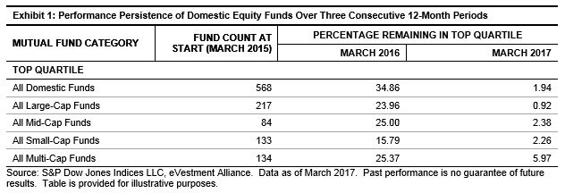
Exhibit 2 shows the same performance persistence over five consecutive periods. It is important to illustrate this longer time horizon for two reasons. First, it is generally harder than random chance to remain in the top quartile the further out in time we study. Second, the most recent results display a particular intricacy; namely, as of March 2017, two funds persisted in All Domestic Funds while no funds accomplished such a feat in the sub asset level categories. The question then arises: shouldn’t the number of funds on the asset class level at the end of the period aggregate to the All Domestic Funds category? The answer is no for reasons we will outline below.

The only additive part of the performance persistence is that the sub asset class category counts should add up to the All Domestic Fund category for the base year. All subsequent years are subject to an interaction effect that makes them not directly comparable. For example, suppose that all of the unique large-cap funds return 20%-30% each year. Next, suppose that all of the unique mid-, small-, and multi-cap funds return 0%-5% each year. Within the large-cap category, it could be the case that no single fund is in the top quartile each consecutive year (displayed in Exhibit 2 as 0% as of March 2017).
A similar result is seen for the remaining asset class categories. Now, when we combine the universes to examine All Domestic, there will be 100% persistence. This is because in our simple example, all of the large-cap funds have a return strictly greater than the rest of the universe. This implies that the top quartile will be approximately the large-cap universe year after year, thus leading to persistence even though the individual categories had none.
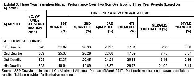
The final table format is a transition matrix. This tracks the movement of funds between quartile/half buckets through time. From the latest results, as shown in Exhibit 3, we see that of the 528 funds that were in the top quartile, only 31.82% of them managed to repeat that performance over the subsequent non-overlapping period. Similarly, 21.02% of the bottom bucket disappeared and 8.14% changed their mandate.
With this blog, we attempt to lay out the key steps in interpreting the scorecard so that the results can lead to meaningful educational conversations about manager performance. These charts, along with the full S&P Persistence Scorecard display the difficulty that fund managers face in trying to repeat their success consistently.
The posts on this blog are opinions, not advice. Please read our Disclaimers.