Get Indexology® Blog updates via email.

In This List

How Much Is Your Social Security Benefit Worth?

Alaska Healthcare Profiled

Rieger Report: State G.O. municipal bonds have underperformed

Asian Fixed Income: Continuing Rally for Indonesian Bonds

April: A Testing Month for VIX Traders

How Much Is Your Social Security Benefit Worth?

Contributor Image
Peter Tsui

Former Director, Global Research & Design

S&P Dow Jones Indices

Social Security benefits are the gold standard of retirement income.  As Nobel Laureate Robert Merton commented in his article “The Crisis in Retirement Planning,” published in the Harvard Business Review (July/August 2014): “Ask someone what her pension is worth and she will reply with an income figure: ‘two-thirds of my final salary,’ for example.  Similarly, we define Social Security benefits in terms of income.”  In this blog, I will turn it around and try to put a price tag on this stream of retirement income.

This may be timely, as anyone who has read their Social Security statement lately might agree.  As of March 2017, the Social Security Administration includes the following message in the statement received by current and prospective social security benefit recipients: “Your estimated benefits are based on current law.  Congress has made changes to the law in the past and can do so at any time.  The law governing benefit amounts may change because, by 2034, the payroll taxes collected will be enough to pay only about 79 percent of scheduled benefits.”

If we wanted to provide for ourselves the potential shortfall of 21% in our social security benefits in 2034, how much would it cost us?

To answer this question, we consider that the current cost of a single life income annuity paying USD 1,000 per month is around USD 185,000.  Since social security benefits are adjusted for inflation, the cost of such a single life income annuity would be higher.  Without knowing the pattern of inflation changes over time, most annuity providers assume a 2% annual increase in monthly incomes.  With a 2% annual increase option, the current cost of this single life income annuity is about 23% higher, at USD 227,300.

The next step is to determine the monthly social security benefits one would receive.  Assuming the retiree is currently receiving USD 2,500 per month, the projected 21% reduction by 2034 would mean roughly USD 500 less per month.  Thus, since we know it would cost the retiree USD 227,300 to get USD 1,000 per month for life with a 2% annual increase, in order to replace USD 500 a month, the retiree would need to come up with one-half of USD 227,300, or USD 113,650, to get back up to the USD 2,500 monthly income, in current U.S. dollars.

Looking at this another way, if securing USD 1,000 per month costs USD 227,300 now, that means the value of the USD 2,500 monthly income in social security benefits would be worth about USD 568,255 in current U.S. dollars.

The posts on this blog are opinions, not advice. Please read our Disclaimers.

Alaska Healthcare Profiled

Contributor Image
Glenn Doody

Vice President, Product Management, Technology Innovation and Specialty Products

S&P Dow Jones Indices

According to an April 6, 2017, CNN story titled “High-cost Alaska sits in the eye of health care reform storm,” Alaska currently has the highest healthcare costs of any U.S. state.[1]  In this first profile edition, we look at the state of Alaska and compare just how different the cost profile is for people living in the far North.

To start, we look at the state on a per member per month (PMPM) basis.  As seen in Exhibit 1 and described in the CNN story, healthcare costs are significantly higher in Alaska than any other state in the U.S.  In fact, on average, each Alaska resident spends about USD 525 per month on healthcare as of October 2016, versus a cost of just USD 366 nationally—a USD 160 a month difference, or 43% more.  One could argue that the Affordable Care Act (ACA) is a major reason for this huge cost difference.  However, as Exhibit 1 illustrates, this difference has existed long before the introduction of the ACA.

There Is Hope

There is hope for those in Alaska.  Between August 2015 and October 2016, the increase in healthcare cost trends across the state declined rapidly (see Exhibit 2).  This decline was much more rapid than elsewhere in the country.  In fact, during that same period, change in cost trends in the state of New York continued to increase, peaking at a rate of over 8%.  Even the national trend, which dropped from a high of 5.51% to 4.40%, was not close to the decline in cost increases from 8.84% to 1.71% that we saw in Alaska.  Since October 2014, Alaska has been trending flat.  The average PMPM cost in Alaska between October 2014 and October 2016 was just USD 550, with costs starting at USD 577 per month and ending at USD 525 per month.

[1] “High-cost Alaska sits in the eye of health care reform storm.”

The posts on this blog are opinions, not advice. Please read our Disclaimers.

Rieger Report: State G.O. municipal bonds have underperformed

Contributor Image
J.R. Rieger

Former Head of Fixed Income Indices

S&P Dow Jones Indices

Overall, general obligation bonds have underperformed revenue bonds over the last five years  of low rates.   State general obligation bonds have been the sector that is holding back returns as the lower yield and shorter duration characteristics of these bonds have resulted in muted returns in the up market.

While revenue bonds have a larger foot print by par amount outstanding in the municipal bond market, general obligation bonds remain an integral component of the financing of infrastructure.

Chart: Par amount, stated in billions, of municipal bonds tracked in each index:

Source: S&P Dow Jones Indices, LLC. Data as of April 7, 2017. Chart is provided for illustrative purposes. It is not possible to invest directly in an index. Past performance is no guarantee of future results.

Table: Select general obligation and revenue bond indices, their yields, returns and durations:

*Yield represented is Yield to Worst (YTW). Source: S&P Dow Jones Indices, LLC. Data as of April 7, 2017. Table is provided for illustrative purposes. It is not possible to invest directly in an index. Past performance is no guarantee of future results.

More information on the characteristics of each index can be found on:  www.spindices.com or by clicking on the index names below.

S&P Municipal Bond State General Obligation Index

S&P Municipal Bond Local General Obligation Index

S&P Municipal Bond Revenue Index

Comments and additional perspectives are welcome.  Please also join me on LinkedIn


The posts on this blog are opinions, not advice. Please read our Disclaimers.

Asian Fixed Income: Continuing Rally for Indonesian Bonds

Contributor Image
Michele Leung

Former Director, Fixed Income Indices

S&P Dow Jones Indices

Indonesian bonds, as tracked by the S&P Indonesia Bond Index, gained 5.59% YTD as of April 5, 2017. This is a continuation of the strong growth trend observed in 2016, when the index increased 13.7% owing to the Bank Indonesia’s cut in interest rates on six occasions throughout the year. Indonesia has been one of the top three best-performing countries tracked by the S&P Pan Asia Bond Index over the past three years. Both equities and bonds have been performing well on the basis of solid economic fundamentals.

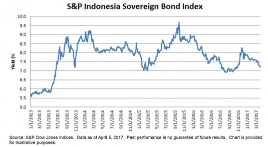
Indonesian government bonds have outperformed corporate bonds over the past year. The S&P Indonesia Sovereign Bond Index was up 6.18% YTD and 11.90% over the one-year period, while its yield also came down 72 bps from 7.88% in December 2016, see exhibit 1.

The S&P Indonesia Corporate Bond Index returned 4.14% YTD and 10.89% over the one-year period. Among the corporate bonds, the utilities sector was the best performer, up 5.38% YTD and 13.86% over the past year; notable contributors were Indosat, TELKOM, and PLN.

The yield-to-maturity of the S&P Indonesia Bond Index tightened 80 bps to 7.07% YTD, and it remains the highest yielding country within Pan Asia YTD, followed by the 7.11% yield of the S&P BSE India Bond Index. As the Indonesian and Indian bonds offer higher yields than their Asian peers which averaged at 4%, they continue to grow in popularity among global investors.

Exhibit 1: The Yield-to-Maturity of the S&P Indonesia Sovereign Bond Index

The posts on this blog are opinions, not advice. Please read our Disclaimers.

April: A Testing Month for VIX Traders

Contributor Image
Berlinda Liu

Former Director, Multi-Asset Indices

S&P Dow Jones Indices

Shorting VIX® was among the top strategies in the past year.  XIV and SVXY both went up over 50% in Q1 2017 (~15% in March alone), almost doubled in the past six months, and returned ~180% over the past 12 months (see Exhibit 1).  However, the declining VIX spot level can only explain part of their performance.

Both XIV and SVXY consistently provide a short exposure to VIX futures, not the spot VIX index.  They are exchange-traded products that track the S&P 500® VIX Short Term Futures Inverse Daily Index, which, as its name suggests, seeks to track the inverse of the S&P 500 VIX Short Term Futures Index.

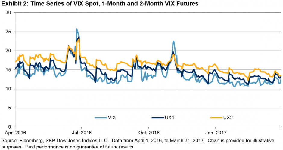
The S&P 500 VIX Short Term Futures Index takes long positions in the first- and second-month VIX futures contracts.  A proportion of the first-month contract (ticker UX1) is rolled to the second month (ticker UX2) every day to maintain a constant 30-day maturity.  As the second-month futures are usually more expensive than the first month (see Exhibit 2), this long VIX futures exposure usually incurs a loss from the roll (the “roll cost”), while the inverse of this exposure, as provided by the S&P 500 VIX Short Term Futures Inverse Daily Index, usually generates a profit from the roll (the “roll yield”).

The roll cost of the S&P 500 VIX Short Term Futures Index may seem small on daily basis, but in aggregate, it causes the index to go down over a long-term horizon.  In the 12-month period (253 trading days), positive roll cost occurred on 247 days (97.63%).  This is the main driver behind the enormous growth of inverse VIX futures products.

However, April 2017 will be an interesting month for VIX traders for a number of reasons.

First of all, the spread between the first-month and second-month VIX futures contracts has narrowed (see Exhibits 2 and 3).  In addition to the reduction in roll yield of the short VIX futures exposure, the flattening of the VIX term structure usually indicates anxiety being built up in the market.  In a distressed market, the VIX term structure may even become inverted, when the first-month futures become more expensive than those of the second month.

Secondly, the spread between the VIX spot and the 30-day realized volatility of the S&P 500 has tightened.  As the benchmark of implied volatility, VIX is expected to be higher than the 30-day realized volatility of SPX.  A tightened spread often indicates that the market is complacent and a VIX spike is on the way.  When VIX spikes, the inverse VIX futures products usually incur losses.

Finally, risk coming from outside of the U.S., including the upcoming French election, should not be overlooked.  As illustrated in Exhibit 5, the term structure of VSTOXX, a VIX-like index that measures the 30-day implied volatility of the Euro Stoxx 50 index, became inverted over the month of March 2017.  As the European market is getting ready for the April 23, 2017 election, market participants in the states might need to fasten their seatbelts.

The U.S. equity market was resilient after Brexit and the U.S. presidential election, but how it will respond to the results of the French election is yet to be revealed.  April could be an interesting month for all VIX investors, on the long or short side of the trade.

The posts on this blog are opinions, not advice. Please read our Disclaimers.