Get Indexology® Blog updates via email.

In This List

The Dollar and Returns

The Long End of the Curve Pays Off in November

Asia Fixed Income: Post the Rate Cut by PBoC

The Simple Economics of Oil

A Santa Claus Rally? Yes, Virginia...

The Dollar and Returns

Contributor Image
David Blitzer

Former Managing Director and Chairman of the Index Committee

S&P Dow Jones Indices

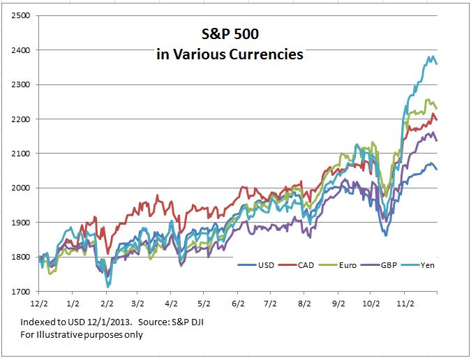
The US dollar has strengthened against most other currencies in recent months.  Over the last year the dollar is up 5% against the British pound, 7% versus the Canadian dollar, 8% over the Australian dollar, 9% ahead of the euro and 16% against the yen.  Movements this big shouldn’t be ignored – foreign investors with funds tracking the S&P 500 are doing much better than their domestic American counter parts while Americans in funds tracking some foreign indices are losing ground because of the dollar’s renewed strength. Further, if it seems some analysts following oil in other countries aren’t as excited as analysts in the US, the answer also is the dollar: Brent crude prices are down about 36% for dollar-based purchasers but only 24% for those based in yen.

The first chart compares the performance in the last 12 months of an investment tracking the S&P 500 for investors in various currencies.  Tracking the S&P 500 in any of the other currencies than the dollar came out ahead.

The second chart shows how US dollar-based investors would have missed out on the recent surge in the S&P TOPIX 150 due to the yen’s weakness.  The gains of the last month or two would have been lost in the translation from yen to dollars.

While investing outside the US is less attractive for many American-based investors as foreign currencies weaken, there is a benefit to investors in the US: the rising dollar makes American equities more attractive to the rest of the world and draws in investment funds which can drive up stocks prices here. The US markets now represent about 50% of the S&P Global BMI index series, the highest proportion in over 20 years – some of that is market gains and some is dollar gains.

The posts on this blog are opinions, not advice. Please read our Disclaimers.

The Long End of the Curve Pays Off in November

Contributor Image
Kevin Horan

Former Director, Fixed Income Indices

S&P Dow Jones Indices

Long duration was the trade to have for the month of November. The yield-to-worst of the S&P/BGCantor Current 30-Year U.S. Treasury Index closed the month at 2.90%, 17 bps tighter than at the beginning of the month, which was 3.06%.  The 10-year yield-to-worst, as measured by the S&P/BGCantor Current 10 Year U.S. Treasury Index tightened by 16 bps.

Investment-grade corporate bonds, as measured by the S&P U.S. Issued Investment Grade Corporate Bond Index, returned 0.7% for the month.  Together with the index’s October gain of 0.9%, the past two months make up for the September loss of -1.17%.

High yield bonds ended in the red in November, as the S&P U.S. Issued High Yield Corporate Bond Index returned -0.63% for the month.  Unlike the high-yield index, the S&P/LSTA U.S. Leveraged Loan 100 Index was in the black for the month, as senior bank loans returned 0.36%.  Though still representing more than half of the YTD return of high-yield bonds (2.46% versus 4.12%), the steady return and lower volatility of leveraged loans are a plus to the sector.

Green bonds, with a duration just under five years (at 4.92), also had a negative return for the month (-0.20%), as the S&P Green Bond Index has underperformed for the year, returning -0.85% YTD.
Capture

The posts on this blog are opinions, not advice. Please read our Disclaimers.

Asia Fixed Income: Post the Rate Cut by PBoC

Contributor Image
Michele Leung

Former Director, Fixed Income Indices

S&P Dow Jones Indices

The People’s Bank of China (PBoC) announced rate cuts on Nov 21; with 1-year deposit rate lowered by 25bps to 2.75% and the lending rate lowered by 40bps to 5.60%. The market is expecting the rate cut not only to revive the growth but also accelerate the interest rate liberalization.  The cash bonds responded favorably as the yield curves tightened.

The S&P China Composite Select Bond Index is an investible, liquid and transparent index that covers Chinese sovereigns, policy banks and Central State-Owned Enterprises (CSOEs).  According to the index, the yield-to-worst has tightened by 12bps in a week and 22bps in November.*

Comparing across the sectors, the Chinese government bonds outperformed the corporate bonds last month; the S&P China Government Bond Index advanced 1.56%.

Looking at the 2014 year-to-date performance, the S&P China Composite Select Bond Index has delivered a total return of 10.03%.* The index’s yield-to-worst has tightened by 170bps to 3.96%, while touching the YTD low at 3.85% on Nov 12. Nevertheless, Chinese bonds continue to gain traction among global investors as they offer higher yields than the bonds from other major markets.

Exhibit 1: The Total Return of the S&P China Composite Select Bond Index

Source: S&P Dow Jones Indices. Data as of November 12, 2014. Charts are provided for illustrative purposes.

*All data are as of Nov 28, 2014.

Please click here for more information on the S&P China Composite Select Bond Index.


The posts on this blog are opinions, not advice. Please read our Disclaimers.

The Simple Economics of Oil

Contributor Image
David Blitzer

Former Managing Director and Chairman of the Index Committee

S&P Dow Jones Indices

Now that the shock of oil under $75 per barrel and gasoline under $3 per gallon has begun to wear off, the debate has shifted to when oil prices will rebound.  A look at the economics of supply and demand suggests that the rebound probably won’t take prices back over $100 that quickly.  Unlike earlier oil price collapses, this time both demand and supply moved and both pushed prices down.  The collapse of oil prices when the global financial crisis morphed into the Great Recession was driven by plunging economic activity and plummeting oil demand.  The oil price drops in the early 1980s were driven by increased supply from the North Sea; falling oil prices after the first oil crisis in 1973 reflected slower economic growth and weak demand.

This time around expanding oil production in the US, largely from shale in Texas and North Dakota, are expanding supply while slowing economies in Europe and Japan, and slower economic growth in China are shrinking demand for petroleum.  The result is a large drop in oil prices.  The diagram shows why getting back to the prices seen last summer would require reversing both these moves.   The initial picture in the summer was demand marked D1 and supply marked S1 intercepting at A.  Then the supply curve shifted outward to the right so that more oil would be supplied across the range of prices.  Now demand D1 and the new supply curve S2 meet at B, price is lower and quantity is larger.  This was followed by a fall in demand which shifted from D1 to D2. The new intersection is C and prices are further down.  Oil consumption is lower at C than B because demand is less.

Source: S&P Dow Jones Indices. Chart is for illustrative purposes only.

Were supply to completely reverse, prices would move to E, but the price rebound would not be complete. Likewise, were demand to expand and return to D1, prices would not return to A.  Only the combination of reversing both these moves could put prices back to the levels seen in June and July 2014.  Since the new fields in Texas and North Dakota are online and producing, a complete reversal of the supply increase is unlikely.  There is some price which is low enough to make production uneconomic; but price needs to only cover operating expenses – the capital investment for exploration and development is a sunk cost.  Speculation in the media about what price would force a production shutdown varies from $70 down to $40 or maybe less.

The price gyrations over Thanksgiving weekend are largely a response to OPEC’s decision not to cut production back.  Just as prices settled into a range between $85 and $110 in 2013 and the first half of 2014, it is possible that a new range centered near $75 will develop going forward.  However, neither that $75 range, or any other price point, will last forever.

The posts on this blog are opinions, not advice. Please read our Disclaimers.

A Santa Claus Rally? Yes, Virginia...

Contributor Image
Tim Edwards

Managing Director, Index Investment Strategy

S&P Dow Jones Indices

Theories that aim to predict stock market performance range from the complicated and impenetrable to the arcane and simply ridiculous.  But some are wonderfully clear: for example, December is usually a good month.  In the festive spirit, and not to be taken too seriously,  we’ve duly found that the evidence supports the existence of a “Santa Claus Rally”.

Our test of choice, which we may as well call a “Santa Score”, is the result of dividing the average performance each December by the annualized total return over the period.  Since there are 12 months in the year, a Santa Score of around one twelfth (about 0.08) would be expected; a Santa Score above 0.08 indicates that December is a better month for stocks, on average.

Santa Score

With an average Santa Score of 0.36, not a single market fails our test.  December has been, on average, around four times more profitable than the average month.  A Santa Score above 1.00 implies that investing only in December (and doing nothing for rest of the year) is a market-beating strategy; Japan clocked in a remarkable Santa Score of 1.13.

Have you been good?  

At least in the past few years, December has borne gifts for equity investors.  But does the market’s good or bad behavior earlier in year have any influence? Exhibit 2 shows the average performance during December for each of these markets, split into those times when the previous 11 months had generated positive (“nice”) or negative (“naughty”) returns.

Good or bad

There is an exception: small-cap U.S. stocks.  Interestingly, they may be last on Santa’s list, but may benefit from a January effect, instead.  Otherwise December’s returns are better in the “Nice” column for every market.

Naturally, that begs the question of how the markets have been doing.  This is answered in final column of Exhibit 2 – and the good news is that every each market is showing positive return year to date.  So, pat yourselves on the back and tuck into your Christmas parties!  Let’s raise a glass to momentum and seasonality. And hope Santa has noticed.


The posts on this blog are opinions, not advice. Please read our Disclaimers.