Get Indexology® Blog updates via email.

In This List

Healthcare Trends – The Full Story

Investment Grade U.S Preferreds, 16%!

Active vs Passive: European active funds generally underperformed their benchmarks but…

Fear of Falling Prices

Are Green Bonds Really in the Red?

Healthcare Trends – The Full Story

Contributor Image
Michael Taggart

Consultant, S&P Healthcare Indices

S&P Dow Jones Indices

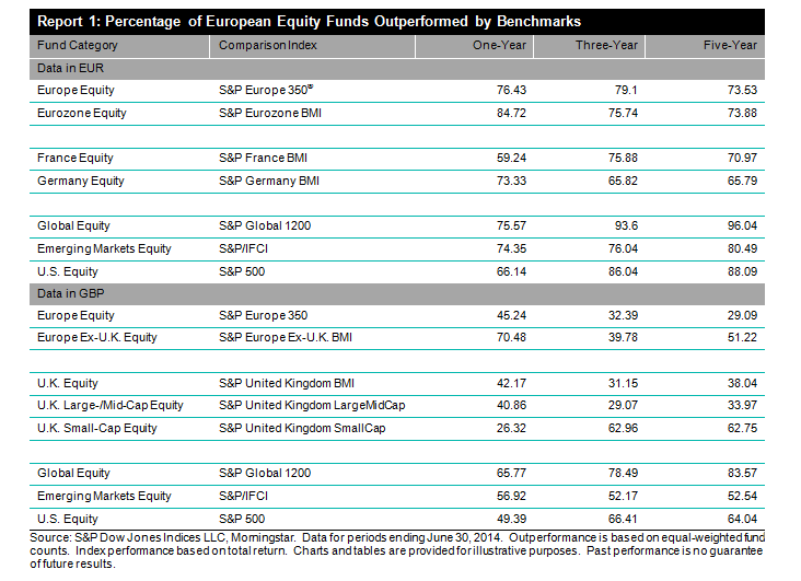
It’s an obvious point, but having access to accurate information is a critical part of being able to manage healthcare costs for the long term. Economic commentators often talk about the increase in healthcare costs (or trends) as a single figure, but, as the S&P Healthcare Claims Indices demonstrate, the truth is that healthcare trends can vary significantly across geographic regions, among the different types of healthcare services and across different segments of the insured population. While these different trends may generally move in consistent directions, there can be significant and often long term differences in the level of trend, ie the change in costs over time, between different components.

As an example, let’s look at the healthcare trends experienced by the four census divisions over the past five years, from early 2010 through mid- 2014 as measured by the S&P Healthcare Claims Indices. Census divisions are broad measures and as the graph indicates, the medical trends across all four regional divisions were roughly consistent during the period, but that average can mask important information about the level and the timing of the trends in each region. Consider the healthcare trends in the Midwest division, which were consistently higher than the national average during 2010 and 2011, but since early 2012 have been the lowest among the four regional divisions. During the second half of 2010, trends in the Midwest averaged 120 – 150 bps above the Northeast trends, but by mid-2012, those trends were reversed, and the Midwest region trends have since remained the lowest of any division.

Capture

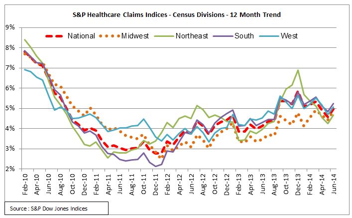
These differences in regional trends over time point to the importance of looking past the average national trend to understand the specific trends that have the most impact. In particular, employers, health plans and healthcare provider systems need to establish their financial objectives using specific trend measures in order to manage their exposure to healthcare costs. Since the S&P Healthcare Claims Indices allow trends to be determined at the three-digit zip code level, it is possible to obtain and use tailored data on regional trends.


The posts on this blog are opinions, not advice. Please read our Disclaimers.

Investment Grade U.S Preferreds, 16%!

Contributor Image
Kevin Horan

Former Director, Fixed Income Indices

S&P Dow Jones Indices

U.S. Preferred securities continue to provide healthy returns for investors.  The S&P U.S. Preferred Stock Index has returned 0.79% for the month and currently returned 13.81% total return year-to-date.

The ratings break-out between constituents of the preferred index has the S&P U.S. Investment Grade Preferred Stock Index even with its high yield counterparts at 0.83% on the month.  A current trend of risk-off from junk is reflected in the indices as the investment grades have returned 16.40% year-to-date.  High Yield as measured by the S&P U.S. High Yield Preferred Stock Index has returned 0.84% so far for the month and 12.69% year-to-date.
S&P U.S. Preferred Returns
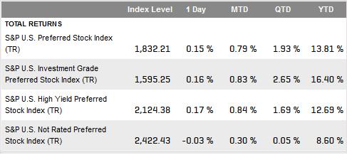
Like Preferreds, the difference in yield between the S&P U.S. Issued Investment Grade Corporate Bond Index and the S&P U.S. Issued High Yield Corporate Bond Index is 2.97% (5.87% vs 2.90%), up from a 1.97% back at the end of June.  The prevailing thinking is that given the different risk profiles between the asset classes, the recent level of reward (yield) does not compensate in the current economy.  Year-to-date the S&P U.S. Issued Investment Grade Corporate Bond Index has returned 6.65% of total return while the S&P U.S. Issued High Yield Corporate Bond Index has returned 4.38%.

The risk-off trend could continue for some time depending on market participant’s credit outlook in our current economic environment.  Recently announced and related to this trend was news from Standard & Poor’s Ratings group expecting the U.S. corporate trailing-12-month speculative-grade default rate to rise to 2.4% by September 30, 2015 from 1.6% in September, 2014.

Source: S&P Dow Jones Indices, data as of November 14, 2014


The posts on this blog are opinions, not advice. Please read our Disclaimers.

Active vs Passive: European active funds generally underperformed their benchmarks but…

Contributor Image
Daniel Ung

Former Director

Global Research & Design

Euro-Denominated Equity Funds

Overall, European equity markets have continued their upward trend over the past year, despite geopolitical concerns in Ukraine and uncertainty over the ECB’s willingness to support struggling economies. It is generally believed that active management may be able to add value to investment portfolios in highly turbulent markets such as this one. However, this belief was once again found to be inconsistent with our findings.

Over the past year, about 74% of European and Eurozone equity funds did not beat their benchmarks and among all fund categories examined, the worst performing were funds invested in global markets. More than 96% of them underperformed their respective benchmarks over a five-year period.

GBP-Denominated Equity Funds

As in the SPIVA® Europe Year-End 2013 report, active GBP-denominated funds invested in U.K. equities delivered the best performance. Over a one-year period, most U.K. funds performed better than their benchmarks. However, this tremendous performance was not repeated in the international fund categories.  Most global, emerging market and U.S. active funds underperformed their respective benchmarks over one-, three- and five-year time horizons.

SPIVA Europe Chart

Read the Report 
Watch the Video


The posts on this blog are opinions, not advice. Please read our Disclaimers.

Fear of Falling Prices

Contributor Image
David Blitzer

Former Managing Director and Chairman of the Index Committee

S&P Dow Jones Indices

Anxiety over deflation is wide-spread and increasing.  The New York Times lead editorial on Sunday warned that weakening commodity prices may be a harbinger deflation or a hint of economic decline.   Despite a few contrary voices, both policy makers and investors seem concerned.  Are the fears misplaced? Or would deflation be a large step backward?

101years

The chart shows 101 years of American inflation measured by the CPI.

Prices move all the time – not just stock prices but prices of almost everything in the economy. Deflation is when prices, usually measured by an index like the CPI, consistently fall.  Inflation is the opposite, prices rise. Largely, but not completely, inflation and deflation are mirror images of one-another; for now call them flation.  If flation’s movements aren’t too sudden, surprising or violent and if everyone anticipates them, the damage would be minimal.  Anticipation is important because financial contracts often specify payments made over time and rarely adjust the payments for flation.  When prices rise, goods and services cost more but money is worth less; in deflation prices fall, goods and services cost less and money is worth more.  If everyone expected 5% inflation and all existing and future loans, bonds, contracts and agreements reflected 5% inflation – and the prediction came true – no one would be hurt by inflation.  Bond holders and other lenders would be compensated for the falling value of money with higher interest rates.  Prices and wages would smoothly adjust.  For a visitor from a foreign country with stable prices the only hints that things were different would be seemingly high nominal interest rates and a falling currency.   Of course this no-pain world of 5% inflation cannot exist – inflation expectations won’t be universal, predictions won’t always come true, prices will depart from their expected path and policy makers will keep changing the game plan.

There are some differences between deflation and inflation. An economy of fully anticipated deflation would be worse than one of anticipated inflation.  First, interest rates can’t go below zero – if some tells you that if you deposit money in a bank, the bank will pay you -5% interest — take 5% of your money and not give you anything in return – you’ll hold on to your cash. Suppose prices are falling 5% per year and government bonds pay 1%. The deflation-adjusted return on the bond is 6% and it is risk free.  Risky investments don’t look very attractive when the risk free real rate of return is boosted by deflation.   Deflation at 1% or 2% might not be a huge impediment to investing, but flation is rarely stable. As investment dries up and the economy slumps, 2% deflation will become 4% or 6% or more.  When prices fall, the best investment is often holding on to your money – its works best by not working at all.

Business faces problems in deflation – as the prices a company receives for its products or services decline, it will try to pay less for everything  – materials, office space, capital and people.  Renters will pressure landlords to lower rents, forcing down real estate values. If capital means bonds, business may face high real rates of interest if bonds were issued before prices began to fall. The it is equity capital, dividends are more expensive. Companies will cut wages and salaries; or, fearing that the best people may leave, will lay off workers.  Were prices slowly rising rather than falling, companies would be able to raise wages and salaries by roughly the same proportion as the inflation rate without paying significantly more in inflation-adjusted wages.

These two factors – that interest rates cannot fall below zero and that people can accept a little bit of inflation with some money illusion – mean that moderate inflation is workable while moderate deflation is not.  For either flation there is a large danger – as the rate expands, it becomes more volatile, less predictable and more damaging.  That is why central banks were so proud of keeping inflation low in the 1980s and 1990s.

With prices rising less than 2% in the US, less than 1% in Europe and oil plunging by 20% since July, should we worry?  The oil price plunge is a different story. While it does contribute to lower prices across the global economy, the drop in oil prices stems from new supply and the structure of the oil markets.  The miniscule increases in prices, much below current policy targets, are a symptom of an economy where demand is growing more slowly than potential supply.  In Europe, the US and Japan, there is sufficient underutilized labor and capital to support faster growth. Slowing or falling prices mean that people, business and government, out of either fear or risk aversion, prefers to hold on to its money rather than spending it. There is room to grow, we just need the right policy to get it started.

The posts on this blog are opinions, not advice. Please read our Disclaimers.

Are Green Bonds Really in the Red?

Contributor Image
Tyler Cling

Senior Manager, Fixed Income Indices

S&P Dow Jones Indices

The green credit market has grown 50% annually since 2007, however market sentiment remains mixed on performance.  The S&P Green Bond Index is down 0.99% YTD, when most of the bond market has done quite well in 2014.  Abundant growth in concert with poor performance could prompt the suggestion that investors are deriving utility from social responsibility in lieu of returns.

Abengoa Greenfield’s equity shares fell 18%, while the price of their 2021 notes fell from $96 to $83 Thursday, following market confusion about the recourse status of the Spanish clean energy firm’s “guaranteed” debt.  Abengoa comprises 2.5% of the S&P Green Bond Index which fell 0.11% yesterday.  This type of volatility is somewhat of an anomaly for the budding market, with the majority of the index being comprised of extremely high rated supranational debt.  The S&P/BGCantor U.S. Treasury Bond Index is up 3.06% in 2014, surpassing its five year annualized return of 2.86%.

The S&P Green Project Bond Index is up 8.85% YTD however, outperforming the S&P Municipal Bond Index which is up 8.27% YTD.  Green project bonds finance specific environmentally friendly projects, creating more risk and return in the current low rate environment.  Green project bonds have also outpaced high yield corporates by nearly 95%, as the S&P U.S. Issued Corporate Bonds Index is up 4.56% YTD.

Capture

The green bond universe is still vastly made up of supranational organizations and performs accordingly, however as segments within the market continue to develop, green bonds are beginning to show their true colors.

The posts on this blog are opinions, not advice. Please read our Disclaimers.