Get Indexology® Blog updates via email.

In This List

Real Data on Healthcare

US Energy Revolution’s Impact on Trade Flows

US Energy Production & Its Growth Dividend

The Shutdown and The Debt Ceiling

Commodities Crystal Ball: What do the FUTURES hold?

Real Data on Healthcare

Contributor Image
David Blitzer

Former Managing Director and Chairman of the Index Committee

S&P Dow Jones Indices

One of the biggest things missing from the never ending healthcare debate is hard data.  “Man-on-the-street” interviews reveal that some people don’t realize that Obamacare, the Patient Protection and Affordable Care Act and the ACA are all one and the same.  The absence of factual data is most crucial when examining the cost of healthcare.  One reason is that healthcare is a huge industry spread across the country and accounting for between a fifth and a sixth of GDP.  A second issue is that detailed data dealing with individual is protected by law and unavailable.

The new S&P Healthcare Claims Indices launched today are a big step toward relieving the lack of data.  These indices cover costs and utilization of inpatient and outpatient healthcare services and prescription drugs.  They are based on actual health insurance claims with data provided by over 30 large national insurance plans. These indices will provide hard numbers to answer questions about how the cost of healthcare is rising or falling across the U.S. and for selected regions, states and cities. More information and the press release can be found here.

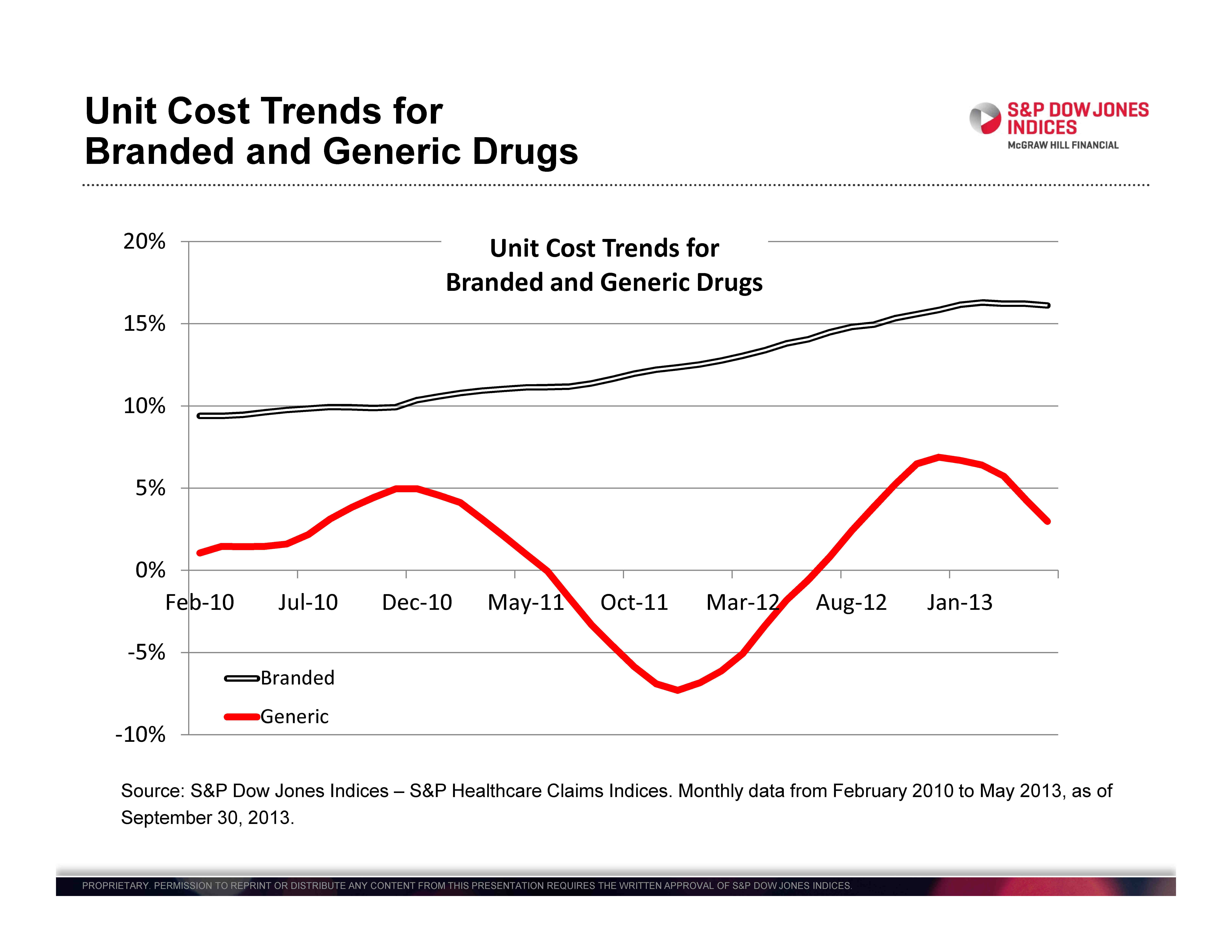
Branded prescription drugs are usually sold by only one company which developed the drug and owns a patent on the drug giving it a monopoly position in the market for that drug. Generic drugs are often sold by a number of companies, the patent may have expired and the market is more competitive.  Since the S&P Healthcare Claims Indices collect data on both kinds of drugs separately, we can track the difference.  The chart shows the unit costs for branded and generic. Generic unit costs vary widely, occasionally falling and never rising faster than 5% annually.  Branded drug costs rise at 10% or more annual and appear to be accelerating.

healthcare drugs(3)

Many people see hospitals with their increasingly complex technology and large staffs as the big factor in rising healthcare expenditures.  Inpatient hospitalization costs are rising, but costs for outpatient care are actually rising faster, as seen in the second chart.  One cause may be efforts to move tests, examinations and routine surgery to outpatient centers from hospitals.  Whatever the underlying cause is, concentrating only on hospitals won’t control some rapidly rising health care costs.

healthcare drugs(2)

The posts on this blog are opinions, not advice. Please read our Disclaimers.

US Energy Revolution’s Impact on Trade Flows

Contributor Image
Bluford Putnam

Managing Director and Chief Economist

CME Group

The substantial increase in the supply of energy from the United States is dramatically affecting US trade flows.  US crude oil production has increased about 29% and natural gas production has grown 33% since 2005.  To analyze the impact on trade flows, we must first examine what has happened to US energy consumption.

Energy consumption trends have been quite interesting.  US oil consumption has actually been declining during the last five or six years just as oil production has increased.   The opposite pattern has occurred with natural gas, with consumption rising more or less in tandem with increased production.  The reasons have to do with relative prices and environmental issues.  Compared to crude oil, natural gas is now much cheaper in terms of a BTU of energy.  Natural gas is also a cleaner burning fuel than coal.  Because of the relative price difference in favor of natural gas, there has been a tendency to consume the additional natural gas domestically, at the expense of crude oil where possible.  In the electrical power generation industry, cleaner burning natural gas has been aggressively substituted for coal.

blu

As might be expected, the primary initial impact of rising US energy production has been on crude oil trade flows.  With simultaneous downward pattern in US crude oil consumption along with increased production, the decline in US Crude oil imports has been quite dramatic.  Also, due to geographic and transport cost efficiencies, we are seeing US crude oil imports rise from their low base levels prior to 2005.  Combining the three trends of higher domestic oil production, lower consumption, and more exports, the net crude oil import bill has shrunk dramatically.  Indeed, China is now a larger net importer of crude oil than the US.

blu2

Interestingly, the increased natural gas production has had its impact on trade flows through coal.  That is, the additional natural gas production has largely been consumed domestically, partly at the expense of coal consumption for electrical power generation, so exports of coal also have increased rather sharply.  Indeed, coal exports were up over 100% in 2012 compared to 2007.

All of these trends in US energy production and consumption have brought the US a little bit closer to energy independence, although energy independence is still not close at hand.   Since it will be much more efficient to continue to import certain energy supplies, what is at stake is the US energy import/export gap, which certainly has narrowed considerably.   Moreover, for geo-politics, it is the crude oil import-export balance that matters most.  In terms of oil, the US is nowhere near the point where exports would equal imports.  Domestic production would have to nearly double to achieve net import/export neutrality for crude oil, and that assumes continued declines in domestic oil consumption.

All examples in this report are hypothetical interpretations of situations and are used for explanation purposes only.  The views in this report reflect solely those of the authors and not necessarily those of CME Group or its affiliated institutions.  This report and the information herein should not be considered investment advice or the results of actual market experience.

S&P Dow Jones Indices is an independent third party provider of investable indices.  We do not sponsor, endorse, sell or promote any investment fund or other vehicle that is offered by third parties. The views and opinions of any third party contributor are his/her own and may not necessarily represent the views or opinions of S&P Dow Jones Indices or any of its affiliates.

The posts on this blog are opinions, not advice. Please read our Disclaimers.

US Energy Production & Its Growth Dividend

Contributor Image
Bluford Putnam

Managing Director and Chief Economist

CME Group

The substantial increase in the supply of energy from the United States is providing the US with an economic growth dividend. Since 2005, which we use as our base year since it roughly represents the year before the energy revolution in the US started, crude oil production in the US has increased 29% and natural gas production has grown 33%. The numbers are impressive and they continue to grow.

Quantifying the US energy boom’s contribution to economic growth is not easy, even though it is obviously substantial.  As is the often the case with economic impacts, the indirect effects can be much larger and more powerful over time than the direct effects.  This makes quantifying the growth benefits to the US economy of the energy supply boom more of an art than a science.

In the US, we are seeing new infrastructure being built to move oil and gas production to users.  Shifting relative prices have encouraged substitution of one form of energy for another and have stimulated construction, including new industrial plants near the sources of the new supplies, especially natural gas.  In some cases natural gas has replaced coal as fuel for generating electricity, and the displaced coal has served to increased US exports.  Natural gas has not generally been considered a transportation fuel, yet its abundance and lower price per BTU is generating greater interest to power bus fleets as well as train locomotives.

Taking a very broad view of the indirect stimulus coming from the new oil and natural gas production, the incremental advantage to the US is probably between 0.5% and 1% of extra real GDP per year, and this energy growth dividend may last for the next five years or more as production continues to increase, as the distribution infrastructure is built, and as industrial users make new investments and build new plants to take advantage of the energy boom.

As noted, our energy growth dividend assessment is more of a back of the envelope calculation than a detailed quantification.  Some energy analysts would go with a higher impact, while some traditional macroeconomists are on the lower side.  No one, however, is downplaying the long-term importance to the US economy.  What is clear is that the energy boom has come at a very good time for the US economy relative to other industrial economies struggling with the lingering aftereffects of the Great Recession of 2008-2009.

 All examples in this report are hypothetical interpretations of situations and are used for explanation purposes only. The views in this report reflect solely those of the authors and not necessarily those of CME Group or its affiliated institutions. This report and the information herein should not be considered investment advice or the results of actual market experience.

S&P Dow Jones Indices is an independent third party provider of investable indices.  We do not sponsor, endorse, sell or promote any investment fund or other vehicle that is offered by third parties. The views and opinions of any third party contributor are his/her own and may not necessarily represent the views or opinions of S&P Dow Jones Indices or any of its affiliates.

The posts on this blog are opinions, not advice. Please read our Disclaimers.

The Shutdown and The Debt Ceiling

Contributor Image
David Blitzer

Former Managing Director and Chairman of the Index Committee

S&P Dow Jones Indices

As of the market close on Monday, Congress is still pushing bills back and forth from one house to the other and a government shutdown looks like the odds-on bet.  The S&P 500 rebounded part way from a sharp drop at the open but has done little since mid-morning.  If the Credit Default Swap market is any indication, the shutdown could be followed by a debt ceiling impasse.   The markets are saying the shutdowns matter and the debt ceiling matters even more.

Shutting the government down for a few days will cost. In 1996 the bill was about $100 million per day due to delays, disruptions and time spent recovering from the shutdown.  The larger damage is probably to how we feel our government and how it looks to others.  Analysts and commentators criticize some European nations which can’t seem to pass a budget, collect taxes or keep a government in office for more than a few months.  If the US begins to look and act that way, can we expect investors – either foreign or domestic – to have confidence in our markets?  The cost of a government shutdown is not $100 million a day or delaying next Friday’s employment report, it is the loss of confidence.

The debt ceiling is another matter.  The damage would be severe as explained in comments today from the New York Times and the Financial Times.  If the debt ceiling isn’t raised the President will face a three-way choice: slash an estimated $600 billion from spending immediately, default on maturing US treasury bills, notes and bonds or ignore the debt ceiling.  Slashing that much spending would mean the government really shuts down – no social security payments, no salaries, no contracts with payment due, nothing at all.  Defaulting on the debt would be worse.  In 2008 when Lehman Brothers went bankrupt, the financial system froze because no one would trust the collateral behind Repos. (Repos, repurchase agreements, are the ways banks, brokers, corporations and money market funds invest overnight.) Without Repos,  there is no access to large amounts of short term overnight credit.  If there is a default, repos with treasury collateral won’t be accepted.   If all the other options are terrible, the one that’s left is to ignore the debt ceiling.  No matter which choice the President makes, the markets are likely to react badly.

The posts on this blog are opinions, not advice. Please read our Disclaimers.

Commodities Crystal Ball: What do the FUTURES hold?

Contributor Image
Jodie Gunzberg

Former Managing Director, Head of U.S. Equities

S&P Dow Jones Indices

What strategies will be the most profitable over the next 12 months?  Which spread will have the greatest opportunity? These are just a few questions we asked the audience at our S&P Dow Jones Indices 7th Annual Commodities Seminar, and we thought you may be interested in their answers.

As I mentioned in a recent CNBC interview, the three main factors influencing commodities currently are quantitative easing, Chinese demand growth and geopolitical tensions.  This backdrop has been characterized by more frequent backwardation and lower correlations.

Commodity Correlations

Given the more frequent backwardation in 2012 and 2013, the performance of more flexible strategies like the S&P GSCI Roll Weight Select and S&P GSCI Dynamic Roll have outperformed their static counterparts. See the table below:

Source: S&P Dow Jones Indices. Data from Dec 2011 to Aug 2013. Past performance is not an indication of future results. This chart reflects hypothetical historical performance. Please see the Performance Disclosure at the end of this document for more information regarding the inherent limitations associated with backtested performance

Also, below are two research papers on the fundamentals of why this is the case:

Research by Barclays shows investors are taking notice and assets are flowing into more active strategies.

AUM Barclays Commodities

Will this continue? We asked our audience, Which index strategy do you believe will be most profitable over the next 12 months?”

Below are their answers, which match the trend of flows into active indexing but buck the trend that flows of  fixed are declining compared to standard. 

13.0%  Front month
26.1%  3-Month Forward
30.4%  Dynamic Roll
30.4%  Long-Short Trend Following

Another question we asked was regarding in which spread is the greatest opportunity?

See the answers from the audience in the charts below:

Source: S&P Dow Jones Indices. Data from Feb 1999 to Aug 2013. Past performance is not an indication of future results. This chart reflects hypothetical historical performance. Please see the Performance Disclosure at the end of this document for more information regarding the inherent limitations associated with backtested performance

What are your predictions? We’d love to hear!

The posts on this blog are opinions, not advice. Please read our Disclaimers.