Get Indexology® Blog updates via email.

In This List

The Other Shoe?

Thinking About P/E Ratios

S&P Dow Jones Fixed-Income Commentary: Mixed Signals as Rates Rise

Bubbles, Corrections, the Fed and Summer Heat

High Yield Munis Still Cheaper Than Corporate Junk

The Other Shoe?

Contributor Image
Craig Lazzara

Former Managing Director, Index Investment Strategy

S&P Dow Jones Indices

One of the striking things about May’s U.S. equity performance was that although the market continued the strength it had shown between January through April, it was strong in a different way. http://us.spindices.com/documents/commentary/dashboard-us-20130531.pdf

For example, the best-performing sector in the first four months of the year was Utilities (up 19.74%); in May the Utilities sector declined -9.06%. At the other end of the spectrum, one of the worst-performing sectors earlier in the year was Technology (up only 5.54% while the S&P 500 was rising 12.74%). In May, Technology was among the best performers (up 4.55% versus 2.34% for to market as a whole). Not surprisingly, this shift away from more defensive sectors caused strategies like low volatility and high dividends, which had been stellar performers between January and April, to lag considerably in May.

One obvious contributor to the rotation in equity sector performance was an equally notable shift in the bond market. At the long end of the curve, yields rose by more than 40 basis points in May. The S&P/BGCantor 20+ Year US Treasury Index, which had risen modestly in the first four months of the year, declined -6.71% in May (its worst decline since April 2009).

It’s not hard to make the case (e.g., see http://online.wsj.com/article/SB10001424127887324423904578520970034006496.html) that as bond yields rose in May, higher-yielding equity sectors such as Utilities became less attractive to income seekers, leading to their underperformance. But what happens now? If bond rates continue to rise, how likely is it that the equity market will continue its recent strength? And if equities weaken, is it possible that the lead might shift to defensive sectors once again?

The posts on this blog are opinions, not advice. Please read our Disclaimers.

Thinking About P/E Ratios

Contributor Image
David Blitzer

Former Managing Director and Chairman of the Index Committee

S&P Dow Jones Indices

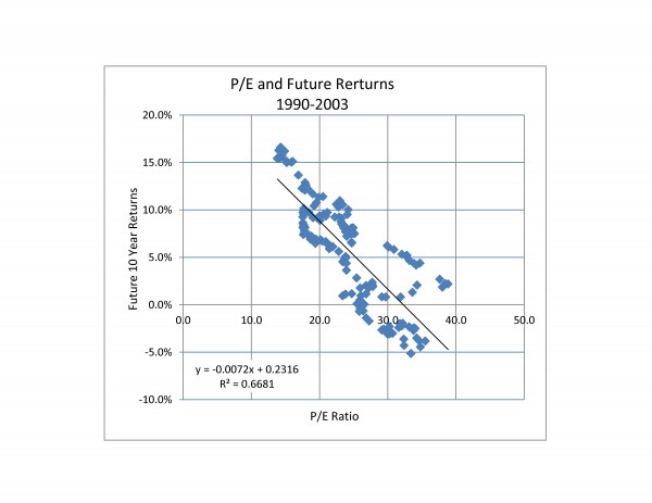
The chart below is  a scatter diagram comparing the P/E ratio to the price return on the S&P 500 over the next ten years.  P/E is defined as each month’s level of the S&P 500 divided by the earnings per share on the 500 over the trailing 12 months. Both the P/E and the index level are data, not forecasts.  The return over the next ten year is the index level ten years into the future divided by the index level used in the P/E calculation and stated as an annual return.  Since we want to look ten years into the future, the most recent data is April, 2003.

Source: S&P Dow Jones Indices

Before trying to forecast the market with the chart, remember that past performance is no guarantee of future returns. Further, the chart is based on the period from 1990 to 2003 so it doesn’t include such notable bits of history as the 2008 bear market or the 1987 market crash. Further, the statistics indicate that the P/E ratio only explains about two-thirds of the changes in market returns — not enough for a reliable guess about the future.


The posts on this blog are opinions, not advice. Please read our Disclaimers.

S&P Dow Jones Fixed-Income Commentary: Mixed Signals as Rates Rise

Contributor Image
Kevin Horan

Former Director, Fixed Income Indices

S&P Dow Jones Indices

Chairman Ben Bernanke has tried to be cautious in scripting a message to the markets, but recent communications out of the Federal Reserve have been mixed.  With seven members of the Board representing 12 districts and past members all speaking to the press, the message can get convoluted at times.  The planning and timing to pare down the central bank’s bond buying program is at the heart of the issue.

Richard Fisher, president of the Dallas Federal Reserve Bank, has been quoted as saying that the reason the country hasn’t seen more job growth is due to fiscal policy.  He has been vocal about reducing stimulus purchases of Treasuries and mortgage-backed bonds, pointing to recent positive news on the recovering housing market.

Joining in the conversation is Philadelphia Fed president Charles Plosser, who also supports a gradual slowdown in bond buying.

Given such aggressive conversation by highly placed individuals, the market took heed as the yield on the S&P/BGCantor 7-10 Year U.S. Treasury Bond Index moved 45 basis points wider, from a recent low of 1.35% on May 1st to its current level of 1.80%.

The rising interest rates also affect credit as the S&P U.S. Issued Investment Grade Corporate Bond Index returns a -1.98% month-to-date return and a -0.39% year-to-date.  High Yield’s month-to-date return is presently negative at a -0.44%, while for the year it is returning a 4.05% as measured by the S&P U.S. Issued High Yield Corporate Bond Index.

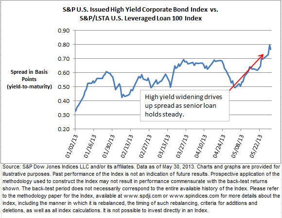
Senior Loans have held steady returning 0.19% to date and 2.93% for the year.  The spread between the yield-to-maturity of the senior loan and high yield indices has widened since its start-of-the-year level of 33 basis points to its current level of 77 basis points.  Though both the S&P/LSTA U.S. Leveraged Loan 100 Index and the S&P U.S. Issued High Yield Corporate Bond Index have seen their yields trend downward from the start of the year, loans have experienced more downward movement dropping 75 bps, while high yield only moved 31 bps.  The S&P U.S. Issued High Yield Corporate Bond Index had held its relatively loftier rates until recently.  Since May 8th, the yield on the index has increased from a 5.54% to 5.84%.  The S&P/LSTA U.S. Leveraged Loan 100 Index yield stepped up a week and a half later, rising on May 23rd by 10 bps from 4.98% to 5.08%.

The higher volatility reaction to rising rates for high yield makes sense when compared to loans.  High yield bonds have more interest rate sensitivity with duration of just less than 5 years and an average maturity of 6.8 years.  Loans, on the other hand, have an average life of around 4 years.  Their duration is 7 days, as the index is rebalanced weekly and adjusted for rate changes, making the S&P/LSTA U.S. Leveraged Loan 100 Index a floating rate product.

Exhibit 1: Mixed Signals as Rates Rise


Exhibit 2: Mixed Signals as Rates Rise


The posts on this blog are opinions, not advice. Please read our Disclaimers.

Bubbles, Corrections, the Fed and Summer Heat

Contributor Image
David Blitzer

Former Managing Director and Chairman of the Index Committee

S&P Dow Jones Indices

There is a growing debate among economists, journalist and bloggers over whether the Fed’s QE3 is creating a bubble in the stock market. (See Krugman, Gillian Tett or Felix Salmon among others) fueled by the market’s gains since the start of the year and the usual worries that disaster will strike during the summer break at the beach.  There are optimists: some say that “Sell in May and Go Away” should be “Buy in May and Make Hay.”  Virtually all agree — correctly — that the Fed’s low interest rates and QE3 policy is boosting stock prices. Further, all also agree, again correctly, that the Fed will sooner or later stop QE3 (or QE4 or QE5) and interest rates will rise. Rising interest rates are usually not the best medicine for the stock market although they don’t spell complete or immediate doom.   Even with the Fed, QE3 and maybe some more QEs, the bubble fears look overdone from here.

First, a bubble is more than anything that results in a crash and collapse.  A bubble usually builds itself on speculative mania as it departs from any link to funamental financial factors.  As the bubble worriers themselves demonstrate, there are plenty of people worrying that the market will collapse and very few expecting it to rise forever more from here.  We’re not seeing genuine specualtive mania, at least not yet.  Remember “Home Prices Never Fall” or recall names like Pets.com?  Little of that is being seen in the market now. Second, while low interest rates are boosting stock prices, that is a fundamental financial factor making stock more attractive.  Of course, the key part of any bubble is when it bursts.  Bursting bubbles cause damge because they change the state of the world and because they pop when no one is expecting it.  Possibly the only thing being watched more carefully than the Dow and the S&P these days is the Fed. And, unlike either the Dow or the S&P, the Fed can send out warning signals — and probably will when the time comes.

Where does all this leave us? Even without bubbles the market can go down.  We used to call those disappointments corrections.  The market is still as unpredicatable as ever so one need not believe every voice of doom that bubbles up.

The posts on this blog are opinions, not advice. Please read our Disclaimers.

High Yield Munis Still Cheaper Than Corporate Junk

Contributor Image
J.R. Rieger

Former Head of Fixed Income Indices

S&P Dow Jones Indices

U.S. Municipal Bonds: (Data as of May 16,2013)

Corporate junk bond yields have risen as mutual funds have seen outflows. Meanwhile, municipal high yield bonds have held their own. A rare twist in the markets may be ending as a result: yields of tax free high yield municipal bonds are 34bps higher (Yield to Worst) than high yield corporate bonds. That spread has narrowed from last week’s 56bp spread.

High yield corporate bonds tracked in the S&P U.S. Issued High Yield Bond Index have returned just under 5% year to date but lost ground the past several days as fund outflows weigh on the market driving prices down and the weighted average yield (yield to worst) up by 22bps since last week to end at 4.88%.

High yield municipal bonds tracked in the S&P Municipal Bond High Yield Index have seen a 3.9% year to date return with yields remaining fairly steady this week to end at 5.22%.
o The Taxable Equivalent Yield of these same municipal bonds is over 8% when using a 35% tax rate.

High Yield Muni & Corporate Bond Index Yields

The S&P National AMT-Free Municipal Bond Index is up 1.26% year to date modestly outperforming investment grade corporate bonds tracked in the S&P U.S. Issued Investment Grade Corporate Bond Index which has returned just under 1%.

The 5 year range of the municipal bond curve is keeping up with the overall market as the 5 year S&P AMT-Free Muni Series 2018 Index has returned 1.14%, while longer municipal bonds in the S&P Municipal Bond 20+ year Index have recorded a total return of 2.14% year to date with yields remaining steady over the course of the week.

Puerto Rico hasn’t left the spotlight and bonds from Puerto Rico have performed like the high yield market returning 3.77% year to date.

The posts on this blog are opinions, not advice. Please read our Disclaimers.