Get Indexology® Blog updates via email.

In This List

Do Dividends Really Pay? (Part 2)

A Closer Look at Indices Country Classifications

Exploring the G in ESG: E & S and Performance – Part 3

Indexing Canadian REITs: A Look at the S&P/TSX Capped REIT Income Index

Standard Benchmarks Extend Standard of Living Through Retirement

Do Dividends Really Pay? (Part 2)

Contributor Image
Philip Murphy

Former Managing Director, Global Head of Index Governance

S&P Dow Jones Indices

Previously I discussed why preference for dividend-paying stocks may not have a strong theoretical footing, but could be grounded in behavioral and practical reasons. Furthermore, due to possible economic signaling generated by dividends, such strategies may be correlated with widely accepted factors like quality and value. This post demonstrates how specific dividend strategy indices may be related to several major factors. Exhibit 1 lists major characteristics of four popular S&P DJI dividend indices. Dividend strategies can be very different from one another so it pays to understand individual indices behind various index-tracking products. However, despite their differences, indices are generally much more transparent than actively managed dividend strategies.

The indices in Exhibit 1 highlight four combinations of constituent selection and weighting. For selection, we have either indicated dividend-yield ranking or persistent historical dividend growth, while for weighting we have yield weighting or equal weighting. The various combinations of selection and weighting methods contribute to significantly different index performance.

Exhibit 2 shows summary statistics of the four dividend indices regressed on Fama-French factor returns including market beta (Mkt-rf), small size (SMB), value (HML), and momentum (MOM). AQR’s quality factor, Quality Minus Junk (QMJ), is added to form a five-factor regression model.

  • Market Beta (Mkt-rf): All of the indices had statistically significant market betas in a tight range from 0.84 to 0.89, indicating somewhat less equity risk than a broad benchmark.
  • Small Size (SMB): These strategies generally did not present positive SMB loadings and, based on the presence of several negative coefficients, the regressions may indicate a tendency toward larger constituents. However, none of the regression coefficients were statistically significant (at 95% confidence) so the data does not support an inference.
  • Value (HML): With respect to HML loadings, we see differentiation among the indices along the line of their primary weighting methods. The yield-weighted indices had positive and statistically significant coefficients (95%), while the equal-weighted indices had somewhat lower, positive coefficients that failed statistical significance.
  • Momentum (MOM): All of the indices’ returns loaded negatively on MOM, but they differed with respect to coefficient size and significance. The S&P 500 High Dividend Index had the largest negative loading with the most significant t-stat. The S&P 500 Dividend Aristocrats and S&P High Yield Dividend Aristocrats were in the middle of the pack in terms of coefficient size, and both were significant. Finally, the Dow Jones U.S. Select Dividend Index had a lower negative coefficient, and its t-statistic was somewhat below the 95% confidence level of significance.
  • Quality (QMJ): Whereas value loadings seemed to be differentiated along the line of constituent weighting methods, QMJ loadings were potentially related to constituent selection. The two Dividend Aristocrat indices, both of which select members with long records of dividend increases, had positive and significant QMJ loadings. The indices that select constituents by dividend yield were less related to QMJ, if at all.
  • Alpha: As expected, when controlled for multiple factor exposures, none of the indices produced alpha over the sample period.

Little differentiation was found between factor loadings of the indices with respect to market beta, small size, or momentum, and none created alpha. On the other hand, value and quality factor loadings were different between indices, and they generally aligned either by constituent selection or weighting. The two yield-weighted indices produced positive and significant value exposure, while the Dividend Aristocrats indices produced positive and significant quality exposure. Interestingly, only the S&P High Yield Dividend Aristocrats had positive and significant loadings on both value and quality over the sample period.

Through this analysis, we see that dividend strategies are not only about income or yield, but also about how their various combinations of factor loadings may compliment portfolios through factor diversification. Market participants ought to carefully consider which strategies can be reasonably expected to enhance their specific investment program before jumping in.

1 http://mba.tuck.dartmouth.edu/pages/faculty/ken.french/index.html

2 https://www.aqr.com/Insights/Datasets/Quality-Minus-Junk-Factors-Monthly

The posts on this blog are opinions, not advice. Please read our Disclaimers.

A Closer Look at Indices Country Classifications

Contributor Image
Alka Banerjee

Former Managing Director, Product Management

S&P Dow Jones Indices

As large sums of global money flows now follow global indices, it is important to understand how global index providers decide on country classifications and country weightages. A global equity index typically has two components, a developed market index and an emerging market index. Until the nineties, emerging market investments were not necessarily mandatory for all large institutional investors but that changed more than a decade ago and global investment portfolios are the norm now. What has also changed is that earlier markets were classified on the basis of their GDP per capita, size of the stock market and accessibility criteria, since most of these parameters were in sync with each other.

However, given the growing size of global fund flows and growth of emerging markets, a number of criteria are now reviewed. This can include the presence of a strong regulatory authority, ease of repatriation of funds, custody, clearing and settlement infrastructure, transparency in decision making, liquidity, and transaction costs. While index providers provide the criteria for classification, the actual decision making will devolve on large market consultations. In an annual or bi-annual exercise, market participants, including asset managers, traders, and asset owners, are polled in their views for each of the criteria for the markets. Based on the feedback received, markets will be classified as developed, emerging and frontier. The weight of the market within the index is derived from the float adjusted market capitalization of the market. This means that the sum of each of the stocks included in the market by their float market capitalization gives each market its weight in the index. Countries that have restrictions on foreign investors in the form of a percent limit will get that limit applied to the market capitalization to give a clear picture of what is actually available to foreign investors. In recent time, this issue has been muddied considerably by the multiplicity of restrictions and access provided by a market like China,where it is hard to pin down a single number.

Earlier, we spoke of frontier markets, a category where the markets are typically very small or accessible in a very limited way. Markets like Ghana, Tunisia, Bangladesh and Sri Lanka fall in this category. Graduating markets from frontier to emerging and emerging to developed can cause a big change in the fund flows to a country. While a move from frontier to emerging is welcomed across board, the story can be different for a move from emerging to developed status. Israel had an approximate 3% weight in an emerging market index a few years ago. When it was graduated in 2010, it fell to only 0.4% of a developed market index. This kind of a move can actually cause fund flows to considerably dry up for a market.

The posts on this blog are opinions, not advice. Please read our Disclaimers.

Exploring the G in ESG: E & S and Performance – Part 3

Contributor Image
Kelly Tang

Former Director

Global Research & Design

In a previous blog, we explored the relationship between corporate governance and stock performance. The results show a wide variance between the top quintile and the bottom quintile, particularly over a long-term horizon (17 years). We applied the same analysis to the RobecoSAM environment (E) and social (S) scores. To do so, we formed hypothetical, annually rebalanced quintile portfolios, ranked by E and S scores, and tracked their forward 12-month performance.i The quintile portfolios were formed on an annual basis as of December 31 of every year.

Looking at the analysis from 2001 through 2017, both E and S scores showed a clear bifurcation in returns, with the bottom quintile performing the worst (see Exhibit 1).

Environment Results

For the portfolios ranked by E score, the fourth quintile (8.36%) and fifth quintile (8.00%) returns were markedly lower than those of the top three quintiles. Over near- to medium-term time horizons, E-ranked portfolios displayed the highest performance spread between the top and bottom quintiles (see Exhibit 2). Perhaps this is because environmental concerns have increasingly moved to the forefront of investor concerns in recent years.

Average rolling returns over the one-, three-, and five-year periods show that, on average, the Q5 portfolio underperformed the Q1 portfolio by about 1.20% (see Exhibit 3).

The results for the governance (G) portfolios showed a greater variance between the top and bottom quintiles compared to the E portfolios. This is expected, as corporate governance reflects management strategy and ability to execute the strategy. On the other hand, E performance reflects risk management of a growing issue that attracts heightened awareness from institutional investors. It appears that for portfolios ranked by E score, market participants may be economically better served by shying away from not only the bottom 20%, but also the fourth-worst quintile, which accounted for the bottom 40% of the ranking universe.

Social Results

The S dimension score measures a corporation’s relationship with its stakeholders, especially its employees, but also the local and wider community in which it operates. The categories analyzed are labor practices, human capital development, talent attraction and retention, human rights stance, and corporate citizenship and philanthropy.

There is a less clear relationship between S scores and subsequent future performance. The back-tested returns do not show a clear underperformance from the bottom quintile, and in fact, the fourth quintile was the best-performing portfolio in the longer time periods (see Exhibits 4 and 5).

Our analysis and the decomposition of the individual ESG scores highlight some interesting information. It appears that for portfolios ranked by G and E scores, investors may be economically better off by screening out securities in the worst quintile of the ranking universe. However, the relationship is less clear between the S score and future stock performance.

The analysis shows that while ranking by overall ESG score could indicate some positive return information, the three underlying subcomponents have different relationships with future stock performance. Therefore, investors may wish to alter the weight of each subcomponent in the overall ESG score.

Our next blog will explore different combinations of the three subcomponent scores.


i The underlying universe is the RobecoSAM coverage universe comprised of global companies starting from December 2000 with 400 stocks and increasing to over 4,000 stocks in 2017.


The posts on this blog are opinions, not advice. Please read our Disclaimers.

Indexing Canadian REITs: A Look at the S&P/TSX Capped REIT Income Index

Contributor Image
Smita Chirputkar

Former Director, Global Research & Design

S&P Dow Jones Indices

In a previous blog post, Evolution of Canadian REITs, we outlined the evolution of the Canadian REITs market. In this post, we will explore in detail the S&P/TSX Capped REIT Income Index, which is designed to serve as an income-producing strategy.

The index seeks to measure the performance of REIT companies in the S&P/TSX Composite, while overweighting and underweighting companies based on their risk-adjusted income distribution yield. It is tilted in favor of securities with yields that have not fluctuated widely. By using risk-adjusted yield—computed as 12-month trailing yield divided by the standard deviation of yield—the higher weight is placed on securities with more stable yields. Also, given that REIT securities tend to be more volatile than the market, the methodology aims to ensure that higher yield does not come at the price of higher return volatility.

To allow for capacity, the constituents are weighted by their risk-adjusted yield ratio times their float-adjusted market cap, with the maximum weight capped at 10%. This way, smaller companies with high yields do not have such a disproportionate weight in the index, and the same applies for large companies with lower yields.

The standard deviation of yield is calculated using the previous 36 months of income distribution yield history. The ability to pay dividends over three years indicates a firm’s strength and stability. There is also less chance of dividend cuts, which are perceived negatively in the market.

Exhibit 1 shows that the S&P/TSX Capped REIT Income Index outperformed the benchmark, the S&P/TSX Composite, on a risk-adjusted basis over the period studied. Historically, the S&P/TSX Capped REIT Income Index exhibited higher best monthly returns, average monthly returns, and maximum rolling 12-month returns compared with the benchmark.

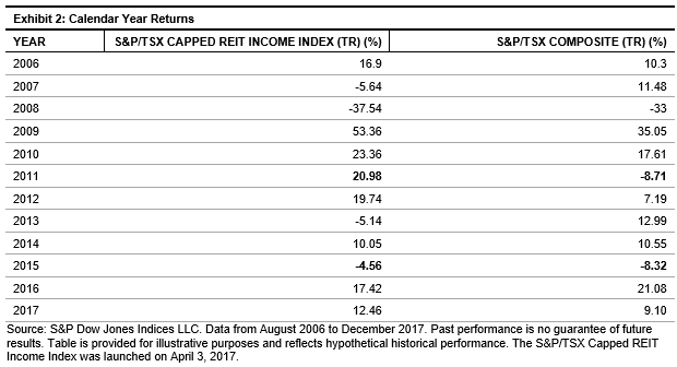
Exhibit 2 shows the calendar year performance of the S&P/TSX Capped REIT Income Index versus the underlying benchmark. We can see that the strategy outperformed the underlying broad market in 8 out of 12 years.

Higher Yield Than the Broad Market

From December 2006 to February 2018, the S&P/TSX Capped REIT Income Index generated an average historical yield of 6.1%, compared with 2.8% for the benchmark.

A full report on the S&P/TSX Capped REIT Income Index can be found here.

The posts on this blog are opinions, not advice. Please read our Disclaimers.

Standard Benchmarks Extend Standard of Living Through Retirement

Contributor Image
Jodie Gunzberg

Former Managing Director, Head of U.S. Equities

S&P Dow Jones Indices

What are the steps in selecting a retirement income option?  Of course cost is one of the considerations, but did you know ERISA does not require selecting the lowest cost investments?  These questions and more are explored in a recent video with Ian Kopelman (DLA Piper), and Tim Kohn (Dimensional Fund Advisors):

What are some best practices for plan sponsors as they discharge their fiduciary duties when thinking about adding an income option to a plan’s menu?

Satisfaction of the Employee Retirement Income Security Act (ERISA) fiduciary responsibilities is process-driven.  In other words, in order for an ERISA fiduciary to satisfy his or her fiduciary obligations, it is imperative to establish and follow a process through which the decision maker can determine and analyze its various options on a comparative basis, apply a cost-benefit analysis on each taking into account the various characteristics of the particular plan in question and its participant population, and on that basis, choose the option that the fiduciary reasonably believes best fits the needs of the plan and its population. 

When selecting an income option for a plan, this involves:

  1. determining various potential income options available
  2. determining the variables of each option (income production, growth, safety, investment to retirement or through retirement, etc.)
  3. determining the particular characteristics of the plan’s workforce and applying each option’s characteristics to that workforce to find a match
  4. analyzing past performance of each option to compare each option’s performance equally
  5. factoring in each option’s cost
  6. factoring in any legal and other variables

Many items listed above need a standard index for comparative analysis.

How may an asset manager assist in this fiduciary process?

An asset manager may help by providing investment solutions that are low cost, broadly diversified and that follow a transparent investment process.  This way, as plan sponsors discharge their fiduciary duties to not only select but monitor those investments over time, they can understand the process and help translate it back to 401(k) or other plan participants.

It is important to note that ERISA does not state you must to staff your investments with the absolute lowest cost or you should use that as it is sole decision-making criteria.  The important thing is to make sure that if after the analysis the lowest-cost spread is not chosen, the reason can justify why the lowest cost burden was not chosen – so documenting is crucial.

What current regulatory and/or legislative guidance might be considered when thinking about adding a retirement income option? 

This question raises issues relating to plan design and its interaction with legislative and regulatory guidance to determine an appropriate way to further that plan design from a legal standpoint.  In other words, the analysis should start with appropriate plan design and once that appropriate plan design is determined on the basis of corporate and retirement needs, a determination should be made as to how the legal and regulatory environment impacts those plan design decisions and the question of how those plan design decisions should best be effectuated.

Thus, the first question one should ask is what the plan sponsor is trying to accomplish with the plan.  Presumably, at least one of the goals is to enable participants to efficiently create a source of retirement income.  This may be determined at the point of retirement but more often it is being thought of as extending through the participant’s retirement to create a sustainable source of income throughout the participant’s retirement years — the old “to or through” question.

Once this design component has been analyzed, the fiduciary has the legal obligation to prudently select the income fund that best and most cost effectively achieves the end that has been determined on the basis of the plan design.  In addition, once the option has been prudently selected, the fiduciary has the legal obligation to periodically review the option selected to ensure that (i) it continues to satisfy the objective on a cost-effective basis, and (ii) other options have not been developed that will more efficiently satisfy the same ends.  Once again, this selection and oversight function requires that the option being evaluated be benchmarked against its peers since the decision to select or continue to retain must be made on a comparative basis.

When thinking about retirement what should the industry be doing to help plans and participants access the retirement income focused solution?

First, solutions should be created to focus on what participants want most in retirement, which is to spend their retirement savings to support a desired standard of living.  Too many default investments today focus only on growing an account balance and don’t fully address the risks that participants face in retirement which is three-fold, not only the market, but also the effects of inflation and interest rates on one’s savings.

Secondly, plan sponsors and their advisors should be structuring their plan to reflect this standard of living goal.  Plans should be looking closely at their Investment Policy Statements to see if they align with the goals of the overall benefits package that would likely benefit from having, as a goal of the plan, an income or outcome-focused goal.  When a plan adopts this philosophy, naturally, a goals-based type investment may be considered as the plan’s default.


The posts on this blog are opinions, not advice. Please read our Disclaimers.