Get Indexology® Blog updates via email.

In This List

Have We Seen the Bottom in Japanese Bond Yields?

30 Year old S&P BSE SENSEX conquers the 30,000 mark

The S&P GIVI Japan Posts Impressive Five-Year Live Track Record

Security Selection & Sector Allocation Effects of Equal Weighting the S&P 500®

The Wrong Diagnosis

Have We Seen the Bottom in Japanese Bond Yields?

Contributor Image
Michele Leung

Former Director, Fixed Income Indices

S&P Dow Jones Indices

While the idea of reflation is picking up steam in global markets, Japan’s core consumer price index rose 0.2% in February 2017, which remained far below the target of 2% set by the Bank of Japan (BoJ). The BoJ kept monetary policy steady in March 2017, continuing the diverging policy paths of central banks.

In fact, despite the rising-rate environment in the U.S., the last BoJ minutes noted that “the monetary policy in Japan should be decided based on Japan’s economic activity and prices.” It also dropped hints by adding, “It will be a considerable amount of time before the Bank will need to change its monetary policy.”  In an attempt to achieve the “price stability target” of 2% at the earliest possible time, the Bank of Japan introduced the quantitative and qualitative monetary easing (QQE) with yield curve control in September 2016.

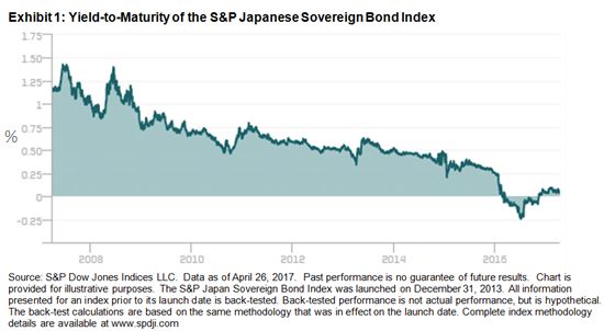
Japanese sovereign bonds, as tracked by the S&P Japanese Sovereign Bond Index, delivered a total return of -0.01% YTD and -1.79% for the one-year period as of April 26, 2017. Looking at a 10-year period, its yield-to-maturity tightened from 1.14% to 0.05%, after spending 9 months in negative territory last year (see Exhibit 1).  The yield reached its lowest point (-0.25%) on July 8, 2016.

The S&P Japanese Sovereign Bond Index currently tracks 304 bonds with a total market value of 919 trillion yen, which is equivalent to USD 8.4 trillion. As of April 18, 2017, the government debt to GDP of Japan was at 250%, compared with 44% for China and 104% for the U.S.[1]  All eyes will be on the next monetary policy meeting, which is scheduled for April 26 and 27, 2017.

[1]   Source: Trading Economics.  Data as of April 18, 2017.

The posts on this blog are opinions, not advice. Please read our Disclaimers.

30 Year old S&P BSE SENSEX conquers the 30,000 mark

Contributor Image
Ved Malla

Associate Director, Client Coverage

S&P Dow Jones Indices

The much awaited 30,000 mark was conquered by the S&P BSE SENSEX on Apr. 26, 2017 where the index level closed at 30,133.35, while the total return index level closed at 42,503.33. It took 557 trading sessions to go from the 29,000 level to cross the 30,000 level.  The S&P BSE SENSEX was launched on Jan. 2, 1986; it is now over 30 years old.  It comprises 30 stocks that represent the broader Indian equity marketplace.  The base year of the S&P BSE SENSEX is 1979, with a base value of 100 index points.

Exhibit 1: Index Returns
Source: S&P Dow Jones Indices LLC.  Data from Jan. 2, 1986, to Apr. 26, 2017.  Chart is provided for illustrative purposes.  Past performance is no guarantee of future results.

Exhibit 1 depicts the price returns of the S&P BSE SENSEX from its launch date.  The total returns version of the index is available from August 1996.

Notable events during the 30-year journey of S&P BSE SENSEX include the following.

  1. S&P BSE SENSEX first passed 1,000 on July 25, 1990.
  2. S&P BSE SENSEX took 1,692 trading days to double the index value on Aug. 21, 1990.
  3. On April 28, 1992, the S&P BSE SENSEX dropped by 12.77%, its worst single day fall.
  4. A major revamp of the S&P BSE SENSEX happened on Aug. 19, 1996, when 15 companies were replaced.
  5. The first ETF linked to the S&P BSE SENSEX was launched on Sept. 1, 2003.
  6. On May 18, 2009, the S&P BSE SENSEX gained 17.3%, the best single day gain.
  7. S&P BSE SENSEX crossed 30,000 during intraday on March 4, 2015; however it closed below the 30,000 level.
  8. S&P BSE SENSEX closed above 30,000 for the first time on Apr. 26, 2017.
Exhibit 2: 1000-Point Level of S&P BSE Sensex
MILESTONE DATE S&P BSE SENSEX INDEX LEVEL NUMBER OF TRADING DAYS SINCE PRIOR MILESTONE
Inception April 3, 1979 124.15
1000 July 25, 1990 1,007.97 2,288
2000 Jan 15, 1992 2,020.18 290
3000 Feb 29, 1992 3,017.68 29
4000 March 30, 1992 4,091.43 15
5000 Oct. 11, 1999 5,031.78 1,732
6000 Jan. 2, 2004 6,026.59 1,060
7000 June 21, 2005 7,076.52 371
8000 Sept. 8, 2005 8,052.56 54
9000 Dec. 9, 2005 9,067.28 63
10000 Feb. 7, 2006 10,082.28 40
11000 March 27, 2006 11,079.02 32
12000 April 20, 2006 12,039.55 15
13000 Oct. 30, 2006 13,024.26 135
14000 Jan. 3, 2007 14,014.92 45
15000 July 9, 2007 15,045.73 126
16000 Sept. 19, 2007 16,322.75 51
17000 Sept. 27, 2007 17,150.56 6
18000 Oct. 9, 2007 18,280.24 7
19000 Oct. 15, 2007 19,058.67 4
20000 Dec. 11, 2007 20,290.89 41
21000 Nov. 5, 2010 21,004.96 715
22000 March 24, 2014 22,055.48 844
23000 May 12, 2014 23,551.00 30
24000 May 16, 2014 24,121.74 4
25000 June 5, 2014 25,019.51 14
26000 July 7, 2014 26,100.08 22
27000 Sept. 2, 2014 27,019.39 38
28000 Nov. 12, 2014 28,008.90 44
29000 Jan. 22, 2015 29,006.02 50
30000 Apr. 26, 2017 30,133.35 557

Source: S&P Dow Jones Indices LLC.  Data from April 3, 1979, to April 26, 2017.  Table is provided for illustrative purposes.  Past performance is no guarantee of future results.

Exhibit 2 shows the details of when the S&P BSE SENSEX crossed various 1,000-point levels.

Over decades, the S&P BSE SENSEX is seen as an indicator of the economic growth of the Indian economy and is tracked to see how the Indian equity markets are performing.  More than 30 years after its launch, the S&P BSE SENSEX closed above the 30,000 level on April 26, 2017.

The posts on this blog are opinions, not advice. Please read our Disclaimers.

The S&P GIVI Japan Posts Impressive Five-Year Live Track Record

Contributor Image
Tianyin Cheng

Former Senior Director, ESG Indices

S&P Dow Jones Indices

The S&P GIVI (Global Intrinsic Value Index) Japan posted an impressive five-year live track record.  It is one of the few multi-factor indices in the market, and it was launched five years ago.  Since its launch in March 2012, the S&P GIVI Japan has outperformed its benchmark, the S&P Japan BMI, by 1.17% per year, with a tracking error of 2.42%.  There has been a larger contribution from the low beta component (0.84%) than from the intrinsic value component (0.39%).  The sequential combination of low beta and intrinsic value appears to have added value.  In terms of risk-adjusted performance, the S&P GIVI Japan had a risk-adjusted return of 0.95, versus 0.82 for its benchmark, due to the reduction in volatility.  The annualized alpha for the S&P GIVI Japan was 1.96%, with a beta of 0.93 against its benchmark.

Having gone through a major sell-off in the last quarter of 2016, Japanese equities, as measured by the S&P Japan BMI, increased 0.47% in the first quarter of 2017.  This was backed by better-than-expected manufacturing and service PMIs; however, a strong Japanese yen remained a major challenge, along with sluggish GDP growth and stagnant inflation.  A combination of ongoing economic improvements and higher expectations for profit growth led to a rebound for cyclically sensitive sectors in Japan, such as energy and materials.

The S&P GIVI Japan underperformed its benchmark index by 20 bps in the third quarter of 2016.[1]  In the first quarter of 2017, the intrinsic value leg and the low beta leg of the S&P GIVI Japan underperformed the benchmark.  The three-year correlation between the excess return of the two legs continued to drop, reaching a low of -0.79.


The posts on this blog are opinions, not advice. Please read our Disclaimers.

Security Selection & Sector Allocation Effects of Equal Weighting the S&P 500®

Contributor Image
Philip Murphy

Former Managing Director, Global Head of Index Governance

S&P Dow Jones Indices

Constituents of the S&P 500 Equal Weight (EW) and S&P 500 are identical, but the EW version is rebalanced quarterly so that every company has equal representation after the rebalance.  That often results in significantly different performance between the two indices, because equal weighting gives more representation to smaller stocks and alters the distribution of sector exposure.

Sector representation is different between the indices because the weight of a sector in the EW index is strictly a function of the number of stocks in the sector, whereas cap-weighted sectors depend on company size and company count.  The largest sector in the EW index is consumer discretionary, because it has the most companies (85 as of March 31, 2017); however the largest deviation from cap-weighted sectors is in information technology because that sector comprises several mega-cap companies such as Apple, Alphabet (parent of Google), Microsoft, and Facebook.  Exhibit 1 shows relative sector weights of the EW index versus its cap-weighted benchmark.

In the 14 years since its launch on Jan. 8, 2003 (counting 2003 as a full year), the S&P 500 EW outperformed the cap-weighted S&P 500 10 times, underperforming in 2007, 2008, 2011, and 2015.  The magnitude of outperformance was greatest in 2009 as the market bottomed and then began its recovery from the global financial crisis.

Decomposing performance of the S&P 500 EW relative to the S&P 500, using 2 Factor Brinson Attribution (showing sector allocation and security selection effects) illustrates the historical impact of EW variation relative to the cap-weighted benchmark.  Since the set of index constituents are identical, the security selection factor measures only the effect of weight differences between the indices.

In spite of significantly different sector allocations between equal- and cap-weighted indices, most of the value added or detracted by equal weighting comes from variations of individual component weights.  In other words, the effect of EW security selection has historically dominated that of EW sector allocation.  The value of security selection relative to sector allocation is important because it demonstrates that the S&P 500 EW aligns with a desire to gain access to smaller S&P 500 stocks without necessarily resulting in detraction from sector redistribution.  Market participants looking for a simple variation of cap-weighting with a reasonable chance of adding value over time may want to consider investment strategies tracking S&P 500 EW.

[1] GICS stands for Global Industry Classification Standard.  Information about GICS is available at http://spindices.com/resource-center/index-policies/.

The posts on this blog are opinions, not advice. Please read our Disclaimers.

The Wrong Diagnosis

Contributor Image
Craig Lazzara

Former Managing Director, Index Investment Strategy

S&P Dow Jones Indices

This morning’s Wall Street Journal described how “a $1.4 billion ETF gold rush” supposedly has disturbed the pricing of mining stocks around the world.  $1.4 billion turns out to be the incremental cash flow into a single exchange-traded fund designed to track an index of the gold mining industry, including some relatively small-capitalization companies.  These flows, it is argued, are another illustration of how passive management is disrupting market efficiency and creating a bubble, the economic effects of which some commentators consider to be even worse than Marxism.

I have no opinion on whether there is a bubble in gold shares at the moment; having one would require a knowledge of these stocks’ fundamental valuations relative to their market prices.   But the bubble, if there is one, has nothing to do with passive management and is only tangentially related to the ETF in question.  The bubble, if there is one, is being inflated by investors who’ve decided that they want to increase their exposure to gold.

If you doubt this, consider what would happen if no ETFs invested in gold stocks, but actively-managed mutual funds did.  Then presumably the $1.4 billion that flowed into the gold ETF would have gone into an actively-managed fund.  An active portfolio would almost certainly be less diversified than the ETF, which means that the same asset flows would have been directed to a smaller number of stocks where they would presumably have been even more disruptive.

When the technology bubble inflated in the late 1990s, the ETF industry was a negligible fraction of its current size.  Bubbles inflate with greed and deflate with fear; whether the mechanism by which fear and greed are expressed is active or passive is a secondary issue.  Focusing on an ETF rather than on the motives of its purchasers is the wrong diagnosis.

The posts on this blog are opinions, not advice. Please read our Disclaimers.