Get Indexology® Blog updates via email.

In This List

Employer Self-Insured Trends Still Moving Upward

Our Humble Solution to Unite Europe

Trimming the Emissions Tree

Surging US Dollar

Round Numbers and the Dow

Employer Self-Insured Trends Still Moving Upward

Contributor Image
Glenn Doody

Vice President, Product Management, Technology Innovation and Specialty Products

S&P Dow Jones Indices

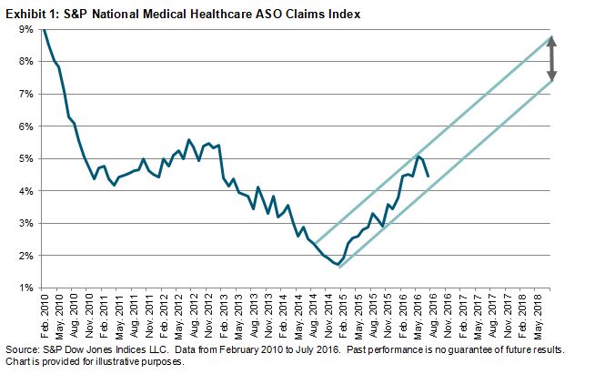
According to the S&P Healthcare Claims Indices, employers should be cautious about getting comfortable with trends in the 4.5%-5% range.  While the most recent data indicates that trends dropped from almost 5% in June 2016 to around 4.5% in July 2016, the overall movement of the trend is still upward.  The S&P National Medical Healthcare ASO Claims Index has been steadily gaining since January 2015, when it reached a low of 1.73% on a national basis (see Exhibit 1).  Over this period of time, the trend has moved in a narrow corridor, approximately 100 bps wide.  Other than three individual months where the trend moved 0.63% (May 2016) and 0.68% (February and November 2015), it has not deviated more than 0.50% in any given month.  In fact, the average trend change over that period has been an increase of 0.19%.  What happens if it continues to move in this corridor over the next 12 to 24 months?  If this were to happen, then in 12 months’ time, the trend could be between 5.76% and 6.76%, and by July 2018, it could be between 7.56% and 8.56%.  This represents a significant change from where the trend is today.  Of course, many market factors could play a role to change the current pattern.  In the next post, we will look at some select geographies across the U.S. to study their change in trends over the past several years.

capture

The posts on this blog are opinions, not advice. Please read our Disclaimers.

Our Humble Solution to Unite Europe

Contributor Image
Reid Steadman

Former Managing Director, Global Head of ESG & Innovation

S&P Dow Jones Indices

Henry Kissinger famously said, “Who do I call if I want to speak to Europe?” In the world of investments, a similar question could be asked, “What index do I use if I want to invest in Europe?” The answer isn’t apparent, and this is why: the leading regional index in Europe, the EURO STOXX 50, doesn’t represent all of developed Europe.

This is a problem and an opportunity. It’s a problem because investors don’t realize the full network effects of relying on one index standard. Though the EURO STOXX 50 is the top index, investors use many indices to get exposure to this region. The result is a fragmented index landscape.

On the other hand, it’s an opportunity for an index provider to step forward to unite Europe by establishing a solution that is both representative of the region in its entirety and an efficient underlying for derivatives and other financial products.

Though establishing a new index standard may seem an impossible mission, we are regularly approached by investment banks and asset managers who are interested in a change. With this in mind, it’s worth considering from time to time what the ideal index landscape for Europe should be and whether the investment community can take steps to achieve it. Solutions already exist. We feel that S&P Dow Jones Indices has a strong candidate in the S&P Europe 350. The challenge is to elevate an index like this for the market to rally around.

A New Standard for Europe
The EURO STOXX 50 is the leading index for futures and options trading, as well as the leading index for ETF assets in the region. The main advantage of this index is its efficiency. The index has, of course, 50 constituents that are easily bought and sold and therefore represent a hedgeable underlying for financial products. The major downside to this index is that it only represents the Eurozone, and therefore excludes major markets such as the United Kingdom and Switzerland.

The S&P Europe 350, on the other hand, includes securities from every developed market but still contains a manageably low number of constituents. It covers 81% of Europe’s market capitalization using only 20% of the region’s tradable securities. The country weightings of the S&P Europe 350 are roughly in line with the broad universe, while the EURO STOXX 50 is weighted much differently. The table below that compares these indices with the S&P Europe Broad Market Index illustrates this.

Country S&P Europe 350 S&P Europe BMI EURO STOXX 50
Austria 0.2% 0.5%
Belgium 2.2% 2.3% 3.7%
Denmark 2.6% 2.7%  –
Finland 1.5% 1.8% 1.2%
France 15.4% 14.7% 37.0%
Germany 14.1% 13.6% 33.1%
Ireland 1.1% 1.2% 1.3%
Italy 3.4% 3.6% 4.5%
Luxembourg 0.4% 0.4%  –
Netherlands 4.9% 5.3% 9.5%
Norway 0.9% 1.4%
Portugal 0.2% 0.3%
Spain 4.7% 4.8% 9.8%
Sweden 4.6% 5.3%
Switzerland 14.4% 13.4%
United Kingdom 29.6% 28.8%
100% 100% 100%

Sources: S&P Dow Jones Indices, STOXX Ltd.

Though these three indices – the S&P Europe 350, S&P Europe BMI, and the EURO STOXX 50 – are highly correlated, the EURO STOXX 50 has underperformed, with higher levels of risk.

Data as of Oct 31, 2016 (Euros, TR) S&P Europe 350 S&P Europe BMI EURO STOXX 50
Annualized Returns
1 Year -6.33% -5.59% -7.95%
3 Year 4.90% 5.68% 2.62%
5 Year 10.31% 11.07% 8.28%
10 Year 2.98% 3.42% 0.41%
Annualized Risk
3 Year 12.96% 12.69% 14.92%
5 Year 11.85% 11.68% 14.62%
10 Year 15.35% 15.52% 18.28%
Risk Adjusted Return
3 Year 0.38 0.45 0.18
5 Year 0.87 0.95 0.57
10 Year 0.19 0.22 0.02

Sources: S&P Dow Jones Indices, STOXX Ltd.

A Change is Needed and Will Come
Europe needs an index that balances efficiency and breadth such that investors enjoy the benefits of both. We are speaking with major product providers and institutional investors about the S&P Europe 350 as a solution. A change from the current indices won’t happen soon, but it will eventually come, and when it does, we will wonder why we didn’t make the switch sooner.

The posts on this blog are opinions, not advice. Please read our Disclaimers.

Trimming the Emissions Tree

Contributor Image
Emily Ulrich

Former Senior Product Manager, ESG Indices

S&P Dow Jones Indices

Some market participants may (understandably) get confused about the difference between “fossil fuel free” indices and “carbon efficient” indices.  They do sound a lot alike!  However, there are some important differences, and I thought I’d use this post to explain.  In a previous post, I discussed the elements of sustainability investing and the nature of the environmental component.  This “environmental” label is in part defined by a reduction in carbon, which is split into two categories: carbon efficiency and fossil fuels.

For the first category, S&P Dow Jones Indices uses data from Trucost to measure greenhouse gas (GHG) emissions per revenue for each company.  Trucost categorizes this emissions data as “direct” and “first tier indirect.”  The combination of these two tiers encompasses what Greenhouse Gas Protocol refers to as Scope 1, Scope 2, and Scope 3 emissions from direct suppliers.

“Direct” (or Scope 1) is rather simple.  It includes direct emissions from companies, i.e., the burning of fossil fuels or emissions released during the manufacturing process.

It gets a little more complicated with indirect emissions (referred to as Scopes 2 and 3).  Scope 2 refers to emissions from “purchased or acquired electricity, steam, heat, and cooling” for own use.[1]  Scope 3 encompasses all other indirect emissions, including transportation and distribution, business travel, and leased assets.[2]  In these two scopes, S&P Dow Jones Indices focuses on the GHG emissions associated with purchased goods and services from direct suppliers.

capture

This efficiency data is incorporated into our S&P Carbon Efficient Series, which can either reweight companies based on carbon efficiency or exclude them based on inefficiency.  As Exhibit 2 illustrates, these indices have been effective at reducing emissions when compared with the benchmark.

capture

The second part of low carbon comes in the form of fossil fuel reserves.  Fossil fuels include coal, oil, and natural gas.  The idea behind reserves is not that they are directly harmful—rather, they can (and hypothetically will) be burned, which produces damaging greenhouse gases.  Because all fossil fuel reserves have the potential to be harmful, S&P DJI offers the S&P Fossil Fuel Free Indices, which are designed to exclude companies that own fossil fuel reserves.  RobecoSAM provides this data by researching all companies in the 23 GICS® energy subsectors and flagging those with fossil fuel ownership.

To put it another way, fossil fuels are an issue due to their potentially harmful impact, while carbon emissions are directly damaging to the environment.  For market participants looking to counteract environmental damage, these passive investment tools may prove valuable and effective.

[1]   http://www.ghgprotocol.org/scope_2_guidance

[2]   http://www.ghgprotocol.org/feature/scope-3-calculation-guidance

The posts on this blog are opinions, not advice. Please read our Disclaimers.

Surging US Dollar

Contributor Image
David Blitzer

Former Managing Director and Chairman of the Index Committee

S&P Dow Jones Indices

The US dollar continues to advance against most developed market currencies as analysts point to rising US interest rates and expectations of tax cuts and increased federal spending as reasons to expect further gains.

One might expect investors to shift their fixed income investments to markets with higher interest rates. Since rates are currently higher in the US than the UK, Japan or Canada, this might be a reason to expect the US dollar to appreciate against those other currencies. The charts compare the difference between the US ten year treasury yield and the yields on British, Canadian or Japanese rates with the forex value of those currencies against the dollar.  The charts suggest that interest rate spreads do have some relation to foreign exchange rates. However, the linkage is not strong enough to reliably forecast the forex rates and the charts say nothing about causation – which comes first between interest rates and currency (Note that the line for the British pound against the dollar is inverted so that when both lines rise, the correlation is positive.)

three

Interest rate differentials aren’t the only factors affecting forex rates. Macroeconomic policy also matters.  With the elections, it appears that US fiscal policy will ease substantially as spending increases and taxes are cut. The new administration has argued for higher US interest rates and tighter monetary policy – given yesterday’s move by the Fed, that is likely.  The first Reagan administration (1981-85) had tight money, easy fiscal policy and a soaring US dollar.

Forecasting foreign exchange rates is notoriously difficult. There is a long series of academic papers extending back to the 1980s testing forex forecasting models. A random walk model with no economic or financial variables tends to do as well as any of the economic and financial models. One explanation is that forex rates, like most of financial variables, depend on expectations of the future.  Back testing a model with realized expectations often gives great results which vanish when the expectations need to be about the future rather than the past.

Even if we can’t accurately forecast foreign exchange rates, we can think about their impact. Having a strong currency may make people feel good about their country; it isn’t always the most desirable economic policy. A strong dollar is good for consumers: cheaper imports and less expensive foreign travel. However, it can hurt exporters whose customers face higher prices in their own currencies. A company deciding between manufacturing at home or abroad may see the strong dollar as a reason to ship jobs overseas.  However, policies to push the dollar down can also create problems. A collapsing dollar would mean higher import prices importing inflation. Given complexity and difficulty of trying to forecast or manage the foreign exchange rate, the answer maybe to hope for a currency rate that is roughly right and not too volatile.

The posts on this blog are opinions, not advice. Please read our Disclaimers.

Round Numbers and the Dow

Contributor Image
David Blitzer

Former Managing Director and Chairman of the Index Committee

S&P Dow Jones Indices

As the Dow Jones Industrial Average approaches the 20,000 level everyone seems to be suddenly fascinated with the figure. People who rarely ask if the market is up or down want to know if the Dow will cross this supposed benchmark today. Journalists   with years sent covering the markets want to know what 20,000 means.  But, if the Dow had started in 1895 instead of 1896 we would probably have passed 20,000 a year ago.

Before we all get too excited, we might remember what happened after the Dow crossed 10,000 for the first time in April, 1999 – it took two big falls back over the next 10 years. The chart shows the Dow from March 30, 1999 to June 30, 2011 with two nasty bear markets.

Psychological studies suggest that a round number is seen as more stable and solid than a more precise figure.  Saying the Dow closed 9,911.21 yesterday may be sound precise and accurate but certainly doesn’t hint have the positive attributes that people tend to associate with a large round number.  If you ignore the chart 20,000 might make you think the market isn’t about to drop. Round numbers may be used to describe products while more exact numbers slightly below a round number are popular for prices.  Prices of individual stocks tend to cluster near round numbers, probably because most people read numbers left to right and 19.90 sounds a lot cheaper than 20.00.  An investor will buy at 19.90 but hold at 20. Moreover, the scale matters: when markets in Europe switched to the euro from the former local currencies, these round number effects switched from the local currency to the euro.

For investors the level of the Dow or any index depends on an arbitrary base value — what really matters the percentage gain or loss over time.

The posts on this blog are opinions, not advice. Please read our Disclaimers.