Get Indexology® Blog updates via email.

In This List

Why Credit Should Not Be an Independent Asset Class Within a Risk Parity Benchmark

Valuing Research: Three Questions

The Virtues of Slow and Steady

Leveraged Loan Market – Growing but Lower Protection?

October Outperformance for the S&P Risk Parity Indices

Why Credit Should Not Be an Independent Asset Class Within a Risk Parity Benchmark

Contributor Image
Michael Rulle, Jr.

Founder, CEO

MSR Investments, LLC

This blog post was co-authored with Matthew Brown, President and COO, MSR Investments, LLC.

We believe there are two critical criteria an index must meet to be considered a benchmark:  1) it must be easy to implement as a viable investment alternative to managers that pursue the same strategy, and 2) it must define only the underlying beta that is common to the portfolios of all managers of the strategy. #1 is the reason we believe futures contracts work as constituents to the S&P Family of Risk Parity Indexes.  #2 is the reason we approve credit as an excluded asset class in this family of benchmarks.

The fact that some practitioners of risk parity have chosen to exclude credit from their portfolios would be reason enough to exclude credit from a benchmark.  However, we would like to take this opportunity to provide a more thorough explanation.  When we analyze the returns of credit indices and their impact on relative performance inside a risk parity portfolio, it becomes clear that when an investor gains exposure to credit they may in fact be gaining exposure to 3 underlying betas:  1) equities, 2) fixed income, and 3) short volatility.  Therefore, if we add credit exposure to a theoretical risk parity portfolio (or index) then we may simply be increasing exposure to equity and fixed income beta, which also ultimately has the effect of reducing exposure to commodities – the “parity” portion of the strategy is disrupted.  Furthermore, to add credit to the benchmark may also accidentally add a new, undesirable beta to the strategy – short volatility.

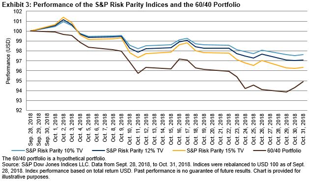
Since the end of 2008 to the end of September 2018, the daily serial correlation of the S&P 500 High Yield Corporate Bond Index is 0.46 along with 63.8% of positive return days.  These are both extraordinarily high numbers and are often endemic to option selling strategies.  [There is no explicit option selling in the index, so high yield investors are implicitly selling volatility.]  This concept manifests itself in a conditional correlation relationship with equities where the correlation (between equities and high yield credit) rises towards 1 with spikes in market volatility.  You need to look no further than the market behavior of February and October of this year to see an example of this phenomena.

We also compared the relative performance of risk parity managers (using a popular 10% Target Volatility (“TV”) manager-based risk parity index as a proxy for manager returns) to the S&P TV10 Risk Parity Benchmark over time to a theoretical 50/50 (Equities/Fixed Income) TV10 portfolio of futures contracts.  We correlated the relative performance of rolling 12 month returns of managers (i.e. managers’ return minus the benchmark return) to the 50/50 TV10 portfolio and got a correlation of 0.73 over the last eight years (prior to eight years ago there were very few managers in this space).  This comparison demonstrates that by adding credit to their portfolios, managers may simply be adding equity and fixed income beta, which the S&P Benchmarks already capture.  The two reasons that correlation isn’t even higher are likely 1) some managers (including the inventor of the strategy) do not invest in credit, and 2) the aforementioned exposure to volatility.

None of this analysis precludes the inclusion of credit in a risk parity portfolio.  The reason to hire a manager is because you want that manager to provide alpha relative to the benchmark.  We simply see credit as an alpha pursuing vehicle that combines underlying betas rather than providing exposure to its own unique beta.  And we don’t believe any this information should be controversial because an investor has the choice to invest with a manager or invest in investment products linked to the benchmark.  The manager vs benchmark analysis is now the same in risk parity as it is in other asset classes thanks to the S&P Family of Risk Parity Indexes.

The posts on this blog are opinions, not advice. Please read our Disclaimers.

Valuing Research: Three Questions

Contributor Image
Hamish Preston

Head of U.S. Equities

S&P Dow Jones Indices

We recently introduced a new measure, capacity-adjusted dispersion, to help conceptualize the relative value of research across different markets.  Intuitively, capacity-adjusted dispersion combines the potential opportunity for outperformance (dispersion) and the potential size of active positions (capitalization) in a given market.  Exhibit 1 shows the capacity-adjusted figures for several markets, globally.  All else being equal, for example, insights into S&P 500 sectors would have been over seven times more valuable than equally-accurate insights into S&P 500 stocks.

Exhibit 1: Capacity-Adjusted DispersionSource: The Value of Research: Skill, Capacity, and Opportunity.  Past performance is no guarantee of future results.  Chart is provided for illustrative purposes.

At first glance, Exhibit 1 makes grim reading for research analysts covering small- or mid-cap U.S. equities: the relatively small market capitalizations of stocks in the S&P MidCap 400 and the S&P SmallCap 600 more than neutralizes their higher dispersion, resulting in low capacity-adjusted dispersion figures.  However, the results do not necessarily mean there is no value to receiving research covering small- or mid-cap U.S. stocks.

One important assumption of the stylized framework outlined in our paper is that the predictive content of research is the same for all analysts.  In reality, this is unlikely to be true: some analysts are likely to be better than others at predicting how constituents (stocks, sectors, or countries) will perform in the future.  If we allow the predictive content of research reports to vary, Exhibit 1 has another interpretation: the predictive content of research covering S&P SmallCap 600 stocks needed to be 50 times more accurate than for research covering S&P 500 stocks in order for the two research values to be the same.  Exhibit 2 shows the relative predictive content required to make the value of research for each of the indices in Exhibit 1 equal to the value of research for S&P 500 stocks.

Exhibit 2: Predictive Content Required for Equivalent Research Value Source: The Value of Research: Skill, Capacity, and Opportunity.  Past performance is no guarantee of future results.  Chart is provided for illustrative purposes

Deciding how to allocate a research budget is a challenging task.  Nonetheless, our stylized framework suggests three questions are important:

  • How accurate are research reports’ predictions?
  • What is the potential reward to being correct?
  • How big can an investor’s active positions be?

Answering these three questions may help market participants use their research budgets more effectively when attempting to deliver alpha.

The posts on this blog are opinions, not advice. Please read our Disclaimers.

The Virtues of Slow and Steady

Contributor Image
Fei Mei Chan

Former Director, Core Product Management

S&P Dow Jones Indices

For most of 2018, the S&P 500 Low Volatility Index® underperformed its parent S&P 500. Through the first nine months of 2018, the S&P 500 climbed 11% while the S&P 500 Low Volatility Index was up only 6%. Then October came and, in one month of acute volatility, the low volatility index recaptured parity with the benchmark. Both indices were up around 3% year to date through Oct. 31, 2018. (This reversal trend continued into November and the S&P 500 Low Volatility Index now has the lead.)

Volatility rose across all sectors of the S&P 500 (see Exhibit 1) and this gives us partial insight into the latest rebalance (reflecting data as of Oct. 31, 2018 and effective after market close Nov. 16, 2018) for the S&P 500 Low Volatility Index.

Exhibit 2 shows the sector allocations for the low volatility index after the most recent rebalance compared to three months prior. As a side note, the GICS reshuffle at the end of September 2018 resulted in a newly named Communication Services sector (combining the old Telecommunication Services sector with some companies shifted from Consumer Discretionary and Technology). However, as it relates to the S&P 500 Low Volatility Index, this change was mostly cosmetic. The index held no Telecom companies three months ago and this rebalance also yielded no stocks from the Communication Services.

Outside of the GICS restructure, the most significant changes were in Health Care and Technology, an addition and a reduction of 4%, respectively. A few names dropped from the Technology sector but the sector’s current standing within the index is still fairly significant from a historical context. Real Estate continued to gain ground, now almost on par with Utilities’ weight in the index. It is the second consecutive rebalance where Utilities scaled back; the sector now has a 21% allocation. Consumer Discretionary’s addition of 2% was somewhat counterintuitive, as the sector was among those that rose the most in volatility, pointing to specific stocks with lower relative volatility in this sector.


The posts on this blog are opinions, not advice. Please read our Disclaimers.

Leveraged Loan Market – Growing but Lower Protection?

Contributor Image
Hong Xie

Former Senior Director, Global Research & Design

S&P Dow Jones Indices

In a prior blog,[1] we highlighted the return profile and yield of the S&P/LSTA U.S. Leveraged Loan 100 Index. We showed that carry is the dominant driver of returns. In this follow-up post, we review additional characteristics of the senior loan market and its evolution in recent years.

The leveraged loan deal size has increased significantly on average during the past six years. Exhibit 1 shows the total and median outstanding size of the 100 loans in the index. From March 2007 to September 2018, the median size of the loans almost doubled, from USD 1.5 billion to USD 2.8 billion. Since the index includes only the 100 largest loan facilities, the total loan size represented by the index increased consistently with the steady growth of the individual loan size, from USD 171 billion to USD 302 billion over the same period.

With the rapid growth of the loan market, an increasing number of loans are issued with fewer restrictions and protective covenants for the benefit of the lender. We demonstrate this in Exhibit 2, which shows that the percentage of covenant-light loans in the index grew from 31% in June 2012 to 79% in September 2018.

Over the past few years, the loan market has seen extensive refinancing at lower spread due to strong demand from investors. Exhibit 3 shows the comparison of the original LIBOR spread and the current LIBOR spread for the index from October 2012 to September 2018. Until the end of 2015, these two spread series followed each other closely, reflecting limited refinancing activities in the loan market. In the first half of 2016, refinancing picked up speed and quickly resulted in lower current spread than original spread. However, from the second half of 2016 to September 2018, the gap between current and original spread steadily closed.

Lastly, we review the industry allocation of the S&P/LSTA U.S. Leveraged Loan 100 Index over time. Exhibit 4 shows the historical industry composition of the index at the end of each year since 2007. As of September 2018, the Services/Retail industries is the largest, accounting for 21% of the index, followed by Computers & Electronics at 18%.

During recent years, leveraged loans have been one of the most popular fixed income segments, given their relatively higher yield and little duration risk. With strong demand from market participants, the leveraged loan market itself is experiencing significant growth in size and is undergoing changes in deal structure. Our analysis shows that among the larger loans, as represented by the S&P/LSTA Leveraged Loan 100 Index, more loans lack protective covenants for lenders. In addition, while loan refinancing was widespread in 2016, which caused a gap between original and current spread, that gap has diminished since then.

[1] https://www.indexologyblog.com/2018/10/24/leveraged-loans-in-a-rising-rate-environment-carry-factor-dominates/

The posts on this blog are opinions, not advice. Please read our Disclaimers.

October Outperformance for the S&P Risk Parity Indices

Contributor Image
Rupert Watts

Head of Factors and Dividends

S&P Dow Jones Indices

Traditionally known for spooky ghosts and witches, October was also a scary month for investors. In spite of an end-of-month rally, global stocks recorded their worst monthly loss since 2011, wiping out USD 5 trillion of investor value. Furthermore, investors were spooked by a rare simultaneous drop in bond prices. In short, this was not a great month for diversification.

While equities and bonds have historically had a low correlation, the diversification benefit has not been maximized by asset-weighted portfolios such as the traditional 60/40 allocation. The influence of bonds is often drowned out by their more volatile equity counterpart. Of course, this was painfully witnessed firsthand during the 2008 global financial crisis, as portfolios dominated by equities suffered large drawdowns.

One of the silver linings of the financial crisis was that it triggered a shift in the way the asset owner community thinks about risk. Increasingly, investors have begun to view asset allocation through a risk-based lens and to embrace the idea of viewing individual assets in a total portfolio context. This philosophy is at the heart of a class of investment strategies known as risk parity.

Risk parity allocates capital across asset classes so that each asset class contributes an equal amount of volatility to the total volatility of the portfolio. It typically assigns higher weights to lower-returning asset classes, such as bonds. The goal of risk parity is to maximize the diversification benefits across complementary asset classes in order to provide a smoother return profile and minimize losses from another major downturn. In the aftermath of that crisis, risk parity has gained significant traction within the asset owner community, growing to an estimated USD 150 billion to USD 175 billion at year-end 2017, according to the International Monetary Fund.[1]

Surprisingly, there was no clear, relevant benchmark to serve this large, established asset base. Upon identifying this need, we launched the S&P Risk Parity Indices with the goal of providing a better way to measure the efficacy of existing risk parity funds. Despite only having been launched in July 2018, our risk parity index suite is already generating a significant amount of interest across the asset owner and consulting channels.

Although it is never wise to judge a long-term strategy by such a narrow time frame, I was excited to appraise October’s performance, given that it was the first significant market “blip” since our index series was launched.

The good news is that each volatility target in the suite outperformed the global 60/40 portfolio, posting modest losses compared with the large drawdowns witnessed in equity markets (see Exhibits 2 and 3). Of course, much of this outperformance was due to relatively lower allocation to equities, accounting for less than 20% of the allocation weight. However, assuming historical low correlations persist, risk-balanced portfolios such as this will likely continue to outperform during pullbacks.

These promising results make me excited to conduct my next analysis to see how the S&P Risk Parity Indices performed relative to their active counterparts. Stay tuned!

[1] https://www.imf.org/~/media/Files/Publications/GFSR/2017/October/Chapter-1/pdf-data/figure1-21.ashx

The posts on this blog are opinions, not advice. Please read our Disclaimers.