We recently launched the monthly U.S. S&P Select Industry Dashboard, which provides key metrics, analysis of correlation and dispersion, and historical risk/return data for 20 investable select industry indices.
The dashboard is a natural extension of our U.S. Select Sector Dashboard, which provides analysis for investable sectors across the large-, mid-, and small-cap ranges. For example, in May 2018, technology was the top-performing select sector. This outperformance was driven by strength in the S&P Semiconductors Select Industry Index and S&P Internet Select Industry Index.
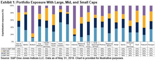
One key feature of this new dashboard is that it illustrates each select industry’s distribution across the range of large, mid, and small caps. As seen in Exhibit 1, in May 2018, biotechnology had the most micro-cap exposure, as opposed to homebuilders, which had the highest large-cap exposure.
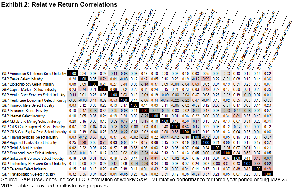
Another feature of this dashboard is a correlation matrix of the relative returns for all 20 S&P Select Industry indices. Banks and regional banks were highly correlated, as expected, as opposed to biotechnology and oil & gas equipment, which shared a lower correlation (see Exhibit 2).
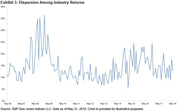
Finally, as the S&P Select Industry indices are much more granular than their sector counterparts, we report on dispersion across industries (in contrast to our reporting within sectors). As of May 2018, the annualized dispersion among industry returns remained at moderate levels (see Exhibit 3); we shall continue to monitor the results in the coming months.
To sign up to receive the U.S. Select Sector and U.S. S&P Select Industry Dashboards, please refer to this link.
The posts on this blog are opinions, not advice. Please read our Disclaimers.