Get Indexology® Blog updates via email.

In This List

Rieger Report: Muni G.O.'s or Revenue Bonds in 2016?

Party like it's 2007

The Consequences of Concentration: 2 - Luck Ascendant

Rieger Report: Bond Market Malformation Worsens

Credit Cards and Retail Sales

Rieger Report: Muni G.O.'s or Revenue Bonds in 2016?

Contributor Image
J.R. Rieger

Former Head of Fixed Income Indices

S&P Dow Jones Indices

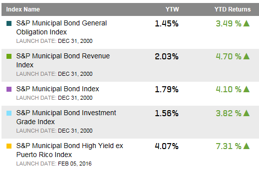
The debate over which sector of municipal bonds, general obligation bonds (G.O.’s) or revenue bonds can provide a better return is a constant one.  So far in 2016, the S&P Municipal Bond Revenue Index has outperformed verses the S&P Municipal Bond General Obligation Index.

Peeling the onion back a bit may help provide more insights.

  • In general, revenue bonds have a higher coupon and higher yield than general obligation bonds so that is a factor in return performance under normal market conditions.  Year to date the G.O.’s have returned 3.49% while revenue bonds have returned 4.7%.
  • While revenue bonds have indeed outperformed, the bond issues that are below investment grade revenue bonds are also a contributing factor.  The S&P Municipal Bond High Yield Ex-Puerto Rico Index is up over 7.3% year-to-date and the majority of those bonds are revenue bonds and not general obligation bonds.  In contrast, the S&P Municipal Bond Investment Grade Index which includes both G.O.’s and revenue bonds has returned over 3.8% year-to-date.  (Note: Selected the S&P Municipal Bond High Yield Ex-Puerto Rico Index as Puerto Rico revenue bonds have seen a significant rebound in 2016 and would further skew the results).

Select municipal bond indices, their yields and total returns:

Source: S&P Dow Jones Indices, LLC. Data as of July 21,2016. Table is provided for illustrative purposes. It is not possible to invest directly in an index. Past performance is no guarantee of future results.

Please join me on Twitter @JRRieger  and LinkedIn

The posts on this blog are opinions, not advice. Please read our Disclaimers.

Party like it's 2007

Contributor Image
David Blitzer

Former Managing Director and Chairman of the Index Committee

S&P Dow Jones Indices

House sales and prices are rising.  Home sales in June were 5.57 million at annual rates, the highest since February 2007 when national home prices peaked.  Currently prices as measured by the S&P/Case-Shiller National Home Price Index are climbing at a 5% annual rate and are a mere 3% from their all-time peak.

What next?  The next S&P/Case-Shiller Home Price Index report will be released on Tuesday morning at 9 AM – check to see if the advance continues.  The data will be posted at www.spdji.com.

The posts on this blog are opinions, not advice. Please read our Disclaimers.

The Consequences of Concentration: 2 - Luck Ascendant

Contributor Image
Craig Lazzara

Former Managing Director, Index Investment Strategy

S&P Dow Jones Indices

Is the remedy for active managers’ well-known performance difficulties to become more active? Some observers think so, and argue that less diversified, more concentrated portfolios should be the wave of active management’s future.  But there are a number of adverse consequences to concentration — for example, risk is likely to increase.   A second consequence is that in manager evaluation, the importance of luck will increase relative to the importance of skill.

While some managers may be skillful, none are infallible.  A manager who is skillful but not infallible will benefit from having more, rather than fewer, opportunities to display his skill.  A useful analogy is to the house in a casino: on any given spin of the roulette wheel, the house has a small likelihood of winning; over thousands of spins, the house’s advantage is overwhelming.

The chart below illustrates the concept.  In a coin-flipping game with a biased coin, we “win”  if more than half our tosses come up heads.  We play with two coins, with a 53% and a 55% chance of heads.  The probability of winning grows as the number of tosses rises and, for any number of tosses, the chance of winning is higher with the more favorable coin.  However, if the number of tosses varies between the two coins, at some point, it is preferable to have a worse coin and more tosses.

Prob Winning as Function of Number of Tosses

The analogy to security selection is straightforward: instead of flipping a coin, a manager picks stocks with a given probability of outperforming the market.  If more than half his picks outperform, the manager “wins” the game.  The more picks he makes, the more likely it is that his skill dominates his luck.  As with the coin-flipping game, for a constant number of stocks, a more skillful manager is more likely to outperform than a less skillful manager.  But if the number of picks varies, an asset owner may be more likely to outperform with a less skillful manager who holds more stocks.

An unskilled manager has a better chance of winning the game the smaller the number of tosses (just as a skilled manager has a better chance the more he tosses).  Concentrating portfolios makes it more likely that good managers will look bad, more likely that bad managers will look good, and more likely that asset owners’ decisions will be informed by luck rather than skill.

The posts on this blog are opinions, not advice. Please read our Disclaimers.

Rieger Report: Bond Market Malformation Worsens

Contributor Image
J.R. Rieger

Former Head of Fixed Income Indices

S&P Dow Jones Indices

As we approach August, the U.S. bond markets have extended their malformed shape despite another round of chatter about the possibility of a Fed hike, this time towards year end.  Subsequent to the June 2nd, 2016 blog Bond Market Malformation, Trouble Ahead? bond yields have compressed further.

Demand continues to outstrip the supply of U.S. investment grade corporate and municipal bond issues as investors seek incremental yield over Treasuries and safe harbors (risk off) during volatile periods. The result bond prices have continued to rise and yields have fallen.

  • Record low municipal yields: The weighted average yield of bonds in the S&P Municipal Bond Index hit a low point not seen before in its 15 year life as the yield to worst (YTW) reached a low point on July 8th of 1.687%.
  • The Taxable Equivalent Yield of the bonds in the S&P Municipal Bond Index is currently right on top of the yield of the corporate bonds in the S&P 500 Bond Index.

Chart 1: Select bond indices and yields (yield to worst):

Blog 7 20 2016 Chart


The posts on this blog are opinions, not advice. Please read our Disclaimers.

Credit Cards and Retail Sales

Contributor Image
David Blitzer

Former Managing Director and Chairman of the Index Committee

S&P Dow Jones Indices

This morning’s release of the S&P/Experian Consumer Credit Default Indices showed that default rates for bank cards – such as VISA, MasterCard or others – climbed year to date while other categories of consumer borrowing such as mortgages and auto loans did not. Even though the bank card rate at 3.11% is 61 basis points above its recent low while the other default rates are within a few basis points of the low, there is little reason to be concerned over rising consumer debt levels.

Bank cards, often called revolving credit, are loans without a fixed maturity which can be paid off at any time.  Some consumers use these cards for convenience rather than borrowing and pay off the balances completely each month. Others may use the cards to borrow in some months and then carry a balance.  Whether for convenience or borrowing, these cards are used for retail sales.  As retail sales expand, card usage and the outstanding balances on these cards are likely to grow.

Comparing consumer credit card borrowing and retail sales shows that consumers are not over-extended. The recent rise in bank card defaults is not a sign of problems around the corner. The first chart shows the ratio of outstanding credit card balances to retail sales excluding automobile since 1992. The ratio is shown as an index with January 1992=100. During the 1990s with a strong economy the ratio rose – card use grew faster than retail sales. From 2000 to 2008, the credit-to-sales ratio bounced around: rising debt in the 2001 recession followed by some deleveraging and then expanded credit and good times until the financial crisis. The bump up in 2008 reflects a squeeze as the economy dropped into recession. This was followed by massive deleveraging as hard times forced consumers to tighten their belts.  The deleveraging bottomed out in March 2014. Since then credit outstanding is up 10.3% while retail sales are up almost 5% as of May 2016.

The second chart shows a related measure compiled by the Federal Reserve: the Consumer Debt Service Ratio (DSR) is the percentage of disposable personal income used to service consumer debt excluding mortgages.  Like the previous measure, the DSR is off the bottom but not high enough to raise any concerns.

Both of these measures confirm other recent reports on consumer confidence, retail sales and employment which show that American consumers are boosting US economic growth.

The posts on this blog are opinions, not advice. Please read our Disclaimers.