Get Indexology® Blog updates via email.

In This List

Are employers' efforts to control healthcare costs futile?

Performance Analysis of Unconstrained Bond Funds

Asian Fixed Income: What Does it Look Like Without India and China?

The Power of a Consensus Glide Path

A Closer Look at the SPIVA India Year-End 2015 Scorecard

Are employers' efforts to control healthcare costs futile?

Contributor Image
Glenn Doody

Vice President, Product Management, Technology Innovation and Specialty Products

S&P Dow Jones Indices

The question for the future of the private insurance system is this: are employers’ efforts to control healthcare costs futile?  Recent data from the S&P Healthcare Claims Indices would suggest that this may actually be the case.  According to the indices, costs for self-insured employers, known as Administrative Services Only (ASO) in the healthcare industry, are starting to increase again after showing declining cost trend levels from the 9% annual cost increases experienced in 2010.  To illustrate this concern, when we peer deeper into the recent data and look at hospital inpatient charges, we see an alarming trend.

Capture

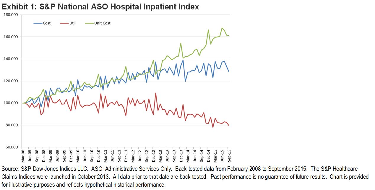
According to Exhibit 1, which looks at hospital inpatient costs, utilization, and average cost per day, employers have done remarkably well in controlling the utilization of services.  This decline in utilization can be attributed to many things, including increasing participant costs for inpatient services, the ongoing substitution of outpatient facilities for services formerly done on an inpatient basis, as well as better education among the users of these services.  However, what is evident is that even though utilization has declined since 2012, we have seen that average costs on the inpatient side have remained steady between USD 120 and USD 140 per member per month.  How is it that utilization or use of healthcare services could be falling, while at the same time average costs are holding steady?  The answer is evident in the average cost per inpatient per day index (unit cost) numbers.  Unit costs have been mirroring in reverse the drop in utilization.  This is a clear indication that as utilization drops, there is less revenue for service providers, and to compensate they have been increasing the fees charged for services to offset the revenue loss.  If this is the case, employers must ask themselves if future efforts to instill cost control are going to be met with the same results.

The posts on this blog are opinions, not advice. Please read our Disclaimers.

Performance Analysis of Unconstrained Bond Funds

Contributor Image
Hong Xie

Former Senior Director, Global Research & Design

S&P Dow Jones Indices

Most unconstrained bond funds claim to offer the following potential benefits:

  • Low correlation to core fixed income;
  • Attractive risk-adjusted returns; and
  • Actively managed downside risk mitigation.

We examined each of these claims for the average performance of unconstrained bond funds since 2011 and noted that fund performance varied among them.

Persistently Higher Correlation to the Global Aggregate Bond Index Than the U.S. Aggregate Bond Index

Exhibit 1 shows the rolling two-year correlation of the average monthly return of unconstrained bond funds to that of the U.S. and global aggregate bond indices.  Though unconstrained bond funds do show periods of low, or at times negative, correlation to the U.S. Aggregate Bond Index, they also tend to demonstrate persistently high correlation of above 0.50 to the Global Aggregate Bond Index, though only until 2014.

Capture

Lower Risk-Adjusted Returns Than the U.S. Aggregate Bond Index on Average

Exhibit 2 shows the risk/return profile of unconstrained bond funds versus the U.S. and global aggregate bond indices.  On average, unconstrained bond funds delivered lower return and lower return per unit of volatility than the U.S. Aggregate Bond Index and higher return than the Global Aggregate Bond Index.  As average returns across funds tend to smooth out performance volatility due to the imperfect correlation between these funds, we also charted the performance statistics for quintile portfolios by return for the 36 funds that had full performance data for our analysis period.  Only one out of the five quintiles demonstrated a higher annualized return than the U.S. Aggregate Bond Index, and none outperformed the U.S. Aggregate Bond Index in terms of return per unit of volatility.

Capture

Improved Drawdown

Exhibit 3 shows the maximum drawdown for unconstrained bond funds versus the core fixed income indices for the analysis period.  On average, unconstrained bond funds experienced a maximum drawdown of 3.02%, which was better than the U.S. Aggregate Bond Index and the Global Aggregate Bond Index.  Exhibit 3 demonstrates the variance in maximum drawdown across all funds.  On average, at least 60% of funds experienced worse maximum drawdown than the U.S. Aggregate Bond Index.

Capture

The posts on this blog are opinions, not advice. Please read our Disclaimers.

Asian Fixed Income: What Does it Look Like Without India and China?

Contributor Image
Michele Leung

Former Director, Fixed Income Indices

S&P Dow Jones Indices

According to the S&P Pan Asia Bond Index, India and China together represented 79% of the overall market value as of April 18, 2016.  While foreign investor access to these countries is opening up, the investability is still limited.  The market value excluding these two countries is around USD 2 trillion, as tracked by the S&P Pan Asia Ex China and India Bond Index, and Korea has the biggest exposure (see Exhibit 1).

Looking at historical performances, the S&P Pan Asia Bond Index outperformed the S&P Pan Asia Ex China and India Bond Index over the past one-, three-, and five-year periods, reflected the robust returns in the Indian and Chinese markets in recent years.  However, the trend has been reversing in 2016 and the S&P Pan Asia Ex China and India Bond Index increased 5.65% YTD, as of April 1, 2016. Interestingly, the S&P Pan Asia Ex China and India Bond Index also demonstrated higher volatility in the past 5 years (see Exhibit 2).

Exhibit 1: Country Breakdown of the S&P Pan Asia Ex China and India Bond Index

201604a 201604b


The posts on this blog are opinions, not advice. Please read our Disclaimers.

The Power of a Consensus Glide Path

Contributor Image
Philip Murphy

Former Managing Director, Global Head of Index Governance

S&P Dow Jones Indices

Some who follow target date fund (TDF) performance have taken note that lately, the S&P Target Date Index Series has outperformed many TDFs.  In most historical periods, index performance was middle of the pack.  However, 2015 was an exception, as shown in Report 2 of our Year-End 2015 Target Date Scorecard.  Every vintage of the S&P Target Date Index Series produced total returns that were close to, or better than, those of funds in the 90th percentile of the target date mutual fund universe.

This story may seem like another chapter in the “index versus active” narrative, but it is particularly puzzling because of the methodology used to determine the benchmark asset allocation and glide path.  Every year, S&P DJI determines the asset allocation of each target date index vintage by compiling the holdings and asset-class exposure of a universe of active TDFs and using that data to create benchmark allocations reflecting average exposures of the active universe.  The benchmark therefore represents a consensus of asset-class exposure across its glide path; the average opinion, if you will, across the TDF industry.  I draw two conclusions from recent performance.

First, there is collective wisdom in the consensus.  There are a number of moving parts in every TDF suite.  Which asset classes are included?  What considerations inform the investment policy?  What assumptions are made?  How is the glide path expected to shift over time?  Which underlying funds are used to implement the investment policy?  What is the fee structure?  Whereas any individual TDF management team acts in response to an array of investment policy considerations, client interests, and self-interest, the consensus represents the wisdom of the crowd.  Collective thinking sometimes has superior value.

Second, it’s hard to beat a portfolio of index funds.  Single-asset-class managers and investors are challenged enough when it comes to beating cap-weighted benchmarks like the S&P 500®.  The risk of active underperformance is increased when multiple funds are included in a portfolio.  Rick Ferri and Alex Benke demonstrate this effect in their paper, “A Case for Index Fund Portfolios.”

One final point about average performance: even if we never see another year like 2015, consistently achieving average performance is a more reliable way of compounding returns over time than alternately bouncing between outperformance and underperformance.  Perhaps tracking a market consensus glide path would be more enlightened than most industry insiders care to admit.

The posts on this blog are opinions, not advice. Please read our Disclaimers.

A Closer Look at the SPIVA India Year-End 2015 Scorecard

Contributor Image
Utkarsh Agrawal

Associate Director, Global Research & Design

S&P Dow Jones Indices

In 2015, the S&P BSE SENSEX remained volatile and ended in the red, at -3.68%.  In contrast, the S&P BSE India Government Bond Index ended the year in the black, at 8.33%.  The net investment by domestic mutual funds in the Indian equity and debt markets was significantly higher than the net investment by foreign investors.  Domestic mutual funds invested INR 721.98 billion and INR 4,340.99 billion in equity and debt markets, respectively.  Meanwhile, foreign investors added INR 178.08 billion and 458.57 billion, respectively.   Investors displayed mixed sentiments, let’s take a quick look at the performance of Indian large-cap equity funds from the latest SPIVA India Scorecard produced by S&P Dow Jones Indices and Asia Index Private Limited.

  • Over the one-, three-, and five-year periods that ended in December 2015, 36%, 47%, and 57% of large-cap equity funds in India, respectively, underperformed the S&P BSE 100.
  • Over the five-year period studied, the survivorship rate was low, at 70%, and the asset-weighted fund return was 103 bps higher than the equal-weighted fund return. This shows that the funds with a larger asset base had the advantage of the economies of scale over the five-year period.
  • The return spread between the first and the third quartile break points of the fund performance was 4.59% over the five-year period, demonstrating that there was a wide dispersion in the returns of the funds in this category over this period.
Exhibit 1: Indian Equity Large- Cap Fund Characteristics
Statistic Five-Year Period (%)
Funds Outperformed by the S&P BSE 100 56.52
Survivorship 69.57
Equal-Weighted Fund Returns 7.53
Asset-Weighted Fund Returns 8.57
S&P BSE 100 Returns 7.09
First Quartile Breakpoint 10.01
Second Quartile Breakpoint 8.22
Third Quartile Breakpoint 5.42

Source: SPIVA India Year-End 2015 Scorecard.  Data as of Dec. 31, 2015.  Past performance is no guarantee of future results.  Table is provided for illustrative purposes.

For details on other periods and categories, please read the full report.

The posts on this blog are opinions, not advice. Please read our Disclaimers.