Get Indexology® Blog updates via email.

In This List

S&P BSE SENSEX – Does it really reflect the performance of the Indian Capital Market?

The Challenging Outlook for Interest Rates

Worth Every Penny

VIX: Reverting to the Mode

Three Myths of the U.S. Senior Loan Market

S&P BSE SENSEX – Does it really reflect the performance of the Indian Capital Market?

Contributor Image
Mahavir Kaswa

Former Associate Director, Product Management

S&P BSE Indices

It’s hot out there in India. Is it because of the peak of summer? Or because of the Modi swearing in as a PM? Or because of the S&P BSE SENSEX is reaching new highs in the past few weeks? On May 9, 2014, the index reached another new, all-time high of 23,048.49 (price return index). The S&P BSE SENSEX, India’s most-tracked bellwether index, is designed to measure the performance of the 30 largest, most-liquid and financially sound companies across key sectors of the Indian economy that are listed on the BSE Ltd.  The index is also regarded as the pulse of the Indian capital market across the world.  The question arises here; does the S&P BSE SENSEX really reflect the performance of the Indian capital market? Let’s check this out. The S&P BSE 500, which is one of the broadest market indices in the S&P BSE Index Family, covers roughly 95% of the total listed market capitalization on the BSE Ltd.  Thus, we can safely use the S&P BSE 500 as a proxy for the Indian capital market.  The S&P BSE SENSEX comprises only 30 stocks and covers close to 50% of the total listed market capitalization on BSE Ltd.

Exhibit 1: Total Market Capitalization Coverage
Indices/Exchange Total Market Capitalization (INR Billion) Coverage (%)
S&P BSE SENSEX 37,059.42 49
S&P BSE 500 71,138.43 95
BSE Ltd. 74,947.91 100

Source: S&P Dow Jones Indices and BSE Ltd.  Data as of April 30, 2014. Exhibit 2 shows annualized returns and annualized risk (risk measured in standard deviation) over the past one-, three- and five-year periods.  The Exhibit confirms the fact that the S&P BSE SENSEX and the S&P BSE 500 have similar risk/return profiles.  Over the past five years, the S&P BSE SENSEX has posted a risk-adjusted returns ratio of 0.76 (which means 0.76% of returns earned per unit of risk taken), while the S&P BSE 500 has posted a slightly lower (but similar) risk-adjusted return ratio of 0.73.

Exhibit 2: Index Performance (Return and Risk)
Period S&P BSE SENSEX (TR) S&P BSE 500 (TR)
Return (%) Risk (%) Risk Adjusted Return Ratio Return (%) Risk (%) Risk Adjusted Return Ratio
1-Year 17 13 1.26 15 16 0.95
3-Year 7 16 0.43 6 18 0.31
5-Year 16 21 0.76 17 23 0.73

Source: S&P Dow Jones Indices.  Data as of April 30, 2014.  Calculations are based on total return index levels in INR. As shown in Exhibit 3, the S&P BSE SENSEX and the S&P BSE 500 have fairly similar distributions across all sectors of the Indian capital market.  Financials comprises the highest proportion of the S&P BSE SENSEX (27.6%) and the S&P BSE 500 (25.6%); while a telecommunication service carries the lowest proportion of the indices (2% of the S&P BSE SENSEX and 2.2 % of the S&P BSE 500).  Other sectors follow a similar pattern, with similar weights in both of the indices.

Exhibit 3: Sector Composition of S&P BSE Indices
Sector S&P BSE SENSEX (%) S&P BSE 500 (%)
Consumer Discretionary 10.7 10.6
Consumer Staples 11.9 10.9
Energy 13.0 9.6
Financials 27.6 25.6
Health Care 5.5 6.9
Industrials 6.3 8.6
Information Technology 16.5 13.1
Materials 3.6 8.8
Telecommunication Services 2.0 2.2
Utilities 2.9 3.7
Total 100.0 100.0

Source: S&P Dow Jones Indices. Data as of April 30, 2014.

The posts on this blog are opinions, not advice. Please read our Disclaimers.

The Challenging Outlook for Interest Rates

Contributor Image
David Blitzer

Former Managing Director and Chairman of the Index Committee

S&P Dow Jones Indices

Analysts and forecasters in the US expect that the Fed will hold the fed funds rate at its current zero to 25 bp target until around the middle of 2015.  Meanwhile, expectations about Europe are shifting.   Recent comments from the UK by the former deputy governor of the Bank of England and others suggest that British interest rates could begin a slow climb sooner than in the US, maybe as soon the start of 2015.  The UK housing market is very strong with prices climbing rapidly.  Moreover, the strength is not just high-priced London houses sought by foreigners; it is in many parts of the country. Higher interest rates and a shift in government policies on support for mortgages are likely.  In both the US and the UK, the rise in interest rates will be slow and gradual and the eventual peak is likely to be modest compared to levels experienced in the years immediately before the financial crisis.

In the US the central bank will be feeling its way as it adjusts the operating procedures to controlling interest rates through the rates paid by the Fed on reserves rather than traditional open market operations.  Due to quantitative easing and the extreme growth of the Fed’s balance sheet, it cannot control interest rates by draining reserves from the banking system – excess reserves are much too large.  Instead, it will raise the rate it pays banks on their deposits at the central bank. The result is that banks will be encouraged to either raise the rates they charge on loans or shift funds from lending to their deposit accounts at the Fed. The central bank may need some time to fine tune its actions.

The outlook in Europe is different.  The European Central Bank is concerned that the economy is weakening and that deflation is a growing risk.  The response is likely to be continued easy money and efforts to keep yields low, somewhat similar to the Fed’s quantitative easing. Interest rates are likely to remain low, possibly lower than in either the US or the UK.

For investors these developments raise several questions.  While many are anxiously awaiting the return of higher yields on relatively safe instruments such as US treasuries, things will not be simple.  As interest rates climb, bond prices drop.  An investor who rushes into bonds at the first sign of rising yields may be rudely disappointed as capital losses driven by rising yields mount. Investors may hold off until they believe the rise in yields is almost over and then rush into bonds. This could cause a momentary pop in prices and temporally lower yields.  In short, timing the re-entry into some segments of the fixed income markets will be challenging.  The differing patterns of yields in the US, the UK and the euro area will also provide some questions.  If, as seems to be expected, yield turn up in the UK first while in the euro area they lag behind the US, there could be some shifts in both corporate issuance and investor preferences.

By the beginning of 2016, the fixed income landscape is likely to be quite different.  Treasuries and sovereign issues that pay a positive real yield would be welcome despite the puzzles they will bring.

The posts on this blog are opinions, not advice. Please read our Disclaimers.

Worth Every Penny

Contributor Image
Craig Lazzara

Former Managing Director, Index Investment Strategy

S&P Dow Jones Indices

This morning’s Wall Street Journal reports that “Investors are piling into the shares of small, risky companies at the fastest clip on record, in search of investments that promise a chance of outsize returns….”  We’ve commented on such risk-seeking behavior earlier, because it has an important bearing on the low volatility anomaly.

The tendency for low-volatility or low-beta portfolios to outperform market averages has been the subject of at least 40 years of academic and practitioner research.  Given its challenge to what “everyone knows” about risk and return, a number of explanations for the low vol anomaly have been advanced.

Our favorite, the so-called “preference for lotteries,” comes from the realm of behavioral finance.  The expected value of buying a lottery ticket is negative — so under the assumptions of classical economics, no one would ever buy a lottery ticket.  But this misses a broad swath of reality.  The behavioral explanation is that some people are willing to risk a known sum in exchange for the possibility, remote though it may be, of becoming humongously rich next Tuesday.

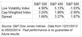
What’s the analog of a lottery ticket in the stock market?  The market’s lottery tickets are the shares of highly volatile, untested companies — exactly like the penny stocks cited by the Journal.  When investors pay up to buy volatility for volatility’s sake, it creates an opportunity for those who take the other side of their trades.  We see this in the results of our low volatility indices so far in 2014:

Low Volatility YTD 052214

It may appear paradoxical that low vol strategies are doing well when interest in speculative, penny-stock strategies is growing.  What behavioral finance tells us is that the two occurrences aren’t contradictory — in fact, one may be driving the other.

The posts on this blog are opinions, not advice. Please read our Disclaimers.

VIX: Reverting to the Mode

Contributor Image
Reid Steadman

Former Managing Director, Global Head of ESG & Innovation

S&P Dow Jones Indices

In the article at this link, Bill Luby – VIX analyst extraordinaire – dispels a misconception I have heard repeated at conferences and in presentations. Very often, people refer to VIX as “mean reverting.” This is not correct in the strictest sense of that phrase. VIX is not inclined to return to its long-term average. Rather, VIX is more likely to return to its “typical” levels. It’s more correct to say that VIX is mode reverting. I’ll explain more, since understanding this distinction is essential to understanding VIX. 

In Luby’s words, VIX has an asymmetric return profile. He notes that “VIX spikes are generally short-lived” and that “a low VIX often persists for extended periods.” 

Put another way, VIX is defined by its extremes. It’s like your hothead friend in high school who day to day is a reasonable guy, but occasionally, when something agitates him, he flares up and punches someone. Your friend’s average mood – halfway between calm and ready to commit criminal assault – doesn’t matter that much because he is rarely there. 

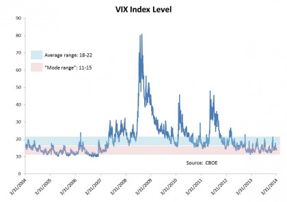
Let’s look at the past ten years, ending March 2014, to get a sense as to why an average is a less useful measure in the case of VIX. In that time, we have had 2,517 trading days. The average closing VIX value has been around 20. How many times has VIX closed at or around this average, say between 18 and 22 (those values inclusive)? The answer is 511 times, or 20% of all observations. 

Now let’s look at the most frequently observed level, the mode. After rounding, the VIX level that shows up most is 13. But how often does VIX land at or near this particular level? Again, let’s count. VIX has closed in a range between 11-15 exactly 955 times the past ten years, representing 38% of all trading days.

The best way to see this, however, is with a graph. You see huge upticks, particularly during the financial crisis. But VIX seems to drift back, sooner or later, to a certain base level.

Mode

So, the next time you are at a conference and you hear someone say VIX is mean reverting, boldly step up to the mic and correct them. You now know the real story.


The posts on this blog are opinions, not advice. Please read our Disclaimers.

Three Myths of the U.S. Senior Loan Market

Contributor Image
J.R. Rieger

Former Head of Fixed Income Indices

S&P Dow Jones Indices

The S&P/LSTA U.S. Leveraged Loan 100 Index has returned 1.76% year to date under performing vs. fixed rate high yield bonds.  The low rate environment and continued demand for yield generating asset classes has pushed the S&P U.S. Issued High Yield Corporate Bond Index returns to  4.32% year to date as yields have fallen by 38bps since year end.

Three myths of the U.S. senior loan market:

Myth 1: Senior loans are more volatile than high yield bonds:  the data just does not support this statement.

The five year standard deviation of index level changes (as of quarter end March 31, 2014):

  • S&P/LSTA U.S. Leveraged Loan 100 Index:  7.28%
  • S&P U.S. Issued High Yield Corporate Bond Index: 8.27%

Biggest index drop:

  • S&P/LSTA U.S. Leveraged Loan 100 Index:  -27.9% Dec 2008
  • S&P U.S. Issued High Yield Corporate Bond Index: -30.4% Nov 2008

(In Feb 2009, the S&P 500 was down over 46% and the S&P GSCI was down over 67%)

Myth 2: Interest rate floors built into many floating rate loans are a negative attribute of these loans: Senior loans are floating rate.  As rates rise, the interest rates these loans pay eventually rises.  Currently, approximately 80% of the loans in the S&P/LSTA U.S. Leveraged Loan 100 Index have interest rate floors that have protected buyers from the current extremely low rate environment.  As rates rise above those floors, the loans can be expected to pay even higher interest rates.  Meanwhile, lenders are getting higher rates due to these floors than had the floors not been in place. Prices of fixed rate bonds of course fall as bond yields rise.

Myth 3: The liquidity of the loan market is nonexistent:  During the first four months of 2014 over $198billion of senior loans have traded in the secondary market.  The 100 constituents of the S&P/LSTA U.S. Leveraged Loan 100 Index represented 25% of the trade volume (over $50billion). The Index is designed to track the most liquid of these senior loans and results in tracking over $237billion of loans by market value.LoantradevolumeApril2014

The posts on this blog are opinions, not advice. Please read our Disclaimers.