Get Indexology® Blog updates via email.

In This List

S&P Pure Growth Indices – Attributes and Performance Drivers

The Continued Ups and Downs of Dividends

The Challenge of Finding Outperforming Active Funds in Canada

Commodities Were Energetic in May

The S&P Composite 1500®: An Efficient Measure of the U.S. Market

S&P Pure Growth Indices – Attributes and Performance Drivers

Contributor Image
Wenli Bill Hao

Director, Factors and Dividends Indices, Product Management and Development

S&P Dow Jones Indices

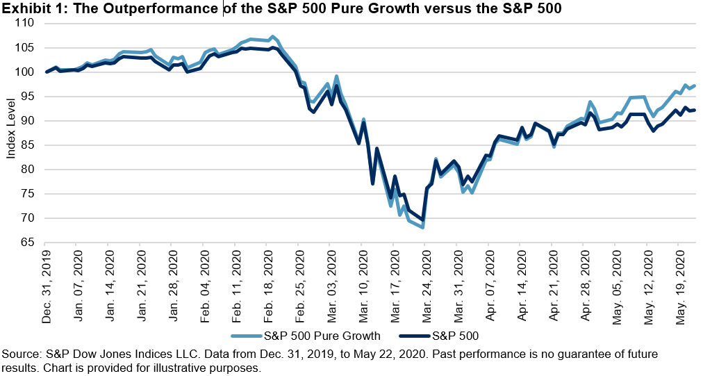
The S&P 500® has had a wild ride in 2020. The index hit an all-time high in February, then dropped 33.8% to the bottom in March due to the COVID-19 pandemic, and then rallied 32.6% by May 22. During this turbulent time, the S&P 500 Pure Growth, while declining along with markets, ultimately outperformed its benchmark by 4.92% (see Exhibit 1). The following analysis investigates attributes of this outperformance.

The S&P Pure Growth Index Series uses the following three components to define overall pure growth scores, and constituents are weighted based on their style scores:[i]

  • Three-year change in earnings per share (excluding extra items) over price per share;
  • Three-year sales per share growth rate; and
  • Momentum (12-month percentage price change).

Fundamental Risk Factor Exposure

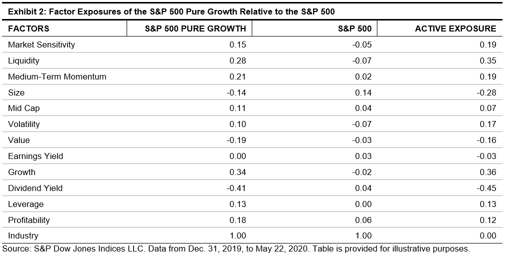
To better understand the characteristics of the S&P Pure Growth Index Series, we use a commercially available fundamental risk model to capture risk exposures. We measure active exposures of the S&P 500 Pure Growth relative to the S&P 500 (see Exhibit 2).

The S&P 500 Pure Growth had the highest positive tilt toward growth (0.36), followed by liquidity (0.35), medium-term momentum (0.19), and market sensitivity (0.19). Results were broadly in line with the index design . Moreover, the S&P 500 Pure Growth constituents tended to have higher return volatility, higher leverage, and better profitability.

On the other hand, the index was most underweight to the dividend yield factor (-0.45), followed by the size (-0.28) and value (-0.16) factors. This means that companies in the S&P 500 Pure Growth had lower dividend yields, tended to be smaller size, and had higher valuations than companies in the S&P 500 universe.

Sector Exposure and Performance Attribution

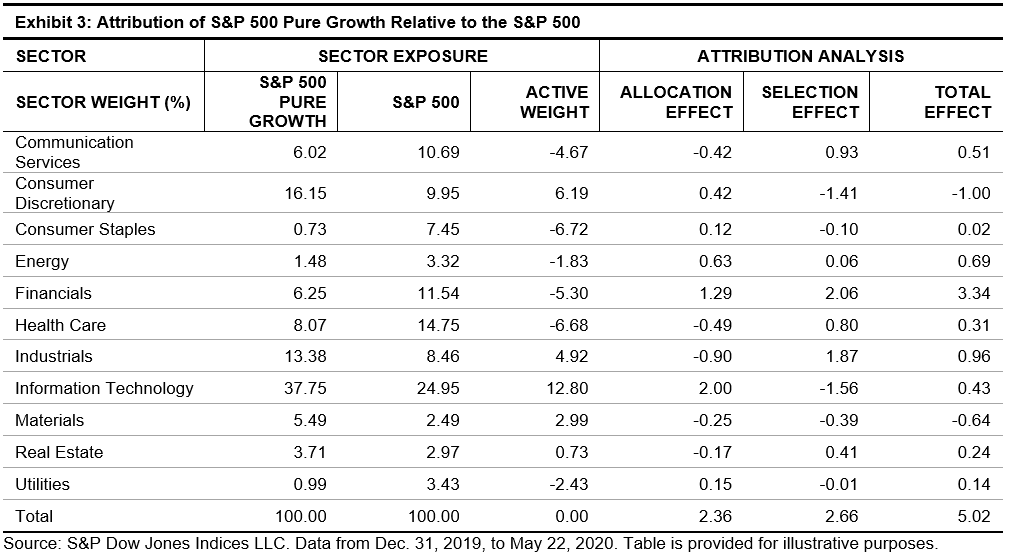
We next decompose excess returns of the S&P 500 Pure Growth into sector allocation and security selection of index constituents.

From Exhibit 3, we see the index was historically overweight in Information Technology (12.80%), Consumer Discretionary (6.19%), and Industrials (4.92%). In contrast, it was underweight in Consumer Staples (-6.72%), Health Care (-6.68%), Financials (-5.30%), and Communication Services (-4.67%) relative to the S&P 500.

The total performance effect was about 5%, with almost half of that coming from sector-allocation effects (2.36%). Information Technology and Financials had the highest sector effects of 2.00% and 1.29%, respectively. On the other hand, more than half of the outperformance came from selection effect (2.66%). Selection effect measures added value of security selection within a sector. The results showed that the methodology of the S&P 500 Pure Growth led to better-performing securities.

In conclusion, the S&P 500 Pure Growth outperformed its benchmark during this volatile period. This was mainly driven by positive exposure to growth and momentum and negative exposure to dividend and earning yields. Overall, sector allocation and security selection contributed to the outperformance.

[i] The detailed factor definition and index construction are laid out in the S&P 500 Pure Growth Methodology.

The posts on this blog are opinions, not advice. Please read our Disclaimers.

The Continued Ups and Downs of Dividends

Contributor Image
Shaun Wurzbach

Managing Director, Head of Commercial Group (North America)

S&P Dow Jones Indices

On May 20, 2020, my colleagues and I sought to address some questions about dividends and the viability of tried and true approaches to dividend income.

During that session, Craig Lazzara, Ari Rajendra, and Howard Silverblatt of S&P Dow Jones Indices (S&P DJI) joined me to address:

  • The current state of dividends across the globe,
  • A deep dive into the ups and downs of dividend payers and dividend growers across sectors and regions, and;
  • Historical perspectives that help assess the future viability of index dividend strategies.

A replay of that information session, which incorporated questions submitted during registration, is available at https://on.spdji.com/webinars. We received more questions during our session, and I thought it would be useful to publish the additional questions and provide answers as a follow-up to the session.

Q: What is the current yield of the different S&P DJI dividend strategies discussed in the presentation? How do you see its range going forward?

A (Ari Rajendra): While we can’t speculate on the range going forward, the data in Exhibit 1 provides a relevant perspective on the range of dividend yields for different S&P Dividend Aristocrats® Indices.

Q: Ari, can you go into a bit more detail on the dividend chart you showed (see Exhibit 2)? Are you assuming companies that took government money will cut or suspend dividends?

A (Ari Rajendra): No assumptions were made in the analysis; it was based on public announcements at the time of writing. If a company announced a cancellation or suspension as a result of taking government money, then it would be accounted for with no forecast made.

With respect to Exhibit 2, we grouped index constituents into four categories—announced drops, cancel/decrease, increase/maintain, and unknown. When a company postponed or not announced its dividends, we grouped them under the unknown category with no speculation on likely action.

Q: Do we need a COVID-19 index that would cater to companies adversely affected by COVID-19?

A (Craig Lazzara): The Index Investment Strategy team at S&P DJI produces monthly index dashboards. The S&P Select Industry Dashboard shows the industries that were most adversely affected by COVID-19 across the three-month and YTD return categories displayed in Exhibit 3. Many of these industry-specific indices are tracked by an ETF.

A (Peter Roffman): We’re also examining the concept of COVID-19-based investing, and we’ve noted that COVID-19 has inspired new index concepts across a variety of areas, including COVID-19 coping and recovery industries, as well as ESG indices.

Q: As I am listening to this session, I am seeing that the S&P 500® Dividend Aristocrats was down about 16% versus the S&P 500, which was down 8%. Any comments on why the defensive characteristics discussed in the informational session aren’t showing?

A: Our colleague, Tianyin Cheng posted a recent and detailed analysis on why dividend indices underperformed during the coronavirus sell-off, available on the Indexology® Blog at https://www.indexologyblog.com/2020/05/15/why-did-dividend-indices-underperform-during-the-coronavirus-sell-off/.

Q: Do you believe COVID-19 first hitting Europe and China had any impact on the timing of suspensions (higher globally) versus the U.S.?

A (Ari Rajendra): I’m not sure we can conclusively say whether timing has been the driver of the regional differences. Between the UK and U.S., for example, the peak of the pandemic was almost concurrent. Broadly, we could say that the U.S. equity market had been much stronger than its global peers coming into this crisis. That said, the complexity of global supply chains and simultaneous fall in consumer demand may eventually result in this being a global issue rather than a regional one.

We greatly appreciate the engagement of the more than 600 people that registered for our dividend information session, as we seek to meet your needs for information and education. I recommend that North American-based advisors bookmark https://spdji.com/topic/financial-advisors-us, where we curate the latest content for your interests.

The posts on this blog are opinions, not advice. Please read our Disclaimers.

The Challenge of Finding Outperforming Active Funds in Canada

Contributor Image
Berlinda Liu

Former Director, Multi-Asset Indices

S&P Dow Jones Indices

The SPIVA® Canada Year-End 2019 Scorecard was released recently. Despite the strong performance of broad equities, 2019 proved to be yet another challenging year for active funds in Canada. Here are a few highlights from the report.

Strong Market Performance Did Not Translate to Active Fund Outperformance

The S&P/TSX Composite posted its highest annual return (22.9%) since 2009, ending a decade-long bull run that saw a total gain of 94.9%. Amid this historic bull market, however, 92% of Canadian Equity funds underperformed their benchmark in 2019 and 86% underperformed over the past decade.

Similarly, smaller-cap names in the S&P/TSX Completion gained 26.1%, setting a high bar for active managers to surpass—84% of Canadian Small-/Mid-Cap Equity funds underperformed the benchmark. However, over the long term, this was the best-performing category relative to the benchmark—30% of managers outperformed in the past decade.

International Equity Funds Fared Better, but Not in the Long Term

Funds with a more international flavor did better in 2019 than their domestic counterparts. International Equity funds performed the best across all categories, with 57% underperforming the S&P EPAC LargeMidCap. Longer-term results continued to disappoint, however, as 85% of International Equity funds underperformed over the 10-year period.

Larger Funds Outperformed Smaller Funds in Most Categories

Across the seven fund categories and four investment horizons studied, 23 of the 28 results showed higher asset-weighted returns than equal-weighted returns, indicating that larger funds outperformed smaller ones in general.

Conclusion

Some market participants may hope that they are able to find outperforming active managers. Our SPIVA scorecards continue to highlight the difficulties of beating the benchmarks, and Canadian active funds are no exception.

The posts on this blog are opinions, not advice. Please read our Disclaimers.

Commodities Were Energetic in May

Contributor Image
Jim Wiederhold

Former Director, Commodities and Real Assets

S&P Dow Jones Indices

Bullish sentiment propelled the S&P GSCI higher by 16.4% in May, its best monthly performance in 11 years. The broad commodity index’s more than 50% exposure to energy was a key contributor to its performance. Energy led the way, with the WTI-based S&P GSCI Crude Oil up 55.0%, bouncing impressively off the lows in April. Despite economic data points, like U.S. consumer spending dropping the most on record, commodities posted an overall strong month. Industrial and precious metals exhibited positive gains, while agriculture and livestock were mixed.

The S&P GSCI Energy rose 35.2% in May, completely retracing the poor performance in April. As countries slowly opened from lockdowns, expectations of a pickup in demand coincided with voluntary and involuntary production cuts. Already in a dire situation pre-pandemic, there are now expectations for a wave of bankruptcies in the U.S. shale space, further adding to the production cuts. Markets will be focused on the June OPEC+ meeting for clues regarding further coordination to rebalance the oil markets. The S&P GSCI Natural Gas was the one laggard in the energy space, down 16.7% on the month, due to drastically less seasonal demand and rumblings of storage space becoming increasingly full.

In the metals complex, all eyes were on iron ore, with the S&P GSCI Iron Ore jumping 23.4%. Growing fears about the security of Brazilian iron ore exports, given the growing number of COVID-19 infections among miners, combined with strong Chinese demand for the steel-making ingredients to push iron ore prices through the USD 100 per ton level at the end of May for the first time in 10 months.

The S&P GSCI Precious Metals rose 4.2% in May. While gold continued its impressive rally, it was silver that shone brightest over the month. The S&P GSCI Silver rallied 23.6%, buoyed by supply disruptions due to lockdowns in major silver producing countries, such as Peru and Mexico, and strong demand for silver by silver-backed exchange-traded funds. Silver, which is used in items like microchips and solar panels, has more industrial applications than gold and tends to underperform during recessions and outperform when economies expand.

One would think with the amount of baking occurring in the U.S. during lockdown, grains would display some bullish undertones. However, this was not the case, as the S&P GSCI Grains fell 0.4% in May, with market participants focused on record U.S. supplies and the reignition of the U.S.-China trade war. The International Grains Council raised its production forecast for the 2020-2021 season by 12 million metric ton, while cutting its consumption outlook by 4 million over that period. The S&P GSCI Wheat fell 0.7% but was one of the only commodities with YTD performance down only single digits.

The S&P GSCI Livestock gained 5.4% last month, with the S&P GSCI Live Cattle surging 10.1%. After posting a new 10-year low in April, the same week WTI prices dipped into negative territory, steer prices bounced back, as meatpacking plants in the U.S. dealt with bottlenecks caused by worker cases of COVID-19, while meat demand remained resilient.

The posts on this blog are opinions, not advice. Please read our Disclaimers.

The S&P Composite 1500®: An Efficient Measure of the U.S. Market

Contributor Image
Hamish Preston

Head of U.S. Equities

S&P Dow Jones Indices

The S&P 1500 serves as both a benchmark indicator for U.S. equity market performance and as a basis for passively replicating investment products that aim to deliver a “market” return.  Our new paper examines the index from both these perspectives, and compares the S&P 1500 with other U.S. equity market indices.  Here are a few takeaways.

The S&P 1500 offers a more holistic assessment of the U.S. market.

Many investors look to the S&P 500 to gauge U.S. market performance, with more than USD 9 trillion being indexed or benchmarked to the index as of the end of 2018. However, by looking beyond the S&P 500, the S&P 1500 offers perspectives on a broader range of market narratives. Indeed, S&P MidCap 400 and S&P SmallCap 600 constituents are typically more sensitive to the U.S. economy, and differences in sector allocations can help to diversify large-cap sector exposures.

The S&P 1500 benefitted from its exposure to smaller companies.

Students of financial theory will be well-versed in the “small size” premium: the observation that smaller companies have typically outperformed their larger counterparts.  This premium can be seen when looking at historical returns: the S&P 400 and the S&P 600 outperformed over longer horizons, which in turn helped to explain why the S&P 1500 beat the S&P 500 over the same horizons.

Combined with the fact that most active managers have typically found it difficult to outperform these indices – on an absolute or risk-adjusted basis – the S&P 1500 may be an appealing option for those looking to access the U.S. equity market.

The S&P 1500 Avoids Less Liquid, Lower Priced, and Lower Quality Stocks That Are Specific to the Russell 3000

Market participants can choose from several indices to track the performance of U.S. equities.  For example, the Russell 3000 index measures the performance of the 3,000 largest U.S. companies, subject to certain criteria.  Although sizeable overlaps in mega-cap names meant that the S&P 1500 and Russell 3000 posted similar risk/return profiles, it is important to remember that the two indices are constructed differently.

For example, the S&P U.S. equity indices incorporate an earnings screen whereas their Russell counterparts do not.  One way to see the impact of this earnings screen is to compare the characteristics of S&P 1500 stocks with “Extra 1500” stocks.  The latter group consists of the largest 1,500 U.S. stocks that were not members of the S&P 1500, with around 85% being iShares Russell 3000 ETF constituents at the end of April.

Exhibit 3 suggests that investors may find it more difficult to trade stocks that are specific to the Russell 3000 and may be more likely to encounter capacity constraints: the “Extra 1500” stocks are less liquid, lower priced, and of lower quality.

Taken together, the S&P 1500 is a more representative benchmark for those wishing to seek the returns of the U.S. equity universe but wanting to avoid additional trading and implementation costs coming from the additional 1500 securities.

The posts on this blog are opinions, not advice. Please read our Disclaimers.