Get Indexology® Blog updates via email.

In This List

The Calm That Was

Size Matters for Active Large-Cap Fund Performance

Potential Applications of the Low Volatility High Dividend Concept in Brazil

Beyond Equal Weighting: Reverse Cap Weighting the S&P 500

Defensiveness of the Credit Strength Strategy in U.S. Corporate Bonds

The Calm That Was

Contributor Image
Fei Mei Chan

Former Director, Core Product Management

S&P Dow Jones Indices

Through the end of July, equities had netted a nice gain for 2019 (though the picture looks a lot different so far in August). Unusually, the S&P 500 Low Volatility Index® outperformed in an environment when it has typically lagged its benchmark. (The S&P 500 gained 20.2%, while the low volatility index was up 20.8%, thru July 2019.)

Similar to its last quarterly rebalance, turnover in the low volatility index was limited, with changes taking place following the market close on August 16, 2019. Sector allocations are strikingly similar to the previous rebalance, with Financials, Technology and Utilities adjusting slightly higher while Consumer Discretionary, Health Care and Real Estate scaled back marginally.

The Latest Rebalance for the S&P 500 Low Volatility Index Yielded Minimal Changes

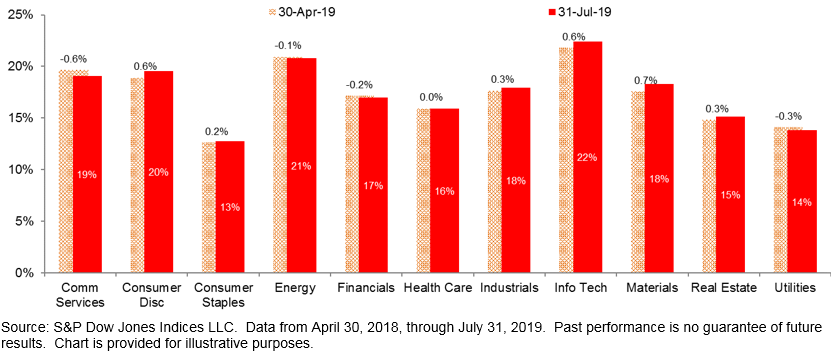
Trailing one-year volatility for S&P 500 sectors, a gauge we use sometimes use to gain insight, barely budged in the last three months. This is consistent across all 10 sectors. It’s therefore not surprising that turnover activity over the last two rebalances is at the lowest annualized level on record.

252-Day Volatility Changed Little Across All S&P 500 Sectors Compared to Three Months Ago

The posts on this blog are opinions, not advice. Please read our Disclaimers.

Size Matters for Active Large-Cap Fund Performance

Contributor Image
Berlinda Liu

Former Director, Multi-Asset Indices

S&P Dow Jones Indices

Over the 15-year period ending March 31, 2019, the biggest 25% of active large-cap equity funds managed about 90% of all the assets under management (AUM) held in active large-cap equity funds. This may suggest that investors’ fund selections skew toward larger funds. But is bigger always better? This topic has been widely debated: although larger funds may be able to hire more skilled fund managers and, in return, managers’ successful track records may attract more assets, one could also argue that smaller funds may face less liquidity constraints in security selection and can “move the needle” with relatively small investments.

In this blog, we explore the effect of size—as measured by AUM—on active large-cap equity funds’ performance. Our study shows that, in the large-cap equity fund category, larger funds tended to take more risk and generate higher returns than smaller ones. However, their main advantage lies in higher survival rates over the long run, which contributed to their lower percentage of underperformance relative to the benchmark.

Over the 1-, 5-, 10-, and 15-year horizons, we first rank all long-only active large-cap equity funds by their size at the beginning of the period and divide them into quartiles, with the first quartile being the largest and the fourth being the smallest. We then compare their returns, volatilities, survival rates, and ability to outperform the S&P 500®. To eliminate the confounding factor of equity capitalization, we limit the universe to large-cap equity funds only. Fund returns are on a net-of-fee basis.

Larger funds were more likely to survive the market cycle than their smaller peers, especially over longer horizons (see Exhibit 1). Among the smallest 25% of funds (fourth quartile) that existed at the beginning of the 15-year study period, only 1 out of 5 survived the entire period compared with a survival rate of over 60% for the largest funds (first quartile) over the same period.

Larger funds also tended to fare better against the broad equity market (see Exhibit 2). For example, in the one-year period ending in March 2019, around a third of first quartile funds beat the S&P 500 compared with only 25% for fourth quartile funds. This difference became more pronounced over longer horizons; the low survival rate among smaller funds helps to explain this result given we assume dead funds underperformed the benchmark. In fact, if we account only for funds that have survived the 15-year period, about 73% of funds in the first quartile and fourth quartile underperformed the benchmark (see Exhibit 3).

We next calculated annualized returns and volatilities of all the surviving funds (see Exhibit 4). On average, larger funds showed higher returns and took higher risk than the smaller funds in the 1-, 5-, and 15-year periods. However, this tendency gradually diminished over longer time horizons: the largest funds generated 30 bps of extra annualized returns compared with the other three groups over the 15-year horizon. The 10-year returns and volatilities indicated that large funds were more conservative than their peers during the 2008 financial crisis and its subsequent recovering period.

The third quartile funds (i.e., the second smallest fund group) showed comparable and sometimes even higher returns than the largest ones. This may help to explain why third quartile funds sometimes performed better against the S&P 500 than the other three groups (see Exhibits 2 and 3). Interestingly, these funds did not take extra risk compared with the largest ones.

Experience the active vs. passive debate on a global scale on Indexology®.

The posts on this blog are opinions, not advice. Please read our Disclaimers.

Potential Applications of the Low Volatility High Dividend Concept in Brazil

Contributor Image
Maria Sanchez

Director, Sustainability Index Product Management, U.S. Equity Indices

S&P Dow Jones Indices

Historically, the percentage of dividend payers in Brazil has ranged between 71% and 87%,[1] making it a propitious environment for implementing dividend-focused strategies. The highest-yielding stocks in high-yield strategies often come with greater portfolio volatility,[2] and Brazil is no exception. This blog explores the rationale behind the implementation of a low volatility high dividend strategy in Brazil and its potential benefit.

Low volatility high dividend strategies aim to provide yield at a reasonable risk level. To review the characteristics of high dividend yield stocks in Brazil, we separated dividend payers from the S&P Brazil BMI universe into hypothetical quintiles based on yield. Securities in each quintile are equal weighted and held for 12 months. Our results showed that the securities in Quintile 1 (the highest dividend yielding stocks) had the highest average 12-month holding period returns (see Exhibit 1).

Then, we went through the same exercise but based the quintiles on their 12-month trailing volatility. As shown in Exhibit 2, securities with lower volatility (Quintiles 1 and 2) had higher risk-adjusted returns (0.56 and 0.55, respectively) while securities in the higher volatile buckets (Quintiles 3, 4, and 5) had much lower risk-adjusted returns (0.28, 0.34, and 0.24, respectively).

Our approach to combine high yield with low volatility consisted of two steps. First, we selected the top 50% of stocks with the highest dividend yield; second, from that subset, we selected the top 40% with the lowest volatility stocks.

To demonstrate the possible benefits of our approach, we created three hypothetical portfolios based on the dividend payers of the S&P Brazil BMI and measured their historical returns from Dec. 31, 2007, to June 28, 2019.

  1. High Yield portfolio: 50% of stocks with the highest dividend yield of the dividend payers of S&P Brazil BMI.
  2. Low Volatility High Yield portfolio: 40% of the lowest volatility stocks selected from the High Yield portfolio.
  3. High Volatility High Yield portfolio: 60% of the highest volatility stocks from the High Yield portfolio.

All portfolios were rebalanced in June and December, and all portfolio members were equally weighted.

The results show that over the mid- and long-term periods, the Low Volatility High Yield portfolio outperformed the High Yield and High Volatility High Yield portfolios with less risk, delivering better risk-adjusted returns (see Exhibit 3).

To review how these hypothetical portfolios performed in the most significant down markets, we looked at the three largest drawdowns of the S&P Brazil BMI since Dec. 28, 2007. In all the drawdown periods, the Low Volatility High Yield portfolio outperformed the benchmark and High Yield and High Volatility High Yield portfolios (see Exhibit 4).

Combining low volatility and high dividend yield strategies by using a two-step screening process when constructing a high dividend index could potentially provide better risk-adjusted returns than a high yield strategy, capturing the benefits of high dividend and low volatility strategies.

[1]   Source: S&P Dow Jones Indices LLC. Data for S&P Brazil BMI from Dec. 31, 2007, to June 28, 2019.

[2]   Luk, Priscila and Qu, Xiaoya, “The Beauty of Simplicity: The S&P 500® Low Volatility High Dividend Index,” 2019, S&P Dow Jones Indices LLC.

The posts on this blog are opinions, not advice. Please read our Disclaimers.

Beyond Equal Weighting: Reverse Cap Weighting the S&P 500

Contributor Image
Josh Blechman

Director of Capital Markets

Exponential ETFs

Consistently outperforming the S&P 500® is difficult. The S&P Dow Jones Indices SPIVA report shows that less than 18% of funds outperformed the S&P 500 (SPX) over the five-year period ending 12/31/2018. So how is it that the S&P 500 Equal Weight Index (SPEWI), a passive index comprised of the very same 500 stocks, accomplished what so few active managers have been able to do, outperforming the S&P 500 in 13 of 19 years from 2000-2018[1]? And how can understanding the nature of that outperformance yield further portfolio innovation?

Through selling winners and buying losers to parity each quarter, equal-weighting attempts to address a core inefficiency of cap weighted indices, which by definition – systematically over-weight, overvalued companies. While it is impossible to identify ahead of time which companies are the overvalued ones, the index should take the mathematical loss over time.

When viewed through this lens, it’s apparent that exploiting the allocation inefficiency of Cap Weighting through Equal Weighting is only a half measure.

The opposite of “Cold” isn’t “Room Temperature,” it’s “Hot.”

The Reverse Cap Weighted Index (Reverse), which as the name implies – reverses the order of the S&P 500 through weighting by 1/Mkt Cap, takes exploiting that inefficiency one step further. In direct contrast to Cap Weighting, Reverse by definition – systematically over-weights undervalued companies.  More information on Reverse Cap Indexing can be found here. The net result of weighting a portfolio in this manner is effectively a contrarian play within the S&P 500, as the largest companies/industries in SPX would be the lowest weighted within the Reverse Index.

Historically, in environments in which SPEWI outperforms SPX, we would expect Reverse to outperform them both. Conversely, in environments where SPX outperforms SPEWI (as is the case over the last three years) we would expect Reverse to be the worst performing of the three. Below is a chart detailing the performance of the three indices from 12/31/1996 – 6/30/2019.

Note: S&P EWI has an index launch date of 1/8/2003 and Reverse has an Index launch date of 10/23/2017. Both Indices are licensed and calculated by S&P Dow Jones Indices and all information for the Indices prior to its Launch Date is back-tested by S&P DJI, based on the methodology that was in effect on the Launch Date. Standardized performance for S&P 500, S&P EWI, and REVERSE can be found by clicking the respective link. Risk & Return data sourced from Bloomberg. All figures represent Total Return of the indices.

Consistent with this expectation, just as SPEWI has outperformed SPX with additional volatility, Reverse was the best performing of the three alongside the highest volatility of group. While the total return figure demonstrates the robustness of the outperformance, the below daily 5-year rolling return chart shows the consistency of that outperformance, with Reverse being the highest returning of the three indices in 78% of the observed data points.

Note: S&P EWI has an index launch date of 1/8/2003 and Reverse has an Index launch date of 10/23/2017. Both Indices are licensed and calculated by S&P Dow Jones Indices and all information for the Indices prior to its Launch Date is back-tested by S&P DJI, based on the methodology that was in effect on the Launch Date. Standardized performance for S&P 500, S&P EWI, and REVERSE can be found by clicking the respective link. Risk & Return data sourced from Bloomberg.

This additional return (and the relationship to SPEWI) is partially derived from the higher Size (SMB), Value (HML) and Anti-Momentum (MOM) factor loads expressed in the Reverse Index, relative to the other S&P weighting schemes. Reverse merely places additional load on the factors that drive differentiation between SPEWI and SPX. These findings (as they relate to SPEWI and SPX) are consistent with prior S&P DJI research.[2]

Note: S&P EWI has an index launch date of 1/8/2003 and Reverse has an Index launch date of 10/23/2017. Both Indices are licensed and calculated by S&P Dow Jones Indices and all information for the Indices prior to its Launch Date is back-tested by S&P DJI, based on the methodology that was in effect on the Launch Date. Standardized performance for S&P 500, S&P EWI, and REVERSE can be found by clicking the respective link. Fama-French factor portfolios are from the Ken French Data Library.

While SPX represents an operationally efficient index, Reverse takes the well understood elements of SPEWI (which exploit the investment inefficiencies of Cap Weighting), one step further and provides a unique contrarian play within the S&P 500 universe.

[1] Calendar year returns were calculated from 2000 through 2018.

[2] Edwards, T., Lazzara, C., Preston, H., and Pestalozzi, O. “Outperformance in Equal-Weight Indices.” S&P Dow Jones Indices LLC. January 2018.

Disclosure:
The author is an employee of Exponential ETFs, the creator and owner of the Reverse Cap Weighted U.S. Large Cap Index (the “Index”). Exponential ETFs has contracted with S&P Opco, LLC (a subsidiary of S&P Dow Jones Indices LLC) to calculate and maintain the Index. The Index is not sponsored by S&P Dow Jones Indices or its affiliates or its third-party licensors (collectively, “S&P Dow Jones Indices”). S&P Dow Jones Indices will not be liable for any errors or omissions in calculating the Index. “Calculated by S&P Dow Jones Indices” and the related stylized mark(s) are service marks of S&P Dow Jones Indices and have been licensed for use by Exponential ETFs. S&P® is a registered trademark of Standard & Poor’s Financial Services LLC (“SPFS”), and Dow Jones® is a registered trademark of Dow Jones Trademark Holdings LLC (“Dow Jones”).
The Reverse Cap Weighted U.S. Large Cap Index (Reverse) is a rules-based reverse capitalization weighted index comprised of the 500 leading U.S.-listed companies as measured by their free-float market capitalization contained within the S&P 500 universe. The Index has an inception date of October 23, 2017, with a back tested time-series inception date of December 31, 1996. You cannot invest directly in an index.
The S&P 500 Index is a widely recognized capitalization-weighted index of 500 common stock prices in U.S. companies. You cannot invest directly in an index.
The S&P 500 Equal-Weight Index is the equal-weight version of the widely-used S&P 500. The index includes the same constituents as the capitalization weighted S&P 500, but each company in the S&P 500 EWI is allocated a fixed weight – or 0.2% of the index total at each quarterly rebalance. You cannot invest directly in an index.
Past performance of an index is not a guarantee of future results, which may vary. The value of investments may go down as well as up and potential investors may not get back the amount originally invested. Performance figures contained herein contain both hypothetical and live returns; results, hypothetical or otherwise, are intended for illustrative purposes only. Index performance returns do not reflect any management fees, transaction costs, or expenses, which would reduce returns. Inclusion of a security within an index is not a recommendation by to buy, sell, or hold such security, nor is it considered to be investment advice. It is not possible to invest directly in an index.
The Index, strategy, and performance returns discussed are for informational purposes only and do not represent an offer to buy or sell a security and should not be construed as such.

The posts on this blog are opinions, not advice. Please read our Disclaimers.

Defensiveness of the Credit Strength Strategy in U.S. Corporate Bonds

Contributor Image
Hong Xie

Former Senior Director, Global Research & Design

S&P Dow Jones Indices

Our fundamental credit strength strategy uses credit ratios to screen out issuers with risky credit profiles and construct corporate bond portfolios with strong credit quality (for a detailed methodology, please see our previous blog). Our research shows that a credit strength strategy can potentially reduce return volatility and improve drawdowns. Our goal in this blog is to further highlight that a credit strength strategy can offer downside protection and sector diversification.

Exhibit 1 illustrates the defensiveness of the credit strength strategy. Both investment-grade and high-yield credit strength portfolios tend to outperform (underperform) the broad market when the credit market falls (rises). This observation is consistent with the reduction in return volatility and drawdown we find in our research (volatility and drawdown are reduced by 12%/16% and 25%/30% for investment grade/high yield, respectively).[1]

As a bottom-up fundamental credit approach, our credit strength strategy emphasizes issuer selection and weighs issuers equally, thereby reducing the overconcentration of financial issuers in the portfolio. A traditional corporate bond index weighs constituents by bond size, meaning an issuer’s weight is dictated by the amount of debt the issuer has outstanding. Therefore, a market-value-weighted corporate bond index tends to have its weight disproportionately concentrated in issuers from the Financials sector, as illustrated by the S&P U.S. Investment Grade Corporate Bond Index (see Exhibit 2).

Weighting issuers equally is one way to avoid overconcentration in issuers or sectors with the most debt, and this strategy is consistent with the goal of constructing a portfolio with better credit fundamentals. Exhibit 2 compares the Financials sector weights in our hypothetical credit strength portfolios versus traditional corporate bond indices.

The diversification effect is noticeable in both investment-grade and high-yield bonds, and it is particularly pronounced in investment-grade bonds, where the average allocation to Financials in the credit strength strategy is nearly half of the broad investment-grade corporate bond index (20% versus 40%).

Defensive portfolios with diversified sector allocation may potentially be able to offer lower return volatilities. A properly constructed credit strength portfolio can offer effective credit exposure for long-term corporate bond investors, while improving risk-adjusted returns and mitigating credit risk.

[1] For more details, please see our previous blog: https://www.indexologyblog.com/2019/07/10/using-credit-ratios-to-build-defensive-corporate-bond-portfolios/

The posts on this blog are opinions, not advice. Please read our Disclaimers.