Many key factors are currently driving oil down and the bloodshed might not be over. As mentioned in a recent CNBC interview, from current levels, the S&P GSCI Crude Oil Total Return could drop another 45% before surpassing energy’s worst historical loss of 78.4% that happened in 2008-2009.
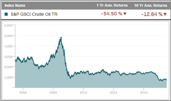
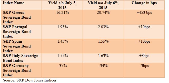
The headwinds of the strong dollar from the Greek crisis, the seasonal slowing of gasoline demand post July 4th, increase in rig counts despite high inventory levels, possible lifting of Iranian sanctions that could ramp up production, and slowing Chinese crude demand plus their crashing stock market are all bad news for oil.
It is not only bad news for oil but the weak Chinese economy and stock market is a huge influence for copper given China consumes about half of the world’s copper. Since early 2011, copper has been dying a slow death but the loss of 3.5% on July 6, 2015 was the biggest one day drop in six months, since January 14, 2015. Also, the weaker dollar from the Greek crisis is impacting all economically sensitive commodities – and copper is known to be one of the most sensitive to growth. Like oil, copper has about 50% left to fall before hitting new index lows.
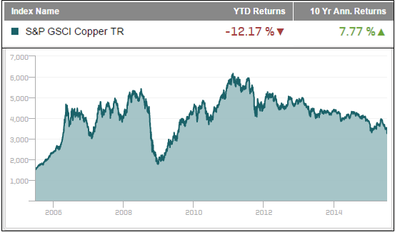
However, Dr. Copper is not always so smart. Historical correlations only run about 0.4 with the Chinese GDP growth and copper actually performs well in weak recessions. It is only in strong recessions where copper tanks. Maybe this is the signal for the start of more than just a weak recession.
According to Jim Cramer, these things need to happen for another global financial crisis: 1. The Greek deal needs to be delayed further, causing the euro to go lower and the dollar to get stronger, which ultimately hurts U.S. exports (and commodities – but not all); 2. China needs to collapse from the weight of its stock market and trillions in bad loans; and 3. The Fed needs to continue discussing raising rates, even though employment isn’t as strong as most thought and industrial production is still not great.
The problem is the worst is potentially just around the corner, coming in Q4, according to commodity seasonality. Despite all the headwinds, the summer generally helps many of the commodities used for travel, construction and even grilling, which kept commodities flat through Q2. Now that the peak driving season has passed, a major catalyst is out of gas, and mid-July is precisely when the worst drawdown in history that lasted from July 14, 2008 to February 18, 2009 started. During that period, the majority of days (16 of 23) with the biggest losses (>4.0%) were in Q4 of 2008.
An investor might be wondering now if it is even possible to hold a basket of commodities without getting slaughtered. Maybe an active manager could pick out the winners, but probably not, given the results from last year’s conference poll where sugar (-16.9%), copper (-12.2%) and nickel (-28.2%) were cited as the best picks for the year going forward. All of those are performing worse than the composite benchmark, the S&P GSCI, that is down 7.3% YTD.
Maybe the smart answer is to simply use an equally weighted index like the Dow Jones Commodity Index (DJCI) rather than the world-production weighted S&P GSCI. To answer that, it must be possible for agriculture and precious metals to overpower the economically sensitive energy and industrial metals. After all, agriculture and livestock have historically very low correlations to the dollar – that is to be expected given people need to eat and these commodities are much more sensitive to weather. Even better now, is the extreme weather from El Nino may be the biggest driving force for food commodities, and on average, the positive impact on agriculture has accelerated with every El Nino since 1982. In the midst of all the current turmoil, wheat and sugar were positive on July 6, 2015, and 5 of 8 commodities in the sector remain positive for the year. Unfortunately, the bad news is that the weighting alone is not powerful enough to carry a commodity basket. Year-to-date through July 8, 2015, the DJCI, S&P GSCI Light Energy, S&P GSCI Risk Weight and S&P GSCI Roll Weight Select have lost 6.4%, 7.1%, 6.3% and 7.7%, respectively.
Another set of indices called “modified roll” addresses contract selection to help commodity performance during down markets. Historically it has been shown there may be a premium for giving up liquidity at the front end of the curve for later dated contracts, but it depended on the time period. Unfortunately, during this time period rolling is not working, and that is because there has been backwardation in commodities this year that has only recently flipped to contango. Year-to-date through July 8, 2015, the S&P GSCI Dynamic Roll, S&P GSCI Enhanced Commodity, S&P GSCI Multiple Contract and S&P GSCI 3 Month Forward have lost 8.7%, 7.0%, 7.5% and 8.2%, respectively.
Again, now is a difficult time for commodities that might get even harder. Is it possible to get smart enough to hold a basket that does not require picking single winners? Unfortunately, no long-only index has proven smart enough to generate a positive return during the worst down days of the past 10 years. That includes all days that dropped more than 4.0% for a total of 35 days. Not even our smartest long-only index, Dow Jones – RAFI Commodity Index, that combines smart rolling and weighting has proven successful (it is down 7.6% YTD.)
However, there is a set of broad-basket commodity indices that is smart enough to generate positive returns in the worst of times. These indices are a subset of a long/short family called “strategic futures” and they are strategic for a reason. The broader strategic futures include financial futures as well as commodity futures, but only the subset using purely commodity futures is examined for this analysis. Three indices, namely, the S&P GSCI Dynamic Roll Alpha Light Energy, the S&P Dynamic Commodity Futures Index (S&P DCFI) and the S&P Systematic Global Macro Commodities Index can be considered smart enough to perform in the worst commodity periods.
In the worst drawdown of the S&P GSCI that lost 70.9% from July 2008 – Feb 2009, the S&P GSCI Dynamic Roll Alpha Light Energy and the S&P Dynamic Commodity Futures Index (S&P DCFI) gained 10.7% and 14.1%, respectively, but despite out-performance over the S&P GSCI the S&P Systematic Global Macro Commodities Index still lost, but only 3.4%.
Extending this analysis by examining the 10-year time period into the best 35 days and worst 35 days gives more insight into the time when protection is needed most. On average, the worst 35 days classified by all days with a greater than 4.0% loss in the S&P GSCI, generated a return of -5.3%. The modifications of long only indices helped but not enough to get positive results. In spite of the worst historical time, the long/short strategic futures indices were smart enough to be positive with average daily returns of between 28 and 129 basis points with some significant daily returns up almost 8.0%. 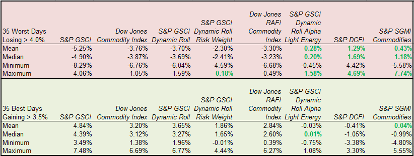 Source: S&P Dow Jones Indices. Ten years of daily data ending July 7, 2015.
On the flip side, when the S&P GSCI posted its 35 biggest daily gains, all more than 3.5%, the strategic futures were basically flat. This combination of protection on the downside with flat performance in commodity bull markets preserves capital. Over long periods of time, smart indices that roll and/or weight differently have also performed well with reduced losses rather than positive returns in down periods. However, for real risk management and the chance for positive returns during the worst of times, the strategic futures have done the job best with all of the independence, transparency, liquidity and cost efficiency indices provide.
The posts on this blog are opinions, not advice. Please read our Disclaimers.