Get Indexology® Blog updates via email.

In This List

War Risk

COMMODITY COMEBACK

International events take the front seat

Targets and Tantrums at the Fed

Why Size Matters

War Risk

Contributor Image
David Blitzer

Former Managing Director and Chairman of the Index Committee

S&P Dow Jones Indices

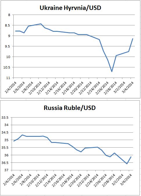
Russia and the Ukraine are dominating trading around the world since last Friday. The charts show the losses and rebound in the stock markets and currencies in the Ukraine and Russia.  The bounce back reflects both a seemingly more moderate comment from Russian President Putin on Tuesday morning as well as the markets pausing after a plunge.

At times the political risks far out-weigh any economic concerns. Moreover, the reaction to Russian troops in the Crimea wasn’t limited to markets in Kiev or Moscow. The US stock market dropped and global oil prices rose. One of the largest jumps was wheat. Looking forward, if the dust settles and the Ukraine remains an independent nation, the stock markets and the currencies are likely to recover.  The turn will come once there is good reason to believe the political situation will return to its pre-crisis position – so there may be a buying opportunity.  However, there are several possible negative scenarios.  The crisis could become a stalemate in which both the Ukrainian and Russian stock markets would probably drift downward, currencies would not rebound and both countries would face recessions.  Any economic sanctions imposed by the US or the EU would hasten both recession and further currency weakness in Russia while having only limited benefits for the Ukraine.   If Russia were to assume effective control of the country, the disappearance of Ukraine’s stock market cannot be ruled out.  In some crises markets collapse. In others, including in wars, markets vanish.

source: Bloomberg data, chart S&P DJI
source:Bloomberg data, charts S&P DJI


The posts on this blog are opinions, not advice. Please read our Disclaimers.

COMMODITY COMEBACK

Contributor Image
Jodie Gunzberg

Former Managing Director, Head of U.S. Equities

S&P Dow Jones Indices

It is no surprise that now might be the perfect environment for brewing commodities.  

  • The S&P GSCI was up 4.5% in February and was in backwardation for the first time in February since 2004. In 2004, the S&P GSCI returned 17.3%.
  • 22 of 24 commodities in the S&P GSCI were positive in February.
  • All 5 sectors were positive, led by agriculture, up 9.7%, which had its best February since 2008.
  • Coffee had its best month in 20 years and its second best month in history going back to Feb 1981. The S&P GSCI Coffee gained 44.0% in Feb 2014, only behind the gain of 52.1% in June 1994.
  • 6 single commodities had a total return greater than 10% this month.  Coffeelean hogssugarsoybeanswheat and silver gained 41.7%, 12.7%, 11.4%, 11.4%, 11.1% and 10.9%, respectively.

We have discussed a number of factors that may be supportive of the asset class including inflating fears of inflation, rising interest rates, falling correlations, backwardation is back and also stocks have led the stock/commodity cycle for the longest period since the 80’s.  

See in the chart below that the S&P 500 has not outperformed the S&P GSCI for 6 years in a row since 1980-87.  While this could last another year (or more) to match its historical streak, the tide seems to be turning.  Through February this year, the  S&P GSCI is now outperforming the S&P 500 for the first time since 2007.

Source: S&P Dow Jones Indices. Data from Jan 1970 to Jan 2014. Past performance is not an indication of future results. This chart reflects hypothetical historical performance. Please note that any information prior to the launch of the index is considered hypothetical historical performance (backtesting).  Backtested performance is not actual performance and there are a number of inherent limitations associated with backtested performance, including the fact that backtested calculations are generally prepared with the benefit of hindsight.
Source: S&P Dow Jones Indices. Data from Jan 1970 to Feb 2014. Past performance is not an indication of future results. This chart reflects hypothetical historical performance. Please note that any information prior to the launch of the index is considered hypothetical historical performance (backtesting). Backtested performance is not actual performance and there are a number of inherent limitations associated with backtested performance, including the fact that backtested calculations are generally prepared with the benefit of hindsight.

Notice below that backwardation has been more prevalent since 2012, but mostly only in the summertime, led by droughts. This month, Feb 2014, was the first backwardated February since 2004, when the annual total return of commodities was 17.3%.

Source: S&P Dow Jones Indices. Data from Jan 2004 to Jan 2014. Past performance is not an indication of future results. This chart reflects hypothetical historical performance. Please note that any information prior to the launch of the index is considered hypothetical historical performance (backtesting).  Backtested performance is not actual performance and there are a number of inherent limitations associated with backtested performance, including the fact that backtested calculations are generally prepared with the benefit of hindsight.
Source: S&P Dow Jones Indices. Data from Jan 2004 to Feb 2014. Past performance is not an indication of future results. This chart reflects hypothetical historical performance. Please note that any information prior to the launch of the index is considered hypothetical historical performance (backtesting). Backtested performance is not actual performance and there are a number of inherent limitations associated with backtested performance, including the fact that backtested calculations are generally prepared with the benefit of hindsight.

The shifting environment from a world driven by expansion of supply to a world driven by expansion of demand has resulted in lower inventories making the commodities more sensitive to supply shocks, driving a positive source of return that is less correlated with equities.

February was a month where we witnessed the positive impact of these supply shocks on commodity prices. The S&P GSCI Unleaded Gasoline gained 13.2% with a total return of 6.4% from low supplies as refineries are switching to summer blends. Also, rising tension in the Ukraine drove the S&P GSCI Energy up 3.7% while other risky assets like stocks fell. 

The same rising tension that supported energy, drove the S&P GSCI Precious Metals up 7.1% to have its biggest monthly gain since August 2013.  While gold can be viewed as a safe haven, the danger in gold is that as tensions ease, there may be a sharp drop in demand and performance.

The S&P GSCI Industrial Metals gained 1.3% this month with nickel and zinc up 5.3% and 5.7%, respectively. A global deficit is being driven by large mine closings as the big zinc ore bodies are tapped out and being replaced by smaller zinc operations. Also, the ban on nickel exports from Indonesia is a potential game changer for the global cost curve that can be bullish for nickel prices.

One of the major supply shocks has been the freezing cold weather, which has affected the entire supply chain of food. Livestock may have eaten more corn this winter due to frigid temperatures and the deep frost may take time to work out of soils, potentially slowing planting. Possible irreversible damage from dryness to Brazil’s coffee crop  and rust fungus in Mexico has killed enough crop for coffee to have its best month in 20 years and second best month in index history since 1981.


The posts on this blog are opinions, not advice. Please read our Disclaimers.

International events take the front seat

Contributor Image
Kevin Horan

Former Director, Fixed Income Indices

S&P Dow Jones Indices

Due to the political issues surrounding Russia and the Ukraine, the yield of the 10-Treasury as measured by the S&P/BGCantor Current 10 Year U.S. Treasury Bond Index tightened by 8 basis points over the course of the last week of February.  The index returned 0.39% for the month as the year-to-date is now a 3.94%.

Investors move towards the safety of U.S. Treasury creating additional demand and lower yields will not have an impact on newly issued debt as there are no auctions scheduled for this week.  The next round of auctions is scheduled for the week of March 11th as a new 3-year and re-openings in the 10- and 30-year are planned.

The economic calendar contains February MBA Mortgage Applications (-8.5% prior) and ADP Employment (155k expected) along with jobless (336k exp.), manufacturing (5k exp.), factory orders (-0.5% exp.) and finally the Unemployment Rate (6.6% exp.).  All of these domestic measurements could take a back seat to the international news if the situation heats up.

The S&P U.S. Issued Investment Grade Corporate Bond Index had a positive week as well returning -.69% for the week as the index closed out the month returning 0.91% and 2.86% year-to-date.  These returns now pale in comparison to the high yield index (S&P U.S. Issued High Yield Corporate Bond Index) as the search for yield continues into 2014.  The only down day in February for the S&P U.S. Issued High Yield Corporate Bond Index was the 4th.  Month-to-date the return of this index is at 1.92% and for the year it is returning 2.70%.

Unlike high yield debt, senior loans as measured by the S&P/LSTA U.S. Leveraged Loan 100 Index sat the sidelines for the month of February.  Returning only 0.05% for the month and 0.67% year-to-date, this index seems to be experiencing investor fatigue after consistent returns over a period of years.  New issue loan deals are going well and seasoned issuers continue to be able to raise money although yields continued to drift higher.


Source: S&P Dow Jones Indices, Data as of 2/28/2014.


The posts on this blog are opinions, not advice. Please read our Disclaimers.

Targets and Tantrums at the Fed

Contributor Image
David Blitzer

Former Managing Director and Chairman of the Index Committee

S&P Dow Jones Indices

Goal oriented monetary policy and hidden sources of volatility, discussed at the US Monetary Policy Forum last Friday, sparked articles in the New York Times, the Financial Times and the Wall Street Journal over the weekend. With investors seeking income in bond and money markets while nervously watching for when Fed policy will shift to higher interest rates, the discussions offer some interesting hints.

In the last year or so the Fed repeated that it wants inflation at 2% and will not raise interest rates until the unemployment is under 6.5%.  The unemployment rate is now a tenth of a percent away from the target but arguments that it is sending misleading signals are widespread. Inflation, as measured by the Fed’s preferred gauge of the deflator on personal consumption expenditures, is well below is its goal. In one presentation Charles Evans, president of the Chicago Fed, proposed that an explicit function could be used to show the trade-off between the inflation and unemployment targets.  He suggested that Fed policy would minimize the loss function:

V=(Inflation – 2%)2 + (unemployment – 5.5)2

The farther unemployment is from its target or the farther inflation is from its target of 2%. The 5.5% unemployment is the Fed’s forecast for 2016; there is no agreed target for unemployment.  This is an improvement over the Taylor rule which chooses the Fed funds rate based on inflation.  The Evans approach gives an explicit goal and shows the trade-off between the Fed’s dual – but sometimes conflicting – mandates of inflation and employment. In the spirit that a picture is worth 10,000 words, the chart (from Evans’ speech at the conference, available at the Chicago Fed’s web site) gives the target.


Source: Federal Reserve Bank of Chicago

One other comment by Charles Evans is worth mentioning: the inflation objective is two sided: being below 2% is as bad as being above 2%.  If getting closer to the bull’s eye in the diagram means pushing inflation over 2% to get a larger reduction in unemployment, that would be part of the approach.  There were times in the past, such as 1979-1982, when high unemployment was seen as the necessary price to pay for low inflation.

The turmoil experienced last summer after the Fed first hinted at tapering is now termed a market tantrum.  One of the papers presented at the Forum explored what might cause the kind of turmoil seen last summer and what might be done to prevent it.   Unlike the financial crisis, the problems would not be caused by banks or excessive debt. Rather, a combination of a long period of low interest rates, the resulting search for yield and competition among fixed income mutual funds can conspire to create volatile fast moving markets. The key ideas revolve around the way mutual funds and other asset managers react which makes interest rate movements and markets asymmetric: when rates fall the reactions are slow and measured, when they rise the response is accelerate by positive feedback.

The story – stylized here – goes like this: The Fed cuts interest to extremely low levels to support the economy.  Investors and fund managers search for yield, extend maturities, reach for lower credit quality and shift assets from short term floating rate money market funds to bonds, bond funds and similar investments.  Mutual funds compete for investors’ assets and a key component of the competition is performance, especially in the search for yield.  When the Fed hints that rates may rise, a “musical chairs” or “rush to the exits” mentality seizes the mutual funds – no one wants to be the last one out of bonds as the prices fall and their performance collapses.  The preferred strategy in this game is getting out first. This rush, (or run in the traditional banking lingo) accelerates the market shift. Further, rising rates and falling prices encourages investors to withdraw money from the same mutual funds, pushing rates further up. All this is modeled and described in more detail, in the paper presented at the Forum.

The puzzle for monetary policy is how to tame this possible run on the market.  Never using low interest rates to support the economy is not the answer. Maybe more transparent policy would help.  One conclusion is that bank regulations would have no effect have no effect on these tantrums.

The posts on this blog are opinions, not advice. Please read our Disclaimers.

Why Size Matters

Contributor Image
Craig Lazzara

Former Managing Director, Index Investment Strategy

S&P Dow Jones Indices

This morning’s Financial Times revisits the argument that smaller funds generally have a performance advantage over larger funds.  One contention advanced in favor of this view is that as funds grow, they “have” to hold more large-cap stocks, and that this large-cap weighting hurts overall performance: “Outperformance in large-cap companies is harder to achieve because they are more efficiently priced.”

Not exactly.  Increasing a fund’s weighting in large caps actually produces two distinct effects which should not be conflated.  The more important of the two is an allocation effect: if large caps, as an asset class, do less well than mid- or small caps, then increasing a portfolio’s exposure to the large-cap segment of the market is likely to diminish its performance over time.  In this absolute performance sense, the argument against large caps is well-established; the Fama-French study of 1992 is probably its most famous, but by no means its only, exposition.

But adding large-cap stocks also produces what we might call a relative performance or selection effect; if it’s easier to generate excess returns (“alpha”) in small-cap stocks than in large, then performance might suffer for that reason as well.  That’s the argument of the FT‘s source, and on first blush it’s plausible.  It’s certainly true, e.g., that research coverage is tilted toward larger companies.  And the dispersion of mid- and small-cap stocks is greater than that of  large caps, which tells us that the opportunities for alpha-generating stock selection diminish as we go up the capitalization scale.

But higher dispersion, and the scarcity of research coverage, imply only that the likelihood of misvaluation is higher among smaller companies.  There’s no reason to assume that the likelihood of undervaluation is higher for small caps than large caps, and without that presumption the case for active management of small-cap stocks withers.  Logically, of course, the average component of any index can’t be either over- or under-valued relative to the index’s valuation level — there is, in other words, no net supply of alpha.  And the empirical data demonstrate that generating excess returns relative to an appropriate index is just as difficult for small- cap managers as it is for large.

Size matters because small- and mid-cap stocks, over time, tend to outperform large caps.  But when it comes to stock selection, the average small- or mid-cap investor, like his large-cap counterpart, would benefit from a passive approach.

The posts on this blog are opinions, not advice. Please read our Disclaimers.