Get Indexology® Blog updates via email.

In This List

Fear Gauge Spikes: Let's Play Hot Potato

How Badly is Gold Bleeding?

S&P 500 Foreign Sales - Asia Continues Up, As Europe Continues Down

Indexing Multi-Asset Solutions

S&P 500 and Dow Jones Industrial Average

Fear Gauge Spikes: Let's Play Hot Potato

Contributor Image
Jodie Gunzberg

Former Managing Director, Head of U.S. Equities

S&P Dow Jones Indices

For what risk does the commodity investor get paid? At what point is the fear gauge so high the risk gets passed like a hot potato? The answers to these questions will help explain why post the global financial crisis there has been a link between VIX spikes and commodity losses.

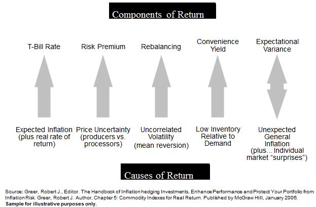
Let’s address the first question of what risk the commodity investor takes to be compensated. While there are five fundamental sources that drive the commodity asset class returns, the insurance risk premium is a major source of return and is the one behind the VIX – commodity link. Please see below for the chart of fundamental sources and components of commodity returns and click here to hear more about them in an educational slideshow.

5 Commodity Return Sources

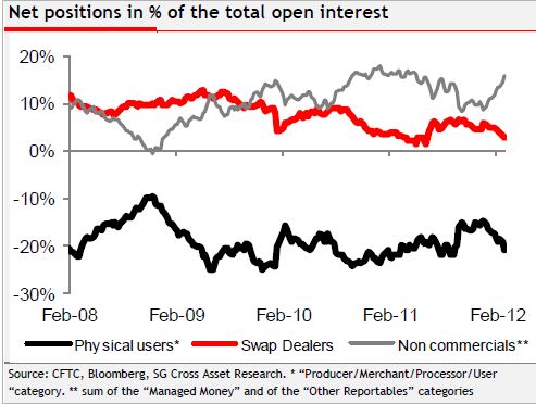
The insurance risk premium is available to long-only commodity investors since there is a gap that needs to be filled between producers and commercial consumers that are hedging. Remember, the futures markets exist to facilitate hedging, not to forecast prices. The producers go short to protect against price drops and the consumers go long to protect against price increases. However, the producers need protection against price drops more than consumers need protection against price increases. The reason this is the case is supported by two economic theories: 1. Hicks’ theory of congenital weakness that argues it is easier for consumers to choose alternatives so they are less vulnerable to price increases than producers are to price drops, and 2. Keynes’ theory of “normal backwardation” that argues producers sell commodities in advance at a discount which causes downward price pressure, which converges to the spot at the time of delivery.  This results in net short hedging pressure from physical users as shown in the graph below:

Hedging Pressure

This leads us to the second question, “At what point is the fear gauge so high the risk needs to be passed like a hot potato?”

As published in a white paper by Cheng et al., while in normal times, or in other words “pre-crisis”, commodity investors accommodate the needs of commercial producers by providing the aforementioned insurance by taking the long side of the futures contracts that the commercial consumers forego. However, in times of financial distress, or “post-crisis”,  commodity investors reduce their net long positions in response to an increase in the risk as measured by VIX, causing the risk to flow back to the hedgers.

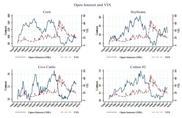
What is happening, as Tang and Xiong argue, is that although the risk sharing improves as the presence of commodity index traders increases, the expense of risk spillover from outside markets increases.  Simply stated, the risk for investors to provide insurance becomes too high to bear. Like the convection of a current of air that flows from a high-pressure area to a low-pressure area, the risk flows from the more distressed commodity index investors to the less distressed hedgers – beginning the game of “hot potato” since no one wants to hold the risk. The result is a collapse in open interest as shown in Cheng’s paper in the table below.

VIX Commodity Open Interest

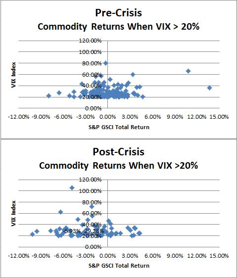
How does this translate into linking VIX spikes to commodity dips? Using weekly return data on a rolling basis daily back to January 1990, of a total of 215 times that VIX spiked more than 20%, 142 occurred prior to Sept 2008 and 73 occurred after Sept 2008. In the pre-crisis, of the 142 times that VIX spiked >20%, commodities fell 82 times or 58% of the time with an average return of 6 basis points during the weeks of VIX spikes. However, the post crisis number of weeks on a rolling basis where VIX spiked >20% was 73 and commodity returns were negative 65 of those times or 89% with an average return of -3.4%. Please see the charts below that demonstrate this:

Source: S&P Dow Jones Indices. Data from Jan 1990 to July 2013. Past performance is not an indication of future results. This chart reflects hypothetical historical performance. Please see the Performance Disclosure at the end of this document for more information regarding the inherent limitations associated with backtested performance

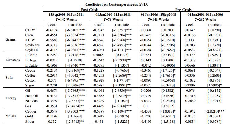
A similar result holds when examining commodity returns for the week following a VIX spike >20%. Pre-crisis returns were 0.00% and post-crisis returns were -2.2%. Cheng’s paper finds a similar result for individual commodity futures markets via regression analysis as shown below:

We report coefficients from a weekly regression of commodity returns as the left-hand side variable on contemporaneous and one lag of changes in  the VIX as right hand side variables, controlling for lagged commodity returns, percentage changes in the BDI, changes in the Baa credit spread, and  changes in inflation compensation. Each row reports coefficients for a different commodity and each set of columns reports coefficients for different  sample periods. For brevity, only the coefficients on the contemporaneous change in VIX are reported. Coefficients are reported where both returns  and the VIX are in basis points. We use the Newey and West (1987) construction for standard errors with four lags. */**/*** denotes significant at  the 10%, 5%, and 1% levels, respectively.
We report coefficients from a weekly regression of commodity returns as the left-hand side variable on contemporaneous and one lag of changes in the VIX as right hand side variables, controlling for lagged commodity returns, percentage changes in the BDI, changes in the Baa credit spread, and changes in inflation compensation. Each row reports coefficients for a different commodity and each set of columns reports coefficients for different sample periods. For brevity, only the coefficients on the contemporaneous change in VIX are reported. Coefficients are reported where both returns and the VIX are in basis points. We use the Newey and West (1987) construction for standard errors with four lags. */**/*** denotes significant at the 10%, 5%, and 1% levels, respectively.

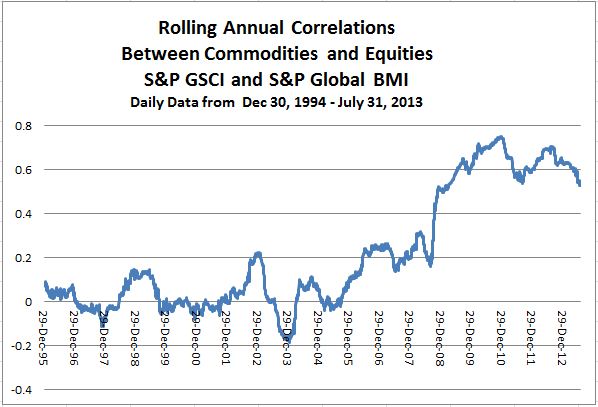
In conclusion, something to watch as an indicator of when the risk on – risk off environment might end this game of hot potato may be how the quantitative easing and policy drive the correlations between commodities and equities, which seem to have peaked, but not so obviously to declare game over yet.

Source: S&P Dow Jones Indices. Data from Dec 1994 to July 2013. Past performance is not an indication of future results. This chart reflects hypothetical historical performance. Please see the Performance Disclosure at the end of this document for more information regarding the inherent limitations associated with backtested performance

The posts on this blog are opinions, not advice. Please read our Disclaimers.

How Badly is Gold Bleeding?

Contributor Image
Jodie Gunzberg

Former Managing Director, Head of U.S. Equities

S&P Dow Jones Indices

In light of much negative news about the bust in gold, I thought it might be interesting to share the impact the gold drop has had on dollar exposure in the two most widely used commodity indices, the S&P GSCI and DJ-UBS.  Below is a note we published today in a media bulletin:

Good afternoon –

Jodie Gunzberg, Vice President at S&P Dow Jones Indices has issued the following research note:

Gold’s Bear Market Impact on the Commodity Market

Gold is down 21.6% YTD in the S&P GSCI and DJ-UBS

What does that mean in dollars? The indices lost about $1.6B in gold in 2013.

BUT it’s not all bad news. Gold has actually gained almost $600m in the indices since its bottom on June 27, 2013. 

There are approximately $155B tracking the two most widely followed commodity indices S&P GSCI and DJ-UBS.  While the assets tracking are closely split with about $80B tracking the S&P GSCI and $75B tracking the DJ-UBS, the amount in gold is quite different.  The S&P GSCI has been impacted far less from the lower exposure resulting from the world-production weight.

Data as of August 13, 2013


The posts on this blog are opinions, not advice. Please read our Disclaimers.

S&P 500 Foreign Sales - Asia Continues Up, As Europe Continues Down

Contributor Image
Howard Silverblatt

Senior Index Analyst, Product Management

S&P Dow Jones Indices

S&P Dow Jones Indices released their foreign sales reports today (bit.ly/1eGKVbf ). The top-line items are that foreign sales increased (46.6% from 46.1%), Asian sales continued to grow as European sales continued to decline, and S&P 500 issues reversed their income tax payments and sent more to Washington in 2012 than they sent abroad (51.2% in 2012 compared to 45.3% in 2011). The bottom-line item, however, is taxes. There is battle brewing over who should pay what, and I believe that battle will emulate the health care debate, and be just as divisive. Corporations pay what is required, and if there is a legal way to reduce their payment, they will take it, and rightfully so (I feel). The issue is the rules, and that is where we should be focused on. Fairness, economic implications, and social policy all have a part in the rules. It would be nice to believe that when congress returns they will focus in on those issues, but with all due respect to my compliance people – I fear that past performance will be indicative of future returns.

S&P 500 sales:
In 2012, European sales declined to 9.7% of all S&P 500 sales, down from 11.1% in 2011 and 13.5% in 2010
U.K. representation declined to 1.7% from 2.4% in 2011
European ex-U.K. sales declined to 8.0%, from 8.7% in 2011 and 12.0% in 2010
Asian sales increased to 7.5% of all sales, from 7.2% in 2011 and 6.1% in 2010
Canadian sales declined to 4.1% of all sales from 4.3% in 2011

Information technology continued to be the most successful and exposed sector in terms of foreign sales, with 58.3% of its declared sales being foreign
The sector represents 16.2% of all U.S. foreign sales, down from 19.0% in 2011

S&P 500 companies reversed their payments and sent more money to Washington for income taxes than they did to foreign governments
Payments to Washington increased 24.2% to $145.8 billion, as payments abroad declined 1.8% to $139.1 billion
51.2% of declared income taxes were paid to the U.S. and 48.8% were paid to foreign governments

A slight uptick in the companies reporting foreign sales data was noted, however, almost half of the S&P 500 issues still do not report sufficient information to facilitate producing a complete report on global sales.

For the S&P 500, 46.6% of all sales are estimated to have been produced and sold outside of the U.S. in 2012, compared to 46.1% in 2011 and 46.3% in 2010.

Observation/Commentary:
At this point it is not just about tax rates and credits, but in what domain the sales and profits are registered in. Tax policy has now become a major issue with the public debate expected to grow substantially, emulating the levels and political turmoil which surrounded the health care debate.

While European sales are down, they are still a major component of U.S. sales, with their growth expectations having now been scaled back. Asian sales are increasing, and just as relevant is the production which is done there and imported back to the U.S. The Heartland of America (manufacturing) is returning, with the question being how much can it grow given U.S. economic and social costs, as companies continue to cut-costs and have difficulties passing along higher costs. Retail issues show the impact quicker to foreign sales and currency, as consumers can quickly decide to change their spending habits (COH, TIF, MCD); decision for major purchases, such as equipment (CAT) can take months to decide or change.

An upturn after last year’s tick down, but Asia continues to increase as Europe continues to decrease.

IT remains as the leader in foreign sales, with Energy rebounding.

Uncle Sam became a majority holder in income tax receipts – I expect tax policy to become the key issue later this year, emulating the health care turmoil and debate.

Using the current membership (proforma), a stronger gain was posted in foreign sales.

An initial review of the data shows that S&P MidCap 400 issues have less exposure to foreign sales than large-cap issues, with S&P SmallCap 600 issues having even less. Sector variance showed that mid- and small-cap issues had slightly higher concentration in Health Care and less in Information Technology and Finance. Top-line foreign sales exposure seems to reduce with size, but bottom-line income may be a different story.  Large-caps may be able to control more of their fate through ownership, joint ventures and the ability to hedge currencies to protect costs.  Smaller-caps appear to have to go with the flow more – so if they are currently importing component parts from Japan, they are saving a few cents. I’ll put together a report later in the month.

The posts on this blog are opinions, not advice. Please read our Disclaimers.

Indexing Multi-Asset Solutions

Contributor Image
Aye Soe

Former Managing Director, Global Head of Core and Multi-Asset Product Management

S&P Dow Jones Indices

Multi-asset strategies have been traditionally offered via active management. Institutional and high net worth investors have used multi-asset strategies to meet their specific needs such as matching liabilities and achieving absolute returns. As the indexing industry evolves beyond asset class beta and systematic risk premia, we are starting to see multi-asset investment solutions offered in a pre-packaged index format. S&P Dow Jones Indices offers a suite of multi-asset strategies ranging from target date to target volatility indices. The table below highlights examples of multi-asset solutions that have been indexed or can potentially be indexed.

In our recent paper, The Role of Multi-Asset Solutions in Indexing, we cover a number of multi-asset solutions that can be indexed. We discuss three case studies in detail: risk parity, income generation and inflation protection. Our analysis shows that portfolio risk can be mitigated by diversifying across asset classes while meeting the specific investment objective, whether it’s income, inflation protection or balanced asset class risk exposure.


The posts on this blog are opinions, not advice. Please read our Disclaimers.

S&P 500 and Dow Jones Industrial Average

Contributor Image
David Blitzer

Former Managing Director and Chairman of the Index Committee

S&P Dow Jones Indices

SPX-INDU

The two best known and most widely followed stock indices in the world are the S&P 500 and the Dow Jones Industrial Average.  While both follow large cap US stocks and both have long histories, they are quite different in some important ways. The Dow is the oldest regularly calculated stock index dating back to 1896.  It began as 12 stocks, became 30 in 1928 after a series of changes and continues that way today. The Dow was created by Dow Jones & Company, the published of the Wall Street Journal and is now owned and maintained by S&P Dow Jones Indices.  It is price-weighted meaning that the index is calculated by adding up the prices of the 30 stocks and dividing by the divisor. The divisor is used to prevent the index from changing when the stocks are changed. With price weighting, the highest price stock, IBM carries about 23 times more weight in the index than the lowest price stock, Alcoa.  In fact, IBM has twice as much weight and a bigger impact on the index than ExxonMobil even though ExxonMobil is almost twice as large as IBM measured by market value.

The S&P 500 is a relative new comer.  It took its present form of 500 stocks in 1957 when the Standard Statistics 90 Stock Index, created in 1926, became the S&P 500.  The 500 is value-weighted (sometimes called cap-weighted).  The market value of all 500 companies is totaled and divided by a divisor. The divisor serves the same function for the 500 as it does for the Dow, preventing jumps when stocks are replaced. Since not every share of every stock is readily available in the market – some shares are closely held and rarely traded – the index is float adjusted to exclude closely held shares. Each company’s weight in the index is proportional to its size.  For instance, ExxonMobil’s weight will be twice that of IBM in the S&P 500 unlike the price-weighted DJIA.  Because of the different weighting methods and the much larger number of stocks in the S&P 500 than the DJIA, the range from largest to smallest company, or highest to lowest price, is much greater for the S&P 500.  The larger number of stocks in the 500 also makes it possible to divide the index and compare the performance of different parts of the market using sectors (technology, utilities, health care, financials, etc.) or styles (growth and value). Further, because the market is value weighted, the returns and volatilities measured with the S&P 500 give returns and volatility for the market.

Overall both indices are widely followed and both are used to analyze and predict the market and to invest or manage risk through investment products based on the indices.

The posts on this blog are opinions, not advice. Please read our Disclaimers.