Get Indexology® Blog updates via email.

In This List

S&P BSE SENSEX During the Modi Administration’s Budget Sessions

Active Management for Volatile Times?

Quantifying Fee Drag on Investment Returns

Commodities Performance Highlights – January 2019

S&P 500 Performance in 2018: How Much Does Size Matter?

S&P BSE SENSEX During the Modi Administration’s Budget Sessions

Contributor Image
Ved Malla

Associate Director, Client Coverage

S&P Dow Jones Indices

Every year in India, the Finance Minister presents the Union Budget, which is perhaps the most important economic activity in the country. “Budget Day” comes with a lot of expectations, and it therefore has a bearing on the capital markets in both the pre- and post-budget sessions. The days before and after the budget session usually bring volatility to the capital markets.

With “Budget Day” just around the corner, attention is turning to the Finance Minister as he gears up to announce the last budget of this administration on Feb. 1, 2019. This will be considered an “interim budget” rather than a regular budget because India will have national elections in a few months, and the next finance minister gets to make the final decisions after a new administration is formed. The interim budget will be crucial for the government considering the recent debacle in the state elections in December 2018, which may have an impact on the sops that are rolled out in this budget; hence, the people have higher expectations than usual during this budget session.

The S&P BSE SENSEX’s total return index value increased from 27,648.13 on Jan. 31, 2014, to 52,335.86 on Jan. 31, 2019, and the highest close was at 55,975.53 on Aug. 28, 2018 (see Exhibit 1). This represents a five-year CAGR of 17.30% for the period.

Exhibit 1: S&P BSE SENSEX Total Return

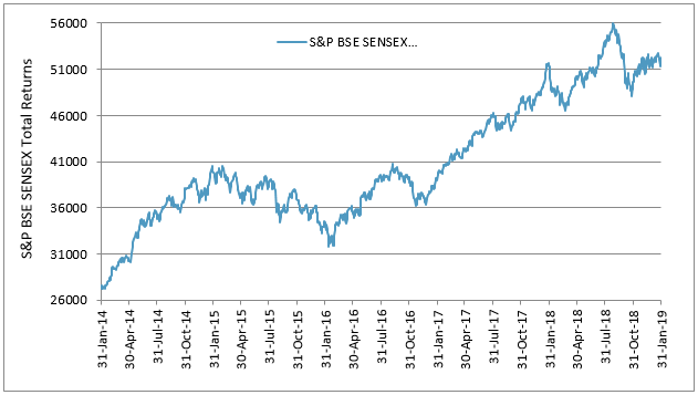
Source: S&P Dow Jones Indices LLC. Data from Jan. 31, 2014, to Jan. 31, 2019. Index performance based on total return in INR. Past performance is no guarantee of future results. Chart is provided for illustrative purposes

Exhibit 2: 30-Day Pre- and Post-Budget Day Monthly Returns and Volatility of the S&P BSE SENSEX
PERIOD BUDGET DATE RETURNS (%) VOLATILITY (MONTHLY) (%)
PRE-BUDGET POST-BUDGET PRE-BUDGET POST-BUDGET
2014-2015 July 10, 2014 -0.28 -0.22 3.97 3.68
2015-2016 Feb. 28, 2015 -1.14 -5.88 3.81 3.92
2016-2017 Feb. 29, 2016 -6.88 7.86 5.96 5.01
2017-2018 Feb. 1, 2017 3.88 4.36 2.51 2.41
2018-2019 Feb. 1,2018 6.39 -5.27 1.99 3.92
2019-2020 Feb. 1, 2019 0.02 NA 3.28 NA

Source: S&P Dow Jones Indices LLC. Data from June 9, 2014, to Jan. 31, 2019. Past performance is no guarantee of future results. Table is provided for illustrative purposes.

In Exhibit 2, we can see that in most years, the S&P BSE SENSEX witnessed high volatility in the 30-day pre- and post-budget sessions. The highest 30-day pre- and post-budget volatility was observed in 2016. The lowest volatility in the 30-day pre-budget session was seen in 2018.

To conclude, we can say that the budget sessions tend to be volatile for capital markets in India. The pre-budget movement has historically been influenced by market participant expectations for the budget, while the post-budget movement tends to be based on the actual budget presented by the Finance Minister. The budget may be the most important economic activity affecting capital markets in India, and its relevance is captured by the movement of the S&P BSE SENSEX.

The posts on this blog are opinions, not advice. Please read our Disclaimers.

Active Management for Volatile Times?

Contributor Image
Craig Lazzara

Former Managing Director, Index Investment Strategy

S&P Dow Jones Indices

This morning brought a report that “retail investors have returned to Wall Street, pouring money into mutual funds focused on US equities for the first time since early 2015, according to data from TrimTabs Investment Research…. ‘Maybe people think, in times of higher volatility, active managers will do a better job,’ Winston Chua, an analyst at TrimTabs, said of the $3.3bn that retail investors put into mutual funds in January.”

They might think that, but they would be wrong.

Our SPIVA reports have tracked the relative out- and under-performance of actively-managed mutual funds since 2001.  It’s been a rough ride for active managers – in an average year, 64% of large-cap funds underperformed the S&P 500; a majority outperformed in only three years.  Seventeen years of data are not a lot, and we should be circumspect about drawing too many conclusions from too few observations.  Nonetheless, we can make at least a crude judgment as to whether volatile, weak markets favor active managers.

The graph above divides the SPIVA database into “strong” years (when the market rose by at least 10%), “moderate” years (smaller positive returns), and “bad” years (negative returns).  In strong markets, 66% of active funds underperformed the S&P 500; in down years, “only” 63% underperformed.  That hardly constitutes persuasive evidence of successful active management in declining markets.

There’s a reason for this finding: most actively-managed funds are more volatile than the benchmark against which they’re evaluated.  Moreover, fund volatility tends to persist – a high-volatility fund this year is likely to have above-average volatility next year.  The contrast with fund returns – where success this year tells you nothing about the likelihood of success next year – is notable (and, from the active manager’s standpoint, regrettable).

The active-passive debate will continue unabated in 2019, and there may be good reasons why some investors should hire active managers.  The expectation of outperformance in a bad market is not one of them.

The posts on this blog are opinions, not advice. Please read our Disclaimers.

Quantifying Fee Drag on Investment Returns

Contributor Image
Berlinda Liu

Former Director, Multi-Asset Indices

S&P Dow Jones Indices

The impact of fees on investment returns is a widely studied and much debated topic. Over the past decade, as index-linked, lower-cost passive investing has taken hold, fees have become a greater focus. In recent years, there have been several studies published examining the impact of fees on performance.

The U.K’s Financial Conduct Authority (FCA), which has long been concerned that investors are charged high fees for active funds that closely track index performance, has published a number of reports calling for fee transparency. Last month, the European Securities and Markets Authority (ESMA) published a study[1] that showed that actively managed equity funds have higher fees than passively managed equity funds, leading to lower performance on a net-of-fees basis for active funds.

Following the ESMA study, a recent article in the Financial Times[2] argued along similar lines that more mutual funds underperformed their benchmarks than institutional accounts in the same category in the long term, primarily due to higher fees.

The question then arises, to what degree do fees vary between institutional and retail accounts for a given investment style?

To quantify the fee discrepancy between retail and institutional accounts, we compiled the fees analysis using data from institutional managed accounts and mutual funds as of Dec. 31, 2017. For institutional managed accounts, we looked at managers that reported both gross-of-fees returns and net-of-fees returns and calculated the difference as the fee. For mutual funds, we used the expense ratio to represent the fees.

We then calculated the median fee charged in each category (see Exhibit 1).[3] In general, institutional managed accounts charged roughly 60%-75% of the fees charged by mutual funds. Among the four equity investment styles we analyzed, the median fee of institutional large-cap strategies was roughly two-thirds of similar large-cap mutual funds.  Similarly, the median institutional emerging market and global equity strategies had fees 33 bps lower than their retail counterparts.

The gap between institutional accounts and mutual funds widened in fixed income.  High-yield institutional accounts, for example, charged 39 bps less on average than their mutual fund peers, and the median fee was only 59% of the median fee being charged by retail high-yield funds.

The impact of fees is prominent when we compare the strategy’s relative performance against its respective benchmark. For example, over the last 10 years, the S&P Composite 1500® outperformed 11 percentage points (71% versus 60%) more domestic mutual funds than domestic institutional accounts on a gross-of-fees basis, and the gap widens to 16 percentage points (87% versus 71%) on a net-of-fees basis (see Exhibit 2).

Fee impact is further magnified in less liquid or less efficient markets. In emerging markets, on a gross-of-fees basis, 12 percentage points (61% versus 49%) more mutual funds underperformed their benchmarks compared with institutional counterparts; on a net-of-fee basis, the gap almost doubled to 22 percentage points (85% versus 63%).

Our analysis is consistent with ESMA’s conclusion that costs are higher for retail compared with institutional investors across asset classes and domiciles. Actively managed retail funds may provide a slightly better gross performance than passively managed funds, but the margin is small and may diminish after fees are accounted for.

[1]   https://www.esma.europa.eu/sites/default/files/library/esma50-165-731-asr-performance_and_costs_of_retail_investments_products_in_the_eu.pdf

[2]   https://www.ft.com/content/b92a78a3-1409-376c-81b4-86b58a2b2e9d

[3]   We used the same categories as those provided in the Financial Times article.

The posts on this blog are opinions, not advice. Please read our Disclaimers.

Commodities Performance Highlights – January 2019

Contributor Image
Fiona Boal

Managing Director, Global Head of Equities

S&P Dow Jones Indices

Commodities enjoyed an impressive start to 2019. The S&P GSCI was up 9.0% in January, while the Dow Jones Commodity Index (DJCI) was up 5.4%. The strong performance was largely driven by a notable recovery in petroleum prices, but industrial metals also enjoyed a revival.

Oil prices recovered strongly over the first full trading week of January, before trading within a narrow range for the remainder of the month. The S&P GSCI Petroleum ended the month up 14.6%, recuperating the bulk of its full-year 2018 declines in just one month. Late in the month, preliminary data presenting a steep drop in OPEC’s January output and fear of supply disruptions associated with U.S. sanctions against Venezuela offered additional comfort to oil bulls, but such comfort is rightly tempered by signs of weakening global economy growth.

Growing concern regarding potential weakness in the Chinese economy, lower oil prices, and a slide in investor sentiment had weighted on the price of most industrial metals at the tail end of 2018. But the new year brought the prospect of shrinking inventories, especially for nickel and copper, back into focus for investors. The S&P GSCI Industrial Metals rose 5.3% in January, while the DJCI Industrial Metals was up 6.1%. Nickel surged 16.8% for the month, front-running hopes that the relationship between the U.S. and China may be removed from the deep freeze, confirmation of a deepening supply deficit, and nascent signs that the prolonged period of U.S.-dollar strength may be beginning to waiver.

A resurgence in investor appetite for so-called “safe-haven” assets saw the S&P GSCI Gold reach its highest level since May 2018 at the end of January. There was certainly no lack of risk catalysts for those investors considering increasing their tactical allocation to gold, including an uptick in equity market volatility, growing concern regarding the health of the global economy, uncertainty over the path of U.S. interest rates, and a raft of geopolitical risks.

Across the agriculture complex, performance was skewed mildly to the upside (S&P GSCI Agriculture up 2.2%, DJCI Agriculture Capped Component up 2.3%), but cocoa was a stark exception. The S&P GSCI Cocoa was down 10.1% in January, as the main crop harvest in West Africa started to wind down and supplies at major ports built up.

The S&P GSCI Livestock was down 1.7%, and the DJCI Livestock was down 1.5% for the month. Lean hogs (down 7.1%) dragged the index into negative territory on the back of a somewhat unexpected surge in U.S. pork production and the removal of any residual premium following the initial outbreak of African swine fever in China.

See more details on how the commodities measured by the S&P GSCI and the DJCI fared here.

The posts on this blog are opinions, not advice. Please read our Disclaimers.

S&P 500 Performance in 2018: How Much Does Size Matter?

Contributor Image
Kelly Tang

Former Director

Global Research & Design

2018 certainly proved to be a turbulent period for equities, and the market was especially volatile in the fourth quarter, effectively wiping away all the gains that the S&P 500® had generated in the first three quarters of the year. Overall, the S&P 500 returned -4.38% in 2018. Despite landing in negative territory, the S&P 500 still performed better on a relative basis than its mid-cap or small-cap peers (see Exhibit 1).

There are market participants who believe the performance of the S&P 500 is driven by mega-cap securities, and it is not difficult to see why the perception persists—from Dec. 31, 2012, through Dec. 31 2017, 23% of average annual total return came from the top 10 securities ranked by market capitalization (see Exhibit 2).

In order to delve deeper into whether size played a role in 2018, we expanded our analysis beyond the top 10 securities. To do so, we grouped the constituents of the S&P 500 into deciles in descending order by market capitalization. Therefore, Decile 1 contains the largest 50 securities of the S&P 500. We then analyzed the contribution to returns of the decile portfolios (see Exhibit 3). Given that Q4 2018 proved to be the most volatile, we calculated Q1 through Q3 2018 performance to understand how the portfolios were performing prior to the hard hit Q4 2018.

Not surprisingly, Decile 1 was either the best-performing or the worst-performing group for every quarter in 2018. Further, the decile portfolios returns were generally monotonic in both up and down market periods in 2018. Against that background, one could very well say that market cap played a dominant role in S&P 500 performance in 2018.

However, since S&P 500 employs a market-cap weighting system, we need to isolate the bias introduced by size in the weighting scheme. What happens if we repeat the same exercise for the decile portfolios and employ an equal-weighted methodology? Would the higher deciles still drive overall performance in both up and down markets?

When the impact of size was neutralized through an equal-weighted methodology (see Exhibit 4), Decile 1 did not rank as the worst performer nor did it rank as the top performer. In fact, during the Q1 though Q3 cumulative performance period, Decile 3, Decile 10, and Decile 2 ranked higher than Decile 1.

For the volatile Q4, Decile 1 lagged the best-performing Decile 3 by just 0.1%. The performance during Q4 saw the smallest 50 securities of S&P 500 underperform, with returns lower than all other portfolios as well as the market.

What does this all mean? In 2018, the portfolio that detracted the most from performance was Decile 1, which consisted of the 50 largest securities of S&P 500. However, when the same portfolios were equal weighted, Decile 1 was the second-best-performing portfolio (-2.49%). Looking at the results, one cannot conclusively confirm that size was the sole driver of negative performance in 2018. To be fair, 2018 is just one year of data and to confirm definitively, we would need to study a longer time period.

The posts on this blog are opinions, not advice. Please read our Disclaimers.