Get Indexology® Blog updates via email.

In This List

Commodities Performance Highlights – January 2019

S&P 500 Performance in 2018: How Much Does Size Matter?

As goes January, so ... what?

A Return to the Golden Age?

S&P 500 On Pace For Best January Since 1989

Commodities Performance Highlights – January 2019

Contributor Image
Fiona Boal

Managing Director, Global Head of Equities

S&P Dow Jones Indices

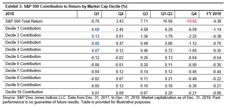
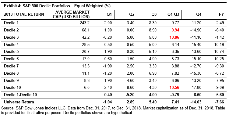
Commodities enjoyed an impressive start to 2019. The S&P GSCI was up 9.0% in January, while the Dow Jones Commodity Index (DJCI) was up 5.4%. The strong performance was largely driven by a notable recovery in petroleum prices, but industrial metals also enjoyed a revival.

Oil prices recovered strongly over the first full trading week of January, before trading within a narrow range for the remainder of the month. The S&P GSCI Petroleum ended the month up 14.6%, recuperating the bulk of its full-year 2018 declines in just one month. Late in the month, preliminary data presenting a steep drop in OPEC’s January output and fear of supply disruptions associated with U.S. sanctions against Venezuela offered additional comfort to oil bulls, but such comfort is rightly tempered by signs of weakening global economy growth.

Growing concern regarding potential weakness in the Chinese economy, lower oil prices, and a slide in investor sentiment had weighted on the price of most industrial metals at the tail end of 2018. But the new year brought the prospect of shrinking inventories, especially for nickel and copper, back into focus for investors. The S&P GSCI Industrial Metals rose 5.3% in January, while the DJCI Industrial Metals was up 6.1%. Nickel surged 16.8% for the month, front-running hopes that the relationship between the U.S. and China may be removed from the deep freeze, confirmation of a deepening supply deficit, and nascent signs that the prolonged period of U.S.-dollar strength may be beginning to waiver.

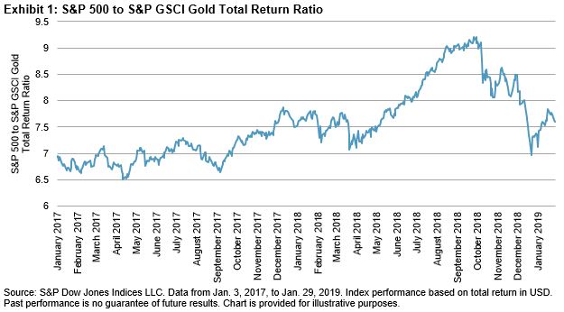
A resurgence in investor appetite for so-called “safe-haven” assets saw the S&P GSCI Gold reach its highest level since May 2018 at the end of January. There was certainly no lack of risk catalysts for those investors considering increasing their tactical allocation to gold, including an uptick in equity market volatility, growing concern regarding the health of the global economy, uncertainty over the path of U.S. interest rates, and a raft of geopolitical risks.

Across the agriculture complex, performance was skewed mildly to the upside (S&P GSCI Agriculture up 2.2%, DJCI Agriculture Capped Component up 2.3%), but cocoa was a stark exception. The S&P GSCI Cocoa was down 10.1% in January, as the main crop harvest in West Africa started to wind down and supplies at major ports built up.

The S&P GSCI Livestock was down 1.7%, and the DJCI Livestock was down 1.5% for the month. Lean hogs (down 7.1%) dragged the index into negative territory on the back of a somewhat unexpected surge in U.S. pork production and the removal of any residual premium following the initial outbreak of African swine fever in China.

See more details on how the commodities measured by the S&P GSCI and the DJCI fared here.

The posts on this blog are opinions, not advice. Please read our Disclaimers.

S&P 500 Performance in 2018: How Much Does Size Matter?

Contributor Image
Kelly Tang

Former Director

Global Research & Design

2018 certainly proved to be a turbulent period for equities, and the market was especially volatile in the fourth quarter, effectively wiping away all the gains that the S&P 500® had generated in the first three quarters of the year. Overall, the S&P 500 returned -4.38% in 2018. Despite landing in negative territory, the S&P 500 still performed better on a relative basis than its mid-cap or small-cap peers (see Exhibit 1).

There are market participants who believe the performance of the S&P 500 is driven by mega-cap securities, and it is not difficult to see why the perception persists—from Dec. 31, 2012, through Dec. 31 2017, 23% of average annual total return came from the top 10 securities ranked by market capitalization (see Exhibit 2).

In order to delve deeper into whether size played a role in 2018, we expanded our analysis beyond the top 10 securities. To do so, we grouped the constituents of the S&P 500 into deciles in descending order by market capitalization. Therefore, Decile 1 contains the largest 50 securities of the S&P 500. We then analyzed the contribution to returns of the decile portfolios (see Exhibit 3). Given that Q4 2018 proved to be the most volatile, we calculated Q1 through Q3 2018 performance to understand how the portfolios were performing prior to the hard hit Q4 2018.

Not surprisingly, Decile 1 was either the best-performing or the worst-performing group for every quarter in 2018. Further, the decile portfolios returns were generally monotonic in both up and down market periods in 2018. Against that background, one could very well say that market cap played a dominant role in S&P 500 performance in 2018.

However, since S&P 500 employs a market-cap weighting system, we need to isolate the bias introduced by size in the weighting scheme. What happens if we repeat the same exercise for the decile portfolios and employ an equal-weighted methodology? Would the higher deciles still drive overall performance in both up and down markets?

When the impact of size was neutralized through an equal-weighted methodology (see Exhibit 4), Decile 1 did not rank as the worst performer nor did it rank as the top performer. In fact, during the Q1 though Q3 cumulative performance period, Decile 3, Decile 10, and Decile 2 ranked higher than Decile 1.

For the volatile Q4, Decile 1 lagged the best-performing Decile 3 by just 0.1%. The performance during Q4 saw the smallest 50 securities of S&P 500 underperform, with returns lower than all other portfolios as well as the market.

What does this all mean? In 2018, the portfolio that detracted the most from performance was Decile 1, which consisted of the 50 largest securities of S&P 500. However, when the same portfolios were equal weighted, Decile 1 was the second-best-performing portfolio (-2.49%). Looking at the results, one cannot conclusively confirm that size was the sole driver of negative performance in 2018. To be fair, 2018 is just one year of data and to confirm definitively, we would need to study a longer time period.

The posts on this blog are opinions, not advice. Please read our Disclaimers.

As goes January, so ... what?

Contributor Image
Chris Bennett

Former Director, Index Investment Strategy

S&P Dow Jones Indices

“The more you look at ‘common knowledge’, the more you realise that it is more likely to be common than it is to be knowledge”

– Idries Shah, Reflections

Statements such as “sell in May and go away” can become accepted wisdom without always facing proper scrutiny.  Another aphorism, particularly timely at the present moment, is offered by “as goes January, so goes the year.”  The idea is that January provides a roadmap for the rest of the year; it sets the tone and begins the trend.  Recently, following a strong market performance in January 2019, experts have begun to assert that good times are likely ahead.

There is some historical support for the thesis that the market’s returns in the remaining eleven months of the year are predicted directionally by January’s returns.  Since 1897, if the Dow Jones Industrial Average (DJIA) ended January with a positive return, the returns for the rest of the year were positive 73% of the time.

However, if the DJIA was negative in January, it offered significantly less predictive power, with the returns for the rest of the year being negative only 45% of the time, and positive 55% of the time.  That is to say, the returns after a negative January had the opposite sign in a majority of cases.

So, rather than saying “as goes January so goes the year”, we ought to say, “If January goes up, the rest of the year will likely be positive.  But if January is a down month, flip a coin”, which is admittedly not as pithy.

Overall, including both positive and negative starts to the year, January has matched the direction of the remaining 11 months returns 62% of the time.  That doesn’t sound terrible; a .620 batting average would get you into the baseball Hall of Fame.  Unfortunately, we’re not playing baseball and 62% is not far above the 50% that guessing a coin flip might get you.

But the “January Barometer” faces a tougher test than a simple coin flip.  Historically, over the long-term, the Dow has gone up in more months (and more years) than it has gone down.   In fact, if we simply predicted that the returns from February through December were going to be positive, no matter what happened in January, it would have been a safer bet: from February to December, returns for the Dow have been positive 66% of the time, regardless of how January performed. 

So what should we take away from this?  I think we can conclude that the “January Barometer” belongs in the category of misleading “truisms”.  January is not a great predictor for the rest of the year, and simply predicting the market will go up has proved more prescient.  Timing the market is hard, and January will not make that any easier.


The posts on this blog are opinions, not advice. Please read our Disclaimers.

A Return to the Golden Age?

Contributor Image
Fiona Boal

Managing Director, Global Head of Equities

S&P Dow Jones Indices

It should be no surprise to seasoned investors that gold has regained some of its shine over recent months. A resurgence in investors’ appetite for so-called “safe-haven” assets has seen the S&P GSCI Gold rise by 11% since mid-August 2018 to the highest level since May 2018. Considering gold’s relative performance, which is arguably a more valuable comparison from a portfolio perspective, gold strongly outperformed U.S. equities during the final quarter of 2018 before giving back some of that outperformance, as U.S. equities rallied through January 2019.

There is certainly no lack of risk catalysts for those investors that are ascending the investment wall of worry at the start of the new year and considering increasing their tactical allocation to gold.

  • A delayed hangover from the sharp global equity market correction in late 2018 and the related uptick in equity market volatility (a proxy for the “fear factor” in any market).
  • Growing concern that the global economy is slowing, albeit from a relatively strong position.
  • A stalling Chinese economy at the same time as burgeoning debt levels that make a large stimulus push increasingly difficult for Chinese leaders to enact.
  • Expectations that the U.S. Federal Reserve may park or even reverse its rising interest rate regime (non-income-generating assets tend to perform better in lower interest rate and lower U.S. dollar environments).
  • Geopolitical turmoil ranging from the U.S. government shutdown, Brexit, and the ongoing U.S.-China trade war saga, to the more recent escalation of the political situation in Venezuela.

But as investors navigate through the myriad of financial risk factors that will shape the trajectory of gold prices over the coming months, it is important for them to differentiate between investor and non-investment demand for gold. Clearly, investor demand for gold has been strong, as illustrated by the flow of funds into gold-linked investment products, but physical demand from the jewelry sector—highly dependent on demand in India and China—has been less stellar. According to the World Gold Council, global jewelry demand was close to flat year-over-year in 2018. On a more positive note, an uptick in central bank gold buying for strategic reserves bodes well for the overall strength of demand. Central banks purchased 74% more gold in 2018 than 2017, for the second-highest annual total on record.

Gold has, at least temporarily, re-entered a golden period in the eyes of those investors looking for safe-haven assets to insulate their portfolios from any number of risks buffeting global financial markets. Gold’s ongoing performance will depend heavily on how quickly these risks dissolve or escalate but will also continue to be influenced by non-investment demand trends.

The posts on this blog are opinions, not advice. Please read our Disclaimers.

S&P 500 On Pace For Best January Since 1989

Contributor Image
Jodie Gunzberg

Former Managing Director, Head of U.S. Equities

S&P Dow Jones Indices

In the first seven trading days of 2019, the S&P 500 had its hottest start since 2003.  That happened following the Fed’s message that it was in no hurry to raise interest rates.  The Fed met again yesterday signaling it might end the interest rate increases, which pushed the S&P 500 up 1.55% for the day (Jan. 30, 2019).  This has put the S&P 500 on track to post its 9th best January on record since 1928, its best January since 1989, and its best month since October 2015 with a gain of 6.95% through Jan. 30, 2019.  In the years including the prior 8 top Januaries, the S&P 500 finished positively 6 times, of which 5 years had gains over 19%. However, the subsequent Februaries were only positive half the time with biggest gain of 5.99% in February 1975.

Source: S&P Dow Jones Indices

The S&P 500 had a notable turnaround in January after posting its second worst December on record.  While there were, and still are some major global uncertainties – both domestically and internationally – it seems like the market was being mainly driven by the Fed.  It wasn’t just the S&P 500 but was the entire U.S. equity stock market that was impacted.  All 42 segments of size, style and sector were positive, which has happened in just 11 prior months, last in March 2016.

Source: S&P Dow Jones Indices. Jan. data ending on Jan. 30, 2019.

Half of the 42 segments of the U.S. equity market are on pace to post their best January on record, using data starting Sep. 1989, the earliest available sector data.  Also, some sectors are on pace to post relatively strong record months, for example, the S&P 600 Real Estate and the S&P MidCap 400 Value are each targeting their 4th best month ever, with respective gains of 12.88% and 11.30%.  The S&P MidCap 400 gained 9.87% and S&P SmallCap 600 9.63%, both posting their best Januaries and beating the S&P 500, as they historically have in rebounds.  Energy was the best performing sector, and unsurprisingly (due to hedging,) large caps (+10.24%) lagged the smaller company performance (+18.67%) as oil rose from sanctions on Venezuela and supply cuts from Saudi Arabia.

Source: S&P Dow Jones Indices. Jan data ending Jan. 30, 2019

Lastly, value outperformed growth significantly, especially in small-cap and mid-cap segments.  While the S&P 500 Value only outperformed the S&P 500 Growth by 1.63% in January, the S&P MidCap 400 Value outperformed the S&P Midcap 400 Growth by 2.77%, the most since the 4.18% outperformance in November 2016.  Moreover, the S&P SmallCap 600 Value outperformed the S&P SmallCap 600 Growth by 3.28%, the most since 4.27% of value outperformance in February 2001, and the 10th biggest outperformance on record.


The posts on this blog are opinions, not advice. Please read our Disclaimers.