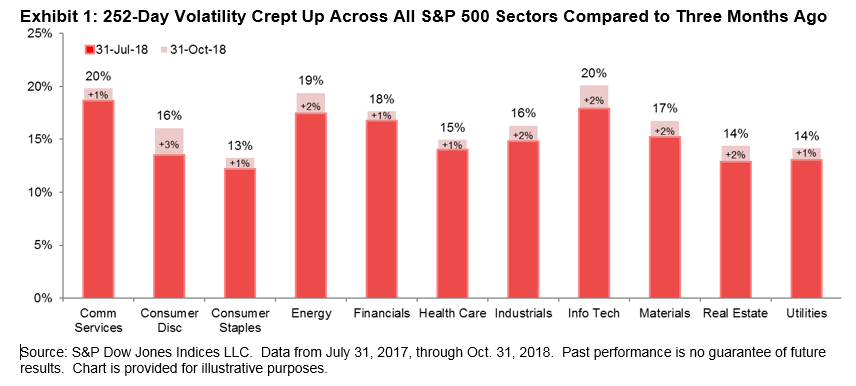
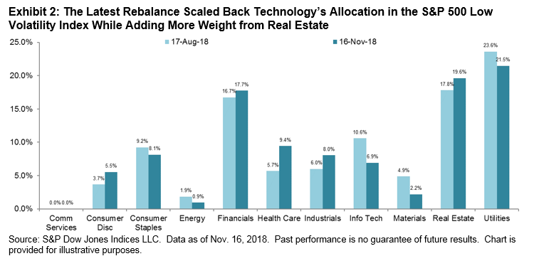
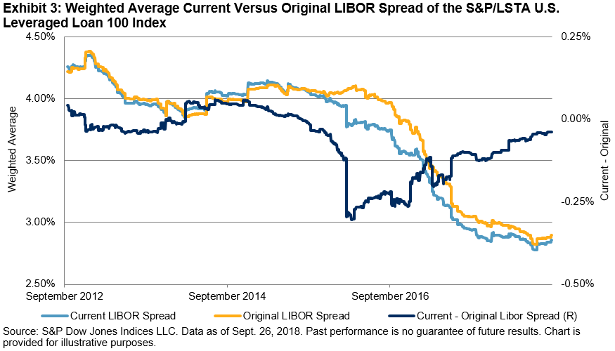
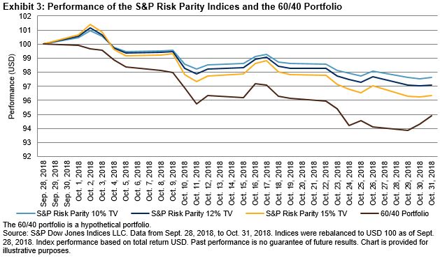
We recently introduced a new measure, capacity-adjusted dispersion, to help conceptualize the relative value of research across different markets. Intuitively, capacity-adjusted dispersion combines the potential opportunity for outperformance (dispersion) and the potential size of active positions (capitalization) in a given market. Exhibit 1 shows the capacity-adjusted figures for several markets, globally. All else being equal, for example, insights into S&P 500 sectors would have been over seven times more valuable than equally-accurate insights into S&P 500 stocks.
Exhibit 1: Capacity-Adjusted Dispersion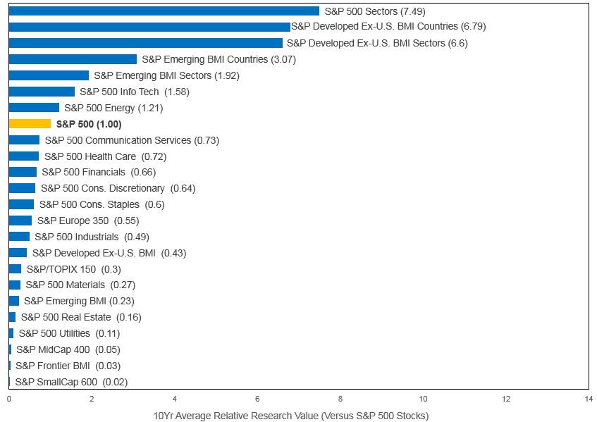 Source: The Value of Research: Skill, Capacity, and Opportunity. Past performance is no guarantee of future results. Chart is provided for illustrative purposes.
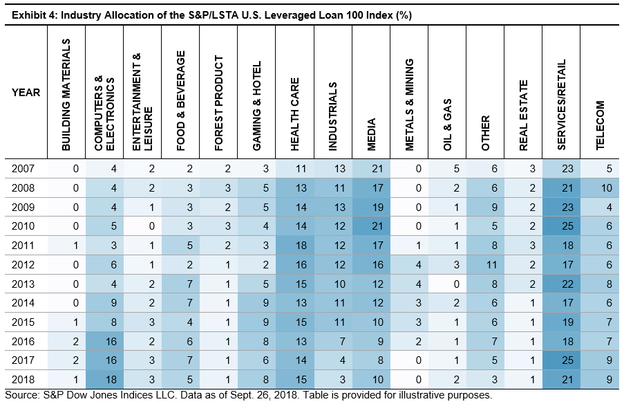
At first glance, Exhibit 1 makes grim reading for research analysts covering small- or mid-cap U.S. equities: the relatively small market capitalizations of stocks in the S&P MidCap 400 and the S&P SmallCap 600 more than neutralizes their higher dispersion, resulting in low capacity-adjusted dispersion figures. However, the results do not necessarily mean there is no value to receiving research covering small- or mid-cap U.S. stocks.
One important assumption of the stylized framework outlined in our paper is that the predictive content of research is the same for all analysts. In reality, this is unlikely to be true: some analysts are likely to be better than others at predicting how constituents (stocks, sectors, or countries) will perform in the future. If we allow the predictive content of research reports to vary, Exhibit 1 has another interpretation: the predictive content of research covering S&P SmallCap 600 stocks needed to be 50 times more accurate than for research covering S&P 500 stocks in order for the two research values to be the same. Exhibit 2 shows the relative predictive content required to make the value of research for each of the indices in Exhibit 1 equal to the value of research for S&P 500 stocks.
Exhibit 2: Predictive Content Required for Equivalent Research Value 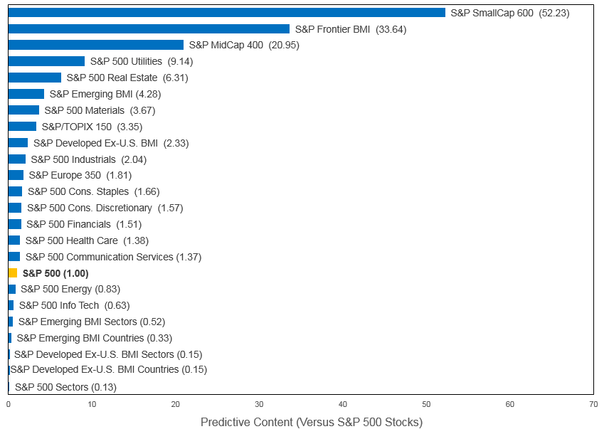 Source: The Value of Research: Skill, Capacity, and Opportunity. Past performance is no guarantee of future results. Chart is provided for illustrative purposes
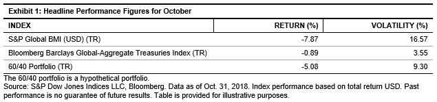
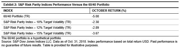
Deciding how to allocate a research budget is a challenging task. Nonetheless, our stylized framework suggests three questions are important:
- How accurate are research reports’ predictions?
- What is the potential reward to being correct?
- How big can an investor’s active positions be?
Answering these three questions may help market participants use their research budgets more effectively when attempting to deliver alpha.
The posts on this blog are opinions, not advice. Please read our Disclaimers.