“Data! Data! Data!” he cried impatiently. “I can’t make bricks without clay.”
– Sherlock Holmes (in “The Adventure of the Copper Beeches”)
Despite yesterday’s hand wringing loss for equity markets— the S&P 500 dropped 3.3%—the index is still up 5.8% year to date 2018. Nevertheless, losing in one day a third of what the equity market achieved in 9 months can, justifiably, cause alarm. In the not too distant past, the market experienced a similar trauma. Then, as now, volatility ticked up. But we also pointed out that in the broader context, the volatility jump in February 2018 was not too significant. Yesterday’s increase was even less so.

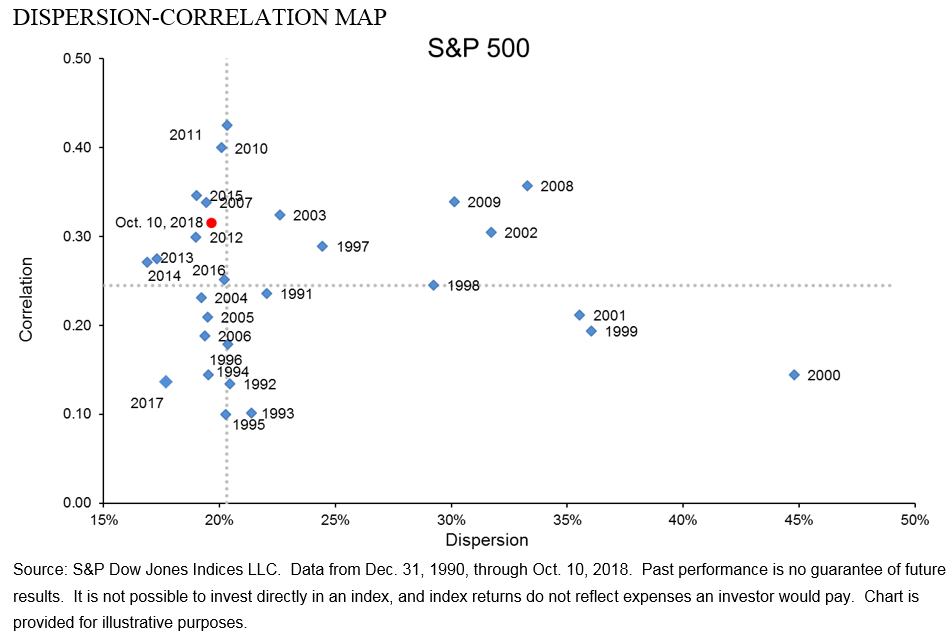
Breaking down volatility into its contributing components offers even more reassuring insight. The dispersion-correlation map offers a look at the two factors that drive volatility. The chart below maps the daily rolling 21-day dispersion and correlation levels since the beginning of August. The jump in both dispersion and correlation on October 10 was quite precipitous, but the levels are still lower than those we saw in February.

However, as the chart below reflects, from a broader context, yesterday’s market took us to above average levels for correlation, but dispersion is still under its 27-year average. This may seem striking given the particularly sleepy year in 2017, but these levels are still quite far from those in the tumultuous years of the technology bubble deflation and the financial crisis.
High dispersion does not guarantee weak markets, but in our data no severe market pullback has occurred in the absence of high dispersion.
The posts on this blog are opinions, not advice. Please read our Disclaimers.