Get Indexology® Blog updates via email.

In This List

Equal-Weighting Versus Equal-Risk-Weighting Strategies

Real Estate Gains Prominence in the S&P 500 Low Volatility Index

A Quick Look at Chilean Sovereign Bonds and Indices

Musings of a Market Commentator

Risk Contributions of Equity/Bond Asset Allocation Portfolios

Equal-Weighting Versus Equal-Risk-Weighting Strategies

Contributor Image
Phillip Brzenk

Managing Director, Global Head of Multi-Asset Indices

S&P Dow Jones Indices

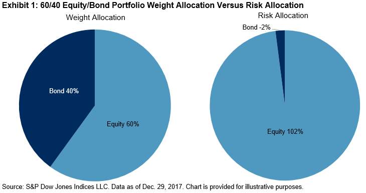
In a prior post, we reviewed the asset class risk contributions of a two-asset portfolio with varying weights. For an equal-weighted portfolio consisting of equities and bonds, we observed that nearly all contribution to total portfolio risk came from equities. To achieve equal risk contribution, the nominal weights in the portfolio would need to be closer 20% equities and 80% bonds. In this post, we extend the analysis by including the commodities asset class, and we observe how risk contributions change over time.

Commodities have relatively low correlations to traditional asset classes such as equities and bonds,[1] thereby potentially increasing diversification when added to a multi-asset portfolio. Moreover, commodities generally perform well in periods of high growth and rising inflation.

Like equities, commodities have historically had relatively high return volatility.[2] Hence, when combined in a three-asset portfolio with bonds, we anticipate that equities and commodities would contribute most to total portfolio volatility. For a portfolio that is equally weighted across the three asset classes, Exhibit 1 shows the risk contributions of each asset class on an annual basis, starting in 2000.

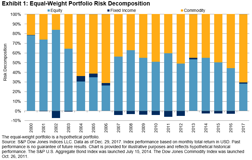
For 2017, commodities contributed most to portfolio volatility, at 71%, significantly higher than its one-third weight allocation. Next, equities contributed second most, at 28%, while fixed income contributed just 1%. For the whole period, we observe that equities and commodities were the dominant contributors to total portfolio risk. On average, equities contributed 53% and commodities 48%—therefore, bonds negatively contributed (-1%) to the total risk. However, contributions varied from year to year; equities contributed as much as 84% to portfolio volatility in 2002, fixed income contributed 6% in 2004, and commodities contributed 71% in 2006 and 2017.

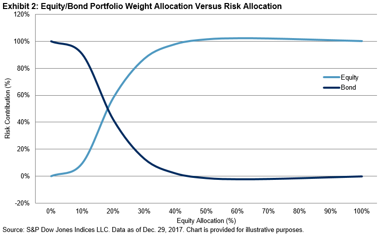
In order for the portfolio to be equal-risk weighted instead of equal weighted, the weight assigned to bonds would need to be markedly higher than the riskier asset classes. In fact, it is often necessary to incorporate leverage into the portfolio, where nominal weights of asset classes would sum to be more than 100%.

Next, we construct a basic equal-risk-contribution portfolio. The portfolio rebalances on an annual basis, with a target volatility level set to be equal to the equal-weighted portfolio volatility from the prior year.[3]

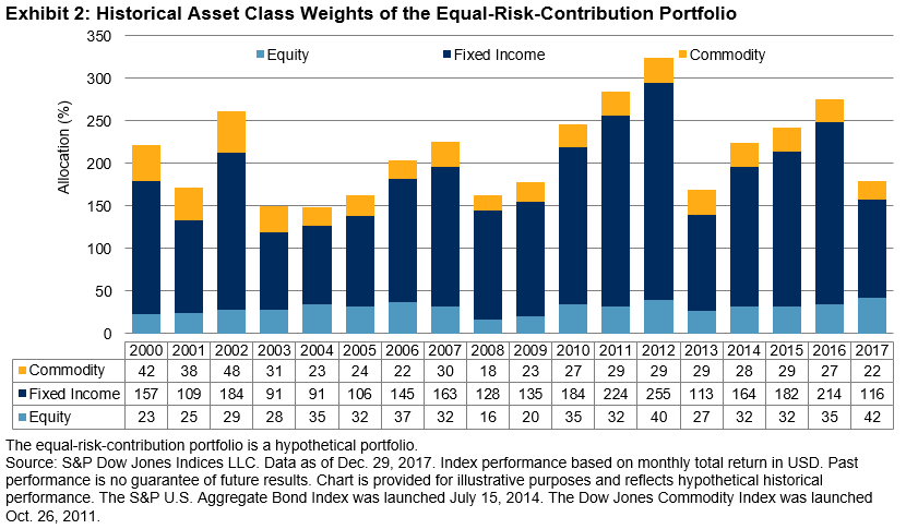
Exhibit 2 shows why leverage is needed for the portfolio, as the weight of the fixed income asset class often hovers above 100%. As the individual volatilities and cross-correlations of the asset classes vary, the nominal weights of the portfolio ranged from 149% to 324% over the entire period.

In a following post, we will review the performance differences between an equal-weighted three-asset portfolio and an equal-risk-weighted one.

[1]   See Asset Class Correlations Affect Portfolio Volatility and Return.

[2]   From Dec. 31, 1999 to Dec. 29, 2017, the annualized volatility of monthly returns were 14.5% for equities (S&P 500®), 16.2% for commodities (Dow Jones Commodity Index), and 3.6% for bonds (S&P U.S. Aggregate Bond Index).

[3]   To construct the equal-risk-contribution portfolio, at the beginning of each calendar year, we used the past one year of daily returns to compute the marginal contribution to risk for each asset class. We employed an optimizer to determine the final set of weights such that each asset class contributed approximately one-third of the total portfolio volatility, subject to several constraints. We set the target portfolio volatility to be equal to the realized portfolio volatility of the equal-weight portfolio from the prior year, subject to a maximum of 10%. The portfolio is constrained to be long only (no negative weights or shorting). Lastly, using the three-month U.S. Treasury Bill as the borrow cost, leverage was allowed for fixed income. Hence, the total nominal weight of the portfolio exceeded 100%.

The posts on this blog are opinions, not advice. Please read our Disclaimers.

Real Estate Gains Prominence in the S&P 500 Low Volatility Index

Contributor Image
Fei Mei Chan

Former Director, Core Product Management

S&P Dow Jones Indices

Year to date, the S&P 500 Low Volatility Index® has underperformed its parent S&P 500, up 5.52% compared to a 7.55% (through Aug. 16, 2018 close) increase for the benchmark. Those who are familiar with low volatility strategies will recognize that this performance is consistent with the historical pattern of returns and in line with its objective. Volatility in 2018 has been higher than in the remarkably sleepy year in 2017. While there’s no denying that volatility has been on an uptrend, current levels are still far below those seen during major calamities.

Rolling 252-Day Volatility for the S&P 500

In the latest rebalance (effective after market close Aug. 17, 2018), the S&P 500 Low Volatility Index added 5% to its allocation in Real Estate, bringing the sector’s weight to 18% (the second largest weight in the index after Utilities). This came at the cost of Industrials, whose weight was reduced by half (primarily due to a reduction of stocks from the Aerospace and Defense industry). Surprisingly, Technology added slightly more weight, maintaining a historically-unprecedented position in the Low Volatility Index for more than a year.

Real Estate is the Second Largest Allocation in the S&P 500 Low Volatility Index Behind Utilities

For insight into the latest rebalance, consider the trailing one-year volatility of sectors within the S&P 500. Volatility crept up across all sectors, by generally similar amounts. Surprisingly, despite the recent turmoil in Technology, volatility there was relatively subdued, inching up only slightly. While the Industrials sector experienced relatively more volatility compared to other sectors, the difference seemingly was not commensurate with the significant weight drop in the S&P 500 Low Volatility Index. Given that the increase in volatility were somewhat evenly distributed across all sectors, it would seem that the allocations from the latest rebalance were driven more by idiosyncrasies at the stock level.

252-Day Volatility Crept Up Across All S&P 500 Sectors Compared to Three Months Ago

The posts on this blog are opinions, not advice. Please read our Disclaimers.

A Quick Look at Chilean Sovereign Bonds and Indices

Contributor Image
Jaime Merino

Former Director, Asset Owners Channel

S&P Dow Jones Indices

This blog is an update of a post from Dec. 7, 2017.  The transition of the BCS indices to S&P/CLX was completed on Aug. 6, 2018, and you can now find the S&P/CLX Fixed Income Indices on the BCS website. Now take another look at the fixed income offerings of the S&P/CLX Index Series with the latest returns and updated reference rate, inflation, and currency data.

The Public Debt Office is the cornerstone of debt strategies for the Ministry of Finance in Chile. It supports liquidity and ensures stability in the local financial market through issuance and placement of treasury bonds. In this context, the Public Debt Office establishes referential interest rates in order to facilitate access to capital markets for Chilean businesses.

To accomplish its objective, the bureau, as part of the International Finance Unit, acts in coordination with the Treasury of the Republic, the Budget Office, and with the Central Bank in its role as fiscal agent in the placement and administration of bonds. It also monitors the investment of temporary surpluses resulting from the administration of the budget, and it proposes capital market reforms to promote the integration of domestic and international financial markets.

The Treasury issues in the local bond market in Chilean pesos and inflation-linked foment units (UF) contribute to the construction of the reference rate nominal and real curves. In 2008, the BTP-10 bonds were issued, which are the 10-year nominal bonds; for UF bonds, Chile issued the BTU-20 and BTU-30, which are 20- and 30-year bonds, respectively. During 2009, new bonds for the real curve were issued, BTU-5 and BTU-10, and for the nominal side, the BTP-5 was issued. As for the Central Bank, similar to the Treasury, they issue the BCP and BCU instruments, fixed-rate nominal bonds and inflation-linked foment unit bonds, respectively, with the objective of executing the monetary policy. Maturities for BCP bonds are 5 and 10 years (no issuance of 2-year reference after September 2012), while BCU have maturities of 5, 10, 20, and 30 years. The coupons of both are paid biannually.

In parternship with Bolsa de Comercio de Santiago (BCS, the local stock exchange), S&P Dow Jones Indices launched a series of sovereign bond indices and sovereign inflation-linked bond indices as a reference to the local market using the bonds described before. This series is categorized by maturity (see Exhibit 1).

As seen, buckets help asset managers benchmark their portfolios in case they need specific maturities. Also, the complete curve indices are calculated in USD for international investors. Exhibit 2 shows inflation, the reference rate from the Central Bank, and the local currency (Chilean peso) over the past 10 years—components that influence in the movements of the indices.

Finally, Exhibit 3 shows the annual returns of some these indices.[1]

[1]   For more information on these indices, see here:

http://spindices.com/indices/fixed-income/sp-clx-chile-sovereign-bond-index

http://spindices.com/indices/fixed-income/sp-clx-chile-sovereign-bond-1-5-year-index

http://spindices.com/indices/fixed-income/sp-clx-chile-sovereign-bond-5-10-year-index

http://spindices.com/indices/fixed-income/sp-clx-chile-sovereign-bond-10-year-index

http://spindices.com/indices/fixed-income/sp-clx-chile-sovereign-bond-index-usd

https://spindices.com/indices/fixed-income/sp-chile-sovereign-inflation-linked-bond-index

http://spindices.com/indices/fixed-income/sp-clx-chile-sovereign-inflation-linked-bond-1-5-year-index

http://spindices.com/indices/fixed-income/sp-clx-chile-sovereign-inflation-linked-bond-5-10-year-index

http://spindices.com/indices/fixed-income/sp-clx-chile-sovereign-inflation-linked-bond-10-year-index


The posts on this blog are opinions, not advice. Please read our Disclaimers.

Musings of a Market Commentator

Contributor Image
Hamish Preston

Head of U.S. Equities

S&P Dow Jones Indices

The S&P DJI index strategy team has for several years produced a variety of monthly and quarterly index dashboards.  Earlier this year, we began to provide a daily summary of what S&P DJI indices and research are telling us about the markets on a day-to-day basis.  (The summary is e-mailed daily to subscribers; see the bottom of this blog post if you’d like to subscribe.)

Writing interesting market commentary can be a tough task.  Let’s face it: while knowing what went up (and what went down) is easy, our hope is to find meaning in the data.  Of course, randomness is a major factor in market movements; sometimes there is no overarching narrative.  But, at other times, a single story or theme comes into focus through the lens of index performance across different asset classes, market segments or investment styles.

We’ve noticed, for example, that markets today are more idiosyncratic than they have been.  A few years ago, commentary was easy: you just had to know whether it was a “risk on” or “risk off” period.  VIX® had pride of place as a market indicator, while the principal underlying dynamic was the market’s interpretation of U.S. monetary policy.   The sometimes-gnomic utterances from Federal Reserve chairman Ben Bernanke determined performance from commodities to equities.  At the risk of exaggeration, an appreciation of changes in the Fed’s policy outlook was sufficient to summarize monthly, and sometimes daily, performance.

The present environment is quite different.  So far this year, trade tensions have gone part of the way towards explaining the market environment, and some of the previous dynamics remain.  But trade has not told the full story, nor do fluctuations in trade barriers affect all market segments similarly.  Political uncertainty has returned, not least in Europe, as the fragile coalition in Germany competes with the rise of Eurosceptic parties in Italy for the headlines.  Such uncertainty weighs on European equities, and has sent German and Italian bond yields higher, but the rest of the world has been largely unaffected.  Latin America has also been buffeted idiosyncratically by political winds, without much in the way of shared consequences.

The exhibit below illustrates how national equity markets so far in 2018 have shown a wide range of performance.  Rising oil prices might be associated to some of the green; trade or political uncertainty to some of the red, but the point of the exhibit is not so much to highlight the role of any driver in particular as to highlight the greater breadth of subject-matter that is required to explain performance.

Source: S&P Dow Jones Indices.  Data as of August 15, 2018.  Past performance is no guarantee of future results.  Chart is provided for illustrative purposes only.

Seeing what went up, what fell, what were the big movers, and how these changes reinforce or depart from recent trends is an important part of producing market commentary. But having lots of information readily available is only part of the process; the real trick is in how you synthesize the key points.  Some journalists are better at this than others; while I still read plenty of articles – certainly more than my fair share – I have gravitated towards commentators who combine personality and, dare I say, a bit of humor when putting their points across.  A bit of personality goes a long way.  As robots conquer the workplace, it is nice to know that at least some areas of expertise still – for now – benefit from the personal touch of individual perspective.

If you would like to read our efforts at producing enjoyable and informative market commentary, e-mail hamish.preston@spglobal.com to be added to our daily dashboard distribution list.  How else will you know what you’re missing?

The posts on this blog are opinions, not advice. Please read our Disclaimers.

Risk Contributions of Equity/Bond Asset Allocation Portfolios

Contributor Image
Phillip Brzenk

Managing Director, Global Head of Multi-Asset Indices

S&P Dow Jones Indices

In a prior post, we reviewed the risk and returns of portfolios with different equity and fixed income combinations. We saw that while equities outperformed fixed income during the period studied, fixed income had a higher risk-adjusted return ratio (annualized return divided by annualized risk). Due to the low return correlation between the two asset classes, compared with when viewed in isolation, the blended portfolios resulted in two notable observations: 1) higher risk-adjusted returns for the 10/90 and 20/80 equity/bond combinations, and 2) higher absolute returns for the portfolios ranging from 30/70 to 90/10 equity/bond mixes.

In this post, to better comprehend the drivers of return and risk for the allocations, we calculated the marginal contribution to total portfolio risk for each asset class. Computationally, the marginal contribution of asset  to total portfolio risk can be defined as:[1]

We calculated the contribution to portfolio risk from 2000 to 2017 for each asset class and Exhibit 1 shows the average annual risk contributions for the 60/40 equity/bond portfolio.

For the classic 60/40 equity/bond portfolio, we see that the risk contribution for each asset class did not align with the weight allocations. While 60% weight was allocated to equities, the average contribution to risk was 102%, thus an average of -2% for bonds. The results show the importance of considering asset class volatility and their covariance. To understand how risk contributions change as weight allocations move from 0%-100% in equity (and 100%-0% in fixed income), Exhibit 2 shows the annual averages.

There is a clear non-linear relationship between the change in weight and the change in risk contribution. With equities being more volatile than bonds and the return correlation between the two being low, as the allocation to equities increases, its risk contribution to total portfolio volatility increases at a quicker pace. In the end, the point where the two asset classes most likely contribute equally would be at the 20/80 equity/bond mix.

Exhibits 1 and 2 in this post allow us to conclude that the risk contribution of asset classes can be meaningfully different from their weight allocations in a portfolio. In following posts, we will build upon the findings in this post and construct a basic three-asset risk parity strategy and compare it with an equal-weight portfolio.

[1]   = weight of asset i, σp = portfolio volatility, βi = beta of asset i to the portfolio, Cov(σip) = covariance of asset i to portfolio, and σp2 = portfolio variance.

The posts on this blog are opinions, not advice. Please read our Disclaimers.