Get Indexology® Blog updates via email.

In This List

Livestock: A Drag on Commodities

The Benefits of Having a Retirement Income Goal and How to Estimate It

Reducing Interest Rate Risk in a Low Volatility Strategy

Small Caps Beating Large By The Most In 16 Years

Performance Analysis of Liquidated Funds in Brazil – Part II

Livestock: A Drag on Commodities

Contributor Image
Marya Alsati

Former Product Manager, Commodities, Home Prices, and Real Assets

S&P Dow Jones Indices

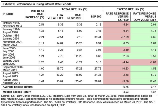
The S&P GSCI was up 1.5% for the month and up 8.9% YTD. Precious metals was the worst-performing commodity, while livestock was the best.

Of the 24 commodities tracked by the index, 18 were positive in May. Nickel was the best-performing commodity for the month, while cocoa was the worst.

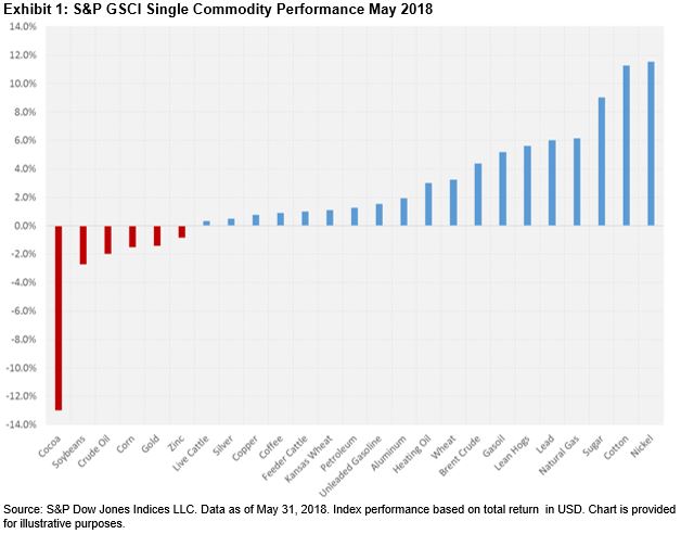
The S&P GSCI Agriculture was up 1.3%. Chicago wheat and Kansas wheat were the best-performing grain commodities, up 3.3% and 1.1%, respectively. Soybeans was the worst-performing grain commodity, down 2.7% for the month, affected by the tariffs imposed by the U.S. on aluminum and steel and the impact this could have on trade with China, which currently imports around 60% of U.S. soybeans, as well as record plantings of the grain in Brazil and the U.S. Cotton was the best-performing softs commodity, up 11.3% for the month and up 18.3% YTD, benefiting from harvest and quality issues, as well as dry weather conditions in the southern plains that could further hinder output.

The S&P GSCI Livestock was up 2.2% for the month. Cattle commodities were positive in May, with feeder cattle up 1.0% and live cattle up 0.3%. Feeder cattle prices were supported by a USDA report that showed a decline in the number of cattle placed on feed in April 2018. Lean hogs was also positive, up 5.6% for the month, due to seasonal demand.

The S&P GSCI Energy was up 1.5%. All the energy commodities, except for WTI crude oil, were positive for the month. Gasoil was the best-performing petroleum commodity, up 5.2% and up 15.0% YTD. WTI crude oil was the worst-performing commodity, down 2.0% over concerns that the Organization of the Petroleum Exporting Countries (OPEC) would raise production levels for the first time since 2016, which further weighed down prices affected by high levels of production. Natural gas was the best-performing commodity in the energy sector, up 6.2%, after the U.S. Energy Information Administration (EIA) reported below average inventory levels combined with high demand during the summer months.

The S&P GSCI Industrial Metals was up 2.1%. All the base metals, except for zinc, were positive in May. Nickel was the best-performing commodity in the sector, up 11.5% due to demand outpacing supply, as nickel is utilized in electronic vehicle batteries, which have seen solid global demand. Zinc was the worst-performing commodity in the sector for the second consecutive month, down 0.8%, bringing its YTD performance to -6.1% due to high supply levels. The S&P GSCI Precious Metals was down 1.2%. Gold fell 1.4%, weighed down by expectations of a moderate increase in inflation levels and rising interest rates, as well as an increase in consumer spending. Silver was up 0.5%, with the benefits from its industrial use outweighing its precious metal safe-haven status.

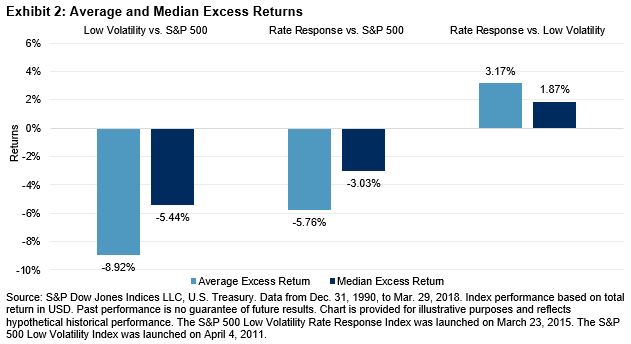
Exhibit 2 depicts the annualized risk/return characteristics of the S&P GSCI sector and single commodity indices. In terms of annualized returns, the S&P GSCI Livestock was the worst-performing sector in the index, down 13.3%, while the S&P GSCI Energy was the best-performing sector, up 40.6%. Energy also presented the highest level of volatility this past year, with an annualized risk level of 20.9%. Live cattle was the worst-performing commodity, down 17.4% year-over-year, while nickel, the best performer in May, was also the best performer year-over-year, up 73.4%. Natural gas, which declined 12.5% over the past year, presented the highest volatility, with an annualized one-year risk level of 31.4%. Natural gas tended to exhibit the highest level of volatility, as can be seen in its 1%-10% annualized risk levels, due to the impact of weather conditions that affect the fundamentals of supply and demand. Furthermore, natural gas has changed significantly since 2009, with the evolution of new technologies focused on extracting natural gas, which has lowered prices.

The posts on this blog are opinions, not advice. Please read our Disclaimers.

The Benefits of Having a Retirement Income Goal and How to Estimate It

Contributor Image
Philip Murphy

Former Managing Director, Global Head of Index Governance

S&P Dow Jones Indices

Individuals preparing for life after full-time employment may find that planning for a particular range of inflation-adjusted retirement income is more effective than planning for a particular range of wealth. Wealth levels are unintuitive because they do not provide practical spending guidelines. They are also heavily influenced by random variables (market returns). Using one’s wealth as a primary gauge may lead to overspending in early retirement by those unprepared to manage a prudent withdrawal program, or underspending over the course of retirement by those overly concerned with outliving their savings.

In contrast, income level planning has several key advantages.

  1. Income levels are intuitive because they provide built-in budgeting guidelines.
  2. Estimating required future income can be tailored to individual circumstances and does not require specialized financial knowledge.
  3. Estimating a future income level (that would be attained upon conversion of one’s savings into income risk hedging assets) does not require guesstimating future market returns the way that estimating one’s future wealth level would.
  4. As a result of #3, there can be more certainty about one’s future income than about one’s future wealth, as long as some of one’s assets are managed to hedge income risk and more savings are devoted to those assets over time.
  5. Once a required future income level has been attained through the allocation to income risk hedging assets (essentially locking in future income), if other capital is available, it can remain invested for long-term growth without great risk of income impairment during market downturns.

In this post, I’ll cover steps #1 and #2 and show a simple way of estimating required future income.

Even if you do not do a great job of tracking current expenses, you can back into personal expenditures as long as you know how much you save and how much you pay in taxes. Every dollar earned must be either spent or saved, so if you know your savings and taxes paid, you can derive personal expenditures by subtracting savings and taxes from gross income.

Once you estimate current personal expenses, directly by logging receipts or indirectly through the method outlined above, you can adjust for expected changes in spending during retirement. For example, suppose the following.

  • I currently spend USD 100,000 a year on personal consumption
  • I estimate that in retirement my personal expenses may decrease by about USD 17,000
  • -USD 10,000 because I will not need to save in retirement accounts
  • -USD 15,000 because I expect to have my mortgage paid off
  • -USD 2,000 because I expect lower clothing and commuting costs
  • +USD 5,000 due to higher expected medical bills
  • +USD 5,000 due to higher travel costs

Adjusting my current level of spending (USD 100,000) for changes in spending patterns after retirement equates to about USD 83,000 (in today’s U.S. dollars) to maintain my current lifestyle in retirement. USD 83,000 per year is therefore my estimated retirement income liability.

Next, we should take account of guaranteed retirement income, such as Social Security benefits. You can get an estimate of expected benefits from the U.S. Social Security Administration website calculator. Suppose the calculator tells me I should receive USD 25,000 per year under current assumptions. Then my net estimated retirement liability, the portion I will have to fund with personal savings in current U.S. dollars, is:

Having completed these calculations, I have a reasonable estimate of the income level that I need to fund in order to maintain my lifestyle in retirement. In my next post, I’ll show how to measure progress toward such a goal well ahead of one’s retirement date.

The posts on this blog are opinions, not advice. Please read our Disclaimers.

Reducing Interest Rate Risk in a Low Volatility Strategy

Contributor Image
Phillip Brzenk

Managing Director, Global Head of Multi-Asset Indices

S&P Dow Jones Indices

In prior posts, we reviewed the impact of rising interest rates on the S&P 500® Low Volatility Index returns. We showed that the low volatility index had negative exposure to rising interest rates, and thus has historically underperformed the S&P 500 in periods when interest rates rose significantly. In this post, we look at the S&P 500 Low Volatility Rate Response Index, a low volatility strategy that aims to reduce interest rate exposure, while maintaining the desired level of portfolio volatility reduction.

The construction of the rate response index is similar to that of the original low volatility index, with an additional step of removing the quintile of securities in the S&P 500 shown to have the most negative exposure to rising interest rates.[i] After these securities are removed, the 100 least volatile stocks are selected for inclusion into the index.

To determine the effectiveness of the rate response methodology, we examined the performance during rising interest rate periods. Exhibit 1 shows periods of significant increases in interest rates (1% or more in 10-year U.S. Treasury Bond yield) compared with the S&P 500. Additionally, we compared the rate response index with the low volatility index in these periods.

The rate response index generally underperformed the S&P 500, lagging the benchmark in 8 of the 10 periods—the average excess return over the S&P 500 was -5.76% and the median excess return was -3.03%. However, the rate response index fared better than the low volatility index in 9 of the 10 periods. For these periods, the rate response index outperformed the low volatility index by an average of 3.17% and a median of 1.87%. Exhibit 2 charts the average and median excess returns.

Looking at the relative performance based on monthly interest rate changes, the rate response index underperformed the S&P 500 the majority of the time when interest rates increased (average of -0.35%). Relative to the low volatility index, the rate response index outperformed nearly 62% of the time and by an average of 0.24% (see Exhibit 3).

The analysis in this blog shows that the rate response index historically outpaced the low volatility index in rising interest rate regimes. In a follow-up post, we will cover the historical performance of the rate response index compared with the low volatility index, concentrating on relative risk reduction versus the S&P 500.

[i]   The interest rate exposure for each security is the resulting regression beta coefficient of monthly total returns to monthly yield changes in the 10-year U.S. Treasury Bond yield for the last 60 months. The most negative securities will have the lowest beta coefficient values. The full methodology of the index can be found on www.spindices.com.

The posts on this blog are opinions, not advice. Please read our Disclaimers.

Small Caps Beating Large By The Most In 16 Years

Contributor Image
Jodie Gunzberg

Former Managing Director, Head of U.S. Equities

S&P Dow Jones Indices

Small caps just outperformed large caps for three consecutive months for the first time since Sep. 2016.  From Feb. through May, the S&P SmallCap 600 (TR) outpaced the S&P 500 (TR) by 9.5%. It is the biggest premium realized in a three month period since the three months ending in May 2002.  In fact, outperformance this big has only happened in a three month period twelve times in history since Sep. 1989.

Source: S&P Dow Jones Indices.

Also, in May, all eleven sectors of the S&P SmallCap 600 gained for the month.  This is the first time all the small cap sectors are positive together in a month since Dec. 2016, and it is a historically quick comeback from Feb. when all the sectors were negative.  This is only the 9th time in history since Jan. 1995 that the small cap sectors went from all losing to all winning in three months or less, and the last time it happened was in Oct. 2015.

The small cap rally that drove the 6.5% total return of S&P SmallCap 600 in May was led by the Health Care +9.3%, Information Technology +7.9% and Real Estate +7.9% sectors.  Comparatively the S&P 500 posted a total return of 2.4% for the month, led by Information Technology +7.4%, Energy +3.0% and Industrials +3.0%.  Four sectors, Telecommunication Services,  Consumer Staples, Utilities and Financials lost in large caps, down a respective 2.3%, 1.5%, 1.1% and 0.9%.  The S&P MidCap 400 TR gained 4.1% in May with 9 of 11 positive sectors.

Source: S&P Dow Jones Indices.

In May, health care measured outperformance of small caps over large caps of 9.0%, the most of any other sector.  As mentioned in this prior post, small cap health care companies have outperformed large caps for several reasons including healthy deal making, increased expectations for acquisition of smaller companies, stronger innovation from smaller companies and that smaller companies may be more immune to concerns about regulatory pressures in healthcare.

Another sector with almost just as much of a small cap premium in May is consumer staples with a premium of 8.8%.  The current economic backdrop is helping the small cap consumer staples more than the large caps in the sector (Note the large cap consumer staples lost for its fourth consecutive month, down a total of 13.9% from Jan. 31, 2018. It is the 8th worst four month return in history, and worst four months since the four months ending in Feb. 2009.)  Smaller consumer staple companies historically do better from GDP growth, gaining on average 5.9% per 1% of growth, as compared to the large caps that rise just 4.0%.  Furthermore, rising rates help small cap consumer staples more than large caps.  For every 100 basis point rate hike, small cap consumer staples rose 7.2% on average historically, whereas the same rate hike has only pushed large cap consumer staples up 4.0% on average.   Lastly, the strengthening dollar may be a force that helped the small caps in consumer staples since they do more domestic business.  On average per 1% rise in the U.S. dollar, the small cap consumer staples rose 1.8%  versus the large caps that rose only 1.3%.

As with all sectors, it is important to drill down further into industry groups, and in some cases even into the more granular industries and sub-industries for clarity about where the performance and potential opportunities exist within a sector.  In the case of consumer staples, there are three separate industry groups: 1. Food & Staples Retailing, 2. Food, Beverage & Tobacco and 3.  Household & Personal Products.  The Food & Staples Retailing industry group had the highest small cap premium for the month, with small caps outperforming large caps by 15.1%.  However, the contribution to the returns from the Food, Beverage & Tobacco industry group were far more substantial from a weight that is about 60% of the sector.  While the return spread of small over large in Food & Staples Retailing was far more than the 6.6% differential in Household & Personal Products, the contribution to return was slightly more from the Household & Personal Products due to the weight distribution.

Source: S&P Dow Jones Indices.

In considering strategy, it is not just the return but knowing the underlying weights, size and the number of stocks allowing for opportunity or diversification.   Note in the consumer staples sector, there are 33 stocks in the large caps and 20 stocks in the small caps, but when split by industry group, Food, Beverage and Tobacco has the majority with 21 big names and 11 small names.  Interestingly, the top 10 constituents total are similarly concentrated, comprising about 70% of each index with the top holding in each near 12%.  The biggest name is Altria Group Inc. and the biggest in the S&P 600 Consumer Staples is  Andersons Inc. The flexibility to change prices of goods quickly is a key to performance in this market, especially if inflation might be a concern.


The posts on this blog are opinions, not advice. Please read our Disclaimers.

Performance Analysis of Liquidated Funds in Brazil – Part II

Contributor Image
Phillip Brzenk

Managing Director, Global Head of Multi-Asset Indices

S&P Dow Jones Indices

In this blog, we estimate the impact of survivorship bias on the performance of active equity funds in Brazil compared with the benchmark, the S&P Brazil BMI. We do so by replicating the outperformance report from the SPIVA® Year-End 2017 Latin America Scorecard, while removing all the liquidated and merged funds. We noted in a prior blog that as a group, liquidated and merged funds in Brazil underperformed the benchmark by a wider margin than the overall SPIVA active fund universe in Brazil. Consequently, including only surviving funds in the research universe, instead of including all funds that were active at the start of the performance measurement periods, should result in an upward bias in outperformance, which we will demonstrate in this blog.

Exhibit 1 shows the percentage of funds in the Brazil Equity Funds category that outperformed the benchmark for one-, three-, and five-year periods as of year-end 2017. Two groups of funds were formed; the first group was the universe used in the SPIVA scorecard and the second group included SPIVA universe-eligible funds after removing the liquidated and merged funds.

We observed that surviving funds outperformed the entire fund universe for all three lookback periods. Additionally, the difference in outperformance figures between the two groups increased as the time horizon increased. While the percentage of funds outperforming the benchmark for the one-year period was not significantly different, for the five-year period 38% of surviving funds outperformed the benchmark, compared with just 18% for the SPIVA universe. This highlights the importance of correcting for survivorship bias, as the success of funds in the category looked materially different when only the surviving funds were included in the analysis.

The posts on this blog are opinions, not advice. Please read our Disclaimers.