Get Indexology® Blog updates via email.

In This List

Carbon-Efficient Portfolio Construction Part 1: Unconstrained Versus Sector Relative

Carbon Risk Integration: Interaction Between Carbon Risk and Traditional Risk Factors

Small Caps Rebound Big in March

Do Dividends Really Pay?

What's In A Sector?

Carbon-Efficient Portfolio Construction Part 1: Unconstrained Versus Sector Relative

Contributor Image
Wenli Bill Hao

Director, Factors and Dividends Indices, Product Management and Development

S&P Dow Jones Indices

As more institutions start to adopt low-carbon investing into their investment processes, it’s important to understand portfolio implications of incorporating carbon risk. We recently published a research paper in which we demonstrated how carbon efficiency can be integrated into factor portfolios. In a series of blog posts, we will be discussing our findings.

We evaluated carbon-efficient investment portfolios from various angles: improvement in weighted average carbon intensity, risk/return profile, sector allocation, and active risk exposures. The carbon intensity data, provided by Trucost, part of S&P Dow Jones Indices, were defined as greenhouse gas (GHG) emissions measured in tons of carbon dioxide equivalent per USD 1 million of revenue (CO2e/USD 1 million).

Sector-unconstrained, carbon-efficient portfolios were formed by ranking stocks in the whole universe (across sectors) based on individual companies’ carbon intensity and grouping them into quintile portfolios.[1] The most carbon-efficient portfolio, Quintile 1, lowered the carbon intensity by 95% to 14 CO2e/USD 1 million from the S&P United States LargeMidCap benchmark (see Exhibit 1). However, on an absolute return basis, Quintile 1 underperformed most of its peers, except for Quintile 5 and the underlying benchmark. In addition, the Quintile 1 portfolio had the highest volatility among all the portfolios, thereby resulting in the lowest risk-adjusted return.

We further analyzed the sector composition and attribution of the unconstrained carbon-efficiency portfolios to explore potential sector biases relative to the underlying benchmark and their impacts on portfolio efficiency.

The average sector weights of Quintile 1 showed that, on average, it had a significant overweight in the financials sector, with an average overweight of 45.29% (see Exhibit 2). The portfolio also had a substantial underweight in the energy, consumer staples, and industrials sectors.

The overweight in financials contributed substantially to the negative active returns of the portfolio relative to the benchmark (see Exhibit 3). From June 2007 to December 2017, the allocation to the financials sector detracted an annualized return of approximately 2.39% from the portfolio’s performance versus 0.43% for the benchmark on a monthly average basis.

Analysis of risk exposures showed that the sector-unconstrained, carbon-efficiency portfolio had positive active exposures to beta, value, liquidity, price volatility, and high leverage. On the other hand, it had large negative active exposures to yield, size, earnings growth, earnings variability, and momentum (see Exhibit 4).[2] Active exposure is defined as the difference between portfolio exposure and benchmark exposure. Therefore, during the back-tested period, the unconstrained carbon-efficient portfolio tended to have lower exposure to quality and higher exposure to value than the benchmark.

The results from Exhibits 2, 3, and 4 confirmed that the unconstrained carbon-efficient portfolio had significant unintended (and unfavorable) sector and risk factor tilts that dragged down the performance. In the next blog, we will continue to discuss how to potentially address these issues.

[1] B. Hao, A. Soe, and K. Tang. “Carbon Risk Integration in Factor Portfolios.” 2018.

[2] We used the Northfield U.S. Fundamental Risk Model to estimate the risk exposure.

If you enjoyed this content, join us for our Seminar Discover the ESG Advantage in
London on May 17, 2018.

The posts on this blog are opinions, not advice. Please read our Disclaimers.

Carbon Risk Integration: Interaction Between Carbon Risk and Traditional Risk Factors

Contributor Image
Kelly Tang

Former Director

Global Research & Design

The discussions on the merits of carbon awareness investing are evolving, and in a previous blog, we discussed how investors are interested in progressing from the current data-driven carbon emission framework to a risk-analysis-driven, two-degree pathway paradigm. The shift has been largely spurred by the Financial Stability Board (FSB) and recommendations from its Task Force on Climate-related Financial Disclosures (TCFD).

Investors who seek to move forward with a risk analysis approach believe that carbon risk will be imminently priced in sooner rather than later and may want to position their existing portfolios in anticipation of this. So far, carbon prices have already been implemented in 40 countries and 20 cities and regions.[1] Research by Trucost estimated that average carbon prices could increase more than sevenfold to USD 120 per metric ton by 2030, [2] as regulations aim to limit the average global temperature increase to 2 degrees Celsius in accordance with the Paris Agreement.

In response to this, Trucost has created a carbon pricing tool designed to help companies estimate internal carbon prices by modeling the progressive tightening of the spread between carbon prices today and in the future, considering science-based price scenarios and national climate change commitments. If a company understands the true cost of carbon, it can be empowered to make better business decisions to hedge against carbon exposure.

Despite the advancements in carbon pricing data and their potential implementation and use, it is somewhat premature to dismiss carbon-footprint-data-based portfolios in the belief that they would measure only part of the carbon pricing risk and would not be forward looking enough to provide a complete estimate of carbon risk exposure. In fact, we would argue that carbon footprint and carbon efficiency data could be rather useful for institutional investors that are already implementing factor-based investing strategies and wish to further align their entire investment process with low-carbon initiatives. We aimed to delve deeper into the interaction between carbon risk and traditional, well-established risk factors, and we have presented our findings in our paper, “Carbon Risk Integration in Factor Portfolios.”

In the paper, we argued that a pure, unconstrained, carbon-efficient portfolio outperformed a carbon-inefficient portfolio, as well as the underlying benchmark, on an absolute return basis, but underperformed on a risk-adjusted basis due to the portfolio having higher volatility. Moreover, we discussed how the carbon-efficient portfolio exhibited unintended sector and factor biases. Using the correlation of carbon intensity with style factors, we demonstrated a stylized framework in which carbon-efficient portfolios (both unconstrained and sector relative) could be combined with traditional risk factors to lower carbon intensity while maintaining the target factor exposure.

Through this analysis, we merged two powerful trends that are shaping the investment industry and provided a framework that could be used by institutional investors that wish to be sustainability-driven while focusing on achieving the risk/return profiles that are specified in their investment mandates. We showed that carbon-efficient factor portfolios could be a meaningful part of the core equity strategic and tactical asset allocation process.

In forthcoming blogs, we will discuss the construction of carbon-efficient investment portfolios.

[1] https://www.carbonpricingleadership.org/who/

[2] http://www.irena.org/DocumentDownloads/Publications/Perspectives_for_the_Energy_Transition_2017.pdf

If you enjoyed this content, join us for our Seminar Discover the ESG Advantage in
London on May 17, 2018.

The posts on this blog are opinions, not advice. Please read our Disclaimers.

Small Caps Rebound Big in March

Contributor Image
Jodie Gunzberg

Former Managing Director, Head of U.S. Equities

S&P Dow Jones Indices

The first quarter of 2018 will be remembered as the quarter that ended the 9 quarter winning streak for the S&P 500 (TR).  As the volatility rose, the market went from posting its best January since 1997, up 5.7%, to losing 3.7% in February, its first monthly loss in 15 months.  February wasn’t only bad for large-caps but for the mid-size and smaller stocks too.  As a quick recap for Feb., 10 of the 11 sectors in the S&P 500 (TR) fell, the S&P MidCap 400 (TR) lost 4.4%, also with 10 sectors down, and the S&P SmallCap 600 (TR) lost 3.9% with all 11 sectors losing.

In March, large caps continued to trend down.  The S&P 500 (TR) lost 2.5% with 8 of 11 sectors losing.  Financials, the second biggest sector with an index weight of nearly 15%, lost the most for the month, -4.3%, positing its worst monthly loss since Jan. 2016.  The tariffs, trade war tensions and falling treasury spreads really hurt the banksInformation Technology, the biggest sector, lost 3.9% in its worst month since Apr. 2016.  The sector is suffering from the privacy issues brought to the forefront by Facebook’s data privacy scandal.  Real Estate performed best, gaining 3.8% in March, ending its 3 month losing streak, but the sector is under 3% of the index so didn’t have much impact.  Real estate may be positioned well despite rising rates since the rates are still so low. That combined with the accelerating growth could support the sector, so extra exposure through equally weighted strategies or sector rotation may benefit.

The equally weighted indices by definition have greater weight in smaller stocks and have historically done well with rising rates, GDP growth, inflation and a falling dollar.  This is starting to show in the performance of the S&P MidCap 400 (TR) and S&P SmallCap 600 (TR) that both gained in March.  While the S&P MidCap 400 (TR) gained just 93 basis points, the S&P SmallCap 600 (TR) gained over 2.0% that pushed its year-to-date returns into positive territory, up 57 basis points in 2018.  In mid-caps, 9 of 11 sectors were positive, and in small caps, 8 of 11 sectors were positive, which is a relatively rare sector recovery, happening in less than 10% of the time.  The last time a rebound for mid-cap sectors that big happened was in Oct. 2014 and for small-caps in Nov. 2016.

Again, as a reminder, here’s what February looked like in one chart:

Source: S&P Dow Jones Indices.

Notice how well mid-caps and small -caps rebounded in March despite the continued weakness is large-caps.

Source: S&P Dow Jones Indices.

Health Care posted the biggest small-cap premium with a 7.3% outperformance in March, explained in detail here.  Financials and Tech also had significant small cap premiums in March of 6.1% and 4.7%, which will be analyzed in subsequent posts.

The posts on this blog are opinions, not advice. Please read our Disclaimers.

Do Dividends Really Pay?

Contributor Image
Philip Murphy

Former Managing Director, Global Head of Index Governance

S&P Dow Jones Indices

What benefits do dividend payments and dividend yields convey? The answers may sometimes be overlooked as market participants seek equity income or the perceived safety of dividend strategies. In 1961, Merton Miller and Franco Modigliani (M&M) theorized that dividend policy is irrelevant to company value.[1] Of course theories are models of reality and require simplifying assumptions. There is room for debate about the limitations introduced by M&M’s assumptions, but it pays to consider their theory because if dividend policy is even close to irrelevancy in the determination of company value, then it is not a fundamental driver of total return. In much of the leading research and literature on risk premia and factors, dividends and dividend yields generally have not been widely found to generate a return premium. Carry is closely related to yield and it originated in foreign exchange markets. It has recently been researched broadly to comprise other asset classes, including equities.[2] However, while equity carry is related to dividend yield, it is a forward-looking measure derived from the valuation of index futures. Most dividend growth or dividend yield strategies do not capture equity carry per se.

All of which is not intended to imply that dividend payments do not contribute to total returns; they obviously do. But they may behave more as a component, rather than a driver, of cash flows. Think of it this way—you are paid by your employer with direct deposit into two bank accounts, Bank A and Bank B. The key drivers of your pay include the health of your employer’s business and your job performance. Whether you get paid through Bank A or Bank B has no bearing on the amount of your pay. The banks serve as cash flow conduits, just like dividends and capital gains. In a theoretical world without market frictions, investors would be able to create dividend-equivalent cash flow by selling shares, as Exhibit 1 illustrates.

If dividends do not drive returns in and of themselves, why do investors seek them? The real world does have market frictions, and there turns out to be an array of potential behavioral, financial, and even legal reasons behind investors’ dividend preference. For example, it may be psychologically easier to receive dividends than to sell holdings, because one may avoid the regret of selling at a loss. There may be emotional reasons, or even legal ones for some types of trust accounts, to avoid an invasion of principal. Financially, there are no sales commissions for dividends, while there may be for selling shares (though many funds can now be sold without transaction fees). Finally, dividends may simply be more convenient. One does not need to plan or remember to transact in order to receive a dividend, while one generally would for selling shares (though many asset managers and financial service providers offer automated withdrawal services). In a nutshell, dividends seem to have potential benefits psychologically, in some cases legally, and in terms of cost and convenience. While M&M made a strong theoretical case for dividend irrelevance, in the presence of market frictions dividend preference becomes somewhat clearer.

Furthermore, even if dividends do not generally drive total returns, they may serve as economic signals. This explanation provides another, possibly theoretically stronger, footing for dividend preference. For example, growing dividends may convey financial strength, while high dividend yield may be correlated with value. Of course, financial strength is closely associated with the quality factor, and value is one of the most widely accepted factors. Therefore, by virtue of a signaling aspect, dividend strategies may offer access to risk premia.

One thing is certain, which is that one dividend strategy can be quite different than the next. Market participants should carefully consider the role of specific dividend strategies with respect to their portfolios’ investment policy and factor exposure. An important overall consideration is that all dividend strategies are somewhat less diverse than the broad market, because not all stocks pay dividends. Therefore, the best dividend strategies are those that compliment diversified portfolios in ways that contribute to desirable characteristics on a case-by-case basis. In my next post, I’ll pick up on dividend strategies again and provide a bit of a deeper dive.

[1]   Miller, Merton H. and Modigliani, Franco. “Dividend Policy, Growth, and the Valuation of Shares.” The University of Chicago Press. The Journal of Business. Vol. 32, No. 4. Pp. 411-433. October 1961.

[2]   Koijen, Ralph S. J., Moskowitz, Tobias J., Pedersen, Lasse Heje, and Vrugt, Evert B. “Carry.” Fama-Miller Working Paper. Nov. 1, 2016.

The posts on this blog are opinions, not advice. Please read our Disclaimers.

What's In A Sector?

Contributor Image
Jodie Gunzberg

Former Managing Director, Head of U.S. Equities

S&P Dow Jones Indices

Following an index announcement stating Nektar (NKTR) among other stocks would be moving to the S&P 500 prior to the open on March 19, 2018, an inquiry came in about the index impact of NKTR on the S&P SmallCap 600 Health Care Index performance.   Given the stock rose over 70% in 2018, it seemed reasonable to ask about how one company can influence a market cap-weighted index.

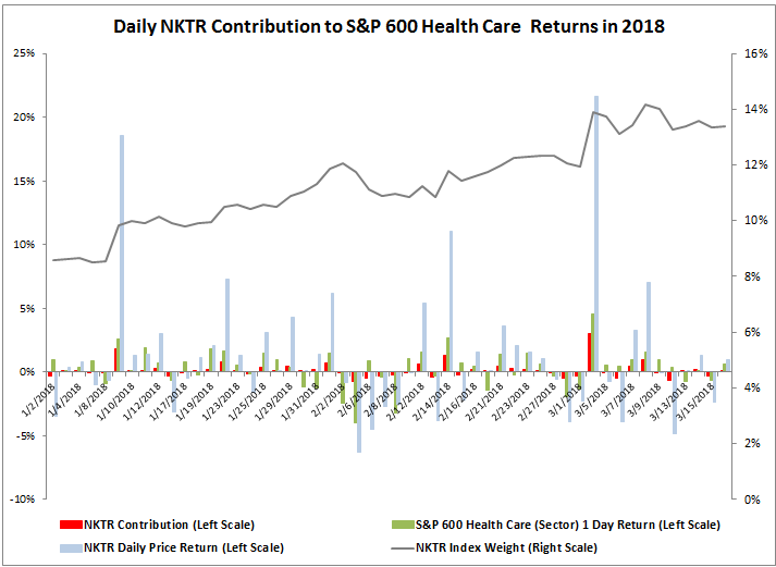
In order to answer this question, the weights and returns of each constituent in the index were measured for a contribution to return.  For this particular analysis, data from Jan. 2, 2018 through Mar. 16, 2018 was used.  Through this time, the weight of NKTR increased from 8.6% to 13.4% with an average weight of 11.4%.  The compounded daily index contribution from NKTR was 7.5% to the 16.4% of the S&P 600 Health Care Index.  The graph shows the daily index contribution of NKTR (in red), making it clear that the contribution does not rise directly just with the weights or returns but depends on the combination, that in turn depends on the performance of other stocks in the index.

Source: S&P Dow Jones Indices

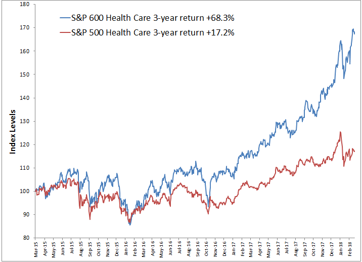
If NKTR, the one stock that rose 70% didn’t drive the whole small-cap health care sector, what else mattered?  The index had 78 stocks contributing to the return, of which 64 stocks or 82% (more than 4 of 5) were positive.  The worst stocks in the best sectors generally benefit.  However, then why have the small caps outperformed the large caps by so much in health care if they are in the same sector?

Source: S&P Dow Jones Indices

Looking deeper than the sector level is required to answer this question, and more granular groups by GICS classifications can say a lot about the performance of a sector.  When analyzing sector performance using (in order from broadest to narrowest) industry groups, industries and sub-industries, insight can be gained into what is driving a sector and whether a stock is going with its group or if individual fundamentals are at play.

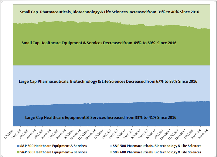
In the case of the health care sector, there are two industry groups, illustrated below with weights in each of large caps and small caps through time. Note that large cap healthcare equipment & services increased through time from 33% to 41% and pharmaceuticals, biotechnology and life sciences decreased in large caps from 67% to 59%.  The opposite happened in small caps where the pharmaceuticals, biotechnology and life sciences increased from 31% to 40% while the healthcare equipment & services decreased from 69% to 60%.

Source: S&P Dow Jones Indices

Next breaking down the sector weights by industry group, industry and sub-industry shows large cap Health Care Equipment and Managed Health Care are biggest and have grown most from 13.8% to 19.2% and 9.4% to 13.4%, respectively, while the Biotechnology and Pharmaceuticals fell most from 24.3% to 20.6% and 38.4% to 32.2%, respectively.  In small caps, the Biotechnology and Pharmaceuticals grew most from 10.1% to 14.3% and 16.9% to 23.2%, respectively.  On the other hand in small caps, Health Care Equipment dropped from 25.0% to 10.0% and Health Care Technology fell from 10.1% to 3.9%. Also, in small caps, the Health Care Distributors are almost gone with only Aceto Chemicals left at 0.19%.

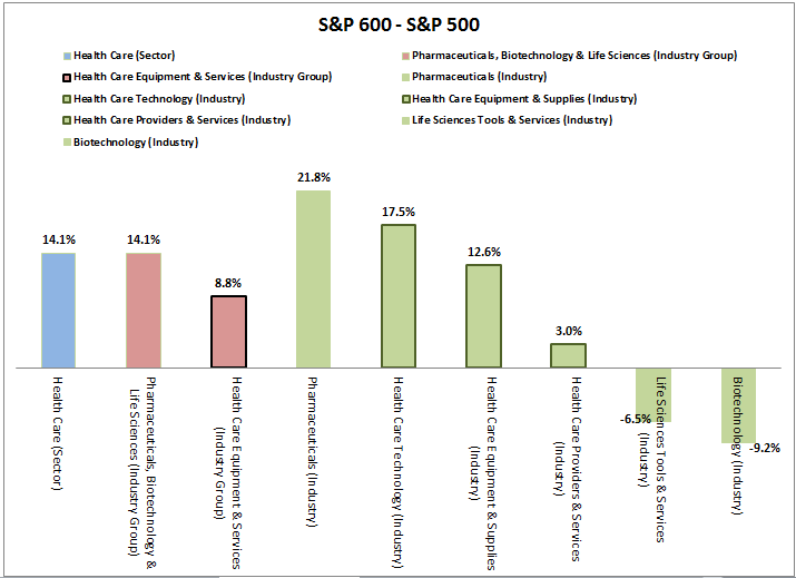
Knowing the weight distribution helps focus where to look for performance contribution.  The 3-year annualized return spread of S&P 600 out-performance over the S&P 500 for the health care sector, industry group and industries shows an interesting split.  While (very slightly) more of the out-performance came from Pharmaceuticals, Biotechnology & Life Sciences (Industry Group) at 14.1%, all 3 industries from Health Care Equipment & Services (Industry Group) showed a small cap premium.  Only Pharmaceuticals did from its broader industry group, but it outperformed by 21.8% annualized over the three years.

Source: S&P Dow Jones Indices

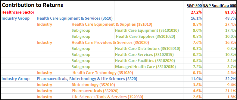
This is the information needed to measure the contribution to returns.   Overall the returns of the health care sector were 27.2% and 81.0% for the S&P 500 and S&P 600, respectively.  Healthcare Equipment & Services contributed 16.1% and 48.7% to large caps and small caps, respectively – that was more than the Pharmaceuticals, Biotechnology & Life Sciences contribution of 11.0% and 32.2%, respectively, to large and small caps. Healthcare equipment & supplies contributed most of that at 8.5% and 27.4% , respectively for large and small cap. Pharmaceuticals added 21.1% to small caps that was the 2nd most significant industry behind healthcare equipment & supplies.

Source: S&P Dow Jones Indices. Estimation based on sum of daily contributions.

The result of this sort of deeper sector analysis can lead to understanding the drivers of performance.  In this case of small caps outperforming large caps in health care, the credit can be given to deal making, increased expectations for acquisition of smaller companies, stronger innovation from smaller companies and that smaller companies may be more immune to concerns about regulatory pressures in healthcare.  These reasons are all mentioned in this article that leads to conclusions about specific stock and ETF choices as ways to benefit from these intra-sector moves.


The posts on this blog are opinions, not advice. Please read our Disclaimers.