Get Indexology® Blog updates via email.

In This List

How Global Is the S&P 500?

S&P BSE SENSEX During Budget Sessions Under Mr. Narendra Modi’s Rule

3 Reasons To Love Equities When Rates Are Rising

The Hunt for Value With High Earnings Expectations in Asia

Inflation News and Fears

How Global Is the S&P 500?

Contributor Image
Phillip Brzenk

Managing Director, Global Head of Multi-Asset Indices

S&P Dow Jones Indices

The S&P 500® is widely considered one of the best single gauges of the U.S. equity market. Composed of 500 companies that are domiciled in the U.S., the index captures approximately 82%[1] of the total U.S. equity market value. An index of U.S. companies may lead one to assume that the index is only reliant on the health and growth of the U.S. economy. In reality, the index is much more global than that. Many U.S. corporations have a global presence, with assets and revenues in foreign markets. Therefore, global market events and economic shocks can have a material effect on S&P 500 companies, thus overall index performance.

To better understand where S&P 500 companies’ revenues are coming from, we used the FactSet Geographic Revenue Exposure (GeoRevTM) dataset,[2] which gives a geographic breakdown of revenues for all companies with available data, down to the country level. Since there are no standardization rules for the reporting of geographic revenue segments, the dataset uses a normalization/estimation process to assign revenues to specific countries. The ability to have detail of revenues at the country level is an important tool in understanding potential country exposures or risks for a company or index.

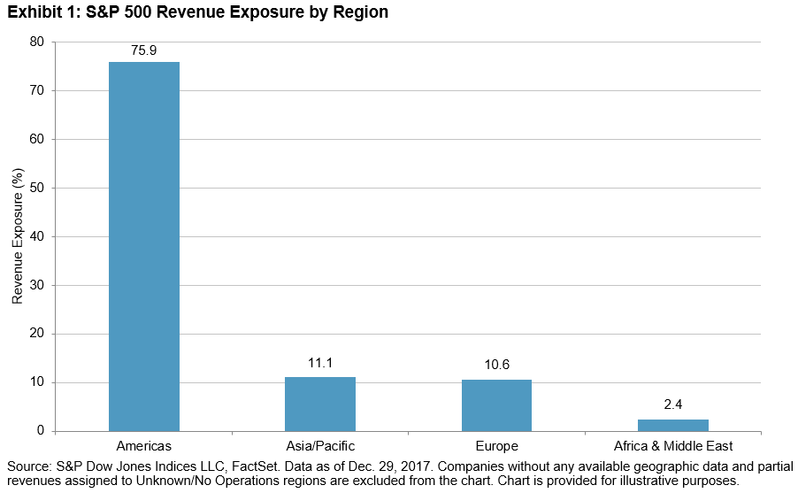
We first look at total revenues at the regional level (see Exhibit 1). The Americas region, which combines the North and South American continents, is unsurprisingly the largest regional exposure, at 76% of total revenues. The Asia Pacific region (11.1%) and Europe (10.6%) follow in terms of total revenue, with Africa & Middle East having the lowest total revenues, at 2.4%.

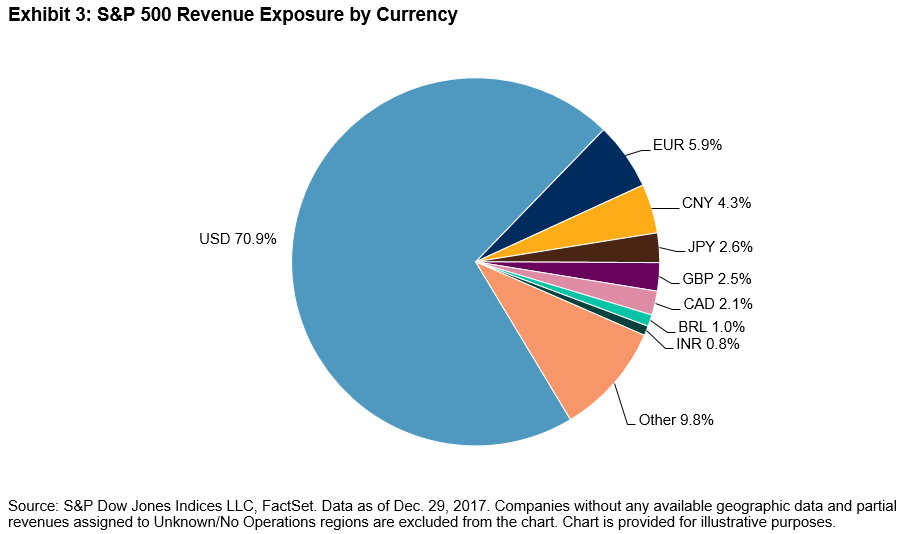
At the country level, nearly 71% of S&P 500 revenues comes from the U.S., with the remaining coming from foreign markets. Internationally, the largest individual countries by total revenue include China (4.3%), Japan (2.6%), and the UK (2.5%).

Given the diverse mix of countries, it is important to examine the potential foreign currency exposure of the S&P 500, which we determined by mapping the currency used in each country (see Exhibit 3). Several additional observations can be made from the currency-based revenue chart. First, it shows that the euro is the foreign currency the S&P 500 has the most exposure to, coming in at 6%. Second, the chart shows the number and the mix of currencies the S&P 500 has exposure to—six foreign currencies with a total exposure of 1% or more and 19 currencies coming in at a minimum of 0.25%.

Given the results, we can see that the S&P 500 has meaningful exposure to foreign markets. As such, events both domestic and globally, as well as policies that change the dynamic between the U.S. and other foreign markets, can potentially have an effect on the S&P 500. In future posts, we will look at how the global market exposure of companies in the S&P 500 affect the performance of the index.

[1]   Source: S&P Dow Jones Indices LLC. Calculation as of Dec. 29, 2017.

[2]   More information on the dataset can be found here: https://www.factset.com/data/company_data/geo_revenue

The posts on this blog are opinions, not advice. Please read our Disclaimers.

S&P BSE SENSEX During Budget Sessions Under Mr. Narendra Modi’s Rule

Contributor Image
Ved Malla

Associate Director, Client Coverage

S&P Dow Jones Indices

On May 16, 2014, the Lok Sabha election results were announced and Mr. Narendra Modi’s Bharatiya Janata Party got a clear mandate to form the government. Narendra Modi was sworn in as the Prime Minister of India on May 26, 2014. Since taking charge, the Narendra Modi government has made several landmark policy decisions. Some of these initiatives are listed below.

  1. GST: The Goods and Services Tax is the biggest tax reform since Indian independence.
  2. Aadhaar Linking: Linking Aadhaar to bank accounts, PAN Card, mobile number, etc.
  3. Jan-Dhan Yojana: Aimed at bringing banking services to every household in India.
  4. EPFO Investment in ETFs: Employees’ Provident Fund permitted to invest in ETFs.
  5. Demonetization: Aimed at cracking down on black money.
  6. Digital India: Aimed at digitizing India and moving to cashless transactions.
  7. Make in India: Aimed at making India a global manufacturing hub.
  8. Skill India: Aimed at providing skill development training to youth.
  9. Startup India: Aimed at promoting entrepreneurship.

The S&P BSE SENSEX is the oldest and most-tracked index in India, and it acts as an indicator of India’s economic growth. Any national or international change in economic activity is likely to have an impact on the S&P BSE SENSEX.

The S&P BSE SENSEX’s total return index value increased from 27,648.13 on Jan. 31, 2014, to 51,281.74 on Jan. 31, 2018, and the highest close was at 51,729.13 on Jan. 29, 2018. This represents a four-year CAGR of 16.70% for the period.

Every year, the Finance Minister presents the Union Budget, which is perhaps the most important economic activity in India. “Budget Day” comes with a lot of expectations, and it therefore has a bearing on the capital markets in both the pre- and post-budget sessions. Mr. Arun Jaitley has been the Finance Minister since this Government was formed. Arun Jaitley has presented four budgets during this term and will be presenting his fifth budget on Feb. 1, 2018.

In Exhibit 2, we can see that in most years, the S&P BSE SENSEX witnessed high volatility in the 30-day pre- and post-budget sessions. The highest 30-day pre- and post-budget volatility was observed in the budget year 2016. The lowest volatility in the 30-day pre-budget session was seen in 2018.

To conclude, we can say that the budget sessions are usually volatile for capital markets in India. The pre-budget movement is caused by market participant expectations for the budget, while the post-budget movement is based on the actual budget presented by the Finance Minister. The budget may be the most important economic activity affecting capital markets in India, and its relevance is captured in the movement of S&P BSE SENSEX.

The posts on this blog are opinions, not advice. Please read our Disclaimers.

3 Reasons To Love Equities When Rates Are Rising

Contributor Image
Jodie Gunzberg

Former Managing Director, Head of U.S. Equities

S&P Dow Jones Indices

Equities haven’t been the most lovable asset class lately but there are reasons to love them despite these prickly times.  The first reason to love equities in rising rate times is that they have gained significantly. Since 1971, the S&P 500 (TR) has gained about 20% on average in rising rate periods, has gained 8 of 9 times and has gained nearly 40% twice with less than a 4% loss for its worst rising rate period. Source: S&P Dow Jones Indices and Federal Reserve Economic Data, Economic Research Division, Federal Reserve Bank of St. Louis. https://fred.stlouisfed.org

While this is less upside than equities have enjoyed in falling rate environments, and some of the equity duration models result in falling asset prices as the discount rate rises, the reality is results can vary.  This is since the equity duration is based on a derivative of the dividend discount model that uses long term interest rates plus an equity risk premium, but these models also rely on growth and inflation.

If there is accelerating growth and inflation, like now, rising interest rates can result in appreciating assets, which is the second reason to love equities in this rising rate time.  Since the rising rates are happening in a profitable economy with strong growth forecasts and increasing dividend payouts (with an extra boost from the income tax reduction,) the variables impacting the equity duration are moving to love stocks rather than hate them.  This makes sense because interest rates may not drive equities but both can rise concurrently from the environment that lifts them.

The third reason to love equities in rising rate environments is that on average for every 100 basis point increase, every single sector, size and style gains.  Small-caps led, gaining 7.3% on average for every 100 basis point rate increase, followed by mid-caps that gained 5.9% and large-caps that gained 2.5%.  The growth acceleration that cancels the negative equity duration is the same growth that propels small-caps so much, putting them in a leading spot to rise with interest rates – especially since monetary policy is not too tight so that rising interest rates don’t hinder the borrowing by small companies too much. Also, look to the sectors reporting strong profits and paying high dividends to perform in this rising rate environment.  As reported in S&P DJI’s Market Attributes in Jan. 2018, 91.3% of Health Care, 83.7% Financial  and 88.2% Info Tech companies beat earnings estimates.  Also not surprisingly, Utilities, Telecom and Real Estate are the highest yielding sectors.  What is interesting is that small-cap financials have a 2.04% yield versus just 1.59% for large and 1.57% for mid cap, but over longer periods of accelerating interest rates, the large-caps do best in the financial sector.  This is since as rates rise, margins expand and with accelerating growth plus loose monetary policy, borrowers may be more active and banks can earn more from the spread. Source: S&P Dow Jones Indices and Federal Reserve Economic Data, Economic Research Division, Federal Reserve Bank of St. Louis. https://fred.stlouisfed.org. S&P 500 from Oct. 1971, S&P 500 Sectors from Oct. 1989, S&P 400 from Aug. 1991, S&P 500 Growth and Value from Feb. 1994, Real Estate Dec. 2001 and all others Jan. 1995.

Overall, this analysis on interest rates that shows support, mainly for small-caps, may help in understanding the macroeconomic impacts of GDP growth, inflation, and the dollar on U.S. equities.  There is overwhelming support for small caps followed closely by mid-caps, and for inflation protection, energy seems to be most sensitive.


The posts on this blog are opinions, not advice. Please read our Disclaimers.

The Hunt for Value With High Earnings Expectations in Asia

Contributor Image
Utkarsh Agrawal

Associate Director, Global Research & Design

S&P Dow Jones Indices

In our previous blog, Earnings Revision Strategies in Asia, we discussed how those strategies performed in Asia. Although they worked well in various markets except Japan, there were some implementation challenges, such as high portfolio turnover and low liquidity for small-cap stocks. Therefore, implementing this strategy in combination with other fundamental factors with lower overall portfolio turnover may be more practical than implementing it as a single-factor strategy. Let us examine how an earnings revision strategy has worked historically in combination with a value strategy in the Asian market. The combination seeks to track the performance of undervalued stocks with high earnings expectations.

Adopting the S&P Enhanced Value Indices methodology,[1] we used earnings-to-price, sales-to-price, and book-value-to-price ratios to identify stocks that were relatively undervalued in comparison to the other stocks in the universe. Stocks with higher ratios were assigned higher value scores. We first selected a top quintile of stocks with the highest value scores from the universe.[2] From these stocks, we selected the top 70% of stocks with the highest earnings estimate diffusion, which is defined as the net percentage of upward and downward revisions in the earnings estimates.[3] We rebalanced the portfolios semiannually in March and September and weighted the portfolio members by their float-adjusted market cap.

With this sequential screening approach, the earnings diffusion strategy delivered return alpha over the simple value strategy in a majority of the Asian markets, with the most pronounced excess return in South Korea and Taiwan (see Exhibit 1). The annualized portfolio turnover was moderate, ranging from 80% to 100% over the back-tested period from March 31, 2006, to Sept. 30, 2017. Interestingly, despite the fact that the simple earnings revision strategy did not historically work in the broad Japanese market as noted in our research paper Do Earnings Revisions Matter in Asia, the earnings diffusion overlay delivered excess return on the value screened stocks in Japan. This implies that market participants in search of undervalued stocks in the Japanese market tended to care more about earnings revisions.

[1]   For more details please see: http://spindices.com/documents/methodologies/methodology-sp-enhanced-value-indices.pdf.

[2]   For each market, the universe comprised stocks with at least three analysts’ estimates. The indices used for each market were: S&P Australia BMI, S&P China A BMI, S&P Hong Kong BMI, S&P India BMI, S&P Japan BMI, S&P Korea BMI, and S&P Taiwan BMI.

[3]   Earnings diffusion was calculated over the previous six-month period as of the data reference date. For more details please see: https://spindices.com/documents/research/research-do-earnings-revisions-matter-in-asia.pdf.

The posts on this blog are opinions, not advice. Please read our Disclaimers.

Inflation News and Fears

Contributor Image
David Blitzer

Former Managing Director and Chairman of the Index Committee

S&P Dow Jones Indices

Two weeks ago inflation fears sparked by a surprise jump in wage gains sent the markets into a tail spin. This week will deliver two rounds of inflation news with the Consumer Price Index (CPI) on Wednesday and the Producer Price Index (PPI) on Thursday.  Month to month changes in both the CPI and PPI are usually quite small; large moves often reverse in subsequent months.  Moreover, measures of expected inflation don’t suggest a great deal of anxiety about rising prices.  Nevertheless, the recent market volatility will focus a lot of attention on this week’s inflation numbers.

The charts shown here provide some perspective on inflation. The charts show the year-over-year change in various inflation measures as well as measures of  expected inflation based on the University of Michigan Survey Research Center and the yields on five-year treasuries and TIPS.

The CPI (second chart) and PPI (third chart) do show an upward trend in inflation since 2015. This reflects rising oil prices in 2016-17 as well as an improving economy. But in both series increases in inflation appear to reverse.

Based on current surveys, the year-over-year increases in the CPI are likely to remain under 2%, the year-over-year increase in the PPI could top 2%. All these are similar to recent numbers.

The Core CPI excludes the volatile food and energy components from the CPI to give a better long term view of inflation


Even the overall CPI, including all components, doesn’t show any hints of a surging prices any time soon.

While the PPI is more volatile, it is not signaling any immediate problems.

Research and comments by various Federal Reserve officials point to expectations of future inflation as a principal determinant of future inflation. This chart shows that expectations have been stable over the last several months.

Finally, the future inflation rate implied by five year treasury notes and the inflation-protected treasury securities do hint that five years down the road, inflation will still be close to 2%.

All charts use data from FRED economic data, St. Louis Federal Reserve Bank.

The posts on this blog are opinions, not advice. Please read our Disclaimers.