Get Indexology® Blog updates via email.

In This List

From Crude to Refined: Evolution of Fossil Fuel Free Investing and the 2 Degree Alignment Pathway (Part II)

What Are Large-Cap Active Managers Up To? A Look at Their Active Factor Bets Relative to the S&P 500 (Part II)

2017: A Selection of Highlights

Rising Rate Implications for Japanese Investors

Financials Beating Tech Twice Is Rare, So Positioning Matters

From Crude to Refined: Evolution of Fossil Fuel Free Investing and the 2 Degree Alignment Pathway (Part II)

Contributor Image
Kelly Tang

Former Director

Global Research & Design

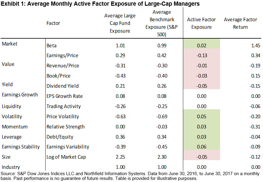
The discussions on the merits of carbon awareness investing are evolving and highlighting a desire to shift from the current data-driven carbon emission framework to a more sophisticated and risk analysis-driven, 2 degree pathway paradigm. The shift has been spurred largely by the Financial Stability Board (FSB) and recommendations from its Task Force on Climate-related Financial Disclosures (TCFD). At the Responsible Investor Americas Conference in early December, the implementation and the impact of the TCFD recommendations were a heavily discussed topic, as they could prove to be a game-changer in carbon awareness investing.

The TCFD was created in 2015 by the G20 Finance Ministers and the Central Bank Governors, headed by Michael Bloomberg and given the goal to create a climate-related disclosure framework that will aid the three major groups who are involved in understanding climate-related financial risks—corporations, investors, and regulators. Its report was released in June 2017 and is expected to prove instrumental in laying the groundwork and framework to help market participants understand the risks and opportunities posed by the transition to a low-carbon economy.

TCFD Recommendations

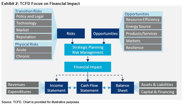
The TCFD recommendations call for greater climate-related disclosure and information in a corporation’s governance, strategy, and risk management processes and the implementation of standardized metrics plus targets. The materiality principle assessment is encouraged in the strategy and metrics and targets sections. The TCFD’s overarching goal was to focus on the financial impact of climate-related risks and opportunities on an organization rather than the impact of an organization on the environment (Exhibit 1). This latter effort is synonymous with impact measurement, which is an outward assessment aiming to quantify the impact of a company in regard to its environmental consequences. As discussed in my previous blog, the endeavor itself is honorable but presents a host of considerable challenges. Global companies have a multitude of businesses and can find themselves making numerous products—some that are deemed positive and others deemed negative. An attempt to arrive at an overall score that quantifies such an impact can be difficult, problematic, and unreliable at best.

TCFD Key Takeaways

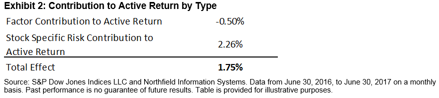
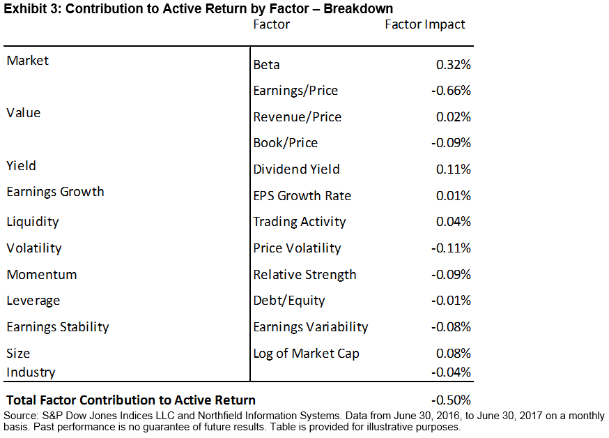
As the TCFD’s report encourages companies to make disclosures, it is hoped that these disclosures will end up in mainstream integrated financial reports rather than in sustainability reports, whereby audit committees and senior executives will then get involved (Exhibit 2). In addition, the task force encouraged the use of scenario analysis, whereby corporations can use forward-looking information, with the 2 degree scenario as the common reference point. The TCFD realizes that widespread adoption of its recommendations is critical and the momentum is there, as evidenced by the recent EU High Level Expert Group on Sustainable Finance announcement that the TCFD recommendations will be integrated into EU policy. More than 100 companies with a combined market cap of approximately USD 3.5 trillion and financial institutions responsible for USD 25 trillion in assets have stated their support for the TCFD recommendations following their launch in July 2017.[1]

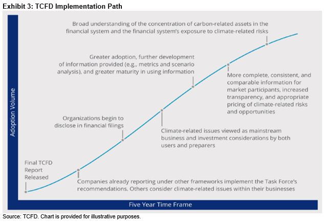
The TCFD says that asset owners have a crucial role to play in influencing better disclosure, as they hold the power of mobilizing assets in the investment value chain. The TCFD is sanguine that its recommendations implementation path will gain further momentum and envision the following milestones over the next five years, as climate-related risks and opportunities reporting takes hold.

[1]   TCFD Press Release, June 29, 2017, Final Recommendations of the Task Force on Climate-related Financial Disclosures (TCFD) Help Companies Disclose Climate-related Risks and Opportunities Efficiently and Effectively, available at https://www.fsb-tcfd.org/wp-content/uploads/2017/06/Press-Release-Final-TCFD-Recommendations-Report-Release-29-June-2017-FINAL-IMMEDIATE-RELEASE-UPDATED-SUPPORTERS-LINK.pdf.

The posts on this blog are opinions, not advice. Please read our Disclaimers.

What Are Large-Cap Active Managers Up To? A Look at Their Active Factor Bets Relative to the S&P 500 (Part II)

Contributor Image
Aye Soe

Former Managing Director, Global Head of Core and Multi-Asset Product Management

S&P Dow Jones Indices

In a recent study published in the Financial Analysts Journal, Ang, Madhavan, and Sobczyk (2017)[1] highlighted that using regression-based factor loadings to measure managers’ factor exposures, even when conducted on a rolling basis, can be misleading due to excessively smoothed coefficients, given that active managers adjust their exposures dynamically. The authors argued that holdings-based attribution offers more insight, and they used the actual holdings of mutual funds to analyze the contribution to active returns by factors.

With that in mind, in a previous post, we performed a holdings-based performance attribution to highlight that the improvement in relative performance of actively managed large-cap mutual funds stemmed entirely from the stock-selection effect (excess returns of 1.75%), demonstrating their abilities to pick winning stocks. In this follow-up post, we use the same holdings of the managers to take a closer look at their active factor exposures relative to the S&P 500 and their contribution to active return.[2] This risk-based attribution analysis complements our prior Brinson performance attribution analysis, providing a holistic picture on the sources of excess returns.[3]

During the 12-month trailing period ending June 30, 2017, large-cap active managers, on average, were underweight to value, dividend yield, and size factors, and they had higher positive tilt to beta, momentum, and leverage factors (see Exhibit 1). In addition, we observed lower negative tilt to price volatility and earnings variability factors within the same group of managers.

Earnings variability and leverage are measures often used as proxies for the quality factor. Taken together, large-cap managers were, therefore, more exposed to lower quality and higher volatility during the 12-month period studied. This generalized behavior comes as no surprise, as the equity market during the same period has been ripe for risk taking, with lower quality outperforming higher quality in the large-cap space.[4]

In terms of the impact of managers’ factor bets on their average active return, we can approximate that not all exposures have been handsomely compensated. For example, dividend yield, revenue/price, and size had negative monthly average returns to the factor, which has resulted in an overall positive factor impact (see Exhibit 3).[5] Beta[6] has also been a rewarding factor for those managers seeking broad market exposure. It has been the best-performing factor, and large-cap managers on average have been overweighting their beta exposure.

However, the average monthly return to other value factors such as book/price and earnings/price have been positive and the underweight to those factors have detracted from the average portfolio active return. Higher average exposure to volatility, momentum, and to earnings variability factors have also detracted from excess returns.

Taken all together, we now have a fuller picture and insight on what has worked for actively managed large-cap mutual funds and what hasn’t over the 12-month period studied. Judging by the longer-term historical SPIVA® results, large-cap U.S equity remains a challenging asset class for an average active manager to beat and to do so consistently. It remains to be seen if the results we witnessed can be repeated in the future.


[1]   Ang, Andrew, A. Madhavan, and A. Sobczyk, “Estimating Time-Varying Factor Exposures,” Financial Analysts Journal. Volume 73 Number 4.

[2]   We use the Northfield US Fundamental Risk Model to estimate the managers’ factor exposures.

[3]   Brinson attribution and risk-based attribution are mathematically and conceptually different enough that they can potentially produce different results. For more illustrative examples, refer to https://insight.factset.com/brinson-and-risk-based-performance-attribution-disagree

[4]   Based on the total returns of the S&P 500 Quality Index (14.79%) versus the S&P 500 Quality – Lowest Quintile Index (17.44%) from June 30, 2016, to June 30, 2017.

[5]   Factor impact is reported as the geometrically compounded return of monthly average active exposure * monthly factor return.

[6]   Beta here refers to the CAPM beta, where the market is represented by the general Northfield universe comprising approximately 5,000 U.S. companies.

The posts on this blog are opinions, not advice. Please read our Disclaimers.

2017: A Selection of Highlights

Contributor Image
Hamish Preston

Head of U.S. Equities

S&P Dow Jones Indices

As we rapidly approach Christmas and New Year (not to mention year-end evaluations) it seems fitting to reflect on what happened in 2017.  We will publish our regional month-end dashboards on December 29 (interested parties may sign up here).  Before then, here are a few highlights using data as of December 15.

Volatility was historically low this year.

There was unusually low volatility in U.S. equities, with daily volatility in the S&P 500® in 2017 being lower than in any other year since 1965.  Meanwhile, the volatility in the S&P Europe 350 was lower than in any full year since the index launched in 1998.

Underlying the dampened risk environment was a series of political risks that failed to manifest: victories for the favorite candidates in Dutch, French, German and Japanese elections contrasted with the surprises of 2016.  Diversification also played a part, as ultra-low stock-to-stock correlations meant winners and losers among individual stocks balanced each other out in the benchmark’s performance.  Market participants also seemed intensely relaxed about the expected impact of anticipated news-flow on S&P 500 constituents, as seen in VIX®.  So far this year, VIX recorded 48 of the lowest ever 57 closing VIX levels, as well as two new all-time low closing levels.  This environment helped the S&P 500 VIX Short Term Futures Inverse Daily Index to a 187.10% year-to-date total return.

Exhibit 1: Average 30-day realized volatility in the S&P 500 for each year since 1957.

Source: S&P Dow Jones Indices. Data from March 4, 1957 to December 15, 2017.  Past performance is no guarantee of future results.  Chart is provided for illustrative purposes.

The U.K. equity market was impacted by the relative value of the Pound Sterling.

The U.K.’s currency acted as a barometer for investors’ confidence in the ability of the U.K. Government to negotiate its exit from the European Union.  The weak and wobbly value of the pound that followed Prime Minister Theresa May’s surprise decision to call a General Election, and the subsequent loss of her party’s majority, helped the S&P United Kingdom BMI (denominated in pounds) to outperform its euro denominated counterpart.  There was a turnaround towards the end of the year, though, when the Bank of England’s decision to raise interest rates for the first time in a decade lifted sterling against the euro.

Exhibit 2: cumulative total returns to the S&P United Kingdom in euros and pounds.

Source: S&P Dow Jones Indices.  Data from December 30, 2016 to December 15, 2017.  Index levels rebased at December 30, 2016.  Past performance is no guarantee of future results.  Chart is provided for illustrative purposes.

Momentum managed to identify the trends.

With the low volatility environment and an upward trend in U.S. equities, the S&P 500 Momentum Index was the best returning S&P 500 “smart beta” strategy in 2017; as of December 15 it had gained 28.68%.  Elsewhere, there was a 47.04% year-to-date rise in the S&P BSE Momentum Index while momentum even performed well in Japanese equities; the S&P Momentum Japan LargeMidCap increased 22.85% since the end of 2016.

And finally…

2017 was quite the year for the S&P/NZX Farmer’s Weekly Agriculture Equity Investable Index; it rose 72.06% to make it the best performing index we report on in any of our regional dashboards.  Among the worst performers on our regional dashboards is the S&P/TSX Capped Energy (in US dollars) which declined 16.85% year-to-date.


The posts on this blog are opinions, not advice. Please read our Disclaimers.

Rising Rate Implications for Japanese Investors

Contributor Image
Michele Leung

Former Director, Fixed Income Indices

S&P Dow Jones Indices

The Fed raised rates for the third time this year, bringing the benchmark Fed Fund Target Rate to 1.25%-1.50%, as expected. U.S. Treasuries outperformed Japanese sovereign bonds in 2017, while U.S. Treasuries’ volatility also came down to one-half of the previous level. As of Dec. 13, 2017, the S&P U.S. Treasury Bond Current 10-Year Index rose 2.70% YTD, outperforming the S&P Current 10-Year Japan Sovereign Bond Index by 233 bps.

The outperformance of U.S. Treasuries this year reversed the previous trend, wherein Japanese sovereign bonds delivered higher risk-adjusted return in three- and five-year timeframes due to the better returns and lower volatility (see Exhibit 1).

While the yield of the S&P Current 10-Year Japan Sovereign Bond Index continued to hover around zero, the yields of U.S. Treasuries were trending higher this quarter on the back of the rising-interest-rate environment. The historical yield spread of the two indices widened from 1.72% to 2.32% over the past three years (see Exhibit 2).

The yield pick-up offered Japanese investors an incentive to buy U.S. Treasury bonds, which is in addition to the portfolio diversification benefit. Subject to their investment view on the currency, market participants could decide to hedge the currency exposure or not. Either way, they may be exposed to extra returns or a reduction in returns that can result from hedging or the performance of the foreign currency.

As an example, the S&P U.S. Treasury Bond 7-10 Year Index is designed to measure the performance of the intermediate-term U.S. Treasury bonds. The S&P U.S. Treasury Bond 7-10 Year Index (TTM JPY) and the S&P U.S. Treasury Bond 7-10 Year Index (TTM JPY Hedged) both track the same bonds with returns represented in Japanese yen, while the latter is hedged in an effort to eliminate currency exposure through a one-month forward currency contract. As demonstrated in Exhibit 3, the hedged index closely tracked the underlying index, while the unhedged version was subject to currency exposure volatility.

Hence, aside from the portfolio diversification benefit and currency exposure, allocating to U.S. Treasuries this year offered better yields and total returns than Japanese sovereign bonds.

Exhibit 1: Risk/Return Comparison of the S&P Current 10-Year Japan Sovereign Bond Index and the S&P U.S. Treasury Bond Current 10-Year Index

Exhibit 2: Yield-to-Maturity Comparison of the S&P Current 10-Year Japan Sovereign Bond Index and the S&P U.S. Treasury Bond Current 10-Year Index

Exhibit 3: Comparison of S&P U.S. Treasury Bond 7-10 Year Indices’ Returns

The posts on this blog are opinions, not advice. Please read our Disclaimers.

Financials Beating Tech Twice Is Rare, So Positioning Matters

Contributor Image
Jodie Gunzberg

Former Managing Director, Head of U.S. Equities

S&P Dow Jones Indices

Historically, the sectors of Information Technology (Tech) and Financials have moved in cycles with Tech mostly outperforming since 2008.  In the past 10 years (data ending Dec. 12, 2017,) Tech has outperformed annualized by 8.2% and the outperformance has been solid until last month.  The levels hit their widest spread on Nov. 27, but the spread has started to narrow since then.

Source: S&P Dow Jones Indices

Although one month of Finanicals outperformance over Tech happened in about 53% of months going back to Oct 1989, 2 consecutive months of outperformance is much more rare, happening in less than 1 of every 4 months.  If Dec. carries on with Financials outperforming Tech, then Nov. with 2.4% outperformance and Dec. with 2.5% outperformance (dropped to 1.2% outperformance as of Dec. 13, 2017) will be the first back-to-back monthly outperformance this year (since Nov. and Dec. 2016.)  If one year doesn’t seem like a long time, when looking back to Aug. 2013 at monthly performance between the two sectors, Financials only outperformed Tech in 2 consecutive months 7 times out of 53 chances, or 13% of the time.

Source: S&P Dow Jones Indices

Information Technology and Financials matter so much since they are the two biggest sectors in the S&P 500 with respective weights of 24% and 14.8% (as of Nov. 30, 2017.)  They are also the biggest sectors in the S&P MidCap 400 with respective weights of 17.8% and 17.2%.  While they are not the biggest in the S&P SmallCap 600 (Industrials are the biggest and Consumer Discretionary is third in size) Financials (2nd) and Tech (4th) still have significant respective weights of 17% and 14.2%.  From their size, they have robust industry groups, industries and sub-industries as classified by GICS (Global Industry Classification System.)  Notice the smallest number of stocks is 59 in the S&P MidCap 400 Financials Sector.

Source: S&P Dow Jones Indices

With so many stocks in each sector (the broadest of the GICS classification levels) that are classified into different industry groups (the next broadest, followed by industries and sub-industries,) it is interesting to look at how the different groups perform in up and down markets, especially if Tech might take a turn while Financials rally.

There are a total of 31 groups combined in information technology classifications and 24 in financials.  So, for simplicity, the first level down, industry groups, that total 3 in each of these sectors will be mainly discussed.  Across all market cap sizes, it is interesting that the correlation of the Technology Hardware & Equipment remains very high to the Tech Sector regardless of the direction of the returns.  The widest correlation gap between the positive and negative performance happens in mid-caps between a very strong 0.89-0.94, with more correlation during negative months.  This industry group has the highest beta and biggest losses when Tech falls.  On the other hand, Semiconductors & Semiconductor Equipment have significant correlation drops when the performance is split into positive and negative Tech months, and has a low beta, especially in large and mid caps when the market is down. Perhaps the most interesting measure is the smaller losses from Software & Services with losses of 83, 72 and 74 basis points for each 1% monthly drop on average in the respective S&P 500, S&P 400 and S&P 600 Information Technology Sectors. Of all the sub-industries in Information Technology, only Home Entertainment Software in the S&P 400 holds up when the sector falls in a month; it gains on average 19 basis points for the average 5.7% sector loss.

Source: S&P Dow Jones Indices

If Financials rise, high correlation, beta and average monthly returns are desirable.  The Diversified Financials Industry Group consistently has the highest average monthly returns when the Financials Sector is up, and the industry group gains more than the sector across every market cap.  While the correlation is only very high in the S&P 500 during positive months, the beta is close to 1 across the sizes but is notably higher in Diversified Financials than Insurance.  Exceptionally performing Sub-Industries when the Finance Sector is positive are the S&P 400-Consumer Finance gaining on average 12.6% monthly with beta of 1.3, S&P 600-Other Diversified Financial Services gaining 6.5% on average, the S&P 600-Insurance Brokers with a positive market beta of 1.3, and in the S&P 500 the sub-industries Regional Banks has beta of 1.4, Multi-Sector Holdings has a beta of 1.8 and Consumer Finance gains 6.5% on average in an up month for Finance.

Source: S&P Dow Jones Indices

Overall, while positioning inside sectors can help in a potential turn of performance, sticking with large caps on a broader scale may be most beneficial since Information Technology has lost least on its way down and Financials have gained most on the rise in the whole sector spectrum.


The posts on this blog are opinions, not advice. Please read our Disclaimers.