Get Indexology® Blog updates via email.

In This List

From Crude to Refined: Evolution of Fossil Fuel Free Investing and the 2 Degree Pathway (Part I)

Active Managers: Hope for high dispersion, not just low correlations

Asian Fixed Income: Indonesian Sovereign Bonds Were the Big Winners in 2017

A Quick Look at Chilean Sovereign Bonds and Indices

Vanishing Stocks

From Crude to Refined: Evolution of Fossil Fuel Free Investing and the 2 Degree Pathway (Part I)

Contributor Image
Kelly Tang

Former Director

Global Research & Design

The discussions on the merits of carbon awareness investing are evolving and are highlighting a shift from the current data-driven carbon emission framework to a desire to move to a more sophisticated and analysis-driven carbon risk paradigm. Prior discussions would typically cover the scientific arguments regarding climate change and whether existing scientific evidence supported investor action for carbon awareness investing.

Climate change knowledge, policy, and action have now progressed to the point that whether or not one agrees with the concept of climate risk, market participants are accepting the fact that carbon may contain financial risk. The integration of carbon risk can take on a number of approaches, ranging from exclusions based on industry classification to a more complex and holistic approach of aligning investments with the 2 degree alignment pathway. Many market participants are realizing that they must think about incorporating some form of carbon risk integration and to not do so may be deemed negligent from a risk management standpoint.

Carbon Awareness Investing Approaches

For current options on carbon awareness investing, the approaches revolve around the following (there may be cross-over approaches with the stated methods, therefore they are not mutually exclusive).

  1. Exclusionary screening. This method is the oldest and the most simplistic method of low-carbon investing and entails either screening out fossil fuels and/or using normalized carbon emissions data to exclude the highest carbon emission offenders whether on an absolute basis or using a sector-neutral method.
  2. Tilting. Weighting portfolios to overweight lower normalized carbon-emission stocks with or without a fossil fuels exclusion.
  3. Thematic investing. Investing in a specific theme such as renewable and clean energy companies, clean infrastructure, and energy efficiency and technology.

Fossil Fuel Free Classifications

In terms of classifications for fossil fuel free investing, the most basic approach entails excluding companies that directly own and develop fossil fuel reserves. In Exhibit 1, the base case highlights the eight GICS sub-industry groups that are excluded ranging from all the sub-industries in the GICS energy sector in addition to the diversified metals and mining sub-industry. The fossil fuel free exclusions account for 6.0% of the total market capitalization of the S&P 500® (as of June 30, 2017), with the integrated oil & gas (2.8%) and oil & gas exploration & production (1.4%) sub-industries having the highest weighting of those excluded.

For many market participants, this approach represents the bare minimum in excluding fossil fuels and they feel that companies that are large consumers of fossil fuels in addition to those companies that use fossil fuels as feedstock should also be excluded. The extension in the carbon chain exclusions would then cull out sub-industries such as airlines, air freight & logistics, trucking, railroads, chemicals, fertilizers, and gas & power utilities. The total market capitalization weighting affected by this extended approach would more than double the impact compared to the base case exclusion and total over 12.8% (as of June 30, 2017).

In the S&P Carbon Efficient Index Series, we utilize data from RobecoSAM and conduct a thorough analysis on fossil fuel companies, and our exclusions are more stringent than the base case scenario but slightly less punitive than the extended scenario whereby we do not exclude airlines, logistics, trucking, and fertilizer companies (see Exhibit 2).

Drawbacks to Current Carbon Aware Investing Approaches

There are a couple of drawbacks to the current carbon aware investing approaches. Depending upon what the primary objective is in constructing the portfolio, the criticisms that are commonly expressed by market participants are:

  1. The blunt application of fossil fuel free exclusions such as those targeting integrated oil excludes the same companies that are making some of the largest investments in renewable energy projects.
  2. Screening by carbon footprint data is backward-looking and too simplistic.
  3. Both fossil fuel exclusions and carbon footprinting do not take into account a company’s carbon risk strategy and mitigation plans, and therefore do not select the companies that are best prepared for the 2 degree transition pathway.

In my next blog, we will examine the Financial Stability Board’s Taskforce on Climate-related Financial Disclosure and how this is setting up the landscape for the shift from the current data-driven carbon emission focused investing to a more sophisticated and impact-driven carbon risk paradigm of energy transition investing.

The posts on this blog are opinions, not advice. Please read our Disclaimers.

Active Managers: Hope for high dispersion, not just low correlations

Contributor Image
Anu Ganti

U.S. Head of Index Investment Strategy

S&P Dow Jones Indices

The Wall Street Journal recently reported that, according to analysis by Credit Suisse, the correlation among S&P 500 sectors had fallen close to its lowest level ever, and that this was good for active equity managers, “who find it easier to make money betting on specific companies or trends when stocks aren’t all moving together.” There’s some validity to these points, but the full story is more complex.

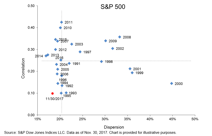
First, if you want to measure correlation in the S&P 500®, you should do it at the level of individual securities, not across the index’s 11 sectors. Inter-sectoral correlation tells us something about the benefit of diversifying across sectors, but it’s also indifferent to the securities within each sector. An active stock picker presumably doesn’t share this indifference. The good news is that, measured at the stock level, correlations are still quite low. Calculated properly, we find that the correlation of the S&P 500 as of Nov. 30, 2017 was an extremely low 0.10.

More importantly, for active managers correlation is not the whole story, nor even the most important part of the story. Dispersion, or cross-sectional portfolio volatility, offers a more meaningful way to identify opportunities for active management.

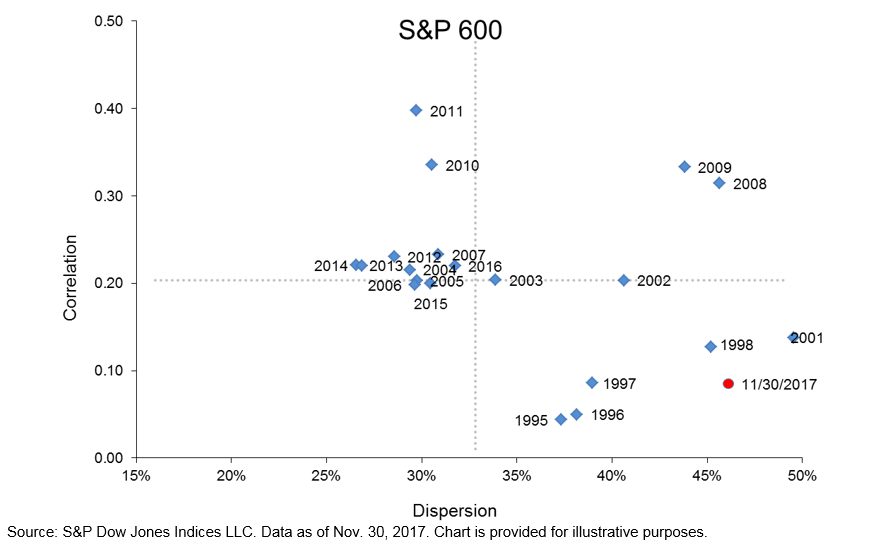
The dispersion of the S&P 500 as of Nov. 30, 2017 was 18.3%, moderately low by historical standards, per the below dispersion-correlation map:

In contrast, dispersion is typically higher for small-cap stocks than large caps. Dispersion for the S&P SmallCap 600® spiked in November to an eye-popping 46.1%. Value added opportunities for skillful stock selection among small caps are therefore much larger than in the large-cap universe.

While correlations are indeed low, we caution that it is premature to rejoice and declare a “stock-pickers’ market,” particularly for large caps, until S&P 500 dispersion starts to move higher. 

The posts on this blog are opinions, not advice. Please read our Disclaimers.

Asian Fixed Income: Indonesian Sovereign Bonds Were the Big Winners in 2017

Contributor Image
Michele Leung

Former Director, Fixed Income Indices

S&P Dow Jones Indices

With the growing appetite for emerging market debt and in the hunt for better yields, Indonesian sovereign bonds have been popular this year. The strong rally has continued since the first quarter (see a previous piece here). The S&P Indonesia Sovereign Bond Index, which seeks to track the local currency denominated sovereign bonds, jumped 15.24% YTD as of Dec. 7, 2017.

There were three new issuances added to the S&P Indonesia Sovereign Bond Index this year, with a total of INR 39 trillion. The total local currency new issuances in the index was only around one-third of last year’s rate, as Indonesian sovereigns continued to tap into different foreign currency markets; for example, they raised USD 4 billion from its global bond issuance in the first week of December. Meanwhile, the new issuances also extended Indonesia’s yield curve to 30 years.

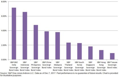
The yield-to-maturity of Indonesian sovereign bonds continued to trend lower. Throughout the year, it has tightened 131 bps to 6.57% (see Exhibit 1). It also represented a 312 bps plunge from the recent high, which was 9.69% on Sept. 30, 2015. Nevertheless, the yield is still competitive with its investment-grade rating of ‘BBB-’/‘Baa3’ and particularly compared to other Asian countries like India (at 7.17%, as represented by the S&P BSE India Bond Index with a rating of ‘BBB-’/‘Baa2’; see Exhibit 2).

The overall local currency bond market in Indonesia, as represented by the S&P Indonesia Bond Index, rose 14.05% YTD, and it was the best-performing country within Pan Asian bond universe.

Exhibit 1: Yield-to-Maturity of the S&P Indonesia Sovereign Bond Index

Exhibit 2: Yield-to-Maturity Comparison of the S&P Pan Asia Sovereign Bond Subindices

The posts on this blog are opinions, not advice. Please read our Disclaimers.

A Quick Look at Chilean Sovereign Bonds and Indices

Contributor Image
Jaime Merino

Former Director, Asset Owners Channel

S&P Dow Jones Indices

The Public Debt Office is the cornerstone of debt strategies for the Ministry of Finance in Chile. It supports liquidity and ensures stability in the local financial market through issuance and placement of treasury bonds. In this context, the Public Debt Office establishes referential interest rates in order to facilitate access to capital markets for Chilean businesses.

To accomplish its objective, the bureau, as part of the International Finance Unit, acts in coordination with the Treasury of the Republic, the Budget Office, and with the Central Bank in its role as fiscal agent in the placement and administration of bonds. It also monitors the investment of temporary surpluses resulting from the administration of the budget, and it proposes capital market reforms to promote the integration of domestic and international financial markets.

The Treasury issues in the local bond market in Chilean pesos and inflation-linked foment units (UF) contribute to the construction of the reference rate nominal and real curves. In 2008, the BTP-10 bonds were issued, which are the 10-year nominal bonds; for UF bonds, Chile issued the BTU-20 and BTU-30, which are 20- and 30-year bonds, respectively. During 2009, new bonds for the real curve were issued, BTU-5 and BTU-10, and for the nominal side, the BTP-5 was issued. As for the Central Bank, similar to the Treasury, they issue the BCP and BCU instruments, fixed-rate nominal bonds and inflation-linked foment unit bonds, respectively, with the objective of executing the monetary policy. Maturities for BCP bonds are 5 and 10 years (no issuance of 2-year reference after September 2012), while BCU have maturities of 5, 10, 20, and 30 years. The coupons of both are paid biannually.

In partnership with Bolsa de Comercio de Santiago (BCS, the local stock exchange), S&P Dow Jones Indices launched a series of sovereign bond indices and sovereign inflation-linked bond indices as a reference to the local market using the bonds described before. This series is categorized by maturity (see Exhibit 1).

As seen, buckets help asset managers benchmark their portfolios in case they need specific maturities. Also, the complete curve indices are calculated in USD for international investors. Exhibit 2 shows inflation, the reference rate from the Central Bank, and the local currency (Chilean peso) over the past 10 years—components that influence in the movements of the indices.

Finally, Exhibit 3 shows the annual returns of some these indices.[1]

[1]   For more information on these indices, see here:

http://spindices.com/indices/fixed-income/sp-clx-chile-sovereign-bond-index

http://spindices.com/indices/fixed-income/sp-clx-chile-sovereign-bond-1-5-year-index

http://spindices.com/indices/fixed-income/sp-clx-chile-sovereign-bond-5-10-year-index

http://spindices.com/indices/fixed-income/sp-clx-chile-sovereign-bond-10-year-index

http://spindices.com/indices/fixed-income/sp-clx-chile-sovereign-bond-index-usd

https://spindices.com/indices/fixed-income/sp-chile-sovereign-inflation-linked-bond-index

http://spindices.com/indices/fixed-income/sp-clx-chile-sovereign-inflation-linked-bond-1-5-year-index

http://spindices.com/indices/fixed-income/sp-clx-chile-sovereign-inflation-linked-bond-5-10-year-index

http://spindices.com/indices/fixed-income/sp-clx-chile-sovereign-inflation-linked-bond-10-year-index


The posts on this blog are opinions, not advice. Please read our Disclaimers.
Vanishing Stocks

Contributor Image
David Blitzer

Former Managing Director and Chairman of the Index Committee

S&P Dow Jones Indices

The number of stocks listed in the US is falling. Currently there are 3,758 listed stocks, ten years ago there were 4,500 and 20 years ago the number topped 7,400. The total value of the market, as measured by the total market capitalization of the S&P Total Market Index, continues to rise. As of yesterday it was $27.3 trillion, up 20% from a year earlier.  However, this gain was largely due to increasing stock prices, not to new capital coming into the market.  Not only are there fewer stocks today than earlier, but capital is flowing out of the market.  Two leading reasons for the declining number of stocks are fewer IPOs and more mergers. The explanation for the capital outflows are dividends and buybacks, plus acquisitions by foreign or private companies.

The annual pace of initial public offerings (IPOs) collapsed after the tech bust in 2000. In the 1990s, IPOs averaged 400 per year; dropped to about 150 in 2000-2006 and then to 100 per year in 2007-2016. In the last four years since the financial crisis the number showed little improvement, only reaching 140 per year. Analysts suggest various reasons for the drop: regulatory costs of being a public company, fear of activist investors and, most of all, the ease of raising capital in the private markets.

The stars in the private markets are the unicorns – private companies with valuations over a billion dollars.  Uber, worth about $60 billion is the most famous unicorn, but certainly not the only one. Other household names include AirBnb, Dropbox and WeWork. There are over 100 unicorns in the US and a roughly equal number outside the US. China is second in terms of both the number and the total value.  When a company can reach a valuation of a billion, or ten billion or possibly $60 billion in the private market, it is no surprise that IPOs are slowing down. While some private companies do eventually become public they are older and larger than they were in the 1990s, and may have a better chance of surviving. Moreover, not all the unicorns become IPOs and some that do vanish shortly thereafter. Since 2009, 110 companies left the unicorns list – 61 IPO-ed including Facebook, Tesla and Pandora but 49 were acquired including BATS, LinkedIn and Zappos. Some promising companies like WhatsApp are acquired before they have a chance to go public.

Mergers and acquisitions are another drain on the number of public companies. Bloomberg data shows an average of 7,700 transactions annually since 2005 totaling about $980 billion each year. Similar data from the Institute for Mergers, Acquisitions and Alliances (IMAA) shows that mergers climbed steadily from 1985 to the mid-1990s when the number of listed stocks peaked. Since there the pace has varied somewhat, but the annual number of mergers never dropped below what was seen in 1995.  Anti-trust efforts faded as mergers rose.

While the number of companies was dropping, capital was also leaving the markets. The drain was not due to mergers which only drain capital when the acquirer is a foreign company or private equity. Rather, stock buybacks and dividends together drain about 5% a year out of the US markets. The Federal Reserve’s Flow of Funds data show that from 2012 to 2016, there was negative net issuance of corporate equity of $2.2 trillion. If one examines the S&P Total Market Index divisor it fell 12% from 2005 to 2016 indicating that capital flowed out of the index and the market over that time period.

The posts on this blog are opinions, not advice. Please read our Disclaimers.