Get Indexology® Blog updates via email.

In This List

Nine of Eleven U.S. Equity Sectors Gained Despite Size

The DJIA Crosses 24k

Energy Posts Gains and Petroleum Boasts Improved Roll Yields

Carbon Exposure of the S&P 500® Low Volatility Index

Carbon Pricing: The Business Case for Low-Carbon Innovation

Nine of Eleven U.S. Equity Sectors Gained Despite Size

Contributor Image
Jodie Gunzberg

Former Managing Director, Head of U.S. Equities

S&P Dow Jones Indices

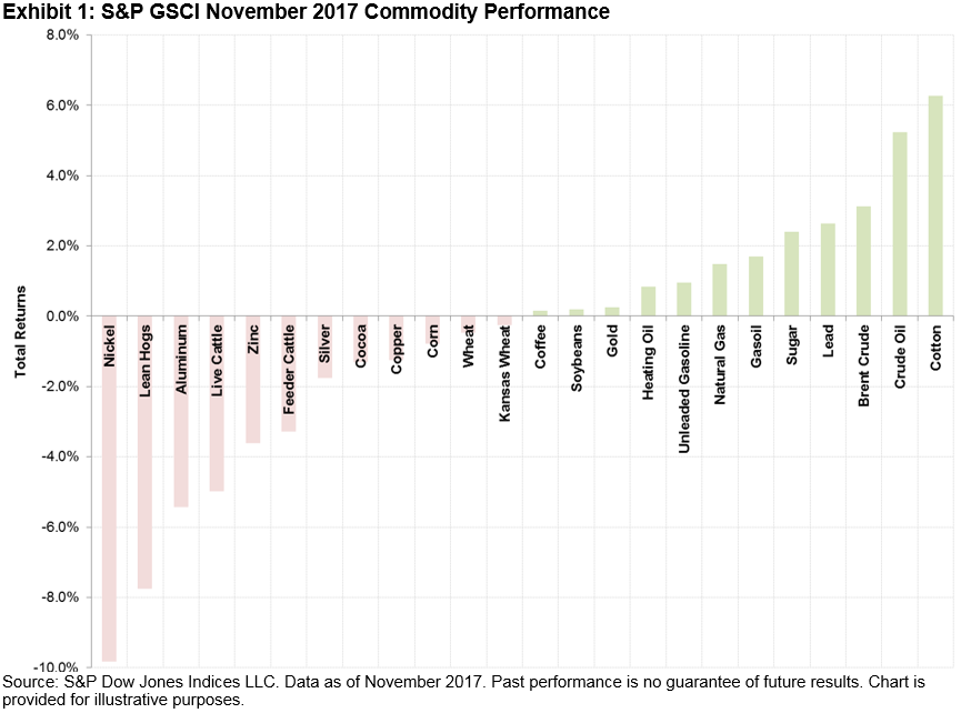
In November, mid-caps led the U.S. equity market with the S&P 400 gaining 3.68%, followed by small-caps in the S&P 600 that gained 3.52% and large-caps in the S&P 500 that gained 3.07%. The S&P 500 logged its 13th consecutive positive month, the longest streak in its monthly history ever (data going back to Oct. 1989.)  All eleven sectors of the S&P 500 were positive, an event that has happened just 13.9% of the time.  Perhaps what is more interesting is that nine of the eleven sectors were positive together across the market caps.  The last time this many sectors gained together in a month across all the market caps was in March 2016.  In total, nine or more sectors have gained together across the S&P 400, S&P 500 and S&P 600 in 19.6% of months in history (since Jan. 1995.)  Consumer Discretionary led both mid (+6.59%) and small caps (+7.53%) in November, making up 11.9% of the S&P MidCap 400 and 15.4% of the S&P SmallCap 600.  For large caps, Telecommunication Services was the best performer, gaining 6.03%, but is the smallest sector comprising just 2% of the S&P 500.

Source: S&P Dow Jones Indices

In November, the size mattered least for the value and growth styles since May 2013.  The difference between value and growth for the S&P 500, S&P 400 and S&P 600 was 0.58%, 0.06% and 0.45%, respectively.  In only four months in history (May 2013, July 2010, Aug. 2005 and May 2004) was the spread so tight between value and growth in mid-caps.  Large caps had just a 22 basis point discount in Feb. 2017 while small caps had a tight discount of 35 basis points in Aug. 2017.  In fact small caps styles have been performing very tightly in 2017, the closest since 2013 and at levels that only come this tight on a monthly basis on average per year 1/3 of the time.

Source: S&P Dow Jones Indices

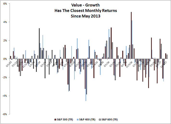
That said, for the year through November in 2017, the S&P 500 Growth is outperforming the S&P 500 Value by 13.24%, the second most in history with a bigger value to growth discount only year-to-date through Nov. in 1998.

Source: S&P Dow Jones Indices

Lastly, 2017 may not be on pace to set any sector records, but for small caps, the S&P 600 Utilities and S&P 600 Health Care are having exceptionally strong performance, up a respective 26.42% and 21.48% YTD through November, on pace for their second and third best years in history.  On the flip side the S&P 400 Telecommunication Services and S&P 400 Energy are on pace for their second and fourth worst years in history, down 42.55% and 21.27% for the year through November, respectively.

Source: S&P Dow Jones Indices


The posts on this blog are opinions, not advice. Please read our Disclaimers.

The DJIA Crosses 24k

Contributor Image
Jamie Farmer

Former Chief Commercial Officer

S&P Dow Jones Indices

Wow.

It may not be experiencing quite the same year-to-date appreciation as bitcoin – nor its volatility, mind you – but by all accounts the Dow Jones Industrial Average has had a remarkable run in 2017.  And, powered Thursday by a gain of 331.67 points (+1.39%), it topped 24,000 for the first time in history.

A few highlights:

  • As of Thursday’s close, the DJIA is up 22.82%. If that level holds, this year will trail only 2013 (with a gain of 26.50%) as the best performing year in the past decade.
  • With 63 new highs already this year, 2017 ranks as the third most prolific year in history, trailing only 1995 and 1925 in the #1 and #2 slots respectively. There have been 52 calendar years when the DJIA notched at least 1 new high and 70 when none were recorded; see below for the top 10 calendar years.
  • With 5 new 1000 point milestones already (20k, 21k, 22k, 23k & 24k), this year is the most active such period on record. It took nearly twice as long for the DJIA to hit the first 1000 points as it has for all subsequent milestones combined.
  • Similarly, the speed with which the DJIA is crossing these thresholds is notable: it has taken only 257 trading days to run through those 5 marks.  By comparison, it took 483 days for the DJIA to move from 18k to 19k.  Of course, there is a big caveat:  it’s important to continue to note that as the DJIA gains in value each successive 1000 point milestone represents a smaller percentage gain.
  • The DJIA has gained nearly 271% from the low of 6,547.05 hit on March 9, 2009 during the depths of the Financial Crisis.
  • Through Thursday’s close, Boeing (BA) with 830.35, UnitedHealth Group (UNH) with 467.66 and 3M (MMM) with 443.64 have been the three largest point contributors to the DJIA’s advance this year.

And, yes, the 2017 column in the chart below is gold – for 24 karat – I couldn’t help myself.


Source: S&P Dow Jones Indices LLC. Data as of Nov. 30, 2017. Past performance is no guarantee of future results. Chart is provided for illustrative purposes.


Source: S&P Dow Jones Indices LLC. Data as of Nov. 30, 2017. Past performance is no guarantee of future results. Table is provided for illustrative purposes.

The posts on this blog are opinions, not advice. Please read our Disclaimers.

Energy Posts Gains and Petroleum Boasts Improved Roll Yields

Contributor Image
Marya Alsati

Former Product Manager, Commodities, Home Prices, and Real Assets

S&P Dow Jones Indices

The S&P GSCI was up 1.4% with a YTD return of 1.3% in November. Of the five sectors in the index, energy and agriculture were positive for the month, up 3.4% and 0.5%, precious metals was flat, while industrial metals and livestock finished the month on a negative note, down 3.2% and 5.5%, respectively.

The 24 commodities tracked by the index were divided between positive and negative territory in November. Cotton was the best-performing commodity for the month, while nickel was the worst.

Crude prices benefited from OPEC and non-OPEC members agreeing to extend output cuts into 2018, and WTI specifically benefited from a decrease in inventories by 3.4 million barrels, as reported by the U.S. Energy Information Administration.

In fact, this low level of inventories can be seen in the roll yield of the S&P GSCI Petroleum. Since August, the roll returns, as measured by the excess return of the index minus the spot return, has moved into backwardation (positive roll yield) for petroleum (see Exhibit 2). In November, the roll yield reflected a small level of contango, or negative roll yield, which is the result of nearer contracts being cheaper than later-dated ones, however this contango level of 0.05% still shows a significant improvement from levels seen earlier in the year. The S&P GSCI has been in contango at the end of each month since November 2014.

The posts on this blog are opinions, not advice. Please read our Disclaimers.

Carbon Exposure of the S&P 500® Low Volatility Index

Contributor Image
Kelly Tang

Former Director

Global Research & Design

Understanding the carbon exposure of smart beta strategies is important for market participants who are already implementing factor strategies and wish to incorporate carbon risk into the investment process. In a previous blog, our analysis showed that factors such as low volatility and value may be predisposed to higher carbon emissions because of their sector compositions.

The low volatility factor in particular stood out, as it generates the highest total in emissions—three times more than the S&P 500 Enhanced Value Index, which ranked as second highest (see Exhibit 1). The S&P 500 Low Volatility Index, as of June 30, 2017, had 17 utility companies that generated over 60% of its direct carbon emissions. This finding of low volatility indices having a high carbon emission bias presents solutions from the index provider perspective to incorporate a carbon efficiency component to low volatility indices. However, it may be helpful to analyze the S&P 500 Low Volatility Index’s carbon emission history in order to assess whether the high carbon emission is a persistent attribute throughout its history.

Emissions are typically measured by mass of carbon dioxide equivalent (CO2e), whereby the “equivalent” is a proxy applied to greenhouse gases other than carbon dioxide and reflects their relative environmental impact. The units of reference are in kilotons of CO2e.[1] Exhibit 2 shows the total direct emissions for the S&P 500 Low Volatility Index on a semiannual basis from December 2009 through June 2017, and it should be noted that there have been fluctuations in the level of carbon emissions.

The S&P 500 Low Volatility Index is designed to measure the performance of 100 least volatile securities, with volatility represented by the standard deviation of price changes over the trailing 252 trading days. The index has shown to have dynamic sector composition depending upon market environments.[2] For instance, the utilities sector’s weighting in the S&P 500 Low Volatility Index has averaged 23% from December 2009 through June 2017 with a high of 32% and a low of 3% (see Exhibit 3). Given sectoral shifts, the potential exists for large swings in absolute carbon emissions data (see Exhibit 2). Yet, the contribution to carbon emissions from the utilities sector appears to remain consistently high, averaging 77% since 2009 (see Exhibit 3).

The primary objective of low volatility strategies is to reduce realized portfolio volatility and therefore these strategies have a tendency to favor defensive sectors such as utilities. Low volatility indices have been shown to reduce volatility in the range of 25-30%. Adding a carbon efficient overlay onto the low volatility factor indices requires a careful consideration of the potential tradeoffs, as the exposure to the low volatility factor or the average volatility reduction level may be compromised in any approach that targets the utilities sector in particular.

For low volatility indices, blindly removing carbon intensive utilities securities could be counterproductive to the primary investment objective of the strategy. As such, more complex portfolio construction techniques such as having an additional quantitative process or an optimization may be necessary to ensure that carbon exposure is effectively minimized while maintaining the desired level of exposure to the factor and the risk reduction abilities.

[1]   Emissions data is sourced from Trucost, which provides data on both direct and first tier indirect emissions on a company-by-company basis; if companies do not report or otherwise make such figures available, Trucost estimates the emissions of each company using a proprietary model. Direct emissions, as the name suggests, encompasses emissions of CO2e produced directly by the entity, whereas indirect emissions are those that arise from the entity’s suppliers of materials and equipment, utilities such as electricity, and business travel. The inclusion of indirect emissions is not always preferable, especially in an index, as this may result in double counting. For example, if a utility company as well as one of its customers is included in the same index, the emissions of the latter would be counted twice.

[2]   Brzenk, Phillip & Soe, Aye. “Inside Low Volatility Indices,” S&P Dow Jones Indices (2017).

The posts on this blog are opinions, not advice. Please read our Disclaimers.

Carbon Pricing: The Business Case for Low-Carbon Innovation

Contributor Image
Rochelle March

Senior Analyst

Trucost, part of S&P Dow Jones Indices

The belief that economic growth is possible without lowering carbon emissions is becoming harder to sell by the minute. A study by the London School of Economics showed that if business-as-usual emissions continue over this century, the value of risk to global financial assets in today’s terms is 1.8%, or USD 2.5 trillion. Likewise, analysis by Trucost shows that operating margins will turn negative for 46% of companies in the chemicals sector by 2030 because emitting carbon will become too expensive (see Exhibit 1).

Clearly, carbon pricing risk—the monetary value that accounts for the future costs of climate change regulation and transition—is likely to be a financially material issue. But addressing carbon risk also creates potential business opportunities.

In August 2017, Trucost launched its Corporate Carbon Pricing Tool to provide a data-led way for companies to translate carbon risk into financial terms. Here’s how carbon pricing can be applied to prove the business case for low-carbon innovation.

  • Calculating return on investment (ROI) for low-carbon investments: Sustainability managers need to provide their CFOs with a compelling business case for low-carbon investments. While investment in a diesel fleet versus an electric one may currently have a higher ROI, when factoring in carbon pricing risk, the ROI changes—especially over the lifecycle of the investment. By integrating a risk-adjusted carbon price into investment decisions and showing how future profits are at stake, the business case for low-carbon investment strengthens.

When using the risk-adjusted carbon price, a USD 1 million investment project has a payback period of less than two years and is already providing positive cash flow by the second year, while a conventional payback period would take almost 13 years.

  • Informing decision-making: To address carbon pricing, companies will need to either absorb the costs, pass them through to customers, or invest in low-carbon initiatives. To weigh these different options, companies can run their emissions and financial data through the Corporate Carbon Pricing Tool to determine which to prioritize.
  • Tailoring investments by region: Some regions have higher carbon pricing risk than others based on current emission schemes. By including this geographic factor, businesses are strategizing how to mitigate the risk, either by relocating their operations to less risky regions or by making low-carbon investments in preferred locations.
  • Benchmarking competitiveness against rival firms: Companies are benchmarking against peers to determine how they compare. If a competitor is leading, it may be able to pass fewer costs to consumers and charge lower prices. This directs companies to figure out why peers are more efficient. Is it location alone or because they are investing in energy-efficient technology?
  • Engaging individual business units to hit targets: Companies say that by communicating the carbon intensity of specific business units, each unit knows how much it needs to hit its target and contribute to a company’s reduction goal. Not only does this support company-wide engagement, it also helps raise internal funds for pilot projects and investments, like Unilever has done.
  • Communicating to investors: Companies increasingly agree that disclosing a carbon price to investors demonstrates a company is taking responsibility for future risks and has the managerial prowess to deliver on climate risk reduction. Increasingly, investors expect companies to report climate-related disclosures by applying scenario analysis, including a 2°C scenario. Additionally, a recent report by S&P Dow Jones Indices showed that low-carbon versions of the S&P 500 and S&P Global 1200 have actually outperformed their benchmarks in the past five years.

Pricing carbon risk provides a strategic link between environmental and financial performance, strengthening the business case for proactively mitigating climate-related risks. Companies and investors that take this step will benefit from a forward lens on carbon risk and the opportunity to inform tomorrow’s low-carbon innovation.

The posts on this blog are opinions, not advice. Please read our Disclaimers.