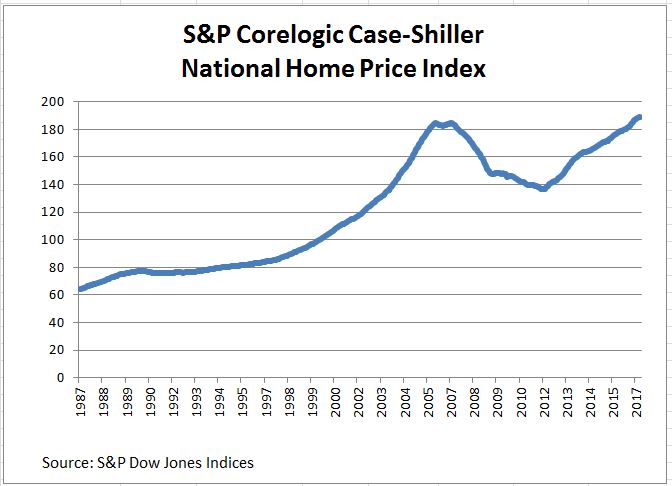
Home prices nationally are rising two to three times faster than inflation. They are up 5.5% from a year ago with some cities rising at double-digit rates. Looking at the chart of the S&P Corelogic Case-Shiller Home Price Indices, many are wondering if we’re in another housing bubble.
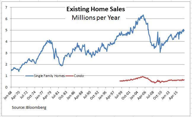
While prices are rising, the following charts do not point to any bubble. The next charts cover sales and the visible supply of existing single family homes. Both show a sharp peak immediately before and during the financial crisis followed by a drop. Home sales have recovered to an annual rate between four and five million units despite stable visible supply of about four months. Condominium sales are roughly flat.

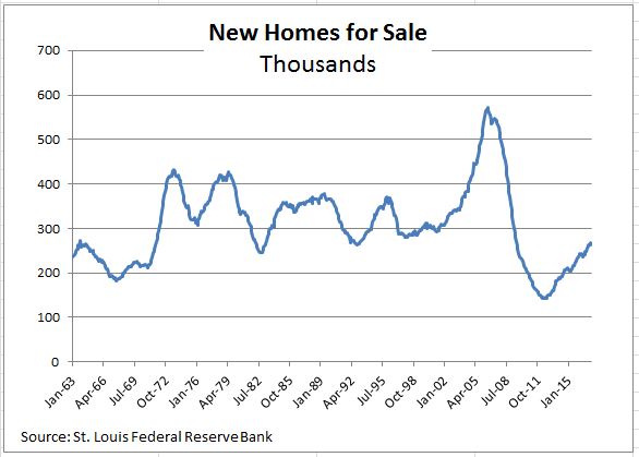
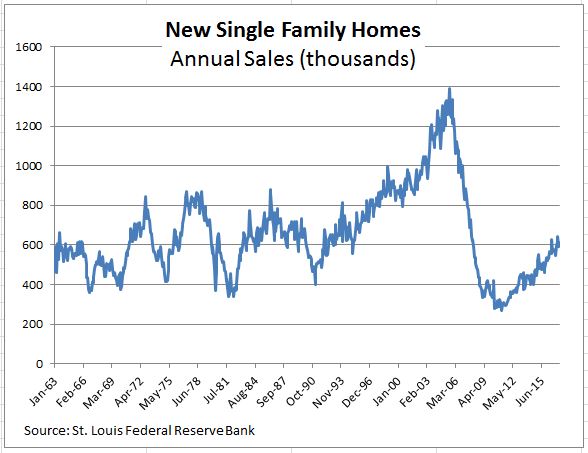
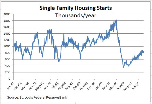
New home supply and sales appear weaker than existing homes. The supply of new homes is measured by homes on the market, not months-supply and shows that supply remains low. Annual sales are close to the pre-bubble range but far below anything that the peak in 2005. A similar pattern is seen in housing starts which measure construction activity.
The next S&P Corelogic Case-Shiller release is Tuesday July 25th.
The posts on this blog are opinions, not advice. Please read our Disclaimers.